


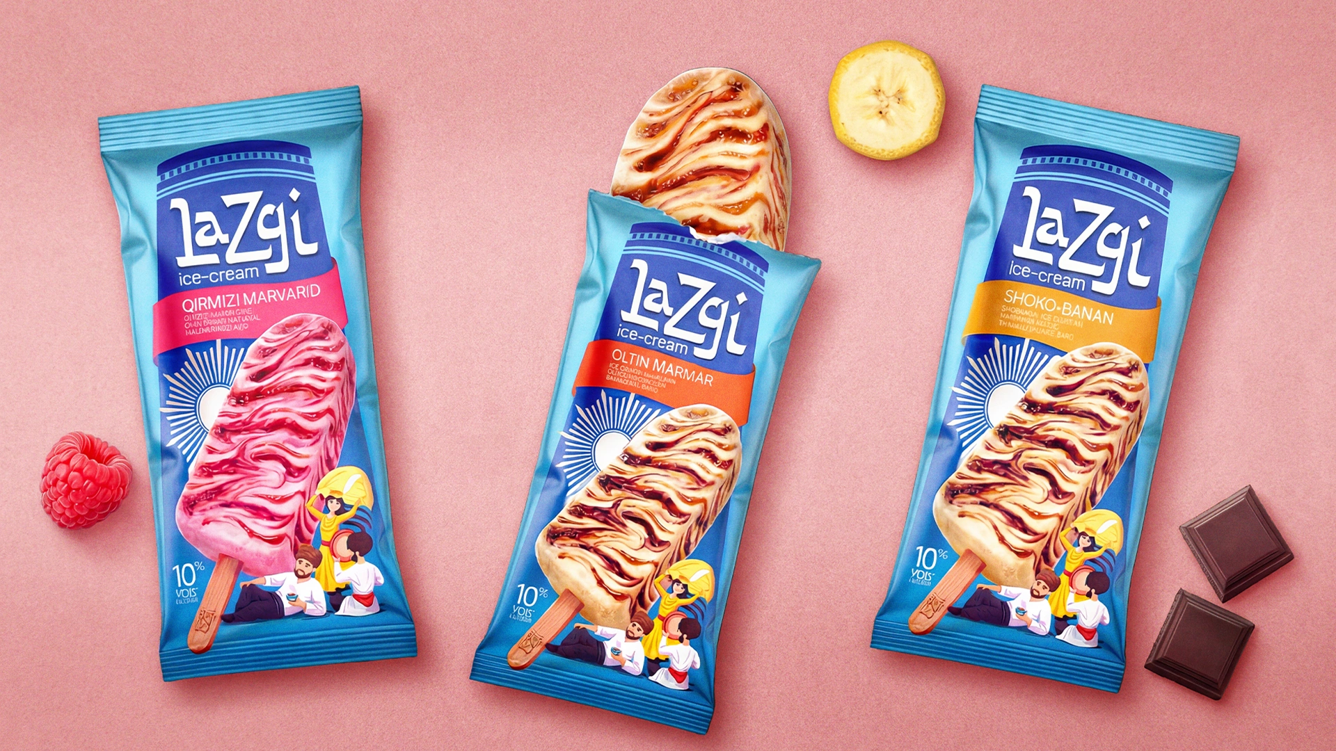
Lazgi – Ice Cream Packaging Design Inspired by Khorezm Culture
When bringing a new product to market, mere translation isn't enough. Adapting it to the local mentality and culture (localization) is the ultimate marketing strategy. The latest project by MINIM agency is a perfect example of this: packaging design for the “Lazgi” ice cream.
1. The Problem and Task
The product's origin story and core idea are quite unique. The equipment that produces this ice cream doesn't just pour the mass into the packaging; it extrudes it using a distinct twisting, rotational motion. This creates beautiful, appetizing waves in the ice cream's texture.
In the Russian market, this specific format was named “Waltz” precisely because of these swirling motions. Our client decided to introduce this technological product to the Uzbekistan market. However, the name “Waltz” doesn't strongly resonate with the local consumer. Because of this, the client made a brilliant decision: to localize the name. A product that inherently embodies dynamic and rotational movement was renamed after our national, high-energy dance — “Lazgi”.
Our task was to visually justify this naming, reflecting the authentic spirit of Khorezm and the unique “dancing” texture of the ice cream itself right on the packaging.
2. Research
Observing freezer shelves and the consumer decision-making process, we discovered an interesting paradox. For most brands in the market, “national flavor” strictly means traditional skullcap (doppa) or cotton flower patterns. As a result, all local products blend into a single, invisible blur on the shelf.
The second key insight related to the consumer experience: buyers are tired of standard, smooth popsicles. Our visual analysis showed that to cut through the visual noise of a store, we needed to abandon generic “Uzbek” templates. Bringing the cold mosaic colors specific to Khorezm and the dynamic, twisted texture of the product to the forefront was the most accurate and powerful solution.
3. The Solution
Since the name was “Lazgi,” the entire design concept was built around the culture, history, and vibe of Khorezm:
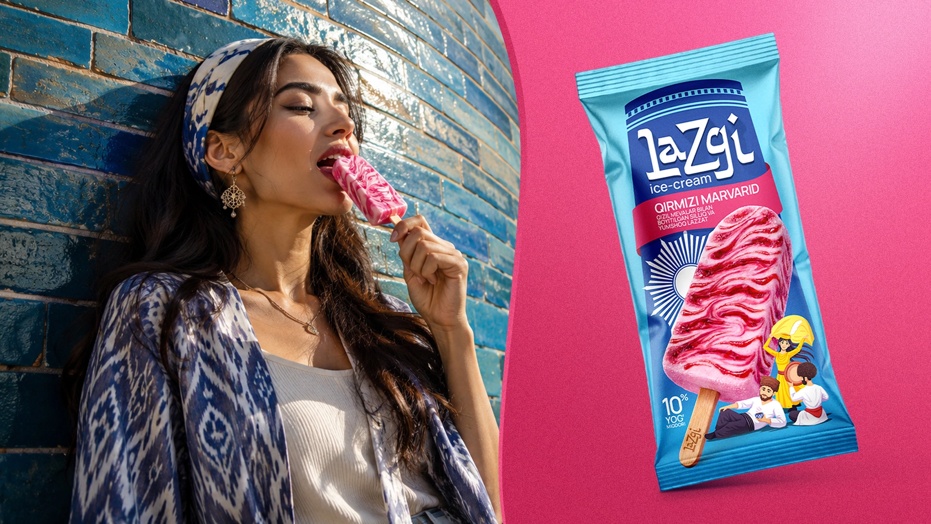
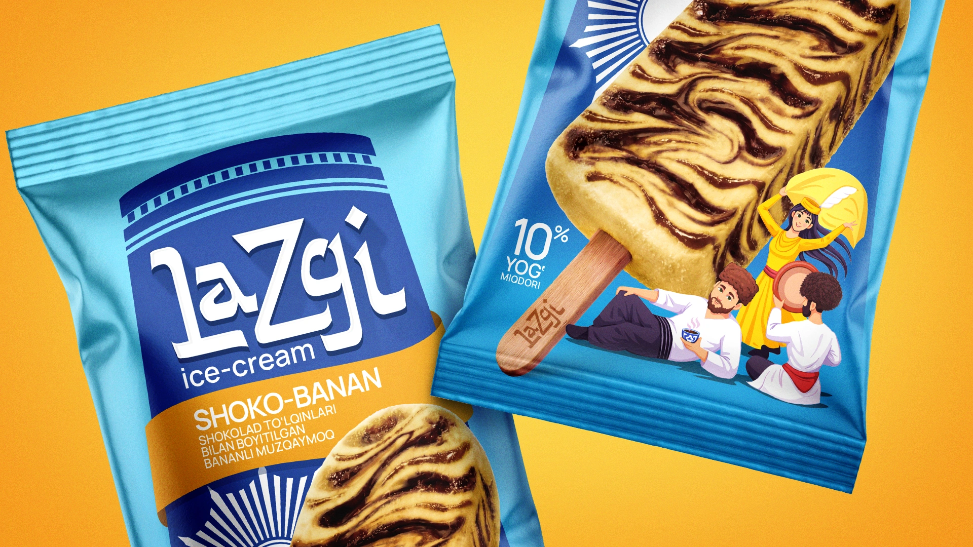
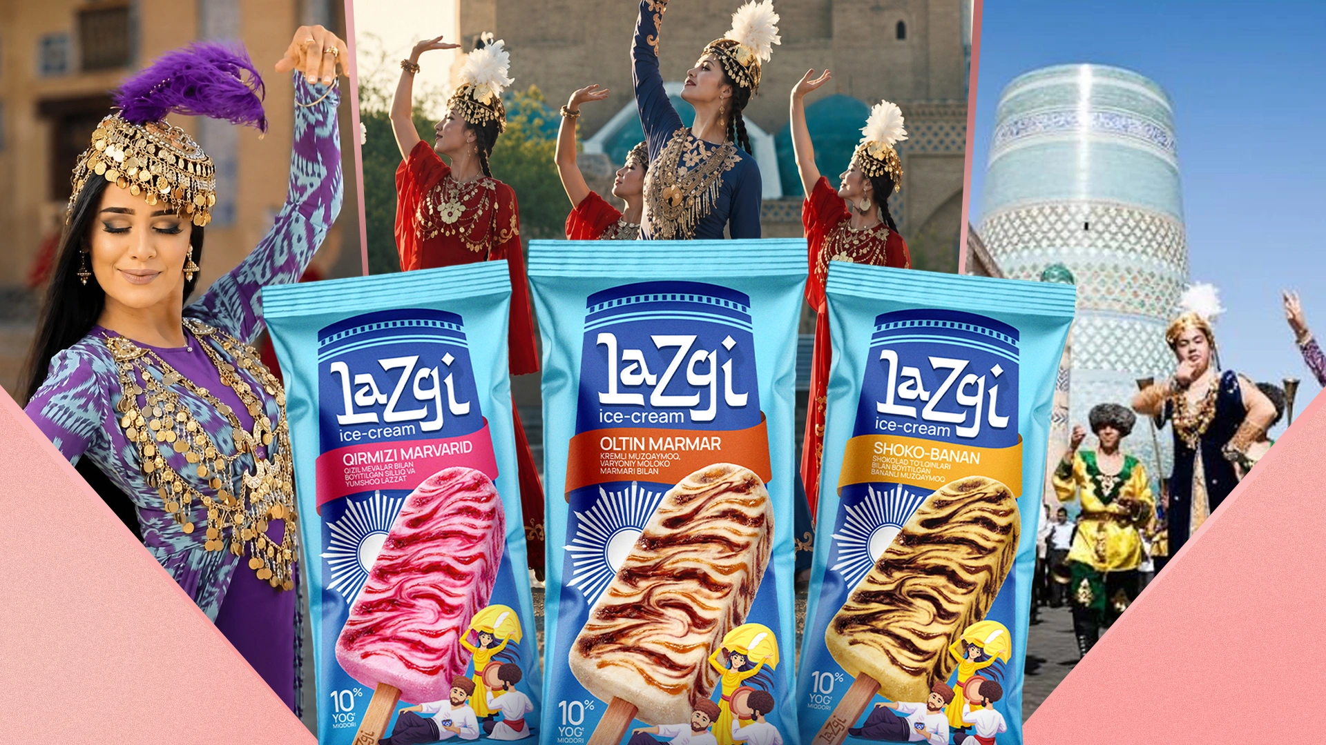
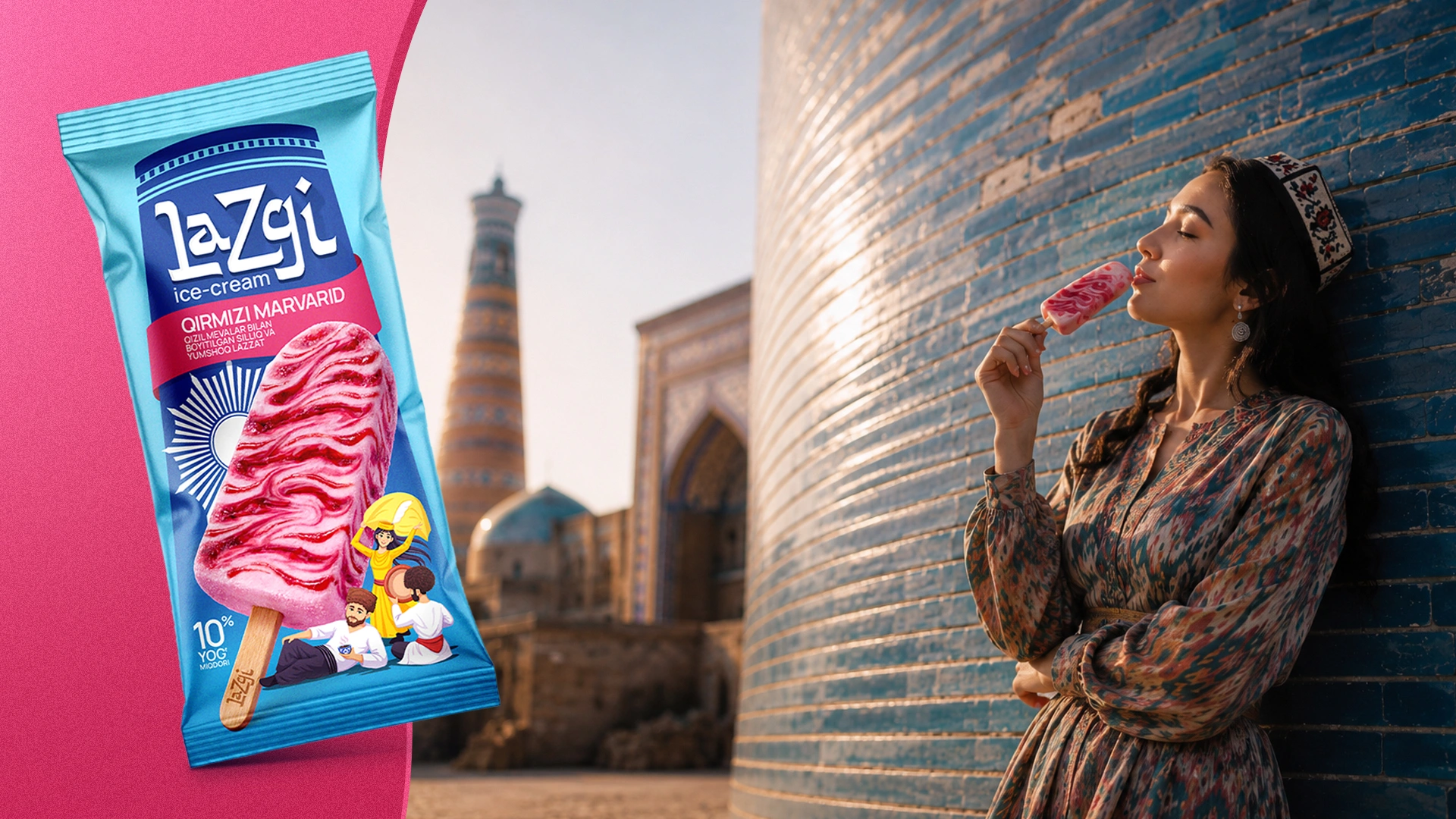
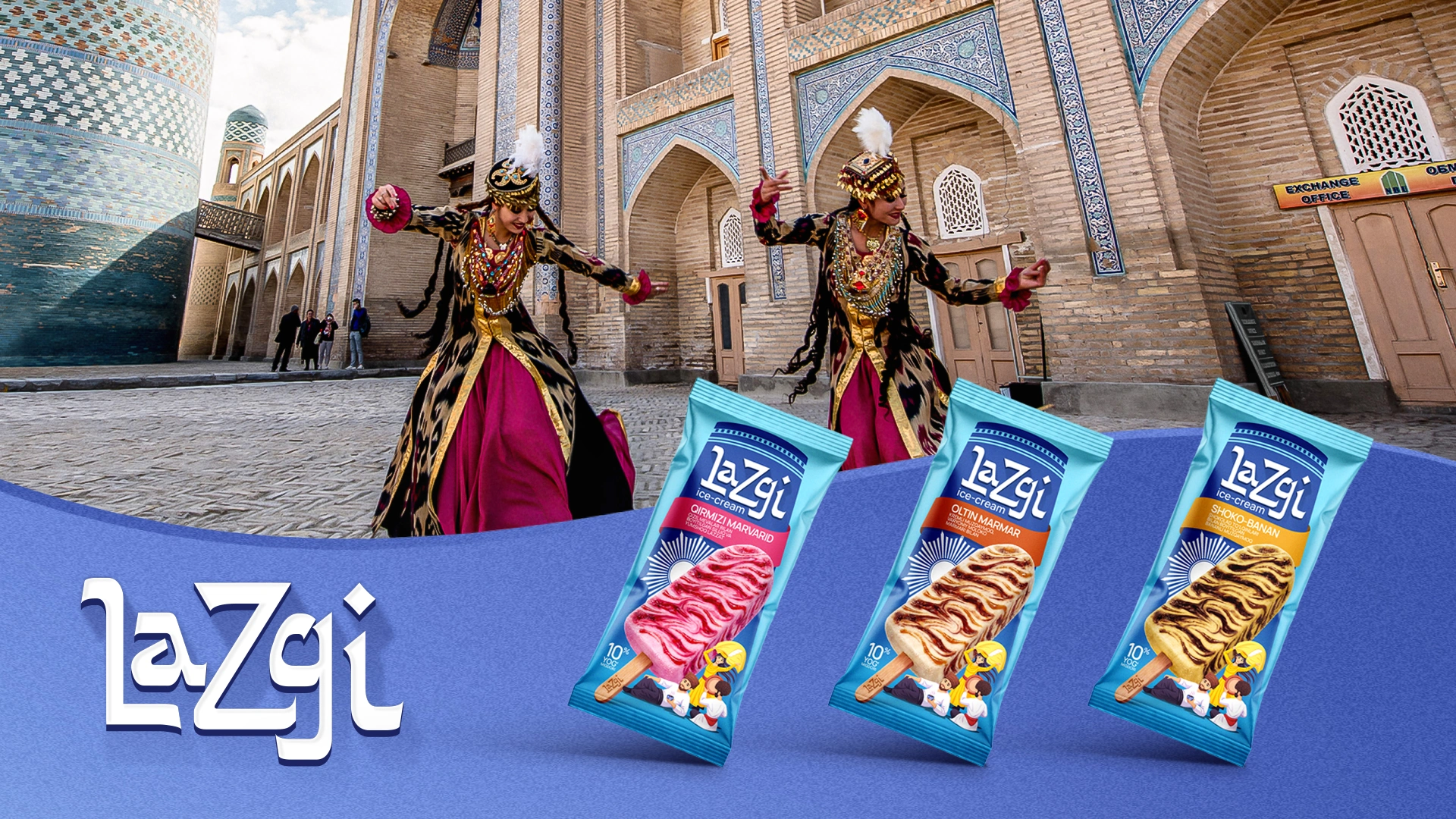
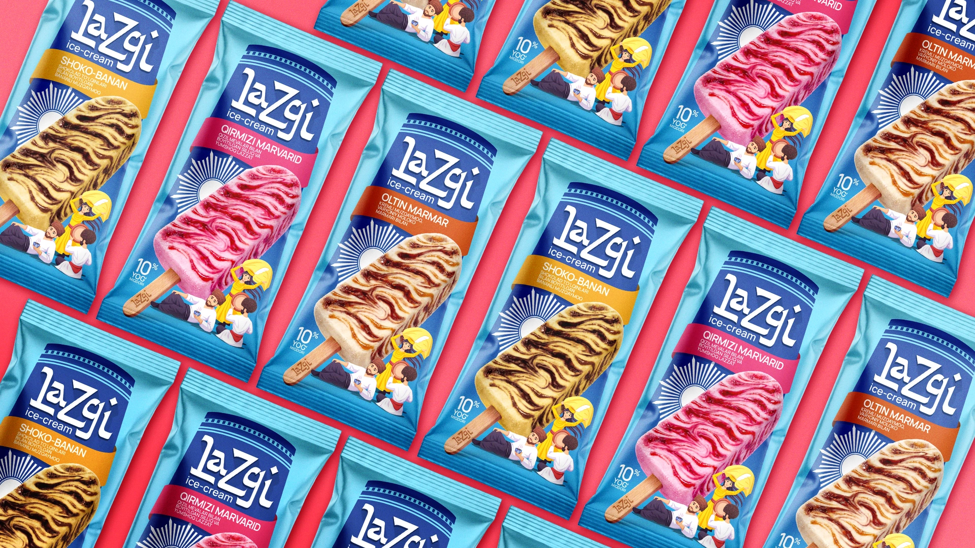
- Historical Heritage — The Sun of the Khorezmshahs: The multi-rayed sun placed in the center of the packaging behind the logo isn't just decoration. When developing the visual solution, we drew inspiration from the historical banner of the Khorezmshah Empire — a multi-rayed sun rising behind a lion. We reimagined this motif using modern, minimalistic graphics and placed it on the packaging.
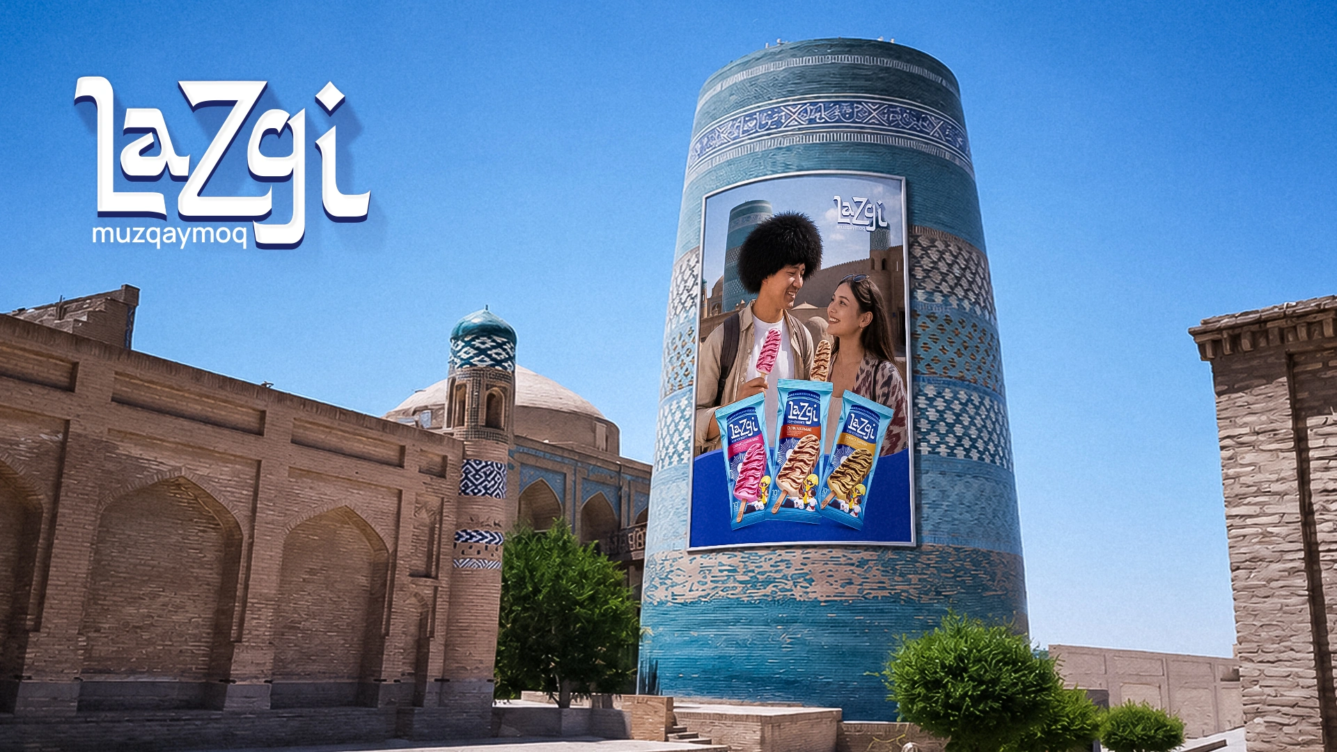
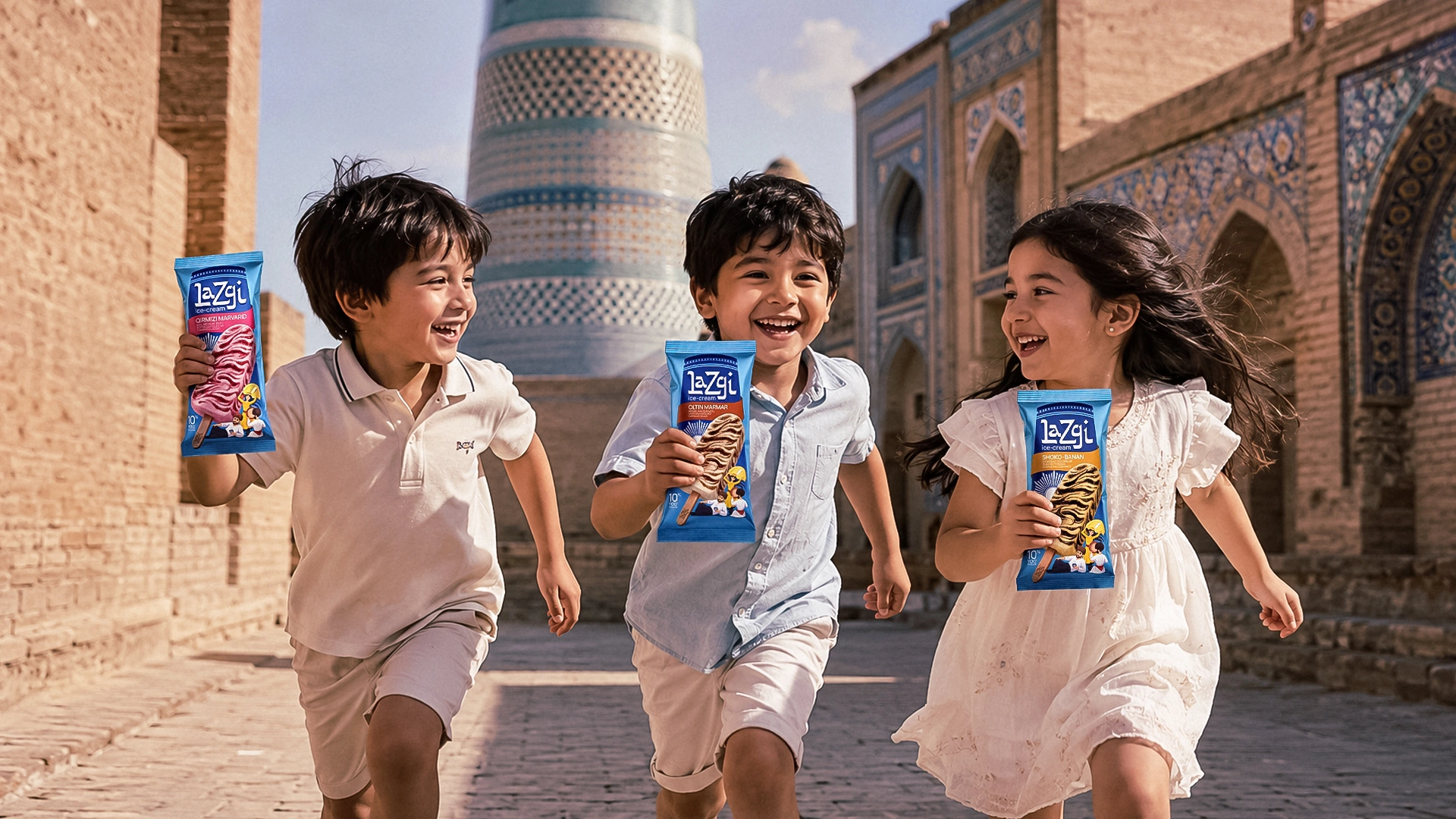
- Background and Architecture: The background features the silhouette of the Khorezm architectural masterpiece — the famous Kalta Minor minaret. The light blue background color and mosaic patterns are a direct nod to it.
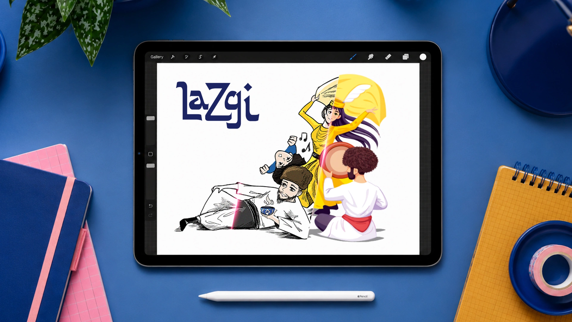
- Illustration and Character: To give the buyer a festive mood, a custom illustration was created for the bottom of the packaging. It features vibrant details of Khorezmian culture: young men wearing traditional chugurma hats, a musician playing the doira, a character relaxing with a bowl of tea, and a girl dancing the Lazgi.
- Flavor Naming: The product was launched in three variations, and we avoided standard naming conventions. Each flavor received a premium name that matched the design:
- Qirmizi Marvarid — Crimson Pearl: ice cream richly filled with raspberry jam.
- Oltin Marmar — Golden Marble: creamy ice cream with a marble pattern of boiled condensed milk.
- Shoko-Banan — Choco-Banana: banana ice cream enriched with chocolate waves.
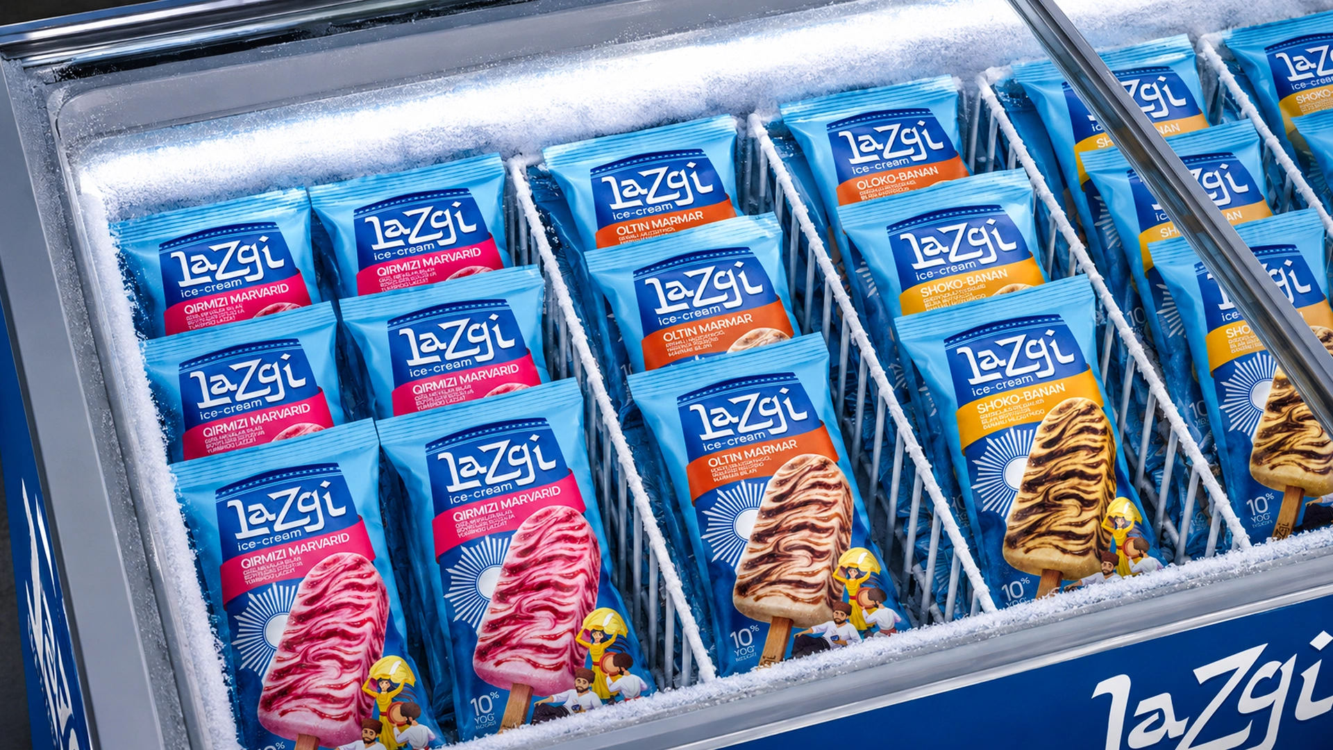
The Result
The logic behind the concept and visual execution was so strong and well-founded that the client approved the design in the very first round, without a single revision.
Through this project, we didn't just adapt a foreign product for the Uzbekistan market. We created a truly local brand with a powerful cultural code — a brand that makes the customer smile the moment they pick it up.
Are you looking to introduce a foreign product to the Uzbekistan market, or do you want to enrich your local brand with deep meaning through design? Contact MINIM agency.