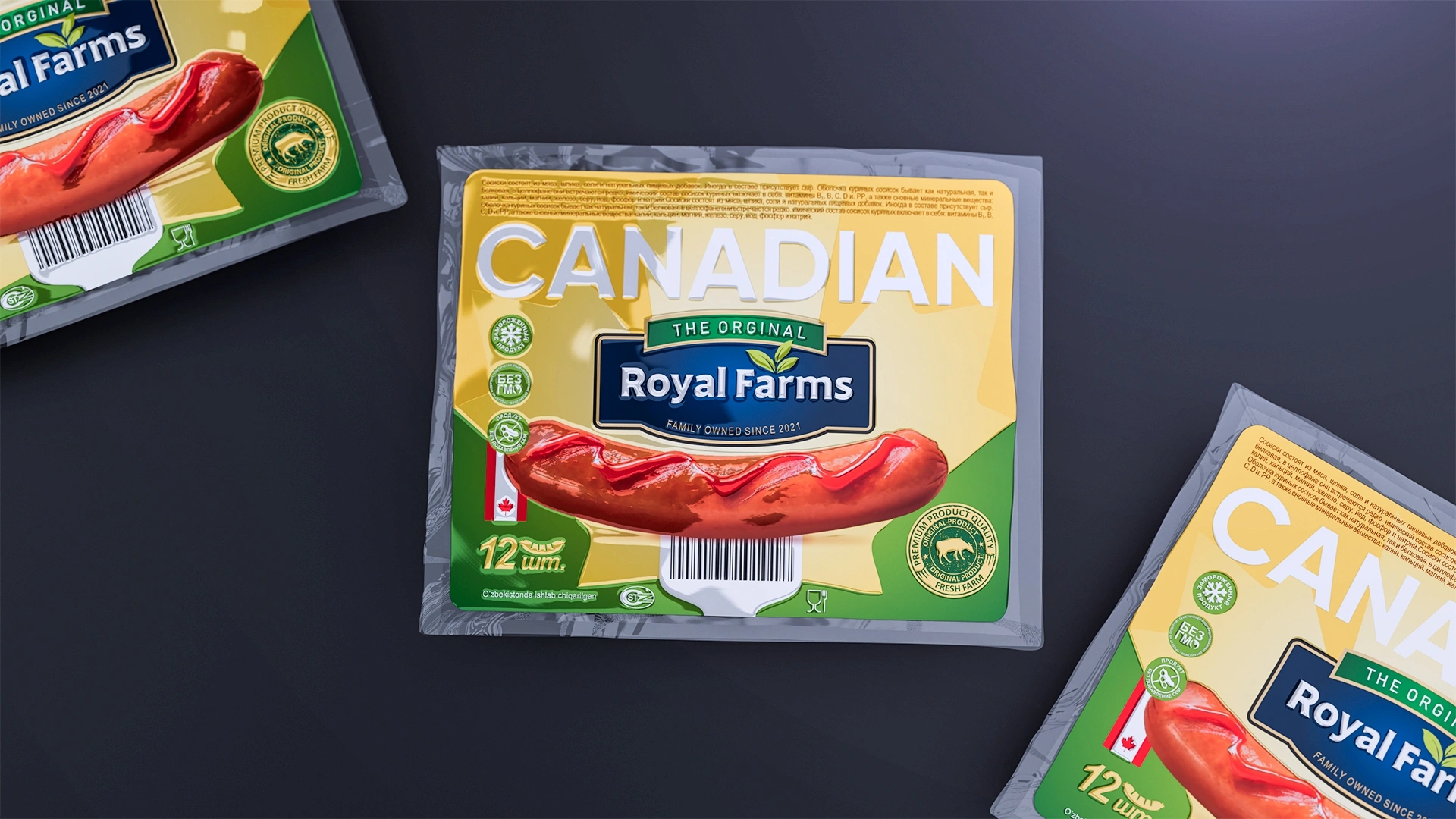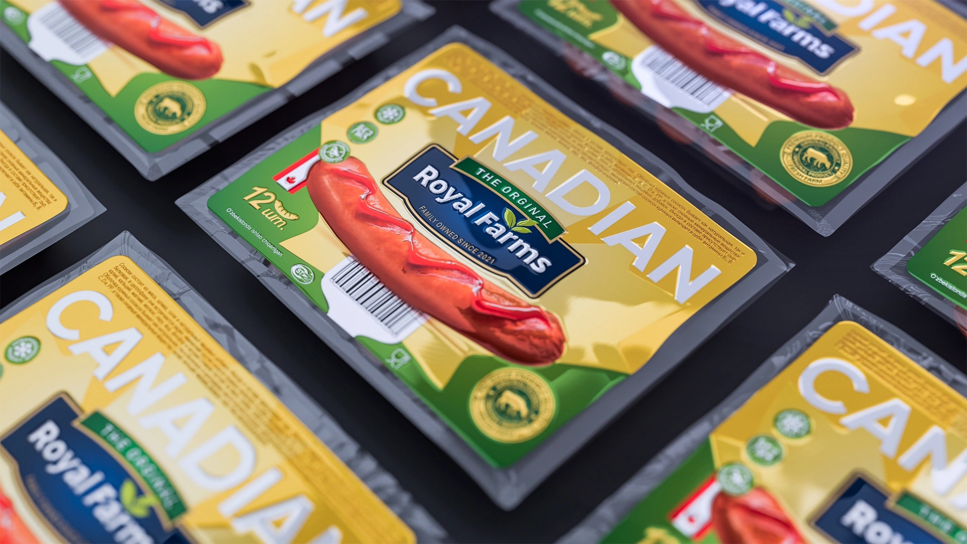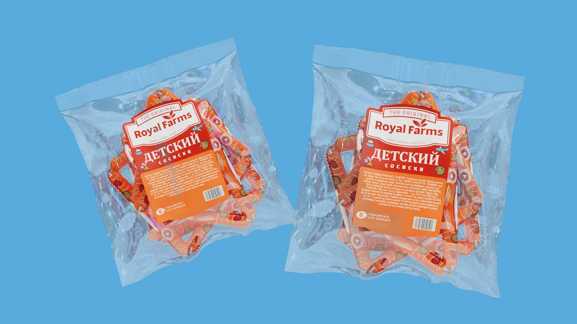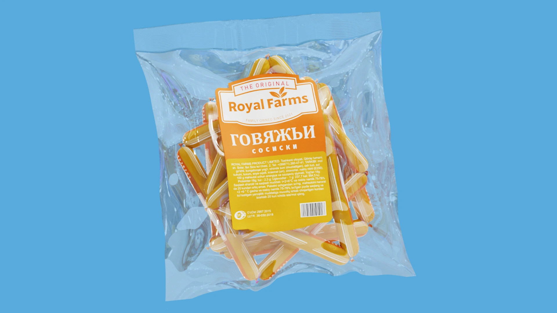



Royal Farms — Logo and Label Design for Sausage Products
Delicious sausages with warm bread go perfectly with morning tea, don't they? But when you walk into a supermarket and head to the meat department, you see that every brand on the shelves is trying its best to grab the buyer's attention: some add bright decorations, others paint the entire packaging in a flashy color, and some use various ornaments to stand out. However, sometimes you don't need to speak loudly to attract attention.
1. Problem and Task
When the "Royal Farms" brand approached us, our task was not to shock anyone or create packaging that was completely different from the rest.
The main goal was to establish system and order! For the entire family of sausages, we needed to develop a uniform and carefully crafted visual concept (a unified style) so that when lined up on the shelf, the buyer would see a single, serious, and reliable brand. The diverse products had to speak the same design language, meaning they needed to perfectly complement each other like members of one family.
2. Research
We tirelessly examined the products on the store shelves. To demonstrate product quality, many brands in the market are used to placing various artificial stamps, animal illustrations, and complex patterns on their packaging. As a result, the true owner of the product — the brand name itself — gets somewhat lost among this multitude of details.
We took a different approach, abandoning the minor distracting elements to focus all our attention on the face of the brand: the logo.
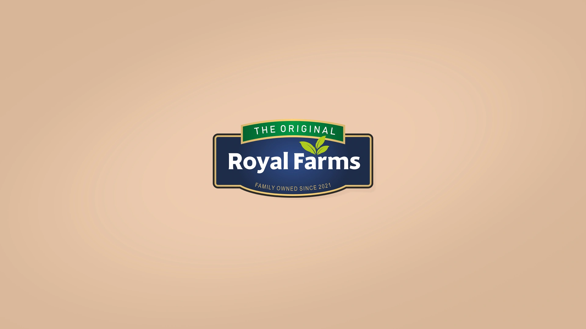
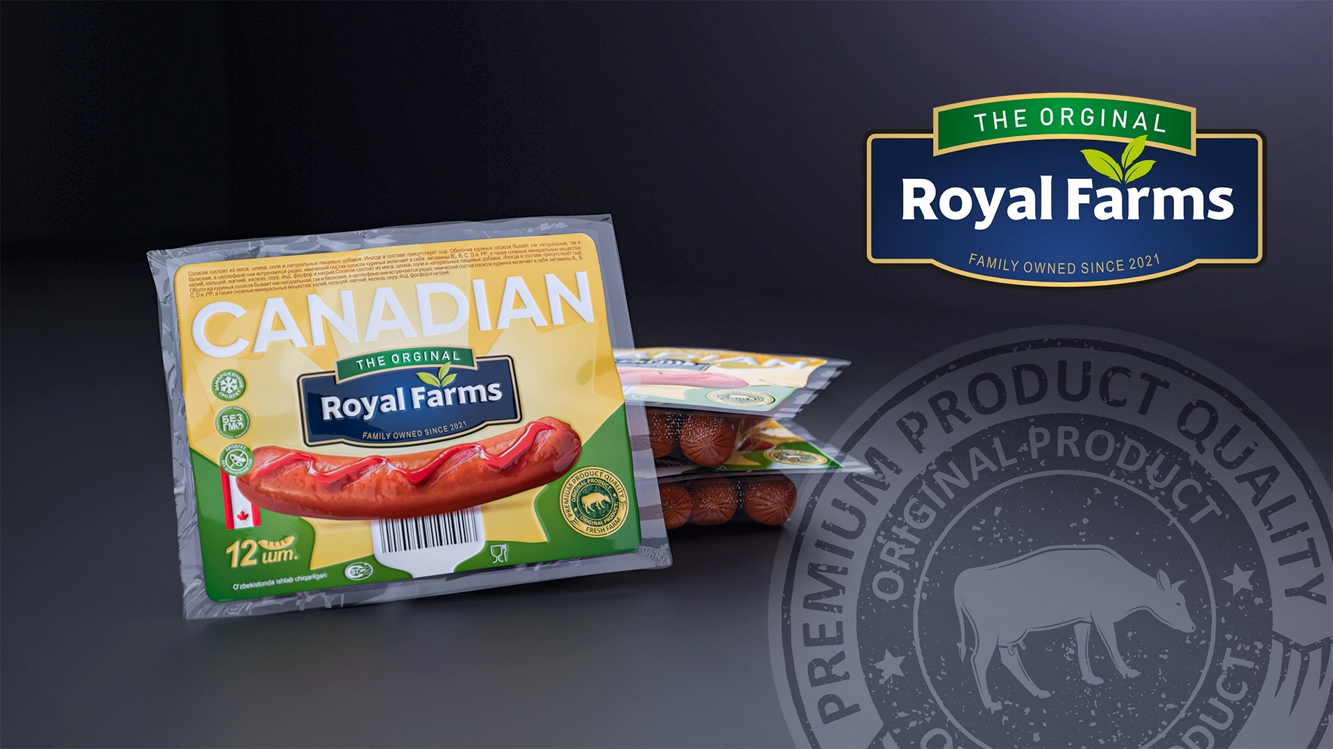
First, we developed a solid "Royal Farms" logo using a combination of dark blue and green colors, which evokes a sense of trust and naturalness in the buyer. The next task was to place this central hero on the sausage packaging without breaking the unified style.
3. Solution
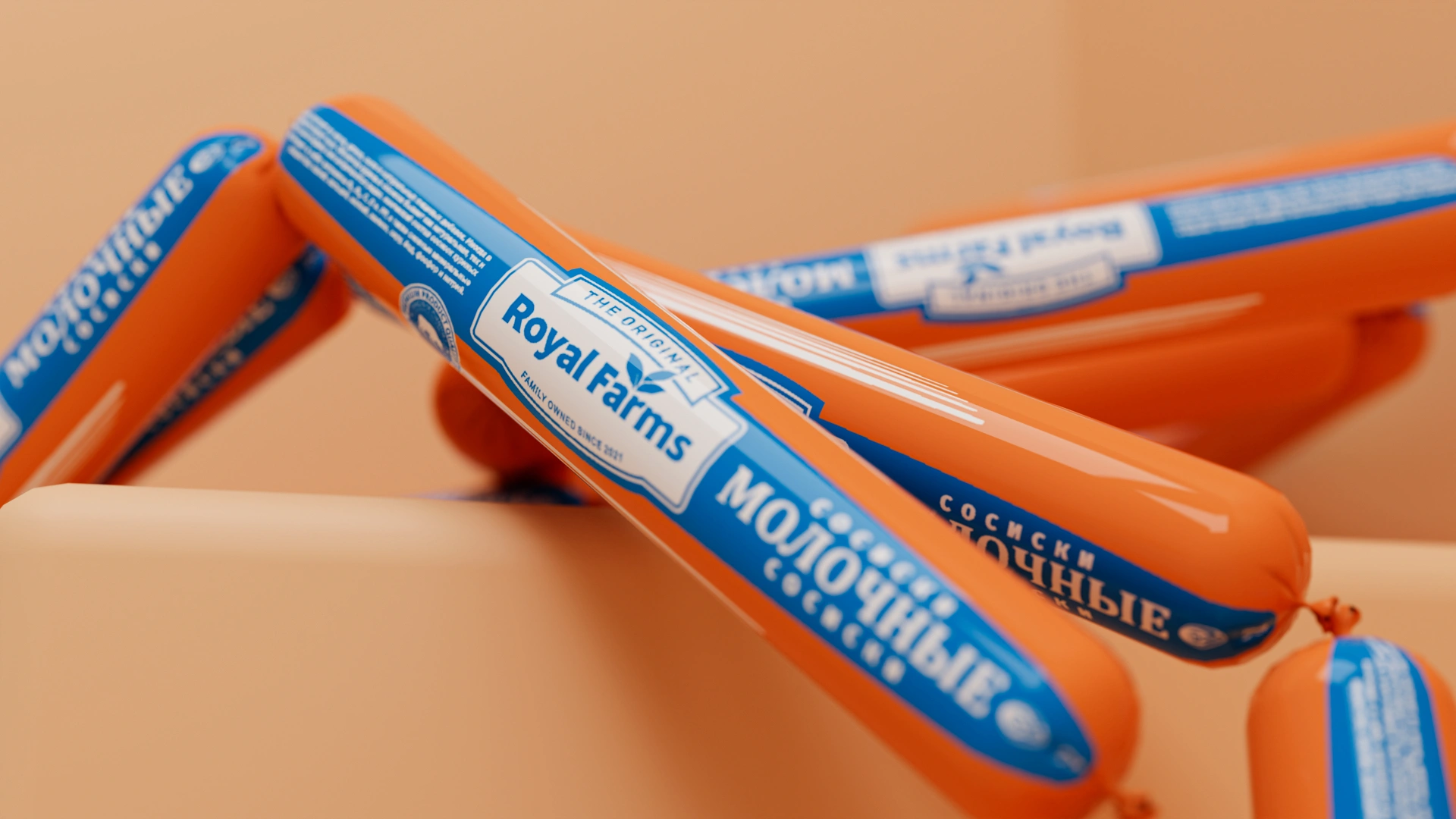
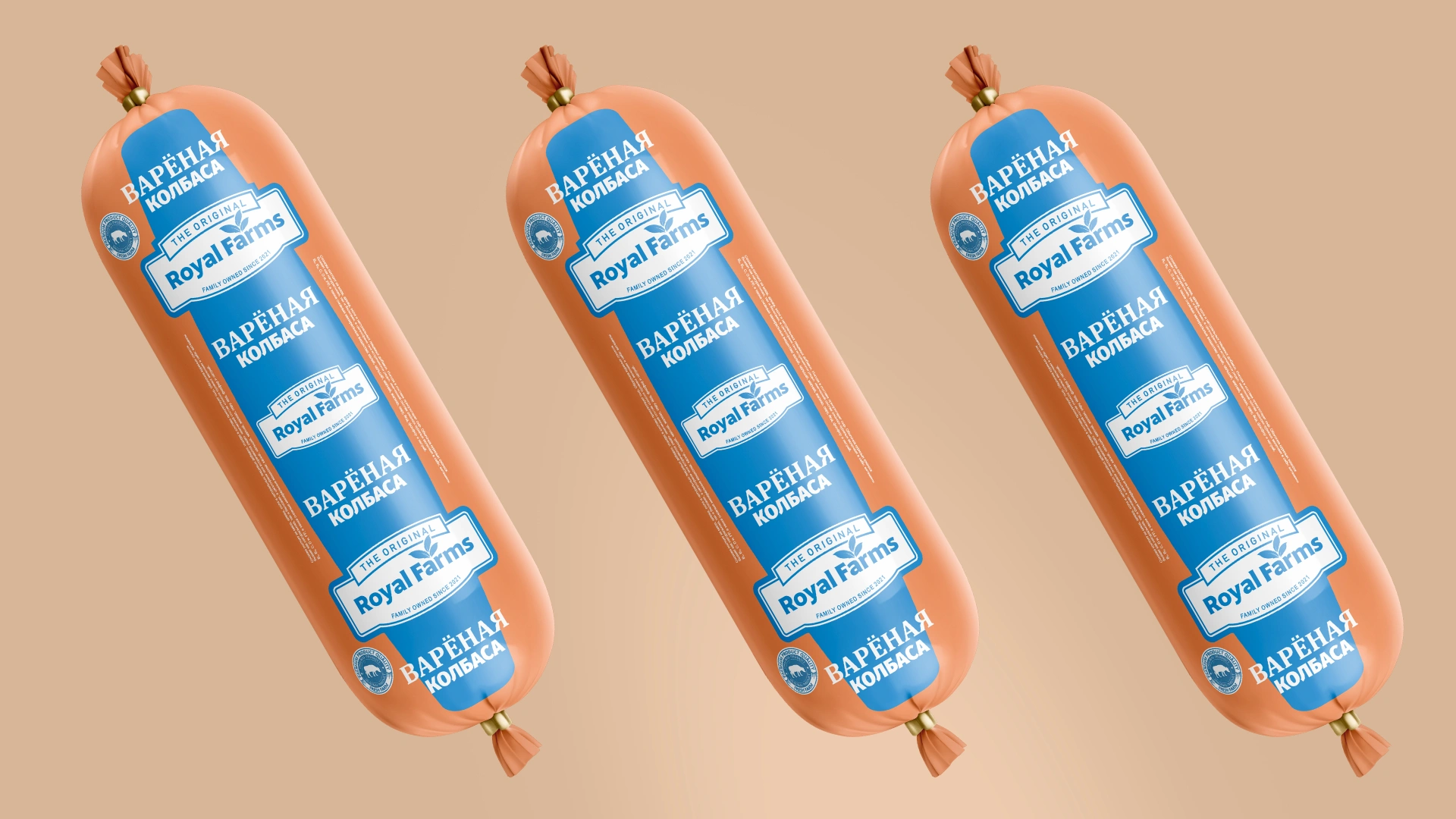
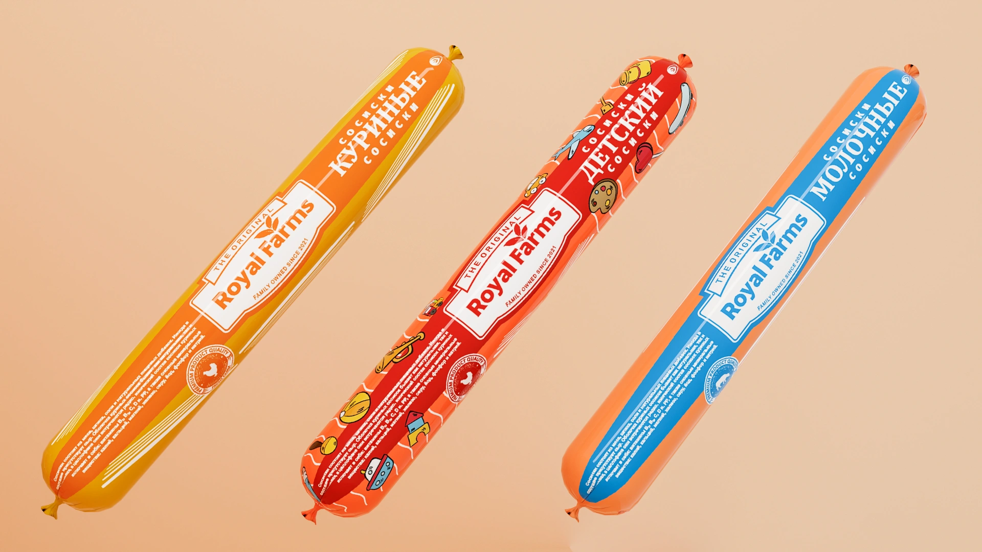
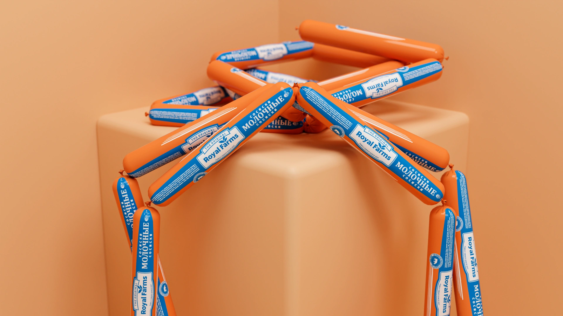
Despite the large variety of product types, we developed a clear, systematic, and unified style that brings them all together. The logo is neatly arranged in sequence, like a ribbon, along the sausage labels. The most interesting aspect is that it adapts to the main color of the casing, standing out either on a white or dark blue background.
While strictly maintaining the unified system, we worked on the colors and compact details to reveal the character of each specific product:
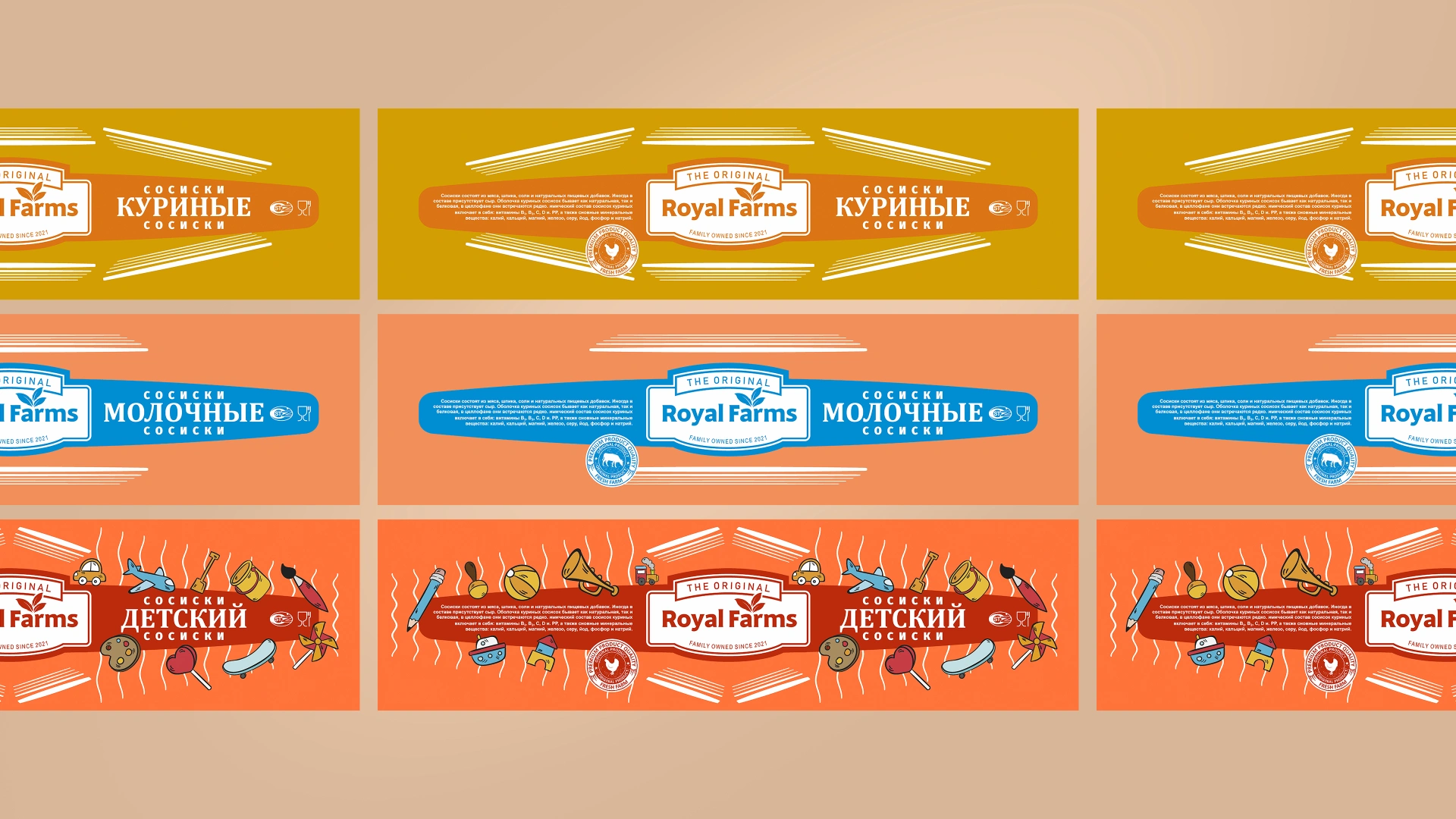
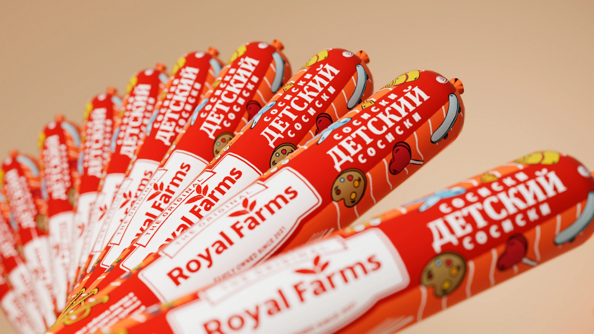
- Kids' sausages: On a vibrant red background, we placed cheerful illustrations of various toys, a skateboard, a lollipop, and paintbrushes. It is an excellent solution that attracts children's attention without deviating from the brand's overall style.
- Dairy sausages: Designed with an appetizing contrast of bright orange and dark blue. This gave the product a uniquely clean and tasteful look.
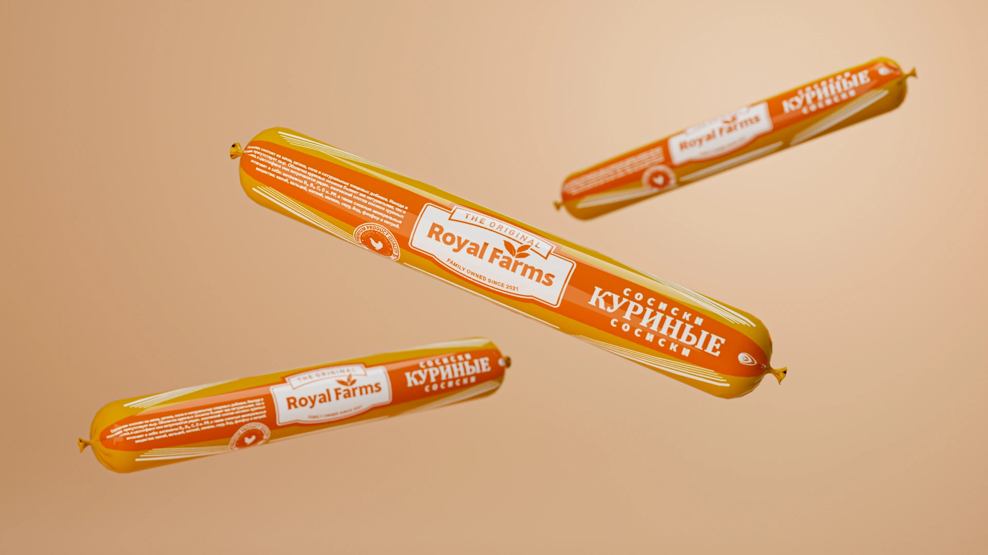
- Chicken sausages: Decorated in a harmonious combination of yellow and dark orange, featuring the logo on a white background. When the whole family of sausages is displayed together, it creates an orderly and eye-catching picture.
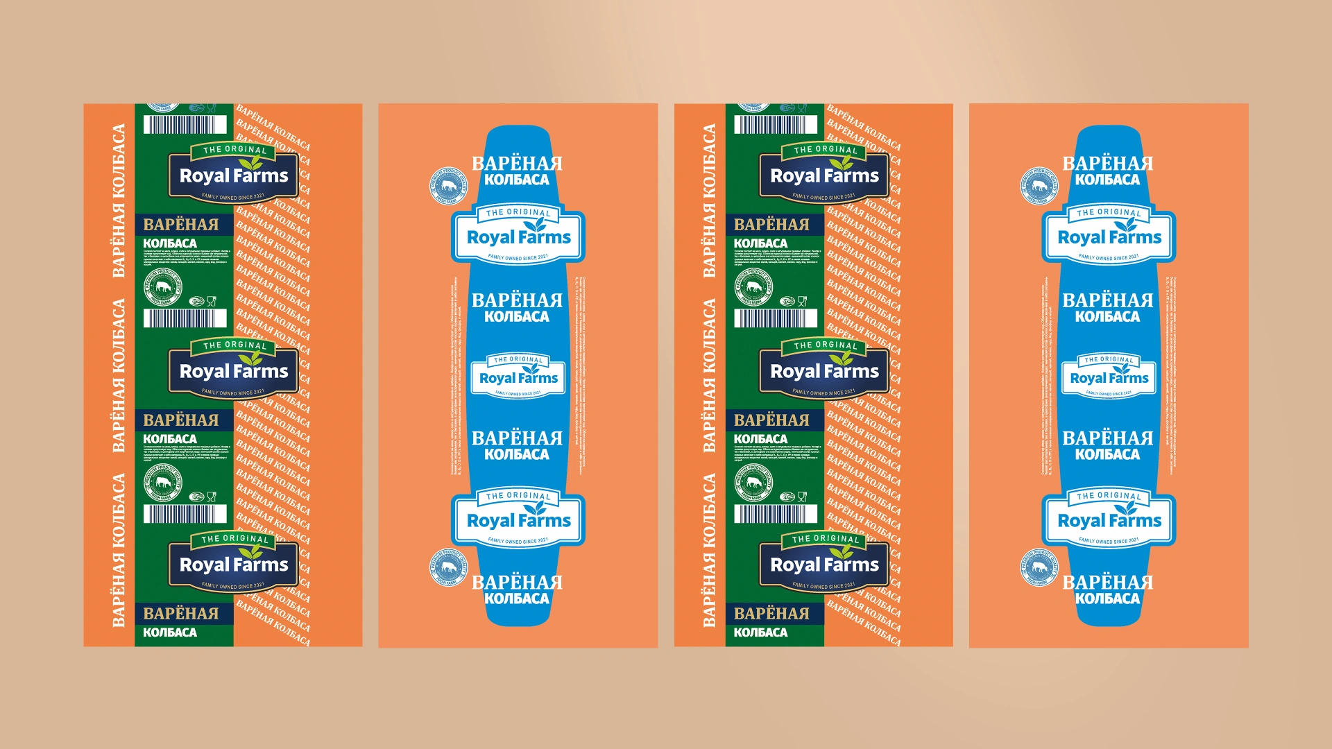
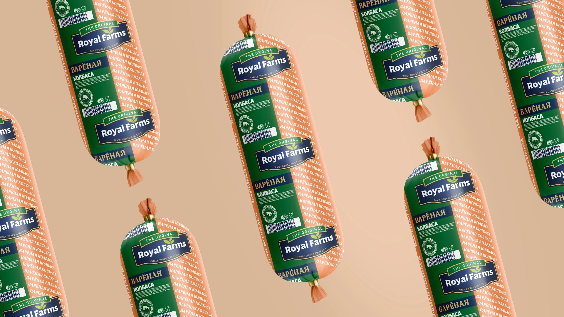
- Cooked sausages (Bologna): For the large-volume sausages, we used classic dark green and light orange casings. The large, sequential logo increases the visual weight of the product, making it look highly presentable when served at the table.
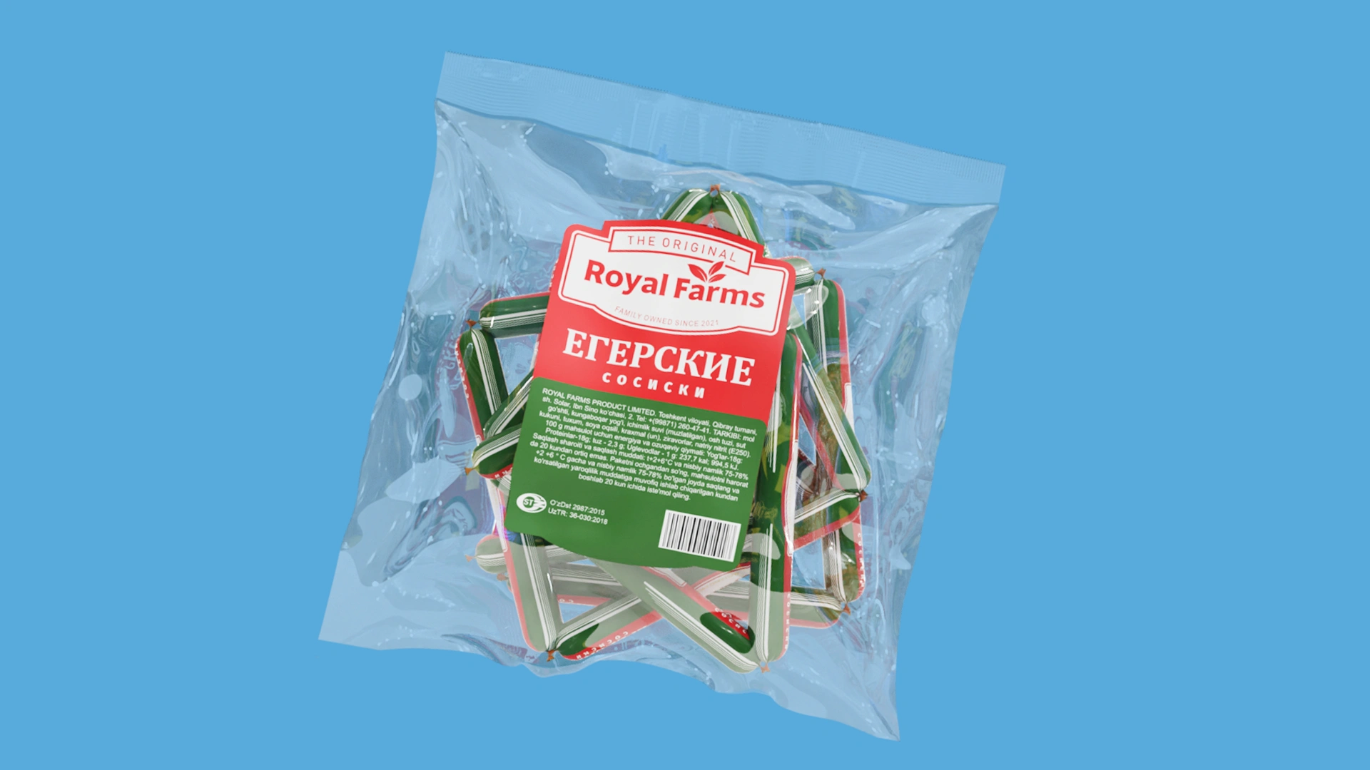
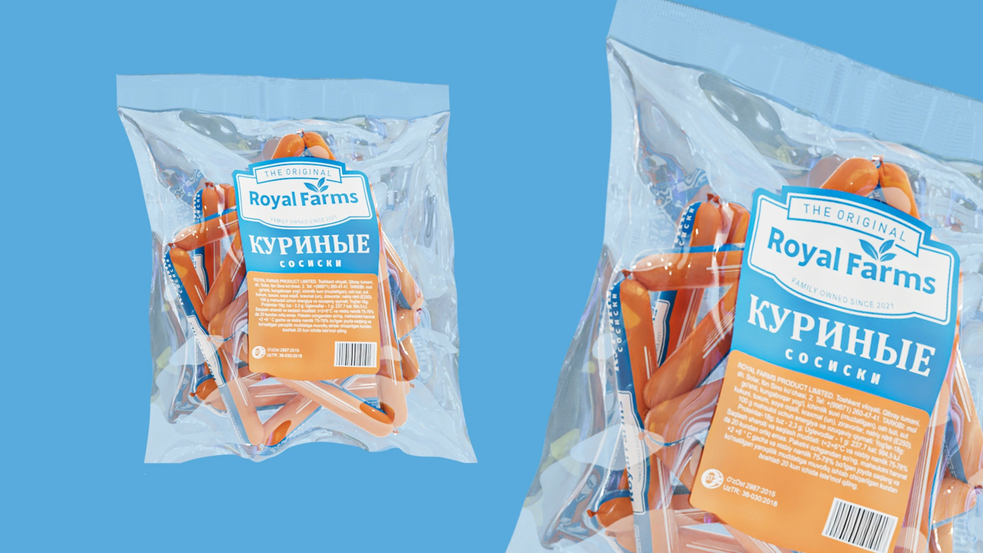
Result
There is a great saying: "People are welcomed by their clothes." The design system created for "Royal Farms" became a neat and fitting "outfit" worthy of the product's high quality. Placing the logo center stage and maintaining a unified style across all products enhanced the brand's solidity. Now, these sausages will not lose out to the diverse, tasteless packaging on store shelves. With their restrained, reliable, and orderly appearance, they effortlessly capture the buyer's attention at first glance.