



25.08.2026
Psychology of Color and Shape in FMCG Packaging Design: What Really Works and What Is a Myth?

Few topics in packaging design are discussed with as much confidence despite having such a shaky evidence base as color psychology. Infographics explaining what each color supposedly means have been copied from blog to blog for years, while claims such as “color increases brand recognition by 80%” have been repeated so often that they are now widely accepted as fact. Below, we examine which of these claims actually stand up to scientific research and which are simply marketing folklore.
Myth: Every color has one universal meaning
According to popular belief, blue means “trust,” green means “eco-friendliness,” and red means “energy,” supposedly working in the same way for all people, product categories, and markets. It is important to separate two different claims here. The fact that color can create stable associations has indeed been studied and scientifically confirmed. However, there is no solid basis for saying that these associations are universal and independent of context.
An academic study by Lauren Labrecque and George Milne, published in the Journal of the Academy of Marketing Science and consisting of four experiments, demonstrated a consistent relationship between color and brand “personality.” Red was statistically associated with excitement and energy, while blue was associated with competence and reliability. However, the same research emphasized that the strength and direction of these associations depend on color saturation, brightness, and, most importantly, how well the color fits the brand’s overall image. In other words, there is no isolated rule of “apply a color and automatically get an effect.”
Various cross-cultural studies of color in marketing also show that even basic associations can shift depending on the cultural context of the audience. The myth is therefore not that color matters, but that its meaning always works in exactly the same way for everyone.
Myth: Color increases brand recognition by 80%
Do you know where this number came from? Journalists traced it back to research conducted by Dr. Hoadley in the late 1980s. Those studies were not about brands at all. At a time when color printing was only beginning to become widely available, the research measured how much color helped people understand documents, charts, and tables. The first source to connect the “80%” figure specifically to branding was not an academic journal, but an advertising brochure published by Xerox. The number then spread from blog to blog while the original source was gradually forgotten. The idea that “color makes a document easier to understand” eventually turned into “color increases brand recognition.” Therefore, color is not a magic wand that increases sales by 80%; it is simply one important factor that deserves careful consideration.
Reality: Color works when it matches the brand’s character
The main lesson from Labrecque and Milne is not a simple “color = emotion” chart. Color does not work in isolation; it works through congruence. The same red can communicate energy on an energy drink package but create anxiety on baby food packaging. So the right question is not “Which color is the strongest?” but rather “How should this product present itself, and which color best fits that personality?”
Reality: The brain interprets shape and taste together
In the human mind, the shape of a product is closely linked to expectations about its taste. Scientific evidence supports this connection. For example, a team led by Oxford University researcher Charles Spence has been conducting experiments in this field for more than a decade. Their findings show that people tend to associate rounded shapes with sweet, pleasant flavors, while angular and sharp forms are more likely to evoke sour, bitter, or intense taste expectations. Experiments have shown that this effect can appear in tableware, typography, logos, and packaging shapes.
However, there is one important condition that is often overlooked. This effect tends to work best for new and unfamiliar products. If consumers already know a brand well, the logical association between shape and taste becomes weaker. This is because the brand image built up over many years can outweigh immediate visual cues. Therefore, this technique is especially useful as a tool for products that are just entering the market.
This principle also works in both directions, meaning that packaging does not always need to be rounded. For example, angular packaging can be the right choice for spicy or very intense snacks because such a shape signals in advance what kind of taste experience the consumer should expect.
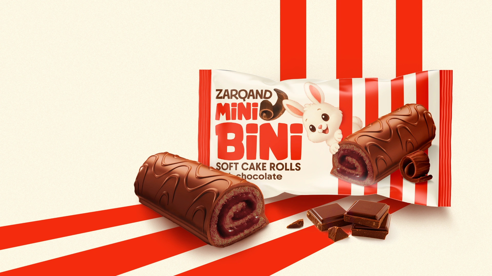
One example from Minim’s portfolio is “Mini Bini.” The packaging for these mini rolls, designed for both children and parents, uses a rounded rabbit character and light colors. These choices were not made purely for decoration. The intention was for these elements to communicate the product’s pleasant taste and friendly personality from the very first seconds of contact.
Something that works even better than any color: the product itself
There is a simple but often overlooked way to communicate a product’s taste more reliably through packaging. Instead of spending time searching for the “perfect” printed color, it can be more effective to show the actual color of the product itself. Printed colors can appear differently depending on printing conditions, store lighting, and individual visual perception. A transparent window in the packaging bypasses many of these external variables and shows the product as it really is.
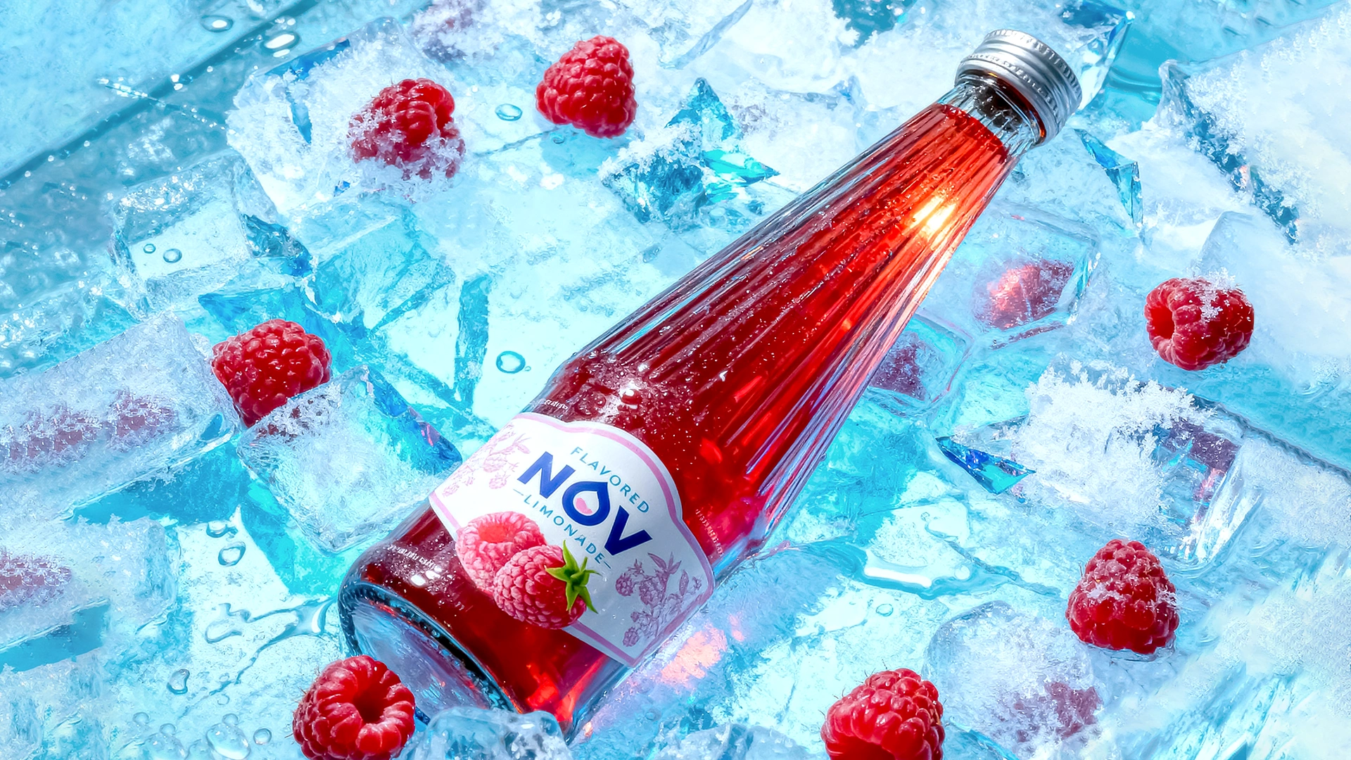
Minim’s packaging for the “NOV” lemonade range was developed according to exactly this principle. A transparent “window” turns the natural color of the beverage into a key part of the design. A fruit image placed next to the transparent section helps communicate the flavor. This allows the consumer to immediately understand that the lemonade is made with citrus fruits.
Another myth: Color works independently of the competitive environment
Even a psychologically well-chosen color can become almost invisible on the shelf. What happens if every brand in the “healthy food” segment uses the same shade of green? In that situation, green stops functioning as a distinctive signal of health and simply becomes part of the background. As a result, consumers may pass by without paying particular attention to any of the brands. That is why color decisions should not be based only on theoretical rules or color charts, but on the real competitive environment at the point of sale. The final result depends on whether the selected color can actually distinguish the product from the competitors standing next to it.
Main Conclusion
Color and shape in packaging are not magic tools, but they are not merely decorative design elements either. They have specific effects that are supported by scientific research, yet these effects do not work according to rigid tables. They work through the interaction and consistency of all design elements. If the chosen visual language fits the product category, audience expectations, competitive environment, and nature of the product itself, the design can genuinely contribute to the brand’s success. A designer who relies on credible scientific research rather than attractive internet infographics can also defend design decisions more convincingly in front of any client.
Share

Other articles

04.10.2026
Brand marketing strategy should be developed before packaging design, not after
If a brief intended for collaboration begins with the words “we just need packaging,” then one very important stage has already been overlooked. The first question from a professional design agency should not be about color or style. The first question should be: what business problem is this packaging supposed to solve? Starting work without answering this question is not merely a theoretical mistake; it is a serious flaw that can lead to major financial losses. One of the most famous failures in global branding practice happened precisely because this question was ignored.

29.09.2026
HALAL CERTIFICATE IN UZBEKISTAN: WHY YOUR BUSINESS NEEDS IT, HOW MUCH IT COSTS, AND HOW TO GET IT
In the past, the "Halal" mark was just a neat marketing trick for many. Slap a green crescent on the packaging, and sales would soar. No one really dug deep to see if there was any actual control behind the label. But the rules of the game have fundamentally changed. Starting May 1, 2025, "Halal" labeling in Uzbekistan was taken under strict state control. Now, this mark requires an official certificate based exclusively on SMIIC standards. Although obtaining the certificate is voluntary, if you want to enter major supermarket chains, export, or work with imported raw materials, it has become a core requirement for doing business.
If you produce food, cosmetics, or even ordinary bottled water, and you want your packaging to boost sales rather than collect fines for illegal labeling, you need to understand the new rules. In this article, we—as an agency working directly with brands—will break it all down for you from A to Z: who issues legitimate certificates today, by what criteria your production will be evaluated, how much the process costs, and in which unexpected products the Halal status plays a decisive role.

21.09.2026
Typical Packaging Mistakes Local Brands Make When Entering International Markets
More and more Uzbek manufacturers are looking beyond the domestic market. In many cases, packaging becomes one of the key factors that determines whether an export launch succeeds or fails. The problem is usually not the quality of the product itself, but the fact that packaging for foreign markets is developed in the same way as packaging for the domestic market. In other words, companies simply take the packaging that already works locally, translate the name into English, and consider the job done.
Below are the most common mistakes and why each of them can cost much more than it may seem at first.