


13.11.2026
Confectionery Packaging Design: Wafers, Sweets and Biscuits

A pack of wafers is taken off the shelf in a couple of seconds, and shoppers rarely compare ingredients. A box of chocolates taken as a gift for hosts, on the other hand, is chosen slowly and carefully. Both sit in the same aisle but do different jobs: one has to trigger appetite instantly, the other must not let the guest down in front of the hosts’ dastarkhan. Below we look at how confectionery packaging design differs for wafers, sweets and biscuits, how to show flavour through film, when a window is needed, and how to keep a range of a dozen flavours in order.
In short. Confectionery packaging has to answer two questions in a second: what flavour is inside and what occasion the purchase is for. Wafers need an appetising cross-section of the filling, sweets need an occasion and emotion, biscuits need trust and a clear format for tea time. Flavours are told apart by colour, the brand stays in one place, and a window is used only where the product sells itself.
Why is confectionery packaging chosen in seconds?
Because sweets are among the most impulsive categories: the decision to buy is often made at the shelf, not at home from a list. In an Advantage Solutions survey (May 2023, 1,154 shoppers in the US), 51% of respondents called single-serve candy an impulse purchase “always” or “often”, while for sweets in large packs the figure was only 32% (NACS, 24.05.2023). The practical takeaway: a small pack has to work instantly, while a large one must withstand calm comparison. Why only a few seconds remain at the shelf is covered in our article on the 3–5 seconds at the shelf.
Local producers also have to compete with imports. According to the National Statistics Committee, in January–July 2026 Uzbekistan imported about 28,500 tonnes of chocolate products worth USD 123.7 million from 46 countries, 19,500 tonnes of them from Russia (UzA, 28.09.2026). A local bar or chocolate stands next to well-known imported brands, and packaging that looks “like everyone else’s” loses before the shopper even learns the flavour.
How do the tasks of wafer, sweet and biscuit packaging differ?
The purchase situation and the main argument differ: wafers sell crunch and filling, sweets sell pleasure and occasion, biscuits sell habit and trust. The table helps define the task as early as the brief.
| Product | How it is bought | What the pack shows first | Common mistake |
|---|---|---|---|
| Wafers | On impulse, for tea and snacking | Layers and filling in cross-section, flavour in large type | Flavours differ only by small print |
| Chocolate bar | At the checkout, on the go | Brand and flavour readable from two metres | Overloaded background and a small logo |
| Loose sweets by weight | At bazaars and counters, from open boxes | Brand and flavour on the wrapper itself | Nameless wrapper: the shopper won’t remember what they bought |
| Boxed chocolates | As a gift, for holidays and visits | Occasion, weight, count and flavours inside | A gift look with no link to the brand |
| Biscuits | Out of habit, for family tea | Appetising product, format and quantity | The image doesn’t match what’s inside |
Sweets sold by weight deserve special attention. At the bazaar and the corner shop, sweets are sold from open boxes, and only the wrapper reaches the shopper. So the wrapper carries the brand, flavour and recognition, while the box works for the seller: weight, flavour and brand must be readable from its side.
How do you show flavour if the pack can’t be opened?
Flavour is shown through the food zone — the part of the pack with the product image — and through colour: the shopper should understand the filling before reading the name.
- A cross-section instead of the whole product. With wafers, sandwich biscuits and filled sweets, what sells is inside: layers, cream, nut crumbs. A whole biscuit looks the same in every flavour.
- Texture as an argument. The gloss of glaze, a snapped piece of chocolate, a bitten sweet convey flavour more precisely than the word “delicate” on the front.
- An ingredient alongside — only if it’s inside. A strawberry next to a wafer promises strawberry in the filling. If the flavour comes from flavouring, it is more honest to show the product itself and the flavour colour, and to name it “strawberry flavoured”. Rules for images and names used to be set by the technical regulation on food labelling — Cabinet of Ministers Resolution No. 490 of 12.07.2017 — but it lost force on 2 September 2025 (lex.uz). Wording is checked against the current sanitary norms.
- One light for the whole range. If flavours were shot on different days and under different light, the range falls apart on the shelf. When to choose photo, 3D or illustration is covered in our article on the food zone on packaging.
Does biscuit and sweet packaging need a window?
A window helps when the product is small, bright and equally attractive in every pack, and hurts when it is large, fragile or uneven. In a study by Xiaoyan Deng and Raji Srinivasan (Journal of Marketing, 2013), participants ate 58% more small M&M’s from transparent bags than from opaque ones, while they ate less of large cookies from transparent packaging (ConfectioneryNews, 05.08.2013). The study measured consumption rather than purchase, but the design conclusion is direct: transparency amplifies the temptation of small sweets and makes the quantity of large ones noticeable.
- A window works for: dragées, jelly sweets, mini biscuits, sweets in coloured glaze — anything that looks good in any pack.
- A window is risky for: large biscuits, wafer rolls and anything that crumbles in transit: the shopper will see crumbs before the brand.
- A compromise: a small window in the food zone, with an appetising image and a large flavour name on the rest of the front.
How do you build a flavour range that shoppers can find on the shelf?
Three rules hold a range together: the brand block stays in one place, each flavour has its own colour, and the flavour name is set large and identically on every pack.
- One colour, one flavour. Colour comes from familiar associations: red and pink for berries, brown for chocolate, yellow for creamy flavours. It matches across the bar, the pack and the box.
- The brand doesn’t move. The logo and the flavour panel stay in the same place, so several packs on the shelf merge into one colour block.
- Flavour bigger than adjectives. “Strawberry” matters more than “delicate”, “airy” and “crunchy” combined.
- Formats from one system. Single-serve, family pack and box are assembled from the same elements, so a new format doesn’t need a new design.
- The wrapper is recognisable without the box. For sweets sold by weight, the wrapper is checked separately: if the brand can’t be recognised without the box, the system is reworked.
Who is the pack for: a child, a family or a guest?
The same sweet is bought for different people, so the pack is designed for the main one.
- A child. According to preliminary results of the 2026 census, Uzbekistan has 11.87 million children aged 0–14, or 30.4% of the population (National Statistics Committee, 07.07.2026). A child chooses with their eyes — character, colour, shape — while an adult pays, caring about ingredients and price. The pack has to convince both.
- Family and tea. Biscuits and wafers are bought for everyday tea, so family packs and packaging that is easy to reclose are valued.
- A guest. In Uzbekistan you don’t visit empty-handed, and a box of chocolates should look worthy without gift wrap. Such boxes are prepared well ahead of holidays: when to start is explained in our article on gift sets for New Year, Ramadan and Navruz.
What does this look like in Minim projects?
The agency’s confectionery projects are collected in the Confectionery section: from cupcakes and wafers to sweets and sandwich biscuits. Three projects show three different tasks.
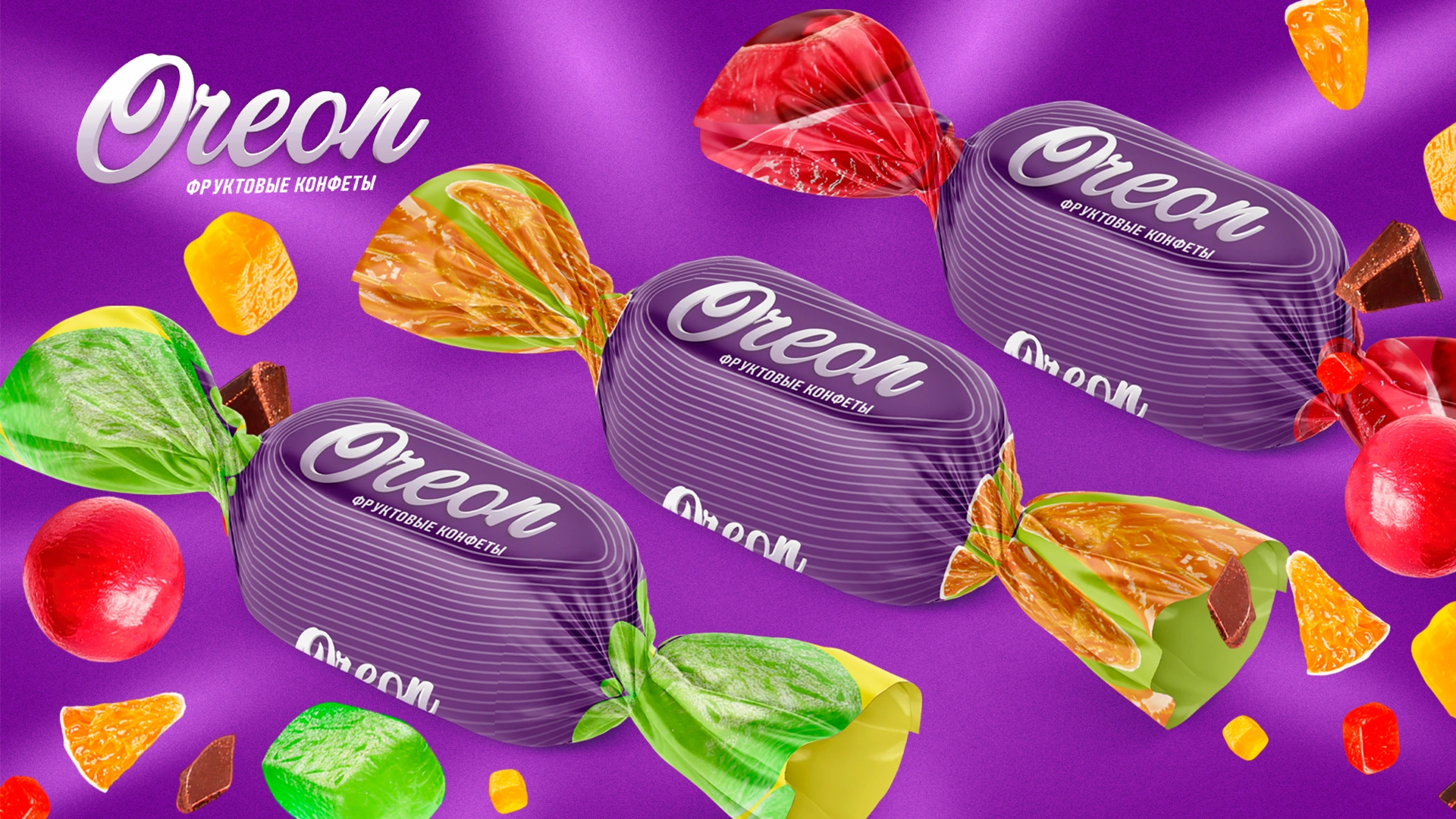
Oreon: breaking out of the burgundy-and-gold code. A client from Tajikistan needed packaging for fruit sweets in chocolate glaze — a mass-market product for supermarkets, corner shops and bazaars. Shelf analysis showed that most chocolate sweets follow the burgundy-and-gold tradition with abundant ornaments, while competitors depict faceless jelly cubes that say nothing about a specific flavour. Minim chose a rich purple background — a rare colour for Tajik confectionery packaging that makes the fruit look juicier — and created realistic 3D models of fruit and sweets with glossy glaze and a bite taken out. All flavours follow shared rules, each with its own accent, and the packaging works as a “pack + wrapper” pair.
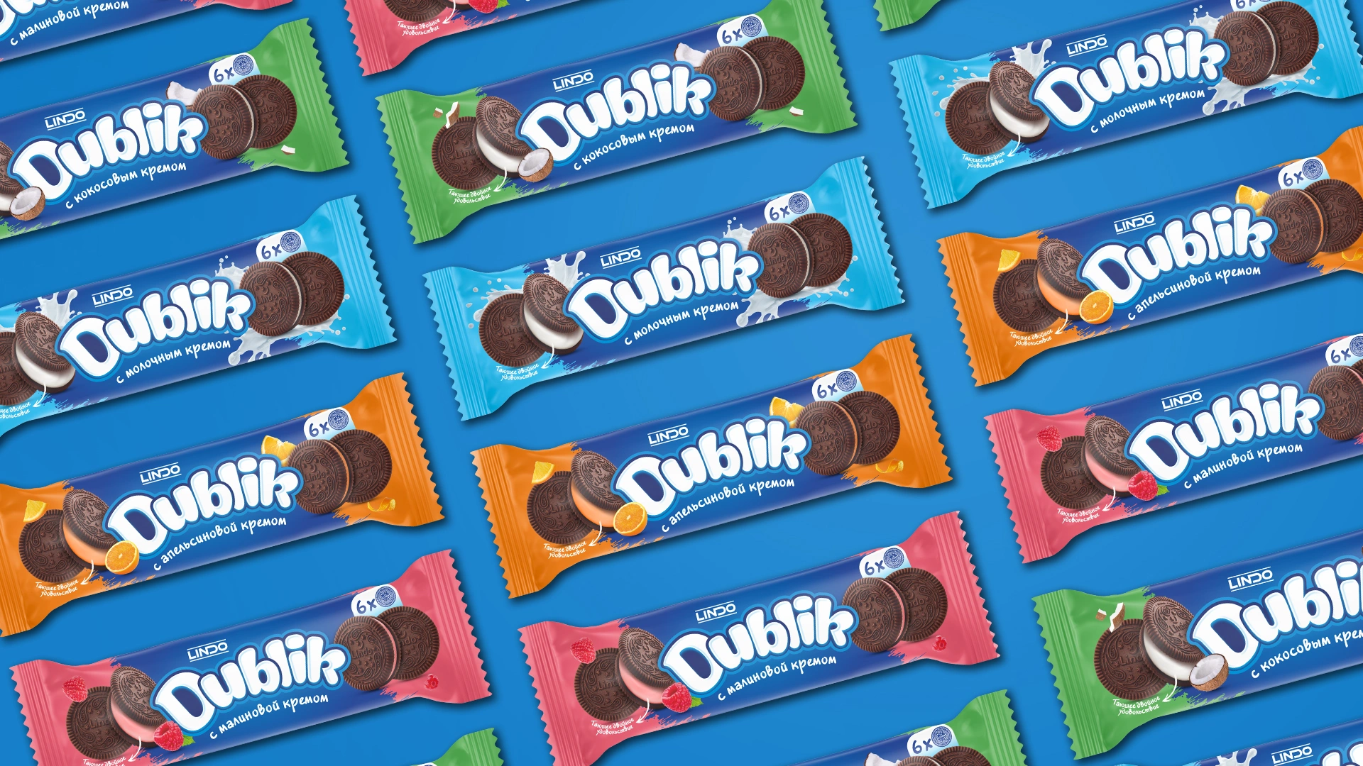
Dublik: a biscuit you want to photograph. For a new cream-filled sandwich biscuit, Minim developed the naming, logo and packaging. The main audience is children and teenagers, especially girls, for whom a beautiful pack becomes part of a selfie or a desktop wallpaper. The name combines “dubl” (double, for the two-layer biscuit) with the affectionate diminutive suffix “-ik”: it sounds warm and is easy to say. Each of the four flavours — milk cream, coconut, orange and raspberry — received its own palette. The range has 8 SKUs (stock-keeping units) in packs of 4 and 6, with show boxes and shelf talkers made for stores. The client fully approved the concept; at the time the case was published, the brand was preparing for launch.
Just: wafers without unnecessary details. The same section features the Just wafer range of eight flavours. The brief called for bright packaging without unnecessary details and a simple name: the agency proposed the name Just and a black background on which each flavour stands out with its own bright accent and realistic wafers and ingredients.

“In confectionery, packaging has no time to explain itself. So we start not with a beautiful picture but with the question of what the shopper should understand from two metres away: which brand it is and which flavour. Everything else the design adds only after that.” — Lazizkhuja Sharipov, founder and director of Minim Design
Frequently asked questions
What should be shown on wafer packaging?
Above all, a wafer in cross-section: the layers and filling that tell the shopper the flavour before they read the name. Only ingredients that are actually inside are placed next to it. Each flavour gets its own background colour, and the logo stays in one place so the range forms a noticeable block on the shelf.
Which colours should be used on sweets packaging?
Colour is assigned to flavour: red and pink for berries, brown for chocolate, yellow for creamy flavours. The brand background is chosen by looking at the shelf: if competitors stick to burgundy and gold, a rare colour will set the range apart more than yet another shade of gold. That is what was done in the Oreon project, with a rich purple chosen for fruit sweets.
Does biscuit packaging need a transparent window?
Not always. A window helps small, bright products: in a 2013 Journal of Marketing study, participants ate 58% more small sweets from transparent bags. For large, fragile or uneven biscuits, an appetising image is more reliable: through a window the shopper will see both the quantity and the crumbs after transport.
How should sweets sold by weight be packaged?
For loose sweets the main brand carrier is the wrapper, because at the bazaar or counter the shopper barely sees the box. The wrapper should show the brand and flavour, and the flavour colour should match the box and the single-serve pack. The box works for the seller: weight, flavour and brand are visible from its side.
Can berries be shown on the pack if the filling uses flavouring?
It is more honest to show the product itself and the flavour colour rather than berries that aren’t in the filling. The former technical regulation on food labelling, No. 490, lost force on 2 September 2025, and since 1 August 2025 requirements for food products have been set by sanitary rules and norms. Flavour images and names are checked against the current SanPiN before printing.
Key takeaway
A pack of wafers is picked up in seconds and a box of chocolates is chosen more slowly, but in both cases the eyes decide. So confectionery packaging needs two things: a flavour that reads before the name, and a brand that stays in one place across all formats. For wafers that means an honest cross-section of the filling, for sweets an occasion visible on both the wrapper and the box, for biscuits a familiar tea-time format. Flavour colour, and a window only where the product looks good in every pack, turn a dozen SKUs into one system. In this category the winner is not the loudest pack on the shelf but the one the shopper easily finds a second time.
About the author. Lazizkhuja Sharipov is the founder and director of Minim Design and has led the agency since its founding in 2019.
About Minim Design. Minim Design is a packaging design agency from Tashkent founded in 2019. The team has more than 20 specialists, and the agency has 1,156 completed projects and exports its services to 12 countries. Minim handles the whole project: naming, logo, packaging design, 3D visualisation and print supervision. The agency’s work has been featured by Packaging of the World, Dieline and World Brand Design Society.
Sources
- National Statistics Committee — preliminary results of the 2026 population census, age structure (07.07.2026): aholi.stat.uz, PDF
- UzA — chocolate product imports in January–July 2026 according to the National Statistics Committee (28.09.2026): uza.uz
- NACS — Advantage Solutions survey on impulse purchases of sweets (24.05.2023): convenience.org
- ConfectioneryNews — Deng and Srinivasan’s Journal of Marketing study on transparent packaging (05.08.2013): confectionerynews.com
- Lex.uz — Cabinet of Ministers Resolution No. 490 of 12.07.2017, lost force on 02.09.2025: lex.uz
- Gazeta.uz — SanPiN instead of mandatory technical regulations for food products from 1 August 2025 (19.04.2025): gazeta.uz
Share

Other articles

13.11.2026
From Loose Goods to a Brand: How a Producer Moves from Wholesale to Retail
At the bazaar, rice from one sack is no different from rice in the next: shoppers compare the price per kilo and buy from whoever gives a better deal. Below: where to start, which channel to choose first, what must be on the pack, and how not to overpay for your first product line.

11.11.2026
Short runs and digital packaging printing: when they pay off
The most expensive packaging is the packaging sitting in a warehouse. Below: how digital differs from offset and flexo, how to calculate the break-even point between them, when a short run pays off and how to prepare the design for it.

10.11.2026
Packaging Design Development Stages: How the Minim Agency Works
Before ordering packaging design, a manufacturer wants to know three things: how long it will take, what they will see and at what point they can influence the result. And an explanation of why the result matters to us as much as it does to the client.