



01.08.2026
How 3 to 5 Seconds on the Shelf Decide a Product’s Fate
A brand can spend years refining its strategy, poured millions into advertising, and building brand awareness. Yet ultimately, whether a product gets bought or left behind is decided in one single spot: right on the store shelf. This is where the final dialogue between brand and consumer takes place—not on TV or social media. And for this moment, the brand has only a matter of seconds.
How Much Time Does Packaging Actually Have?
The first impression of a product forms much faster than most people think. Eye-tracking research reveals that it takes just two seconds for a consumer to register an initial reaction to a product. The process of noticing and processing a package on a shelf takes between 3 and 5 seconds. This brief window determines whether a item gets noticed, understood, and ideally, picked up.
This isn't just marketing theory. Major scientific studies on shopper psychology (including POPAI research and subsequent studies) show that 60% to 80% of fast-moving consumer goods (FMCG) purchases are unplanned—they are decided on the spot inside the store. In other words, consumers rarely enter a store looking for a specific brand; they decide what to buy while standing right in front of the shelf.
Why Does the Consumer’s Brain Skim?
A supermarket shelf is an environment overloaded with visual information. Dozens of brands and hundreds of SKUs actively compete for attention. The human brain cannot process all this data sequentially, so it switches to "autopilot"—making swift decisions based on familiar visual patterns.
As a result, shoppers don't logically weigh options. Before even reading a brand name, the brain reacts to shape, color, and contrast. Studies indicate that consumers only notice about 15% to 20% of the total assortment on a shelf. The remaining products simply fall into their visual blind spot.
What Eye-Tracking Insights Reveal
Eye-tracking technology has turned merchandisers' educated guesses into concrete rules:
-
Shelf placement can matter more than design. The area at eye level and within arm’s reach consistently captures the most attention. Shoppers only look at the top or bottom shelves when searching for a specific item; during casual browsing, those areas are ignored.
-
Attention leans to the right. Research published in the Journal of Marketing Research (Chen et al., 2021) shows that as shoppers move along an aisle, their eyes naturally gravitate toward products on the right. The optimal height for grabbing attention is approximately 35–40 cm below eye level.
-
The brain registers color and shape before meaning. The eye first catches a solid block of color and the overall silhouette of the package. If that color stands out, the viewer then reads the logo and details. This means packaging competes not just with direct rivals, but with all surrounding visual noise, including price tags and POS materials.
Three Stages of Reading Packaging in 3–5 Seconds
Practically speaking, it helps to view these few seconds not as a single moment, but as three distinct scanning stages:
Stage 1 (Under 1 second): “Is this for me?” Here, text doesn't work—shape and color blocking do. If the package blends into the background, the consumer walks right past.
Stage 2 (1–3 seconds): “What kind of product is this?” The brain categorizes the product—determining if it's a snack, a confection, or a premium item. Consumers hold subconscious expectations for visual cues in every category. Breaking these rules arbitrarily feels less like innovation and more like confusing design.
Stage 3 (3–5 seconds): “Why is this better than the rest?” Only at this stage does the shopper start reading. They take in the brand name, core message, and value proposition. A brand can convey only 1 or 2 key points here; any extra information, no matter how large the font, goes unread.
What This Means for Packaging Design in Practice
These principles translate into clear guidelines that must be integrated during the design drafting phase, long before final renders:
Contrast over detail. The winning package isn't necessarily the most ornate—it's the one that breaks through visual noise. Sometimes that requires abandoning standard category colors.
Strict information hierarchy. If a package attempts to convey five key messages, the shopper reads none. The rule is simple: One primary message + one secondary message.
A recognizable silhouette is a brand asset. A distinctive shape is recognized faster than a logo and holds up regardless of lighting or display angles.
Test on the shelf, not on a monitor. Designs must be evaluated at 1:1 scale surrounded by real competitors. Simple testing with everyday consumers frequently uncovers shelf-visibility issues that clean designer screens hide.
How This Operates in Uzbekistan: Minim Case Studies
This is far from abstract theory. Minim Agency’s case studies in the local market prove how these principles drive performance across various categories:
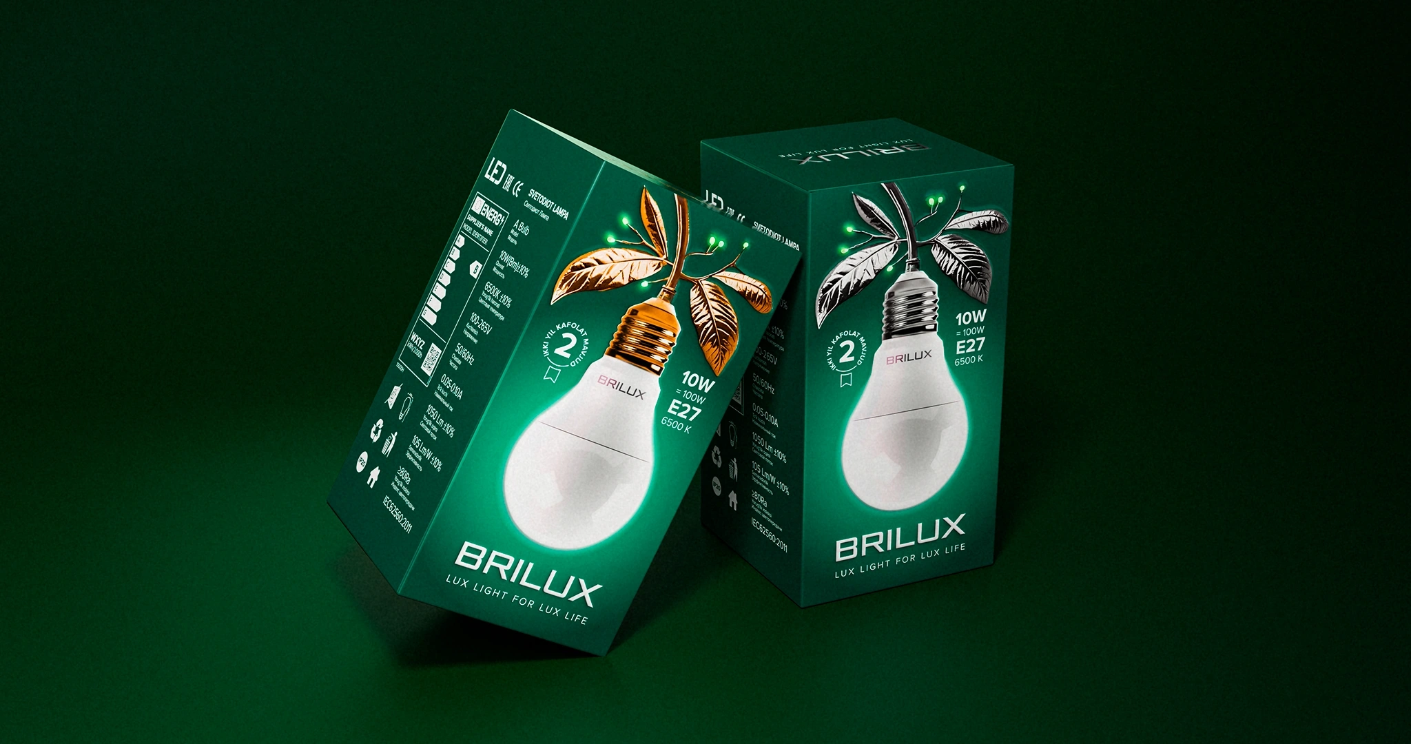
Breaking category conventions (Brilux Case). The LED lighting market in Uzbekistan was visually homogenous. Most brands relied on identical colors and compositions, making it impossible to capture attention instantly. We built the design around an unconventional green palette and a distinctive pear-like silhouette. The product earned a memorable nickname among retailers and consumers alike, significantly easing market entry and shelf placement.
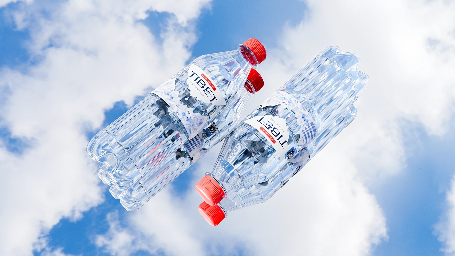
Amplify, don't break, the rules (Tibet Case). In a bottled water market with over 30 players using standard aquatic cues, the goal was to strengthen category codes rather than shatter them. We focused on a prominent visual anchor—a bold drop of water against snowy peaks—to instantly communicate purity and premium quality. Color-coded caps were introduced for quick variant identification, cutting shelf decision time down to split seconds.
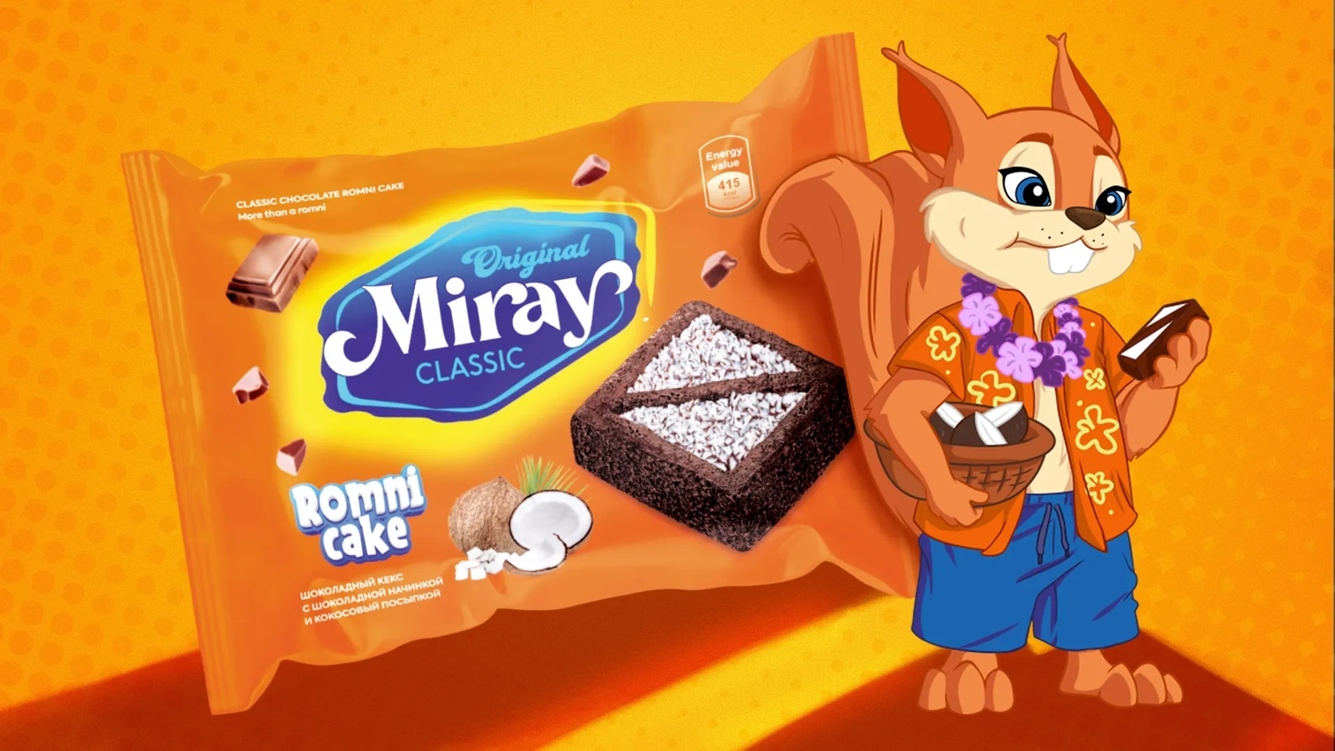
Avoiding information clutter (Miray Case). Entering a crowded confectionery sector, Miray avoided overloading its packaging with text. Instead, we prioritized vibrant colors, a clear logo, and a memorable brand mascot. The resulting high shelf visibility drove a 5x sales increase within four months and paved the way for international export.
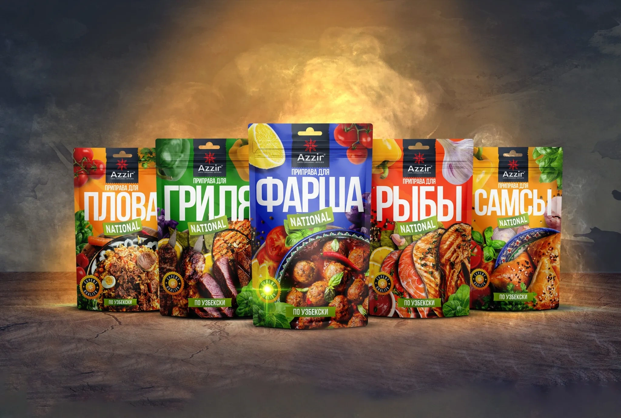
When design sells itself (Azzir Case). A unified visual identity created for a spice brand enabled it to scale seamlessly from 4 to 160 SKUs in a single year. Once consumers decoded the brand’s visual language, line extensions sold organically without relying on heavy ad spend.
The Shelf Is a Media Channel, Not Just a Display
For many products—especially those operating without massive advertising budgets—packaging serves as the primary touchpoint with the consumer. A brand doesn't get a second chance to make a first impression; it either captures attention instantly or loses the customer to a competitor.
Packaging must be treated not merely as a container, but as a dedicated communication channel governed by fierce competition and tight time constraints. Brands that master this dynamic consistently win on the shelf.
Share

Other articles

04.10.2026
Brand marketing strategy should be developed before packaging design, not after
If a brief intended for collaboration begins with the words “we just need packaging,” then one very important stage has already been overlooked. The first question from a professional design agency should not be about color or style. The first question should be: what business problem is this packaging supposed to solve? Starting work without answering this question is not merely a theoretical mistake; it is a serious flaw that can lead to major financial losses. One of the most famous failures in global branding practice happened precisely because this question was ignored.
29.09.2026
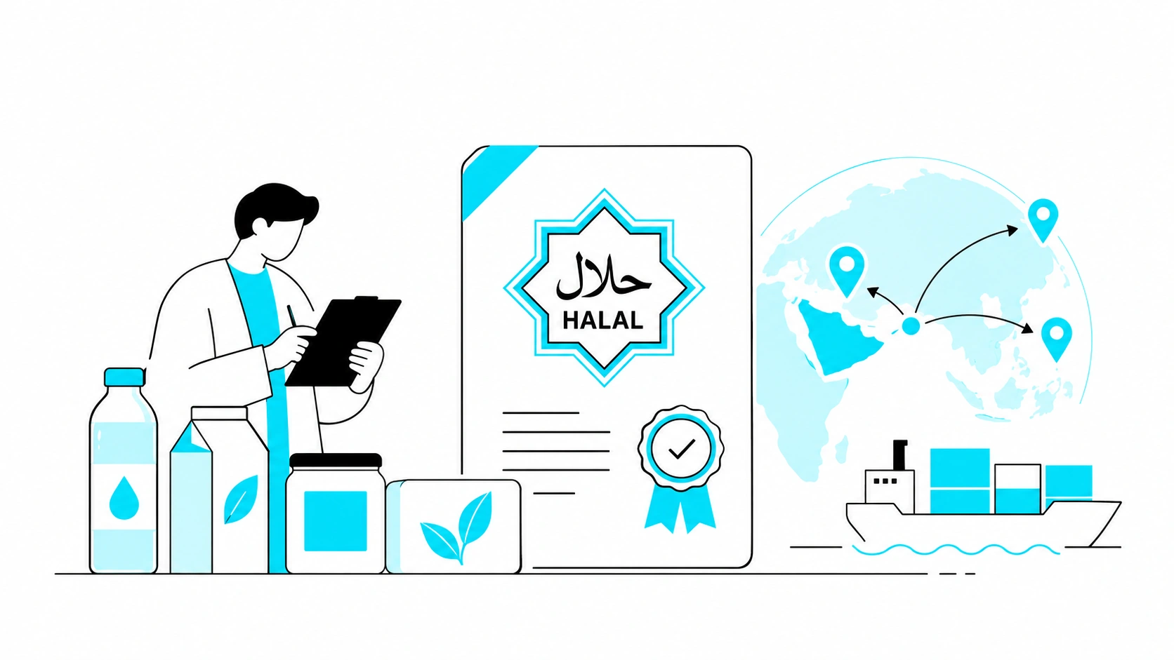
HALAL CERTIFICATE IN UZBEKISTAN: WHY YOUR BUSINESS NEEDS IT, HOW MUCH IT COSTS, AND HOW TO GET IT
In the past, the "Halal" mark was just a neat marketing trick for many. Slap a green crescent on the packaging, and sales would soar. No one really dug deep to see if there was any actual control behind the label. But the rules of the game have fundamentally changed. Starting May 1, 2025, "Halal" labeling in Uzbekistan was taken under strict state control. Now, this mark requires an official certificate based exclusively on SMIIC standards. Although obtaining the certificate is voluntary, if you want to enter major supermarket chains, export, or work with imported raw materials, it has become a core requirement for doing business.
If you produce food, cosmetics, or even ordinary bottled water, and you want your packaging to boost sales rather than collect fines for illegal labeling, you need to understand the new rules. In this article, we—as an agency working directly with brands—will break it all down for you from A to Z: who issues legitimate certificates today, by what criteria your production will be evaluated, how much the process costs, and in which unexpected products the Halal status plays a decisive role.

21.09.2026
Typical Packaging Mistakes Local Brands Make When Entering International Markets
More and more Uzbek manufacturers are looking beyond the domestic market. In many cases, packaging becomes one of the key factors that determines whether an export launch succeeds or fails. The problem is usually not the quality of the product itself, but the fact that packaging for foreign markets is developed in the same way as packaging for the domestic market. In other words, companies simply take the packaging that already works locally, translate the name into English, and consider the job done.
Below are the most common mistakes and why each of them can cost much more than it may seem at first.