


03.11.2026
Fonts for Uzbek Latin and Cyrillic: How to Typeset Bilingual Packaging for Uzbekistan
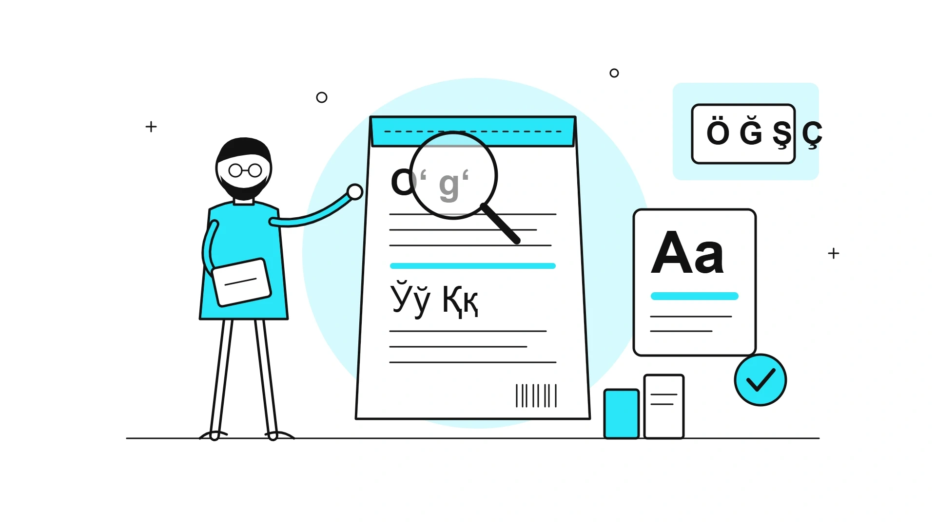
A global brand localizes its pack for Uzbekistan, the files are approved, the run is printed — and in the ingredients list the Uzbek letter “oʻ” shows up as “o'” with a straight apostrophe, or as an empty box. It happens when a typeface is chosen because its Latin looks good on screen and the Uzbek characters are only checked on the printing plate. Now there is a second layer: on 21 October 2026 Uzbekistan signed a law that changes four letters of its alphabet. This guide covers which characters your font needs, what the reform changes, how to split two languages between the front and the back, and how to test a typeface before print.
In short. Bilingual packaging for Uzbekistan needs one type family that covers every Uzbek character in both scripts: ʻ and ʼ for Latin, Ў, Қ, Ғ and Ҳ for Cyrillic, and, after the alphabet reform, Ö, Ğ, Ş and Ç. Uzbek is the lead language, Russian follows in the same family at a lighter weight, and every character is proofed before the files go to the printer.
Which characters does a font need for Uzbek packaging?
The font must contain the Uzbek characters of both scripts as real glyphs rather than look-alike substitutes. Uzbek is written in Latin script officially, but Cyrillic is still widely read, and Russian remains the second language of retail. In practice the marks next to the letters break more often than the letters themselves.
|
Script |
Characters |
What goes wrong |
How to test |
|---|---|---|---|
|
Uzbek Latin today |
oʻ, gʻ with ʻ (U+02BB); tutuq ʼ (U+02BC) |
A straight ' or a backtick ` replaces ʻ, the mark floats too high or drops out |
Set “Oʻzbekiston, gʻalla, taʼm” and compare with a reference |
|
Uzbek Cyrillic |
Ў ў, Қ қ, Ғ ғ, Ҳ ҳ |
A “Cyrillic” font covers Russian only, so the letters fall back to у, к, г, х |
Set “Ўзбекистон, қанд, ғалла, ҳаво” |
|
Uzbek Latin after the reform |
Ö ö, Ğ ğ, Ş ş, Ç ç |
No diacritics in the font, so the software borrows glyphs from another font |
Set “Özbekiston, ğalla, şirin, çoy” |
Google Fonts glyph sets are a useful benchmark. Its basic Cyrillic set, GF Cyrillic Core, includes all eight Uzbek Cyrillic letters, and its basic Latin set, GF Latin Core, includes Ö, Ğ, Ş and Ç but not ʻ or ʼ (Google Fonts Glyphsets). A font that “supports Latin” tells you nothing about oʻ and gʻ: test them separately.
What does Uzbekistan’s new alphabet law change?
The law replaces four letters of the Uzbek Latin alphabet and takes effect six months after official publication. President Shavkat Mirziyoyev signed it on 21 October 2026 (Gov.uz, in Russian):
- Oʻ oʻ → Ö ö;
- Gʻ gʻ → Ğ ğ;
- Sh sh → Ş ş;
- Ch ch → Ç ç.
The digraph ng is no longer a separate letter, and the apostrophe ʼ stays. The new alphabet has 28 letters plus the apostrophe (Spot.uz, 10.09.2026, in Russian). By Dunyo.info’s calculation the law takes effect on 22 April 2027 (Dunyo.info, 22.10.2026, in Russian).
The law does not demand an urgent reprint. Documents issued before it takes effect stay valid, and signs are replaced in stages as they wear out (Gov.uz, 10.09.2026, in Russian). Official statements say nothing specific about labels or packaging [to confirm: how the transition applies to packaging, per the law text on lex.uz].
What this means for you: if you are designing a pack for Uzbekistan now, choose a typeface that covers both versions of the alphabet. Switch to the new letters with your next scheduled print run or redesign rather than a separate reprint.
Which language should lead on a bilingual pack?
Uzbek should lead. Article 22 of the Law “On the State Language” requires products made in Uzbekistan to carry labels and instructions in Uzbek and in the language of interethnic communication, in practice Russian (Lex.uz, in Russian). Citing Article 6 of the Law “On Consumer Protection”, the Competition Committee reminds businesses that product information must be given in the state language, with other languages as an addition (Anhor.uz, 22.04.2025, in Russian).
The market argument is just as strong. According to the 2026 census, Uzbek is the main language of communication for 91.3% of the country’s residents and for 84.7% of Tashkent residents (stat.uz, PDF). A pack without Uzbek ignores the main language of most shoppers, even in the capital’s Korzinka and Makro stores.
An important caveat: the general technical regulation on food labelling (Cabinet of Ministers Resolution No. 490 of 12 July 2017) was repealed on 2 September 2025 (Lex.uz, in Russian). Check the current requirements for your category with a local lawyer or certification body before print.
How do you fit two languages without turning the front into a table?
The front sells in one language; the back informs in two. Keep the product name, flavour or variety and one key message in Uzbek on the front, and repeat them in Russian at a smaller size or lighter weight.
- One family, two weights. Set Uzbek in, say, semibold and Russian in regular. Two different typefaces for two languages compete with each other and make the back look busy.
- Separate languages by block, not by line. Ingredients, storage and address appear first in full in Uzbek, then in full in Russian. Alternating lines make both hard to read.
- Size the layout for Latin. The digraphs sh and ch make words longer: “shirinliklar” (sweets) has 12 characters, the Cyrillic spelling has 11. A layout built for Cyrillic often overflows in Latin, and English source copy is a poor guide to either.
- Never break a line at ʻ. Splitting “o” and “ʻ” across two lines turns the letter into a typo.
- Kern ʻ by hand. In many fonts it sits too far from “o” and “g”, so the word falls apart.
Why Uzbek copy should be adapted rather than translated is covered in Minim’s article on typical packaging mistakes when entering international markets (in Russian).
How do you test a font before sending files to print?
Test with a control string and the final file, not with a first impression on screen.
- Set the control string “Oʻoʻ Gʻgʻ taʼm ЎўҚқ Ғғ Ҳҳ Öö Ğğ Şş Çç” in every weight used in the layout.
- Search the copy for straight apostrophes ' and backticks ` and replace them with ʻ and ʼ. Translation agencies and spreadsheets often deliver the wrong characters.
- Make sure the software has not substituted glyphs from another font: substituted characters differ in weight and height.
- Check the small back-of-pack text on a test print: the thin ʻ is the first to vanish in reversed-out text and on multi-colour backgrounds.
- Outline or embed the fonts in the PDF and compare the copy with the approved text once more.
- Check the licence: does it cover commercial use on packaging in Uzbekistan?
What fine typography local presses can actually reproduce is covered in Minim’s article on printing technologies in Uzbekistan (in Russian).
What does this look like in practice? Minim projects
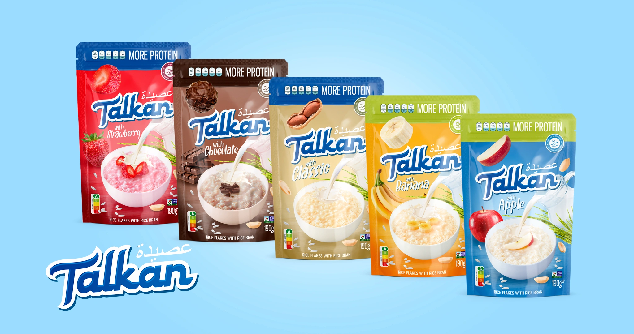
For Talkan (in Russian), rice flakes in five flavours, the pack had to sell both in Arab countries and in Uzbekistan. Minim added Arabic calligraphy above the logo, while the “MORE PROTEIN” line, the Halal certificate and the Nutri-score A mark took the most visible spots. Several scripts on one pack work when each has its own role and place in the hierarchy.
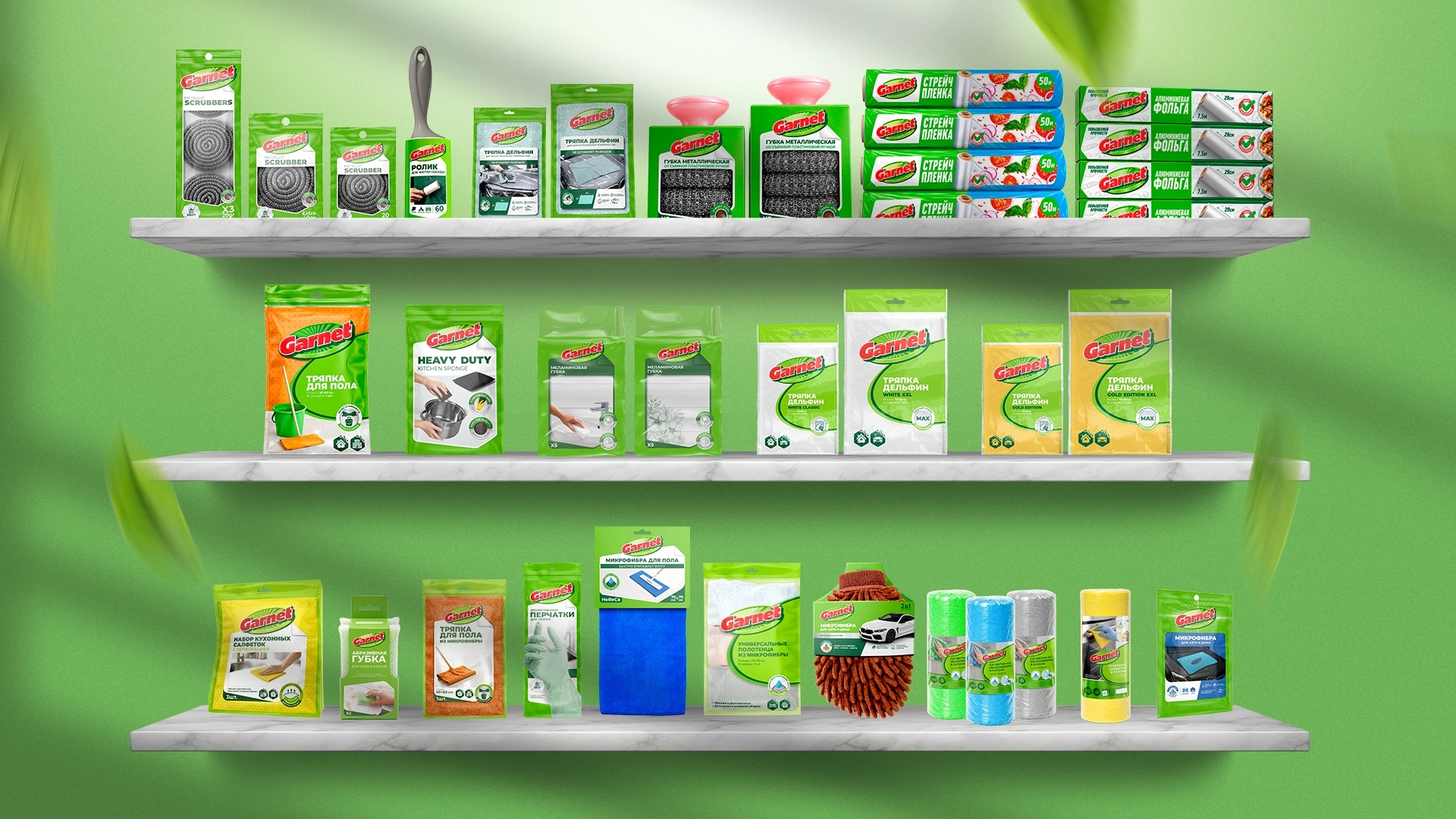
For Garnet (in Russian), a unified design system for 25–30 SKUs of household goods, the agency wrote a shelf-talker slogan in Uzbek Latin: “KERAKLI PAYTDA, KERAKLI YECHIM!” (“The right solution at the right moment”). The Uzbek line reads as the brand’s own phrase, not as a translation from Russian.
“[draft quote — to be approved by the author] In Uzbekistan you choose a packaging font not by the prettiest line on the front but by the most awkward line on the back: a two-language ingredients list full of ʻ, ў and қ. If the typeface survives that, it will survive the front.” — Lazizkhuja Sharipov, founder and director of Minim Design
FAQ
Can Uzbek text on packaging be printed in Cyrillic?
The official script for Uzbek is Latin, and the new law changes four more of its letters. Some brands add Cyrillic for shoppers who grew up with it, but Latin is the safer choice for the main Uzbek text. If you keep Cyrillic, check that the font has Ў, Қ, Ғ and Ҳ and confirm the decision with a local lawyer.
Do we need to reprint packaging after the alphabet reform?
Official statements do not require an urgent reprint: documents issued before the law takes effect stay valid, and signs are replaced in stages. No separate deadlines for packaging have been announced. The sensible route is to switch to the new letters with your next scheduled run and choose a font with Ö, Ğ, Ş and Ç in advance.
What should replace ʻ if the font lacks it?
Change the font or have the glyph drawn rather than use a straight apostrophe. An acceptable fallback is the typographic quote ‘ (U+2018), which looks similar to ʻ. A straight ' or a backtick ` looks like a typo and reads poorly at small sizes. Check the mark in every weight used in the layout before approving files.
Which language should be larger on a bilingual pack?
Uzbek goes larger and higher: the state language law requires it, and it is the main language of communication for 91.3% of residents. Russian repeats the Uzbek text in the same family, at a smaller size or lighter weight. On the front, the second language can be cut down to the product name and flavour.
Where can we find a font with Uzbek characters?
Start with large type families that state support for extended Latin and Cyrillic, for example in the Google Fonts catalogue. A glyph-set label does not guarantee ʻ and ʼ, though: Google’s basic Latin set leaves them out. Before buying a licence, set a control string with every Uzbek character in each weight you plan to use.
Key takeaway
A box instead of “oʻ” on a finished run is not a typesetter’s typo but a font choice gone wrong. Packaging for Uzbekistan is set in two, and from 2027 effectively three, versions of the alphabet: oʻ and gʻ today, Ö, Ğ, Ş and Ç after the reform, plus Cyrillic for shoppers used to it. For any new project, choose a typeface that covers all three. Make Uzbek the lead language, repeat it in Russian in the same family, and test the control string before print, not after. Then the alphabet reform becomes a planned text update in your next run instead of a reason to scrap packaging stock.
About the author. Lazizkhuja Sharipov is the founder and director of Minim Design and has led the agency since it was founded in 2019.
About Minim Design. Minim Design is a packaging design agency based in Tashkent, Uzbekistan, founded in 2019. Its team of more than 20 specialists has completed 1,156 projects and exports its services to 12 countries. Minim covers the full cycle: naming, logo, packaging design, 3D visualization and print supervision. The agency’s work has been featured by Packaging of the World, Dieline and World Brand Design Society.
Sources
- Gov.uz, Migration Agency — President signs the law on improving the Uzbek alphabet (21.10.2026, in Russian): gov.uz
- Gov.uz, Inspection — Senate approves the law changing the Uzbek alphabet (10.09.2026, in Russian): gov.uz
- Spot.uz — new alphabet of 28 letters and an apostrophe (10.09.2026, in Russian): spot.uz
- Dunyo.info — date the law takes effect (22.10.2026, in Russian): dunyo.info
- National Statistics Committee — 2026 census results, languages of communication: stat.uz, PDF
- Lex.uz — Law “On the State Language”, Article 22 (in Russian): lex.uz
- Anhor.uz — Competition Committee on Article 6 of the Consumer Protection Law (22.04.2025, in Russian): anhor.uz
- Lex.uz — Cabinet Resolution No. 490 of 12.07.2017, repealed 02.09.2025 (in Russian): lex.uz
- Google Fonts — GF Cyrillic Core and GF Latin Core glyph sets: github.com
Share

Other articles

04.10.2026
Brand marketing strategy should be developed before packaging design, not after
If a brief intended for collaboration begins with the words “we just need packaging,” then one very important stage has already been overlooked. The first question from a professional design agency should not be about color or style. The first question should be: what business problem is this packaging supposed to solve? Starting work without answering this question is not merely a theoretical mistake; it is a serious flaw that can lead to major financial losses. One of the most famous failures in global branding practice happened precisely because this question was ignored.
29.09.2026
HALAL CERTIFICATE IN UZBEKISTAN: WHY YOUR BUSINESS NEEDS IT, HOW MUCH IT COSTS, AND HOW TO GET IT
In the past, the "Halal" mark was just a neat marketing trick for many. Slap a green crescent on the packaging, and sales would soar. No one really dug deep to see if there was any actual control behind the label. But the rules of the game have fundamentally changed. Starting May 1, 2025, "Halal" labeling in Uzbekistan was taken under strict state control. Now, this mark requires an official certificate based exclusively on SMIIC standards. Although obtaining the certificate is voluntary, if you want to enter major supermarket chains, export, or work with imported raw materials, it has become a core requirement for doing business.
If you produce food, cosmetics, or even ordinary bottled water, and you want your packaging to boost sales rather than collect fines for illegal labeling, you need to understand the new rules. In this article, we—as an agency working directly with brands—will break it all down for you from A to Z: who issues legitimate certificates today, by what criteria your production will be evaluated, how much the process costs, and in which unexpected products the Halal status plays a decisive role.

21.09.2026
Typical Packaging Mistakes Local Brands Make When Entering International Markets
More and more Uzbek manufacturers are looking beyond the domestic market. In many cases, packaging becomes one of the key factors that determines whether an export launch succeeds or fails. The problem is usually not the quality of the product itself, but the fact that packaging for foreign markets is developed in the same way as packaging for the domestic market. In other words, companies simply take the packaging that already works locally, translate the name into English, and consider the job done.
Below are the most common mistakes and why each of them can cost much more than it may seem at first.