


05.11.2026
Dairy Packaging Design: How to Stand Out Among Identical Labels
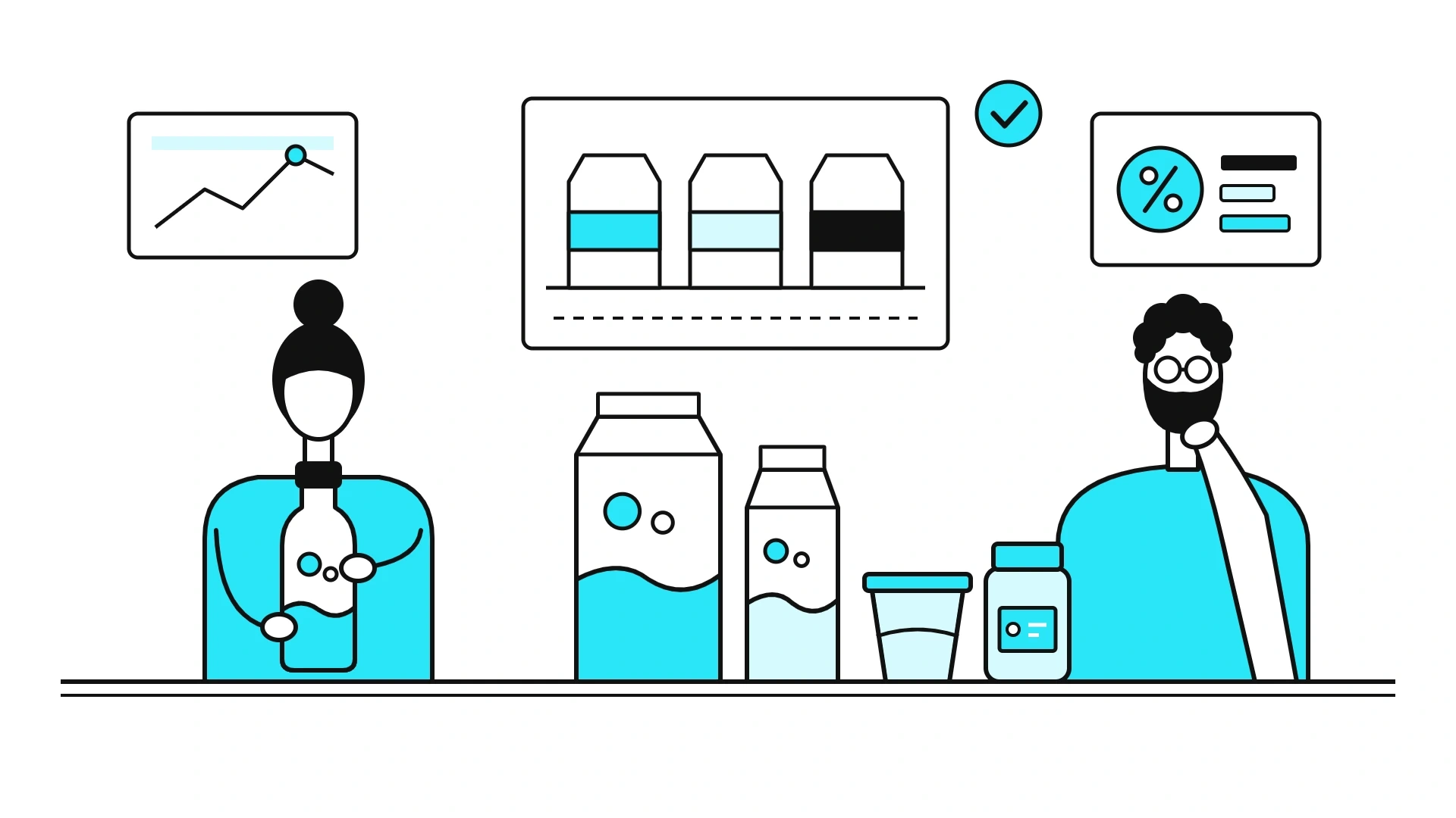
The dairy fridge in any Tashkent supermarket looks like one long label: a white field, a light-blue wave, a cow in a meadow and a big fat-content number. This is not lazy design but the category code: it tells a shopper in a second that they are looking at fresh milk, not juice. But when everyone uses the code, it stops telling one brand from another. Below is which parts of the dairy code are best left alone, where to look for a point of difference and how Minim solved this task in its own projects.
In short. Standing out among identical dairy labels comes from working on top of the category code, not from abandoning it. White, blue and freshness cues stay, while the difference comes from one strong device: a brand hero, a local story, a colour system across the range or a convenient format. The product type and fat content must still read in a second.
Why do dairy packs on the shelf look so alike?
Because every brand answers the same shopper question: is the product fresh, and can I trust it? Over decades the answer has turned into a set of signs: white for purity, blue and light blue for cold and freshness, a meadow and a cow for naturalness, a drop or a splash for the milk itself. Each sign works on its own, but together they add up to a "river of milk" of identical labels.
Meanwhile, competition in the fridge is growing. According to the National Statistics Committee, in January–February 2026 Uzbekistan's large enterprises produced 831.2 tonnes of cheese and cottage cheese, 35% more than a year earlier (stat.uz, 23.04.2026). In January–November 2025 the same figure grew by 58.1% (stat.uz, 20.01.2026). The more brands on the shelf, the more a pack that blends in with its neighbours costs.
Which parts of the dairy code should you not break?
Leave alone whatever helps the shopper find the category and check the product: the product type name, the fat content, the feeling of purity and cold. Everything else can change. The shopper has only a few seconds to decide; why that is so is covered in the article on the 3–5 seconds at the shelf. The table helps separate the fixed from the free at the briefing stage.
| Element | What it tells the shopper | What to do with it |
|---|---|---|
| Product type: milk, kefir, katyk, ayran | What is inside | Keep it large and legible in Uzbek and Russian |
| Fat content, % | The choice within the type | Put it on a separate, prominent badge |
| White and cool tones | Purity and freshness | Keep as background and air, but not as the only idea |
| Cow, meadow, farm | Naturalness | Can be replaced with your own hero or a local story |
| Drop, milk splash | Appetite and texture | Keep as a secondary detail |
| Pack shape | The familiar way of buying | Change with care, considering the filling line and shelf layout |
Sometimes the category code has to be kept almost intact. If shoppers already hold a rigid visual template for the product, dropping it reads as "this is something else". Then the difference is found inside the template: in the hero, the details and the copy.
Where to look for difference if colour and shape are already taken?
The difference comes from one strong device that the shelf neighbours do not have. In dairy, five directions work most often.
- Your own hero instead of an abstract cow. A character, animal or scene that belongs only to the brand and moves from one item to the next.
- A local story. Ayran, katyk, suzma and kurt are products with Uzbek roots. A pasture, a yurt or a dastarkhan, presented as an idea rather than a souvenir, instantly sets a local brand apart from imports.
- A colour system for the range. When each type or fat level gets its own colour, the range forms one visible block on the shelf, and shoppers find their option without reading small print.
- Typography. A large product type name and a distinctive brand typeface are recognised from a distance. What research confirms about colour and shape perception, and what is a myth, is covered in the article on the psychology of colour and shape.
- A family format. According to the 2026 census, children under 14 make up 30.4% of the population, and 85.3% of residents live in private houses (stat.uz). One-litre and 1.5-litre formats, comfortable handles and easy-to-close caps also set a brand apart, especially outside Tashkent.
How does packaging prove freshness and an honest composition?
Information that is easy to find proves freshness better than the words "natural" and "farm": the production date, shelf life, fat content and ingredients. Dairy products keep for days or weeks, so shoppers look for the date more carefully than on biscuits, and the back of the pack works for the brand as hard as the front.
- Space for the date. A field for the date and batch number is built into the artwork in advance: a light background, an adequate size and a clear pointer from the back ("production date: see the cap").
- An honest name. A product with milk fat substitute should not look like butter or cottage cheese. Spreads sit next to butter on the shelf: in January–November 2025 large enterprises produced 28.2 thousand tonnes of margarine and spreads, 22.9% more than a year earlier (stat.uz, 16.01.2026). If a spread pack copies the codes of real butter, the shopper will notice the substitution at home.
- Checking against current rules. The distinction between a dairy product and a milk-containing product was long set by the General Technical Regulation on the safety of milk and dairy products, Cabinet of Ministers Resolution No. 474 of 07.07.2017. It lost force on 02.09.2025 under Resolution No. 553, together with technical regulation No. 490 on food labelling (lex.uz). Since 1 August 2025, mandatory requirements for food products have been set by the sanitary rules and norms (SanPiN) of the Committee for Sanitary and Epidemiological Welfare (Gazeta.uz, 19.04.2025). The label text is checked against the current SanPiN before printing.
How to build a dairy range that shoppers can find on the shelf?
A range is built as a system: the brand block stays in place, while the type colour, fat content and food zone (the part of the pack that shows the product itself) change. Such a system is easy to extend: a new SKU (stock-keeping unit) simply takes its place in the ready scheme.
- Decide what matters most for choice. In milk it is fat content, in yoghurt flavour, in cheese the variety. The main attribute gets the colour.
- Fix the static block. The logo, hero and product type name stay in the same place on every pack.
- Test on a real shelf. Printed mock-ups are placed in the fridge next to competitors and viewed from two or three metres.
- Measure the result after launch. Which metrics to compare before and after a redesign is covered in the article on measuring packaging redesign effectiveness.
What it looks like in practice: Minim's dairy projects
All of the agency's dairy projects are collected in the Dairy section. Three of them show different ways to stand out.
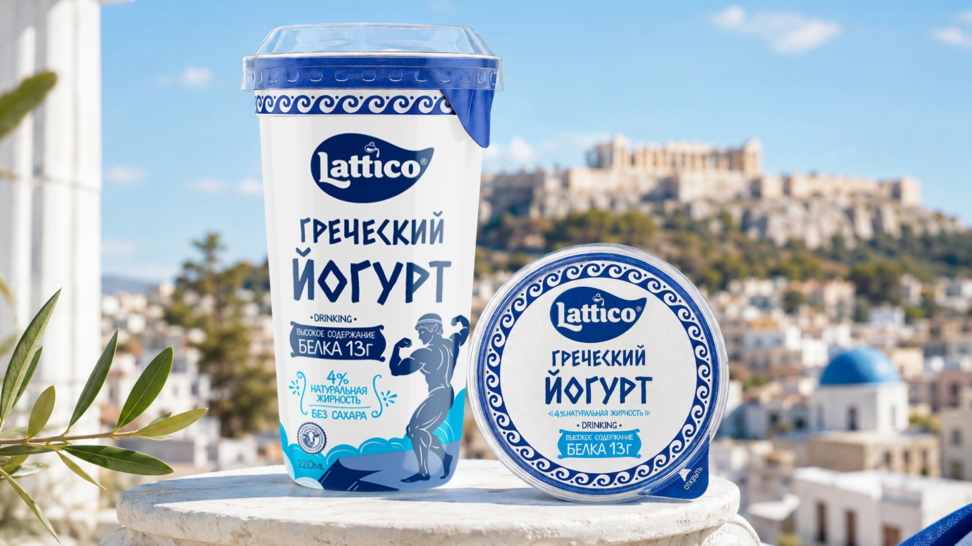
Lattico: difference within a strict code. For the new Lattico Greek yoghurt, the team saw that shoppers already had a category template: white, dark blue and a Greek-style typeface. Minim kept those colours and the typeface, dropped farm motifs and added heroes: an ancient Greek athlete and a girl with an amphora. The concept was approved first time, and more than 15 SKUs were developed on its basis.
Rash Milk: ayran as a summer landscape. Analysis showed that most dairy drink packs look the same: cold colours, standard shapes, visual sterility. For Rash Milk ayran, the agency chose the metaphor of a summer pasture, with green hills, clear sky, yurts and grazing animals, in white, natural green and blue tones.

Rumiya: cheese in the style of an Eastern miniature. For the premium Rumiya cheese, also in the Dairy section, Minim developed the name, logo and packaging. The heroine is a girl caring for a calf, and each cheese variety got its own colour.

"Dairy packaging cannot be invented from a blank page: shoppers look for familiar signs of freshness in the fridge. Our task is to leave them those signs and add one detail they will remember and find next time." — Lazizkhuja Sharipov, founder and director of Minim Design
Frequently asked questions
Which colours should dairy packaging design use?
White and cool shades of blue remain the base of the category: they signal purity and freshness. The difference is better found in an additional colour assigned to the brand or to the product type. If each fat level or flavour gets its own colour, the range forms one visible block on the shelf and is easy to find.
Does milk packaging need a cow?
Not necessarily. A cow and a meadow signal naturalness, but almost everyone uses them, so they do not distinguish a brand. Other images work too: a brand character, a local scene, a recognisable pattern. What matters is that the image fits the product: for Greek yoghurt, for example, farm motifs look out of place.
Which languages should be used on dairy packaging in Uzbekistan?
According to the 2026 census, Uzbek is the main language of communication for 91.3% of the country's residents, and mandatory information on packaging is given in Uzbek. Russian and other languages are usually added as duplicates. Check the exact labelling requirements against the current sanitary rules and norms before printing.
How does a dairy product differ from a milk-containing product?
A dairy product contains no non-dairy fat or non-dairy protein. In a milk-containing product, part of the milk fat, no more than 50% of the fat phase, is replaced with a milk fat substitute. This is how technical regulation No. 474 of 2017 defined these terms. It lost force in 2025, so check the wording on the label against the current SanPiN.
How many SKUs can one design system support?
There is no hard limit if the system is planned in advance: a static brand block plus a changing colour, fat content and food zone. For example, more than 15 SKUs were made on the basis of the Lattico Greek yoghurt concept developed by Minim. A new item is added to the ready scheme without designing the pack from scratch.
Key takeaway
A fridge full of identical white labels does not require a brand to shout louder than its neighbours. Shoppers look for familiar signs of freshness there, and there is no need to take them away. The winning pack keeps the category code and adds one detail of its own: a hero, a local story, a colour system or a convenient family format. An honest name and an easy-to-find date build trust after the purchase, when the shopper decides whether to come back for the product. Difference in dairy is not a rebellion against white, but a precise choice of what to make your own within that white.
About the author. Lazizkhuja Sharipov is the founder and director of Minim Design and has led the agency since it was founded in 2019.
About Minim Design. Minim Design is a packaging design agency from Tashkent, founded in 2019. The team has more than 20 specialists, and the agency has completed 1156 projects and exported its services to 12 countries. Minim runs a project end to end: naming, logo, packaging design, 3D visualisation and print supervision. The agency's work has been featured by Packaging of the World, Dieline and World Brand Design Society.
Sources
- National Statistics Committee — production of cheese and cottage cheese in January–February 2026 (23.04.2026): stat.uz
- National Statistics Committee — production of cheese and cottage cheese in January–November 2025 (20.01.2026): stat.uz
- National Statistics Committee — production of margarine and spreads in January–November 2025 (16.01.2026): stat.uz
- 2026 population census results — age, housing type, language of communication: stat.uz, PDF
- Lex.uz — Cabinet of Ministers Resolution No. 474 of 07.07.2017, lost force on 02.09.2025: lex.uz
- Lex.uz — Cabinet of Ministers Resolution No. 553 of 02.09.2025: lex.uz
- Gazeta.uz — SanPiN replacing technical regulations and standards for food products (19.04.2025): gazeta.uz
Share

Other articles

04.11.2026
Agency and Printer in Uzbekistan: How to Hand Over Packaging Artwork Without Paying for a Reprint
A reprint rarely starts on the press floor. Below is what a print handover package should contain, which artwork errors most often lead to a reprint, and how to split responsibility between the agency, the printer and the brand owner.
03.11.2026
Fonts for Uzbek Latin and Cyrillic: How to Typeset Bilingual Packaging for Uzbekistan
A global brand localizes its pack for Uzbekistan, the files are approved, the run is printed — and in the ingredients list the Uzbek letter “oʻ” shows up as “o'” with a straight apostrophe, or as an empty box. It happens when a typeface is chosen because its Latin looks good on screen and the Uzbek characters are only checked on the printing plate. Now there is a second layer: on 21 October 2026 Uzbekistan signed a law that changes four letters of its alphabet. This guide covers which characters your font needs, what the reform changes, how to split two languages between the front and the back, and how to test a typeface before print.

01.11.2026
Gift Sets for New Year, Ramadan and Navruz: When to Start Packaging Design
A gift set that reaches the store after the holiday is not a gift — it is leftover stock. In 2027, Ramadan, March 8, Eid al-Fitr and Navruz will all fall within six weeks. Here is how to calculate the timeline for each holiday, which format to choose, and what to do if you are already late for New Year.