



01.09.2026
Why Is It Risky to Develop Naming and Packaging Separately?

A common market practice works like this: first, the company founder, marketer, or a specialized naming agency selects a name for the product. The approved name is then passed to a designer, who creates packaging around it. Sometimes the process happens in reverse: the packaging design is approved first, and only afterwards is a name selected to fit it. At first glance, both approaches may seem logical. However, they overlook one important factor. In reality, consumers do not perceive a product name and its packaging separately. They receive both elements simultaneously as one unified signal.
A Name Has a Shape Too — and This Is Not a Metaphor, but a Proven Effect
There is a well-known experiment in psychology in which people are shown two abstract shapes. One is rounded, while the other has sharp, angular edges. Participants are then asked which shape should be called “bouba” and which should be called “kiki.” Regardless of language, age, or nationality, most people associate the rounded shape with “bouba” and the sharp-edged shape with “kiki.” This suggests that the sound of a word, independently of its literal meaning, can create a particular visual impression in the human mind.
This principle has also been demonstrated in packaging design research. Scientists including Carlos Velasco, Alejandro Salgado-Montejo, Fernando Marmolejo-Ramos, and Charles Spence examined product shape, typography, and brand name together. Their findings showed that all three factors can shape consumers’ expectations of a product’s taste. For example, smooth shapes, rounded typography, and softly sounding names tend to strengthen expectations of sweetness. Angular forms, sharp typography, and harsher-sounding names, on the other hand, tend to increase expectations of sourness. This means that a product name is not merely text. It acts as a visual and auditory signal with an influence comparable to packaging form and typography.
The main conclusion is that a name created completely independently of design may end up conflicting with the appearance of the packaging. For example, if a name filled with hard and sharp consonants is placed on soft, rounded packaging, the consumer receives two contradictory signals at the same time. In such a situation, the designer is not necessarily at fault. The core problem lies in treating naming and design as two unrelated processes.
Where Does a Sequential Development Process Fail?
What problems arise when the name is approved first? If only the name is finalized at the beginning, it may later turn out to be too long to fit comfortably on the front of the packaging. This becomes even more challenging when the product is intended for export and the name must be translated, transliterated, or adapted for other languages. Sometimes a selected name may also look visually weak in Cyrillic or Latin script, giving the designer limited possibilities for creating a distinctive logo. More importantly, the sound of the name may not match the taste, mood, or associations the packaging is supposed to communicate. In this case, instead of visually strengthening the name, the designer may be forced to compensate for it.
What difficulties arise when the design is approved first? If the packaging concept is finalized before naming begins, the naming process becomes constrained by the existing visual solution. As a result, the team may start searching not for the name that best expresses the brand positioning, but for a word that simply fits into the available space in the approved design. The most expensive consequence may arise in the legal field. A chosen word may be registrable as a verbal trademark, while the logo created around the approved design could resemble another registered trademark and create potential legal disputes.
What should be considered when entering a market with another language? Problems may also arise when a product enters a market with a different linguistic environment. A name that sounds smooth, pleasant, and natural in its original language may lose those qualities entirely after translation or transliteration. When the phonetic character of the name changes, the shapes, typography, and colors that best support it may also need to change. If the name and visual identity were developed independently, this mismatch may only become obvious during export rather than during the initial brand development stage.
What Is the Right Way to Organize the Process?
The solution is neither “name first, design second” nor the reverse. The most effective approach is for both teams to work in parallel around the same positioning strategy. Name candidates should be evaluated not only according to their meaning and legal availability, but also according to how they sound and what kind of visual identity can be built around them. At the same time, the design system should retain enough flexibility and space for the future name. This prevents the process from eventually turning into a forced search for “the least problematic name that fits the already finished packaging.”
Minim Cases Where Naming and Design Were Developed as a Single Task
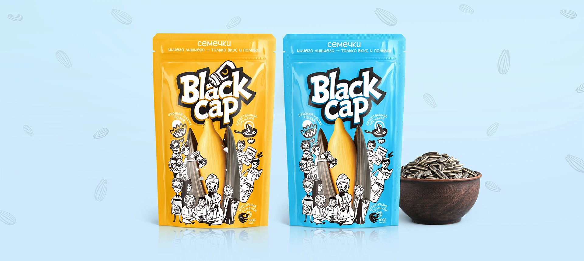
Black Cap. The rebranding of this sunflower seed brand began not with a cosmetic packaging update, but with the creation of a new name. The name “Black Cap” was built around a cultural code associated with Karakalpakstan. Both the brand name and its visual language were developed simultaneously from the same core idea. As a result, there is no visible disconnect between the name and the packaging, and the brand is perceived as a coherent whole.
Tabiall. For the herbal tea line produced under the T-SU brand, naming and premium packaging design were developed within one integrated project. The concept was based on naturalness and references to the legacy of Avicenna. Instead of approving a name first and then merely decorating it, both the verbal and visual identity were built together from the same strategic foundation.

Key Takeaway
Consumers perceive a product name and its packaging as one unified concept. Scientific research directly supports this idea: packaging shape, typography, and the sound of a name can influence taste expectations according to the same perceptual logic. Separating these tasks between different teams and developing them sequentially creates the risk of weakening the brand before the product even reaches the shelf. Working from a single brief and maintaining continuous collaboration between naming and design teams is not merely a procedural formality. It is a way to ensure that both the name and the packaging communicate the same meaning and idea at every level of perception.
Share

Other articles

04.10.2026
Brand marketing strategy should be developed before packaging design, not after
If a brief intended for collaboration begins with the words “we just need packaging,” then one very important stage has already been overlooked. The first question from a professional design agency should not be about color or style. The first question should be: what business problem is this packaging supposed to solve? Starting work without answering this question is not merely a theoretical mistake; it is a serious flaw that can lead to major financial losses. One of the most famous failures in global branding practice happened precisely because this question was ignored.
29.09.2026
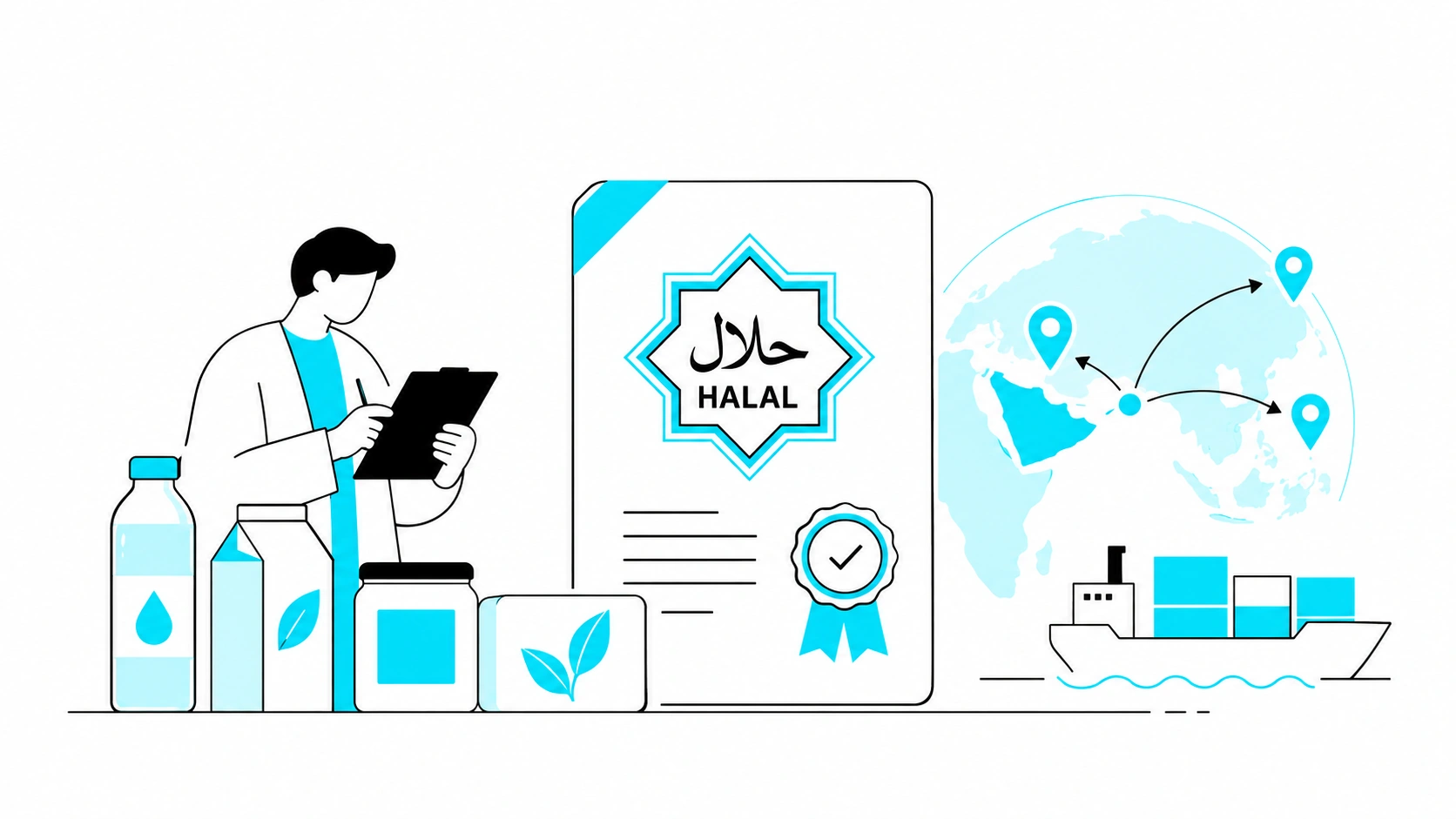
HALAL CERTIFICATE IN UZBEKISTAN: WHY YOUR BUSINESS NEEDS IT, HOW MUCH IT COSTS, AND HOW TO GET IT
In the past, the "Halal" mark was just a neat marketing trick for many. Slap a green crescent on the packaging, and sales would soar. No one really dug deep to see if there was any actual control behind the label. But the rules of the game have fundamentally changed. Starting May 1, 2025, "Halal" labeling in Uzbekistan was taken under strict state control. Now, this mark requires an official certificate based exclusively on SMIIC standards. Although obtaining the certificate is voluntary, if you want to enter major supermarket chains, export, or work with imported raw materials, it has become a core requirement for doing business.
If you produce food, cosmetics, or even ordinary bottled water, and you want your packaging to boost sales rather than collect fines for illegal labeling, you need to understand the new rules. In this article, we—as an agency working directly with brands—will break it all down for you from A to Z: who issues legitimate certificates today, by what criteria your production will be evaluated, how much the process costs, and in which unexpected products the Halal status plays a decisive role.

21.09.2026
Typical Packaging Mistakes Local Brands Make When Entering International Markets
More and more Uzbek manufacturers are looking beyond the domestic market. In many cases, packaging becomes one of the key factors that determines whether an export launch succeeds or fails. The problem is usually not the quality of the product itself, but the fact that packaging for foreign markets is developed in the same way as packaging for the domestic market. In other words, companies simply take the packaging that already works locally, translate the name into English, and consider the job done.
Below are the most common mistakes and why each of them can cost much more than it may seem at first.