


19.11.2026
Snack and Sunflower Seed Packaging Design: How to Win the Impulse Purchase
Hardly anyone puts a bag of chips or sunflower seeds on a shopping list. People grab it on the way to the checkout, at a petrol station or in the corner shop — because they saw it, wanted it and decided in a couple of seconds. Snack packaging gets no second chance: if the eye does not catch it, there is no sale, however tasty the product. Below we look at why snacks are bought on impulse, how to stand out in a category where all the bags look alike, what must read on the front of the pack and how these tasks were solved in Minim's snack projects.
In short. Snacks and sunflower seeds are impulse purchases: according to POPAI, 76% of purchase decisions are made in store. So a snack pack has 2–3 seconds to stop the eye, say what is inside and what flavour it is, and trigger appetite. That takes breaking away from category codes, an ownable colour, a large food zone and clear flavour navigation.
Why are snacks bought in seconds, and what does that mean for packaging?
A snack is a classic impulse purchase: the decision is made at the shelf, not at home. A 2012 POPAI study found that 76% of purchase decisions in US stores are made right on the sales floor (Supermarket News, 08.05.2012). In a General Mills survey of 3,000 convenience-store shoppers, 68% of food and drink purchases turned out to be unplanned: people bought the item because they saw it (BakeryandSnacks, 14.01.2016). Both studies were done in the US, but the mechanics of choosing at the shelf are the same everywhere.
The practical consequence: a snack pack works as both a billboard and a salesperson. It has to:
- stop the eye in a crowded row;
- say in a second what the product is and what it tastes like;
- trigger the appetite or mood people buy snacks for.
Competition for those seconds grows with the market: retail turnover in Uzbekistan in January–September 2026 was 119.7% of the same period of 2025 (stat.uz). The more products on the shelf, the more each second of attention costs.
How do you stand out on a shelf where every bag looks the same?
First you need to understand the category codes — the way things are "supposed" to look in it — and decide which to keep and which to break. For sunflower seeds that means a sunflower, a black or grey background and a photo of the seeds; for chips, product scattered over a saturated colour; for corn sticks, cartoon characters for kids. Codes are useful: they tell shoppers in a split second which aisle they are in. But a brand that copies them wholesale blends in with its neighbours, and price decides the choice.
The rule here is simple: keep a category code where it helps people understand the product, and break it where it stops them remembering the brand. Seeds can stay seeds in the photo, but the background, character and colour should be your own.
The second tool is the colour block. Packs of one brand sit side by side, and if the range has a strong shared colour, they form a "wall" that is visible from a distance. This matters most for hanging strips at the checkout and in small shops, where bags hang in a vertical line.
What must read on the front of a snack pack?
Five elements are enough on the front, and each has its own job. Ingredients, manufacturer details and the brand story go on the back.
| Element | Job | Common mistake |
|---|---|---|
| Brand logo | Recognition on repeat purchase | A small logo gets lost on the hanging strip |
| Product type | Instantly clear what is inside: chips, croutons, seeds | The brand is big, but the product is unclear |
| Flavour | Choice within the range | The flavour is set in the same colour and size as the rest of the text |
| Food zone | Appetite: the product and its key ingredient | A dark, small photo, or the product hidden by graphics |
| Trust marker | Halal mark, "premium grade", net weight | The mark is hidden or takes up half the pack |
An important caveat: a snack bag is not a flat box. A pillow of metallised film is filled with air or protective gas, its edges disappear into the seals and glare on the gloss eats part of the image. The logo, flavour and food zone go in the flat centre of the bag, and the artwork is checked on an inflated sample, not just on a monitor. How to choose between photo, 3D and illustration is covered in detail in our article on the food zone on packaging.
It is also worth checking how the pack looks on screen: in a marketplace listing it shrinks to a small thumbnail, and after delivery the shopper holds it in their hands. More on this in our article on packaging for Uzum Market.
How do you build a flavour range shoppers won't get confused by?
A range is built on a fixed framework and one variable. The logo, layout and food-zone position are the same for every flavour, while the colour changes and guides the shopper from pack to pack.
- Colour is tied to flavour. Shoppers expect cheese to be yellow, pickles and herbs green, spicy red. An unexpected colour works as an accent, but for core flavours it is safer to rely on expectations.
- Brightness rises with intensity. A spicy flavour can be more contrasting than the classic one, and shoppers will find their own heat level.
- A palette with room to grow. Colours are planned in advance so the tenth flavour does not have to be squeezed into a shade already taken by the third.
- Formats are one system. A small checkout pack and a family pack must be recognisable as the same brand.
Who is the pack for: teenagers, children or every generation?
First you decide who the buyer is, and colour, tone and character follow from that. According to the 2026 census, Uzbekistan has 8.5 million people aged 15–29 — 21.7% of the population — and 11.9 million children under 14, or 30.4% (stat.uz). Both groups buy snacks actively, but you need to talk to them differently.
- Teenagers and young adults respond to street culture, games and humour. Rural pastoral scenes bore them.
- Children need a hero and a clear image. But parents often pay, so trust markers belong next to the hero.
- A snack "for everyone" needs an image with no age limit, otherwise adults will decide it is a children's product.
Another factor is where the pack is sold. 54.5% of the country's population lives in cities (stat.uz), the rest in rural areas. There a branded pack often competes not only with the neighbouring brand but also with loose seeds sold by weight. How a producer moves from loose goods to a brand is covered in our article on moving from wholesale to retail.
What this looks like in practice: Minim's snack projects
All of the agency's snack projects are collected in the Snacks section. Three of them show different strategies.
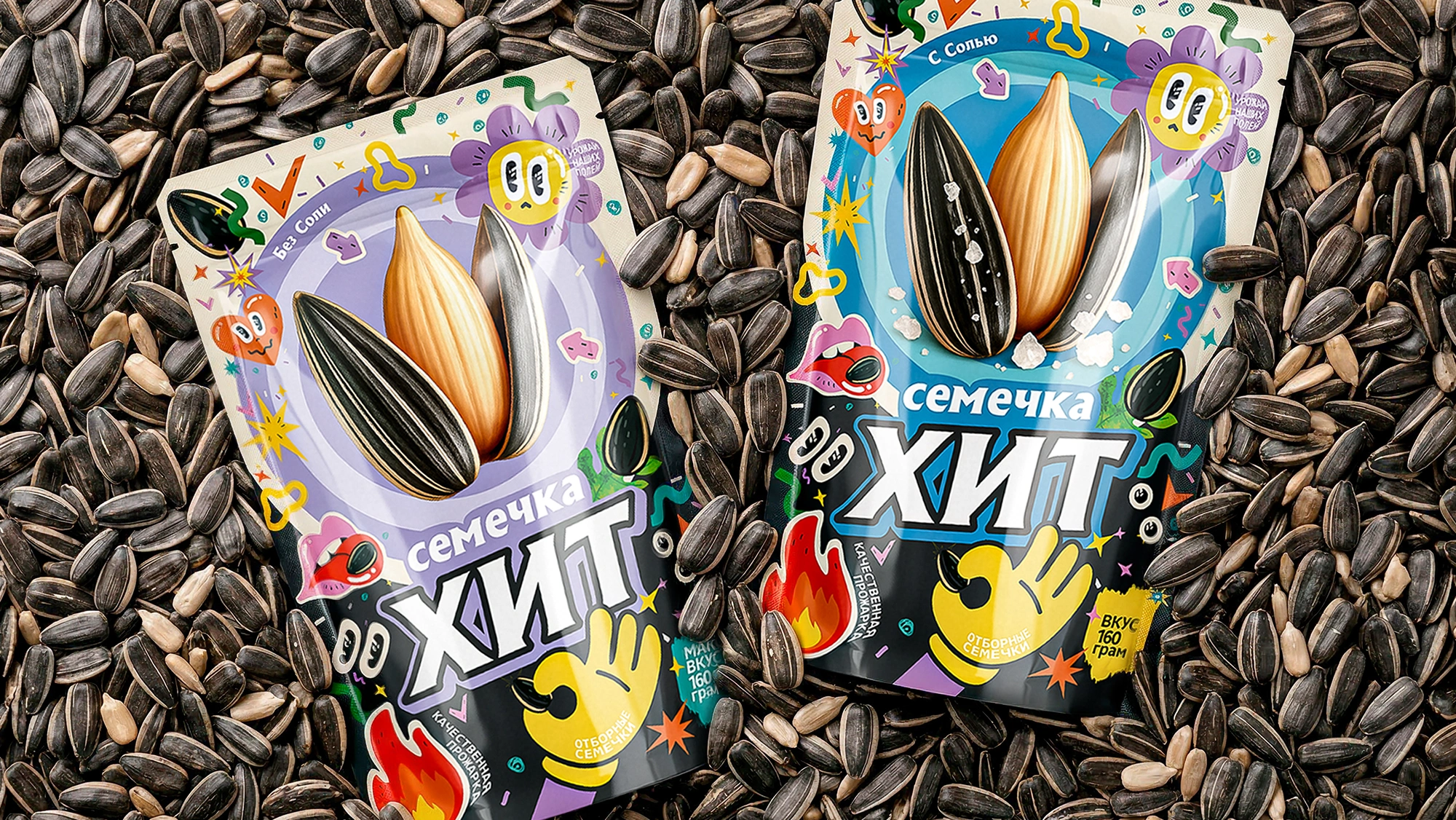
XIT: breaking the category code. Premium sunflower seeds from the Chinese hybrid variety "361" — large, elongated, with white stripes — needed not "yet another bag of seeds" but a fashionable brand. The Minim team noticed that most seed packs speak one visual language: a grey background, rural motifs, a giant sunflower. Meanwhile, seeds had become a snack for gaming and binge-watching. Hence "controlled maximalism": sticker-bombing like on laptop lids and skateboards, a large detailed 3D image of the seeds in the centre and two colour schemes — blue-turquoise with black for salted and lime-lilac for unsalted. Karakalpakstan was chosen as the launch region.
Gazzak Corn: one snack for ages 7 to 70. Jahongir Khodjaev, founder of the Sariq bola brand, wanted flower-shaped corn snacks to be bought with no age limit. Minim created two flower characters: a seven-year-old boy in a red cap and pixel glasses, and a grandfather in round glasses and a doppi skullcap. The characters are mirrored because merchandisers often place packs the wrong way round: however the pack stands, one of the heroes faces the shopper. A Tiffany-blue background sets the pack apart from its neighbours, and the line "Yeysiz — yana deysiz" ("Eat it — and you'll ask for more") works as a promise of taste.

Layker: a range of 10 flavours. For a new snack from an automated factory, Minim developed the naming and packaging: a white centre with a clean food zone and saturated colours at the edges, a different one for each flavour — blue-violet for chocolate, pink for crab, yellow-green for pickles. The system was carried over to shelf talkers, wobblers and price tags.

"Nobody plans to buy a snack — they notice it. That's why we test packaging not only on a monitor but on the shelf and on the checkout hanging strip: if in a couple of seconds it isn't clear what it is and what flavour, the shopper has already taken the pack next to it." — Lazizkhuja Sharipov, founder and director of Minim Design
Frequently asked questions
Why are snacks called an impulse purchase?
Because the decision to buy a snack is usually made at the shelf, not in advance. In the 2012 POPAI study, 76% of purchase decisions were made in store, and in the General Mills survey, 68% of food and drink purchases in convenience stores were unplanned. So snack packaging has to sell on its own, without the help of a shopping list.
What colour should sunflower seed packaging be?
Colour is chosen by looking at the shelf: first you see which colours competitors have already taken, then pick the one that will set the brand apart. The seed category is full of black and grey bags with sunflowers, so a bright brand colour stands out immediately. Within a range, colours help tell variants apart: salted, unsalted, large.
What should be on the front of a chips bag?
Five elements are enough: the brand logo, product type, flavour, a food zone with the product and its key ingredient, and a trust marker such as the Halal mark. Ingredients, manufacturer details and the brand story go on the back. Key elements sit in the flat centre of the bag, because the edges disappear into the seals and film glare distorts the image.
Does a snack need a mascot?
Not always, but a character helps when a brand talks to children or to all generations at once. A hero is remembered faster than a logo, lives on in advertising and social media and sets the pack apart from neighbours with identical product photos. For premium and "grown-up" snacks, a strong colour, typeface and appetising food zone are often enough.
How should snack packaging look on a marketplace?
In a marketplace listing the pack shrinks to a small thumbnail, so the logo and flavour must be readable without zooming in. Foil glare spoils photos, so the pack is shot in even light or rendered in 3D. After delivery the shopper holds the pack, and it should match what they saw on screen.
Key takeaway
A snack does not wait to be found: it is either noticed in 2–3 seconds or passed by. That is why snack and sunflower seed packaging design starts not with a picture but with the shelf: which category codes are already taken, who the buyer is, where the pack will end up — in a chain store, on a checkout hanging strip or in a marketplace listing. Then simple decisions do the work: an ownable colour that forms a block on the shelf, a clear product type and flavour, an appetising food zone in the flat centre of the bag and a system that makes it easy to add a new flavour. Snack packaging is not decoration for the bag but a salesperson that manages to say the essentials while the hand reaches for the shelf.
About the author. Lazizkhuja Sharipov is the founder and director of Minim Design and has led the agency since it was founded in 2019.
About Minim Design. Minim Design is a packaging design agency in Tashkent, founded in 2019. The team has more than 20 specialists, and the agency has completed 1,156 projects and exports its services to 12 countries. Minim runs projects end to end: naming, logo, packaging design, 3D visualisation and print supervision. The agency's work has been featured by Packaging of the World, Dieline and World Brand Design Society.
Sources
- Supermarket News — POPAI study: 76% of purchase decisions are made in store (08.05.2012): supermarketnews.com
- BakeryandSnacks — General Mills survey: 68% of food and drink purchases in convenience stores are unplanned (14.01.2016): bakeryandsnacks.com
- National Statistics Committee — retail turnover for January–September 2026: stat.uz
- 2026 population census results — age groups and urban population: stat.uz, PDF
Share

Other articles
13.11.2026
From Loose Goods to a Brand: How a Producer Moves from Wholesale to Retail
At the bazaar, rice from one sack is no different from rice in the next: shoppers compare the price per kilo and buy from whoever gives a better deal. Below: where to start, which channel to choose first, what must be on the pack, and how not to overpay for your first product line.
13.11.2026
Confectionery Packaging Design: Wafers, Sweets and Biscuits
A pack of wafers is taken off the shelf in a couple of seconds, and shoppers rarely compare ingredients. Below we look at how confectionery packaging design differs for wafers, sweets and biscuits, how to show flavour through film, when a window is needed, and how to keep a range of a dozen flavours in order.

11.11.2026
Short runs and digital packaging printing: when they pay off
The most expensive packaging is the packaging sitting in a warehouse. Below: how digital differs from offset and flexo, how to calculate the break-even point between them, when a short run pays off and how to prepare the design for it.