Our works
Dive into the world of solutions we have created that inspire, build trust and make businesses successful
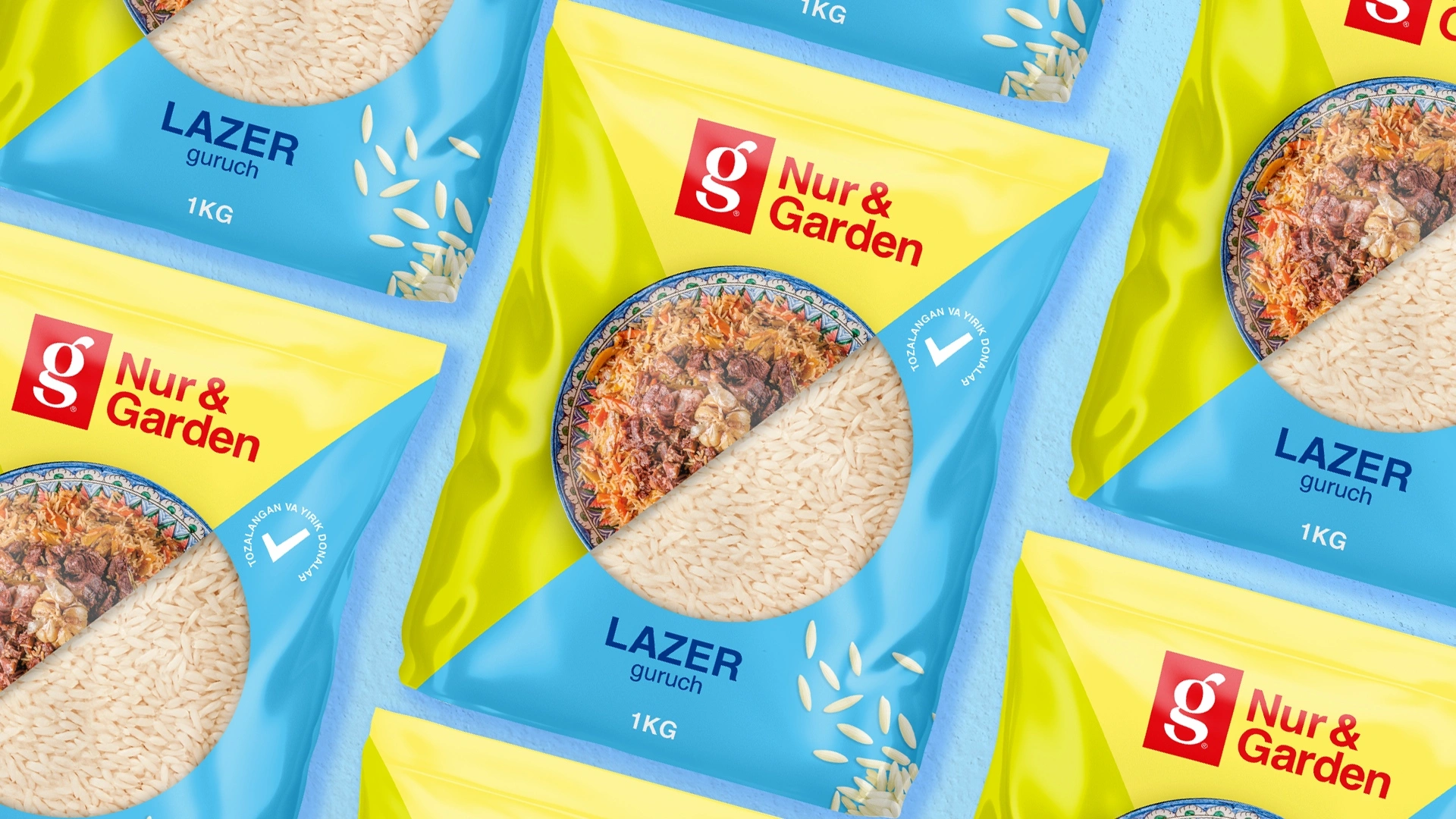
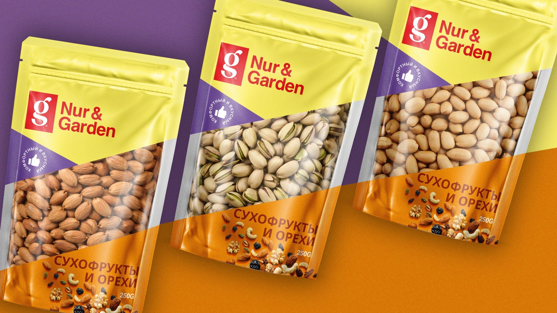
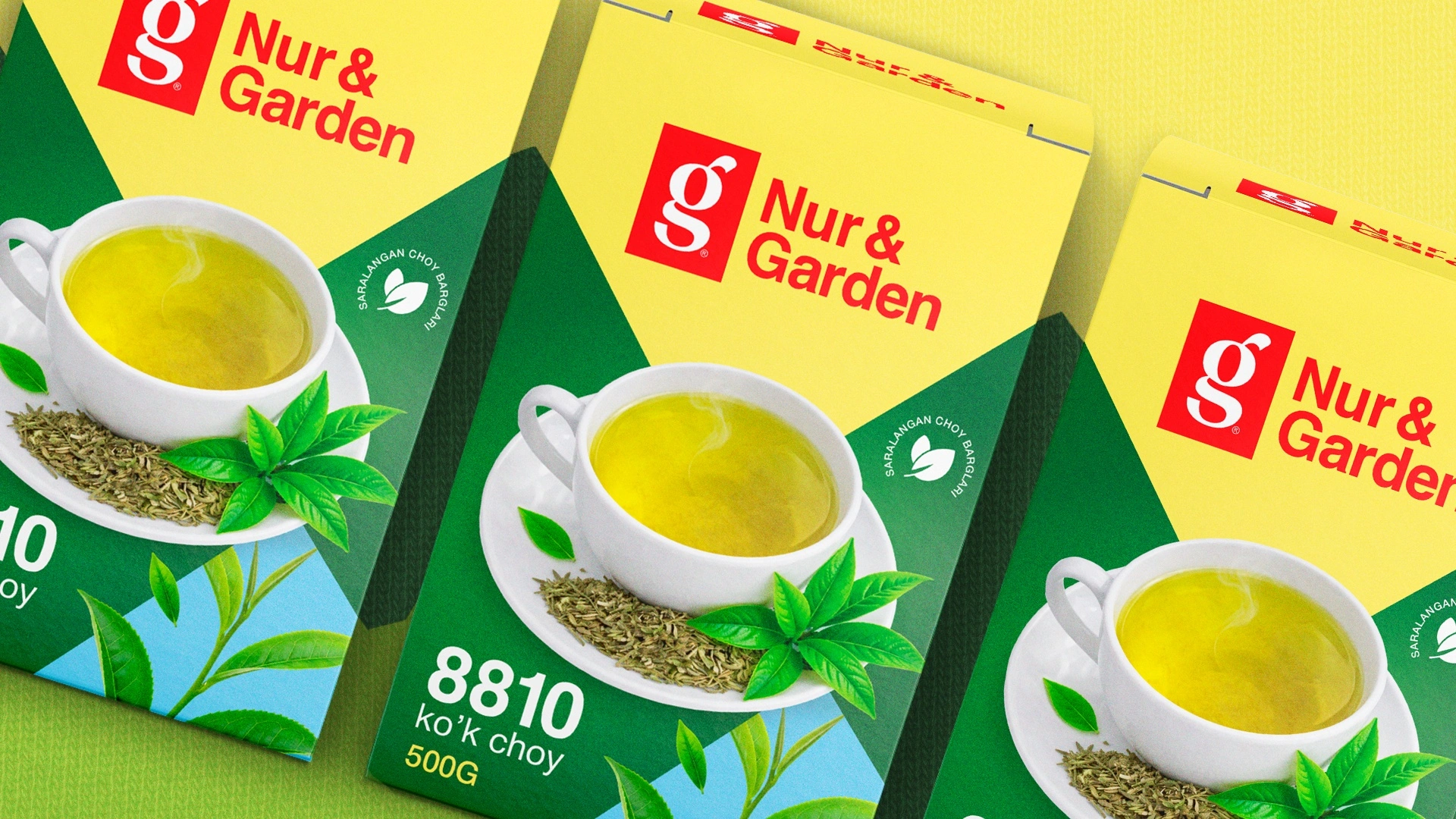
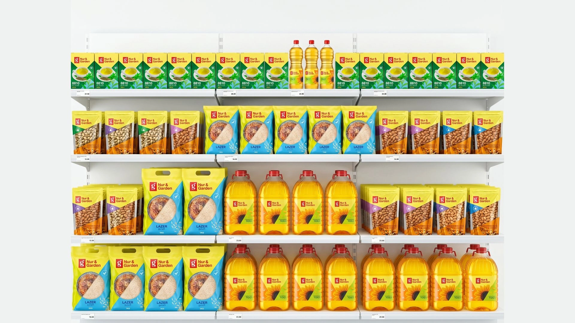
Nur&Garden — Packaging Design for Private Label: From Rice to Dried Fruits
Entering the market with a new product is like knocking on the door of a massive, highly competitive arena. How buyers welcome you largely depends on your "clothes" — in other words, your packaging design. Our next client at the MINIM agency was quite young, but an incredibly ambitious entrepreneur with massive goals. He intended to enter the FMCG (Fast-Moving Consumer Goods) market with a brand-new label — Nur&Garden. Our task was clear and concise: not just to draw a pretty design, but to use the right visual solutions to open the doors to new markets and opportunities for this young brand!
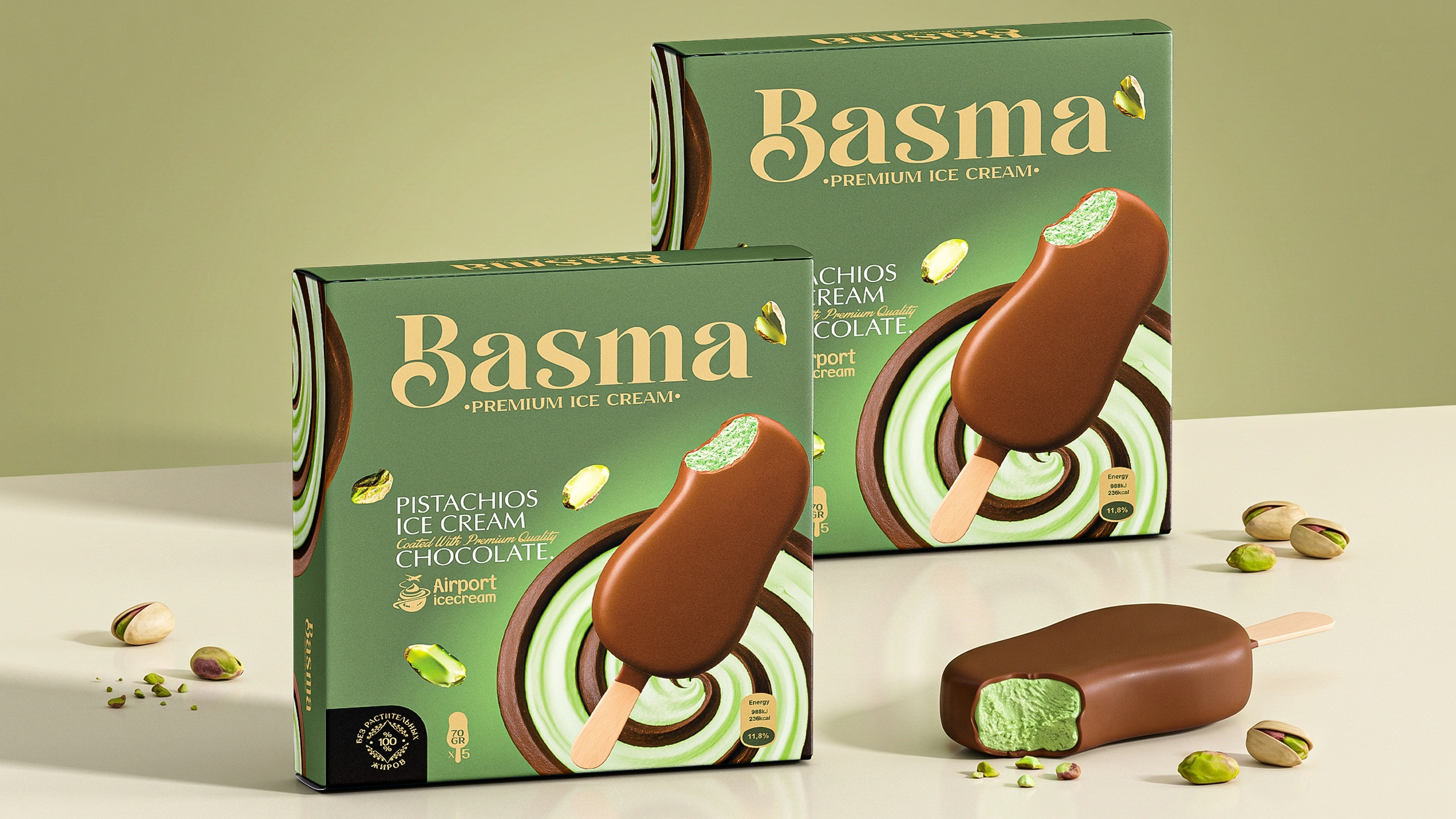
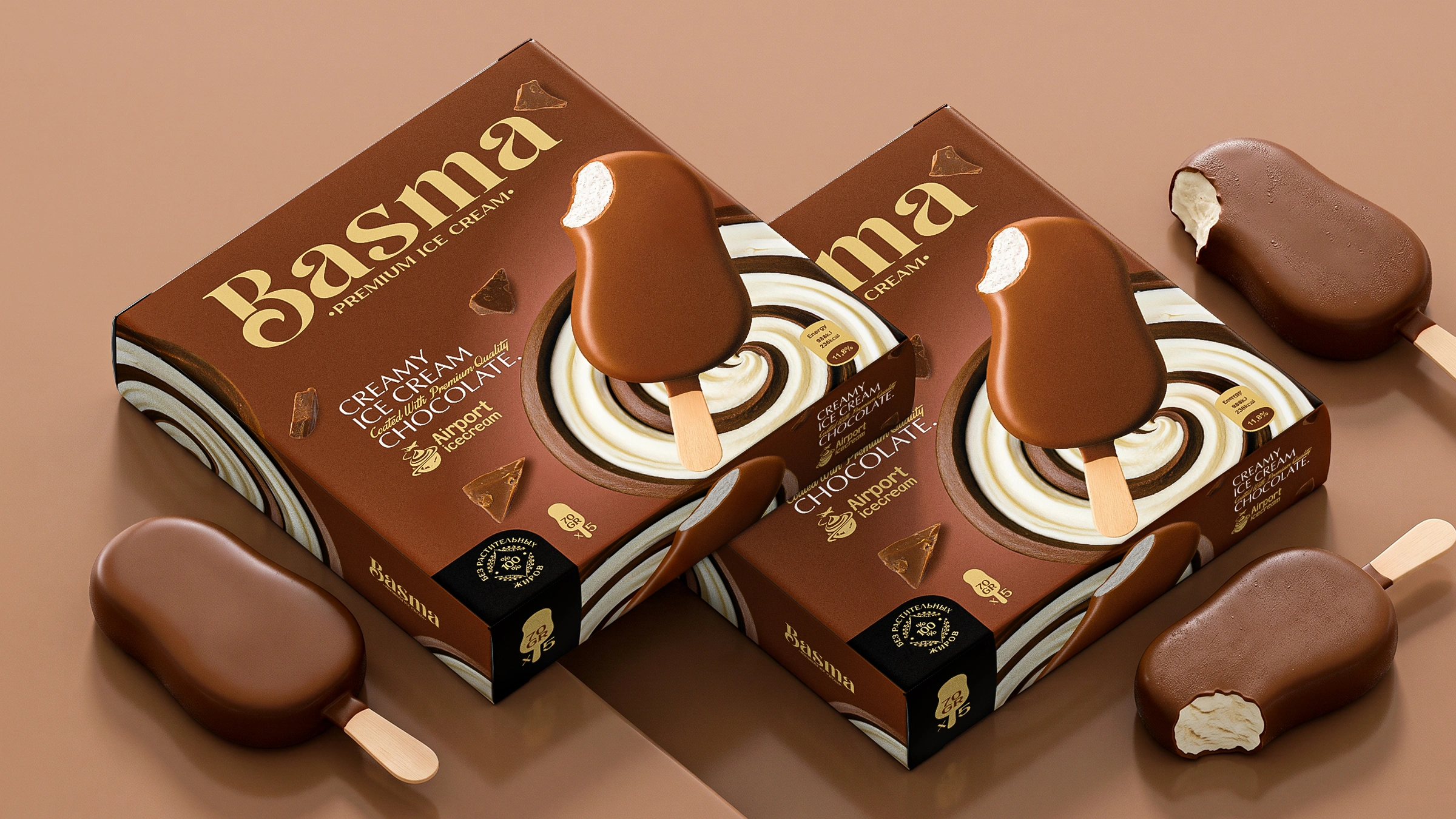
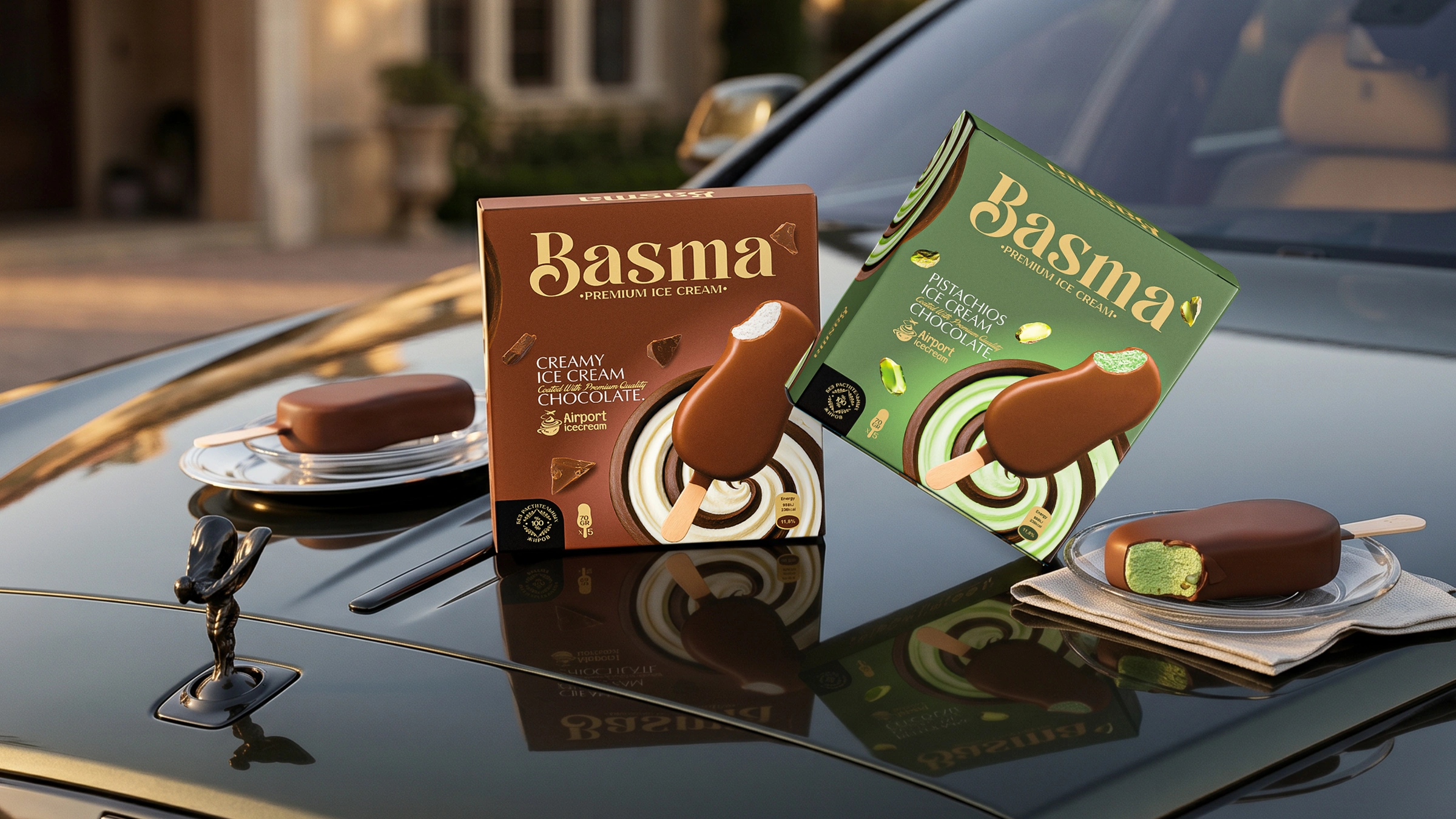
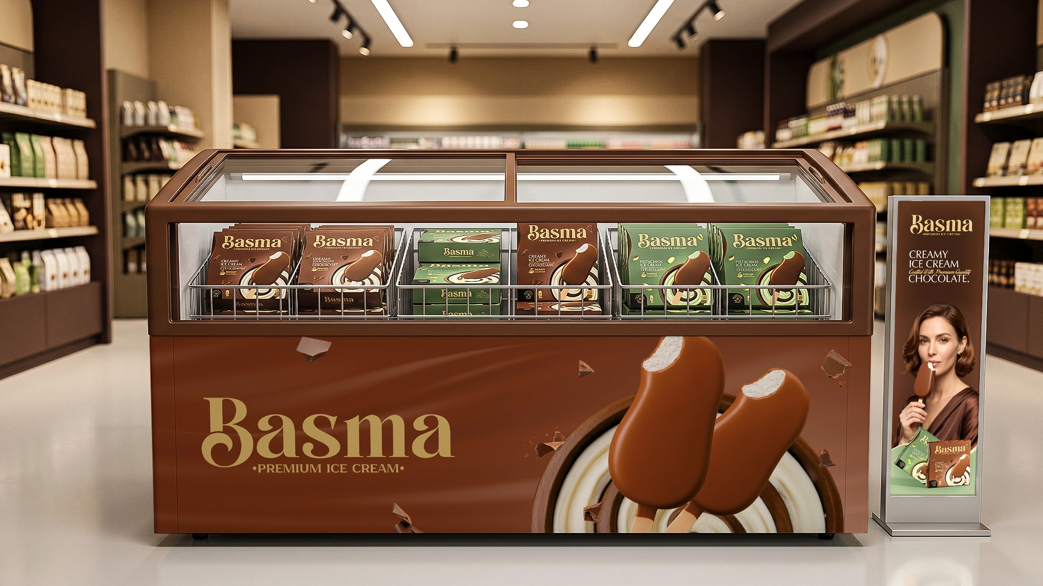
Basma – Boxed Ice Cream Packaging Design
In the world of design and branding, there is an unspoken golden rule: the more a client interferes with the process and micromanages like an “overseer,” the worse the final result turns out. At MINIM agency, we deeply respect all our clients and listen to their opinions, but there are some with whom working is an absolute pleasure. These are the leaders who completely hand over the “steering wheel” to the specialists, giving them total creative freedom. The owners of the Basma (Airport Icecream) brand are exactly this kind of rare and highly cherished client.
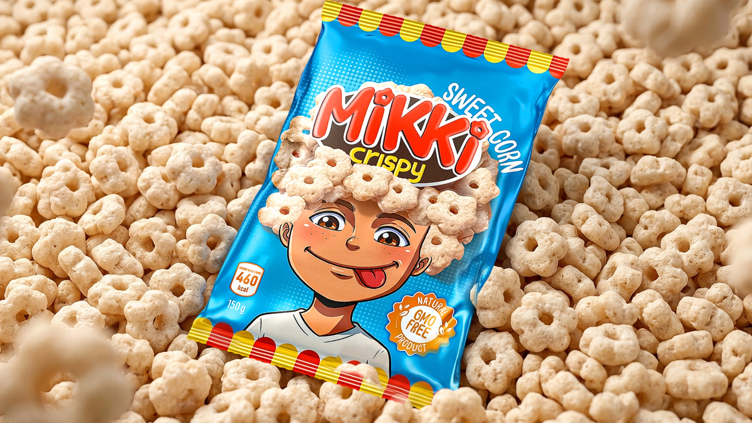
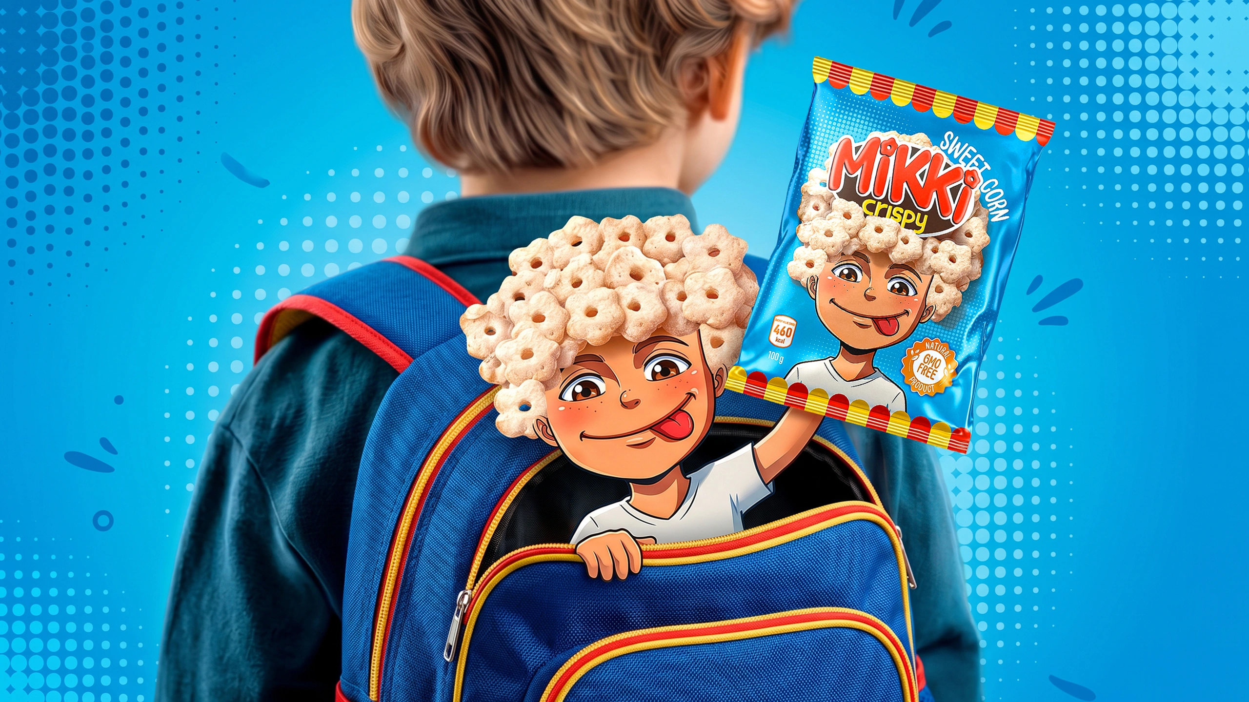
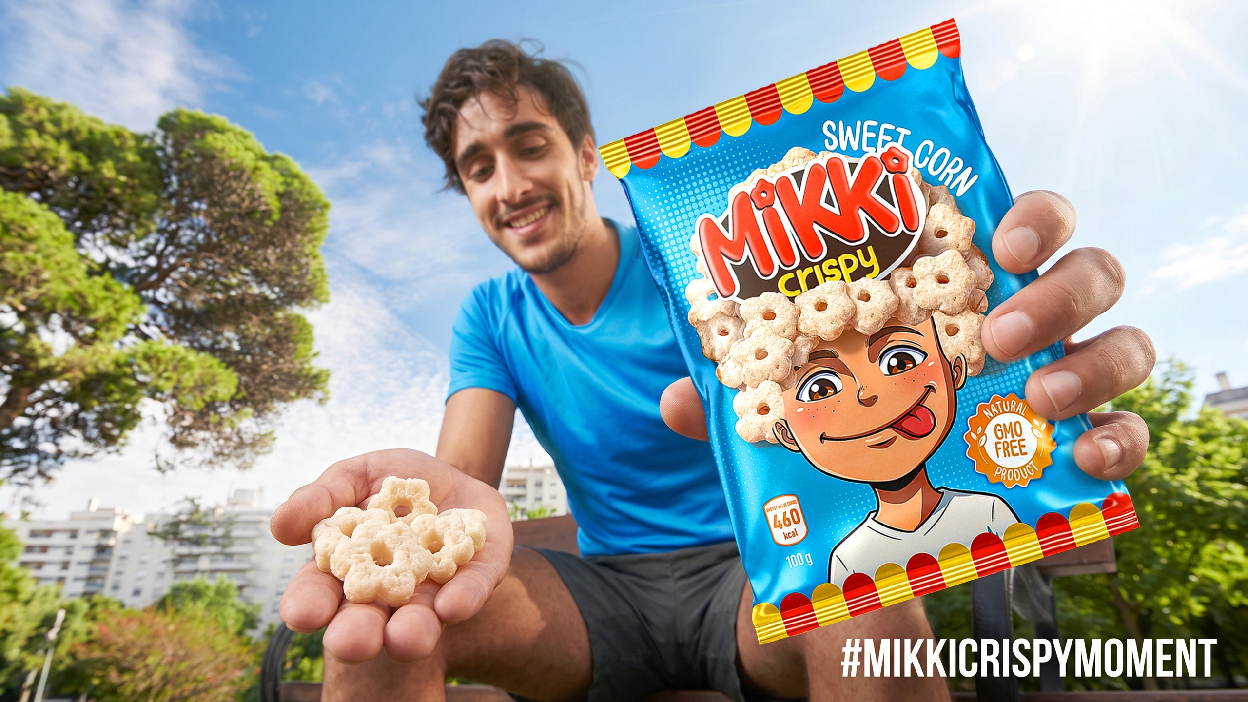
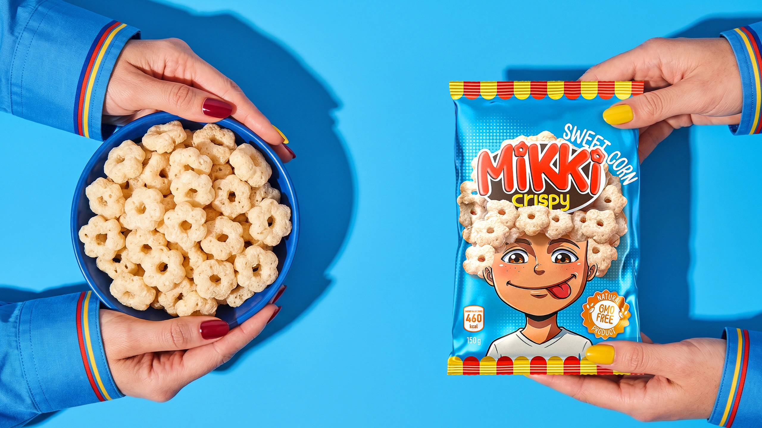
Mikki Crispy – Packaging Design for Sweet Corn Snacks for Kids
You have exactly 3 seconds to grab a child's attention at the store shelf—just enough time for the eye to see and the brain to process the image. Now, ask yourself: does a kid care about a boring logo slapped in the center or a long paragraph about the product's health benefits? Absolutely not! So, what do they actually want? The answer lies in the packaging design for the "Mikki Crispy" brand, developed by MINIM agency.
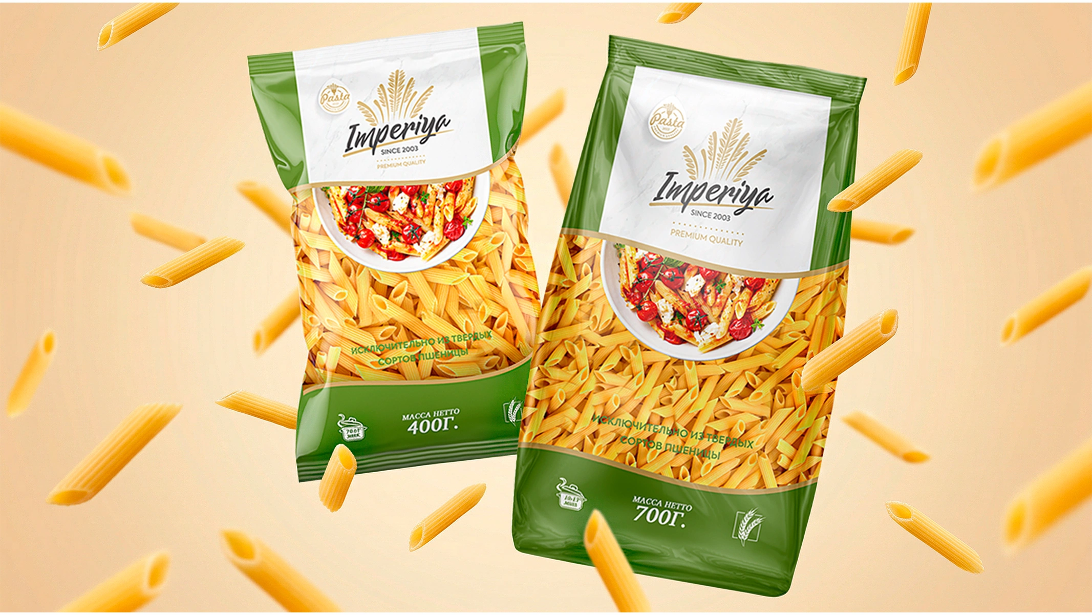
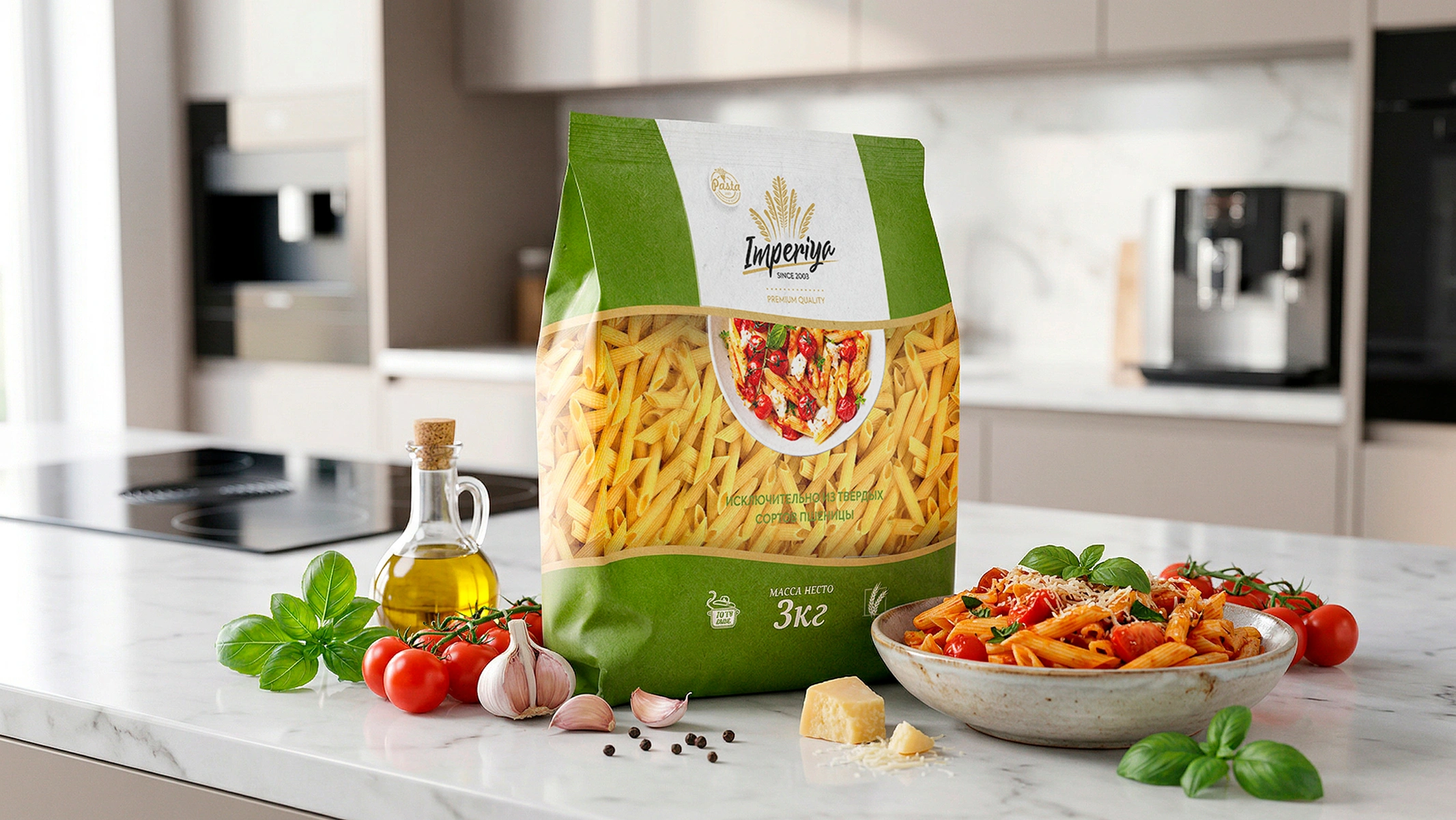
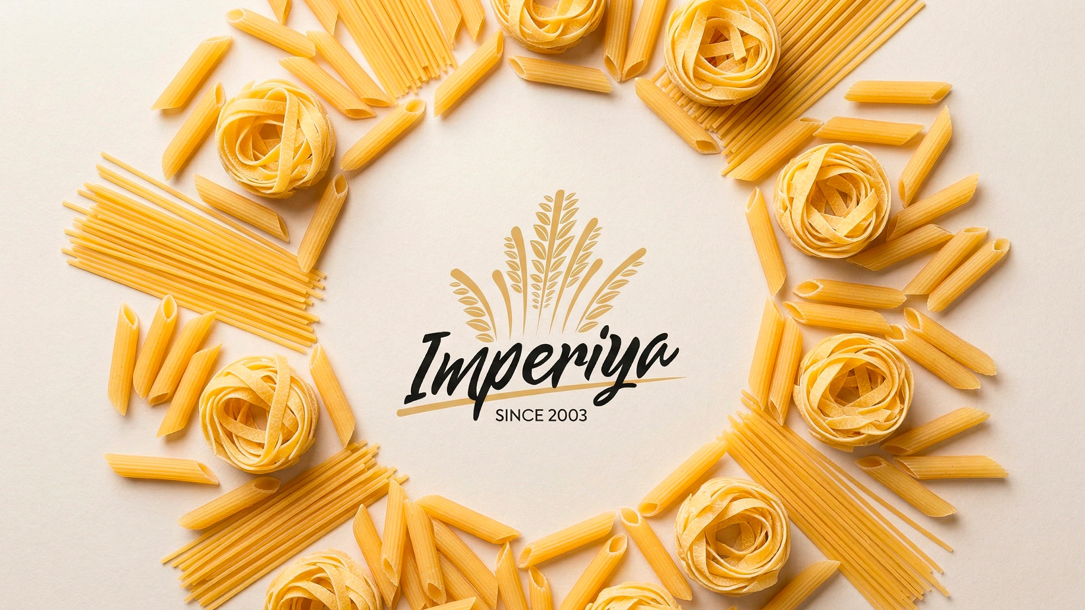
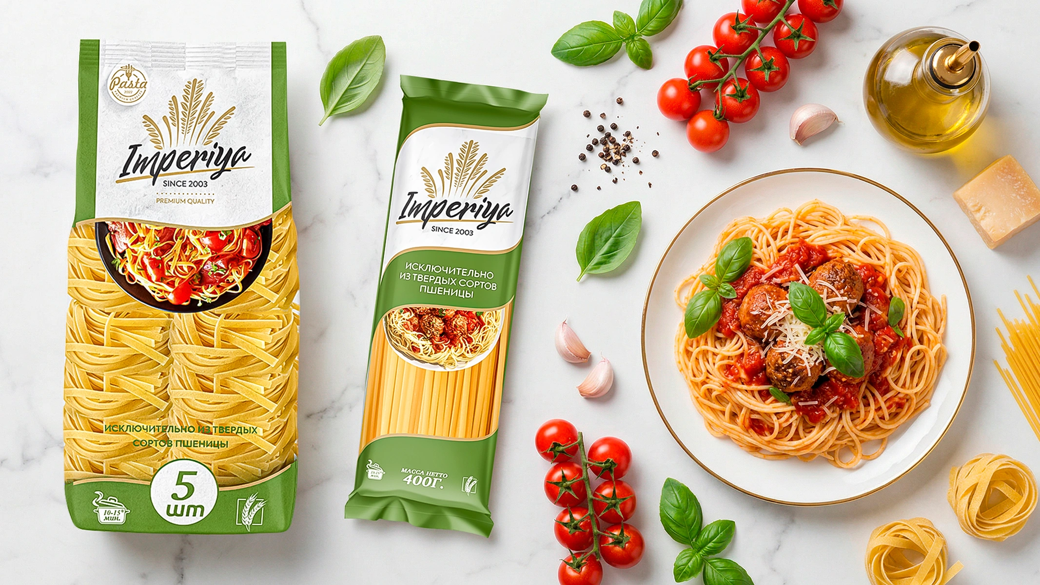
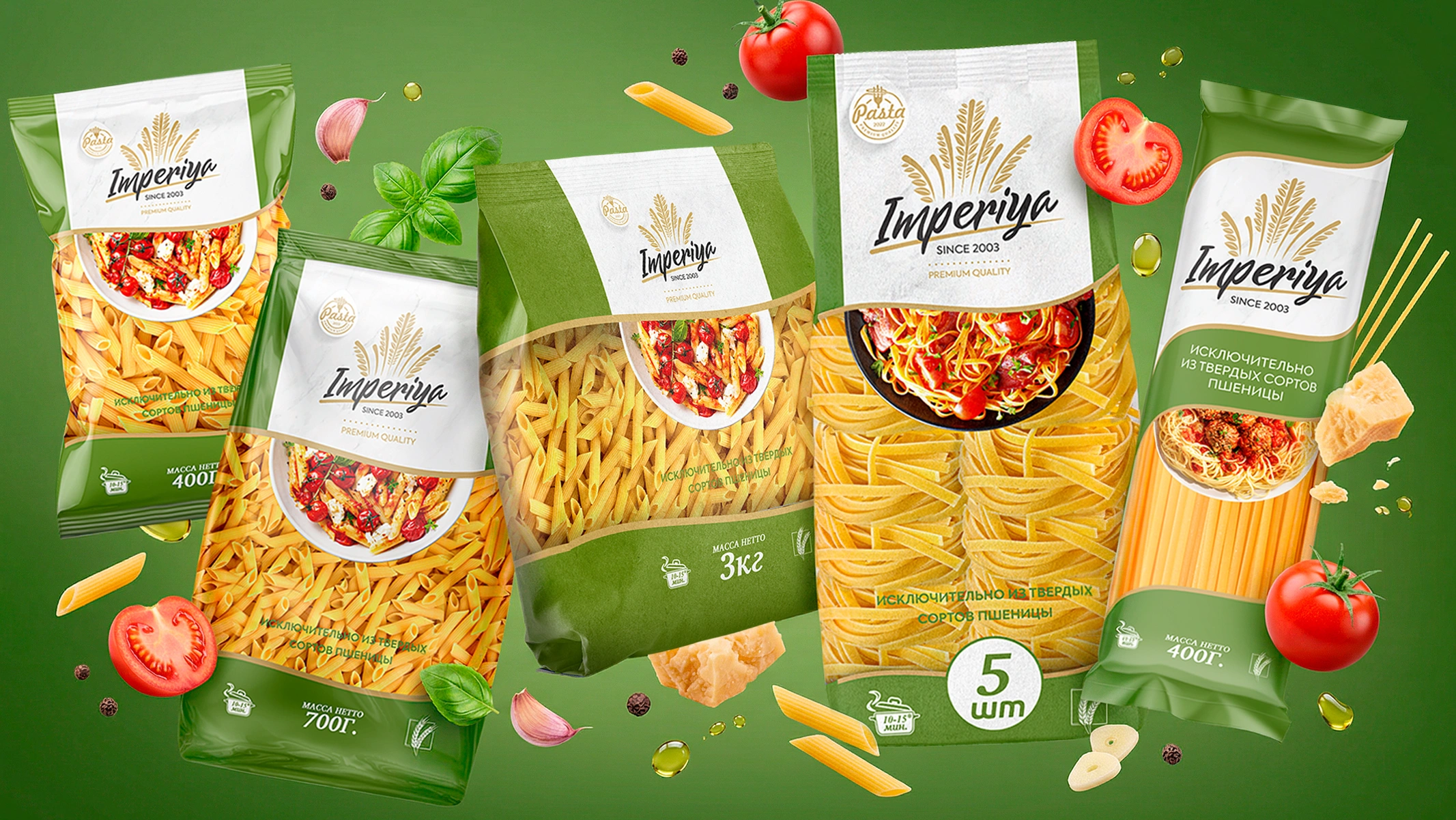
IMPERIA – Pasta Packaging Design and Brand Rebranding
Translating the brand's 23-year history into modern visual language and an open communication strategy with the customer.
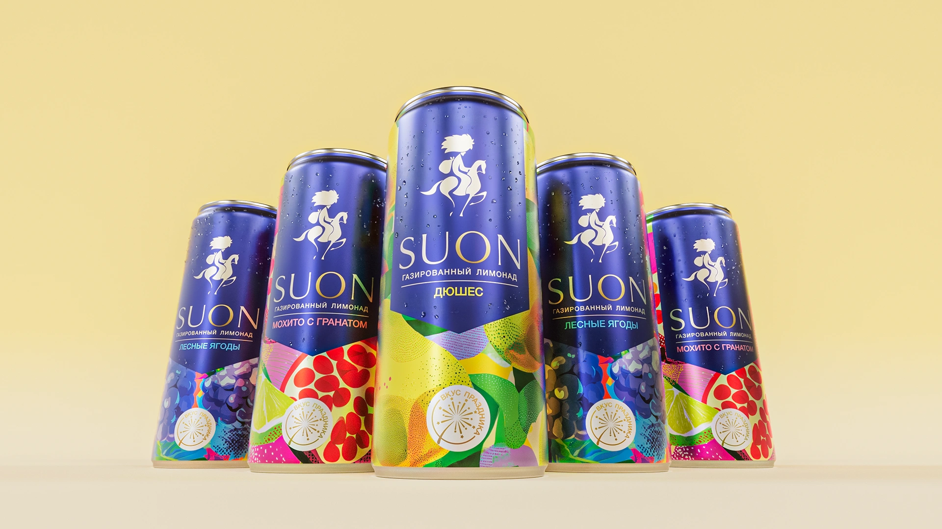
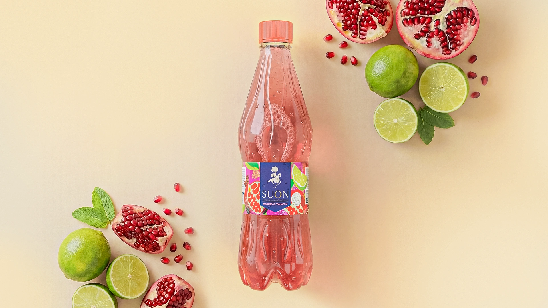
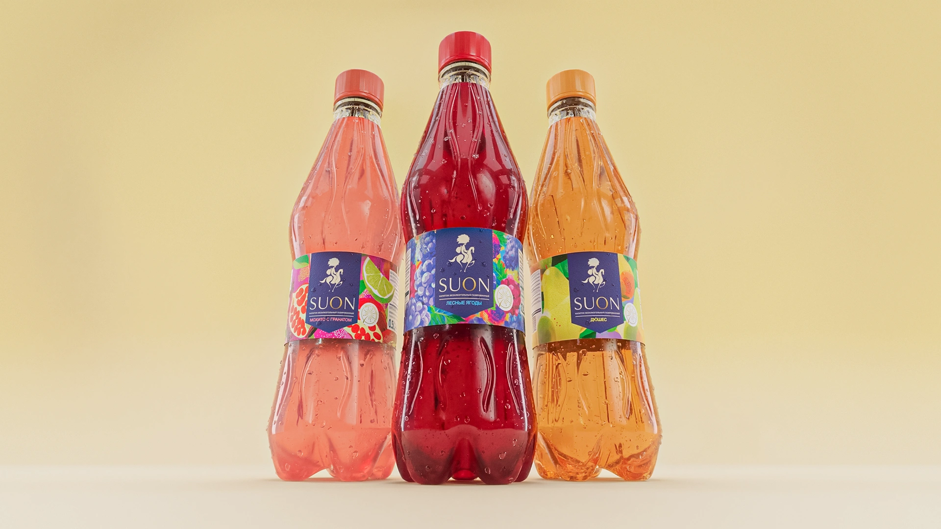
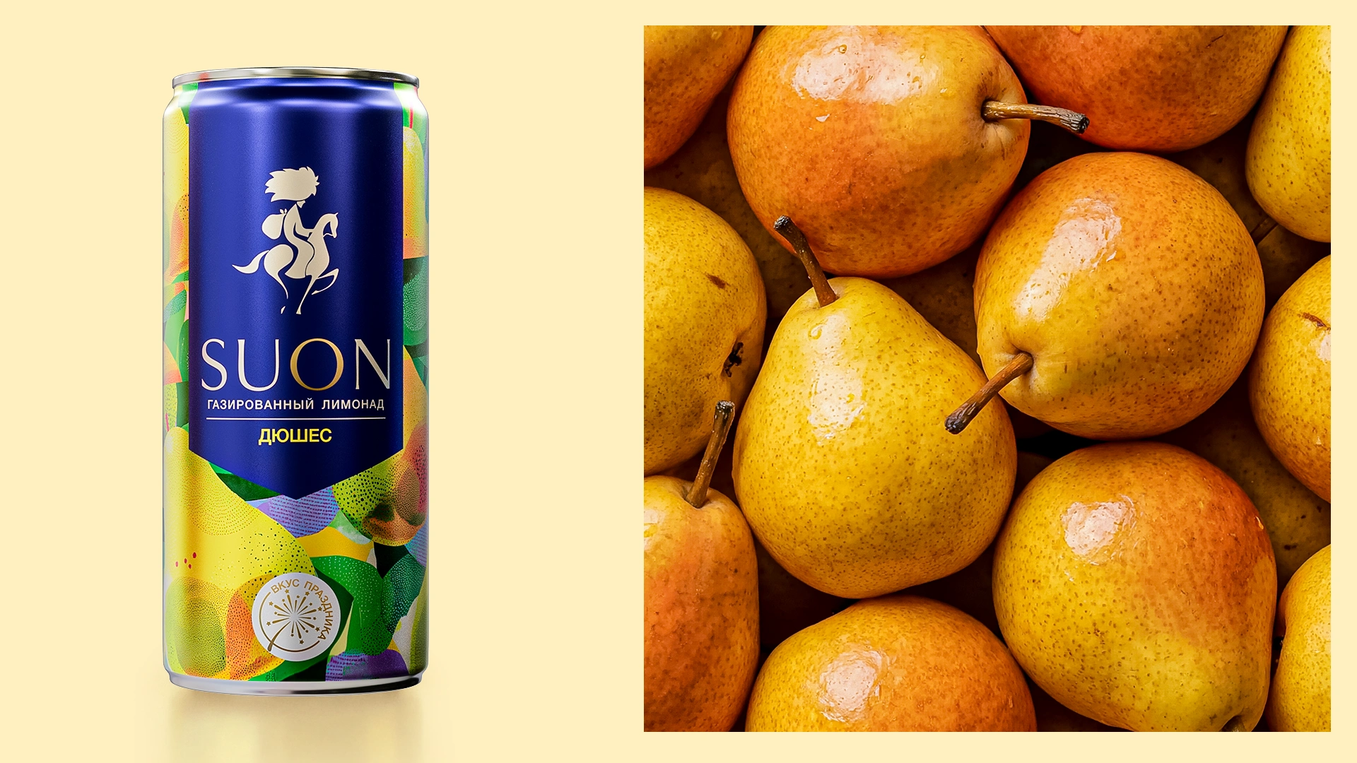
Suon – Logo and Packaging Design for Water and Soft Drinks
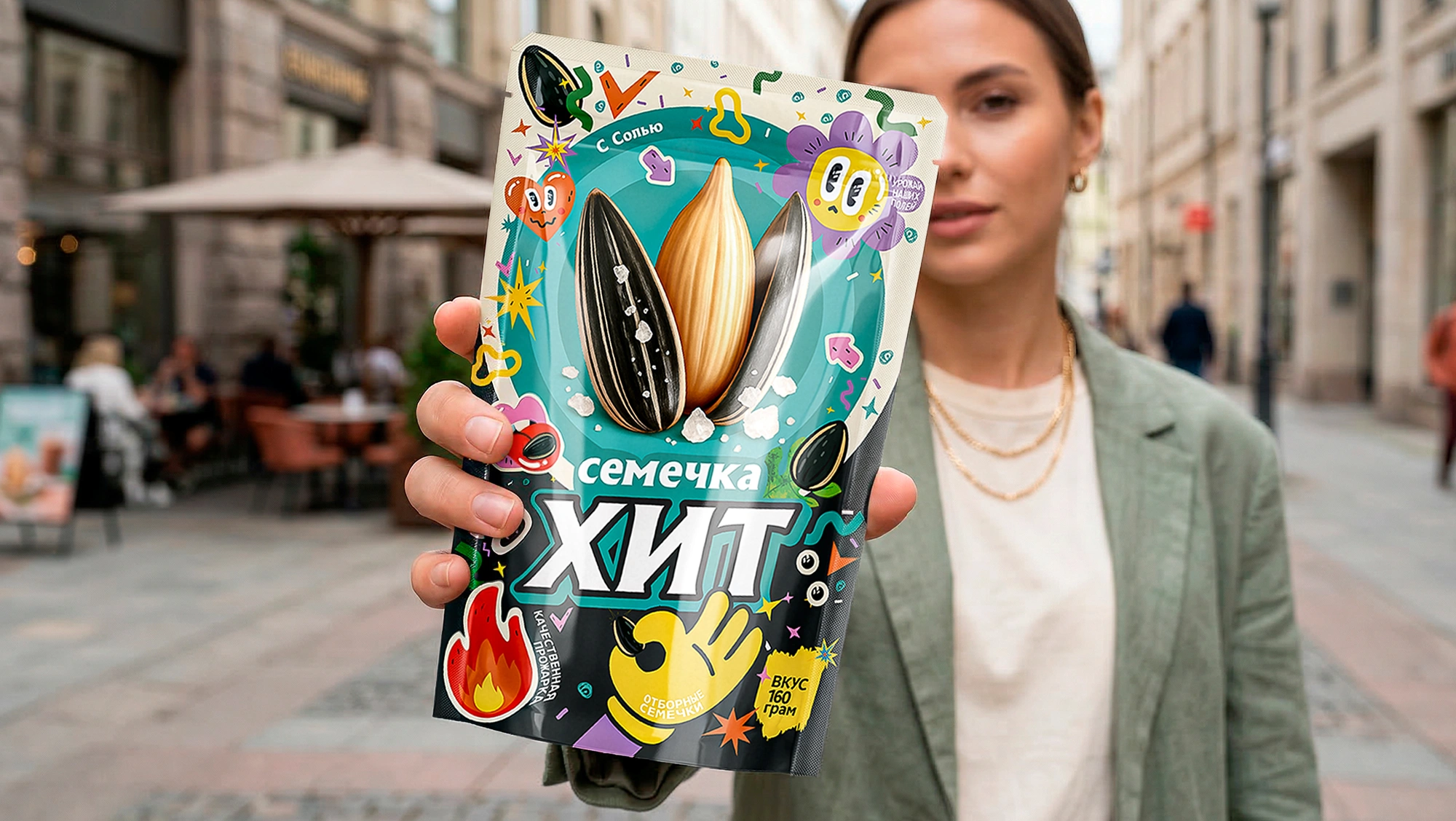
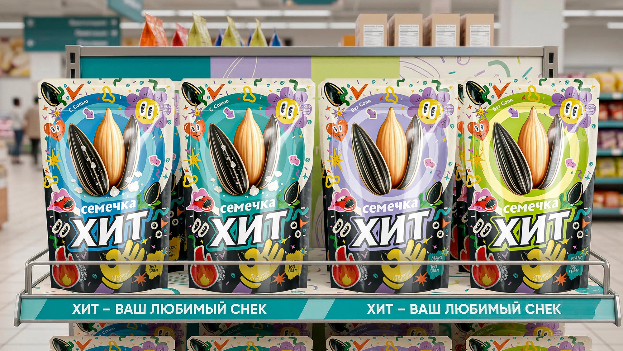
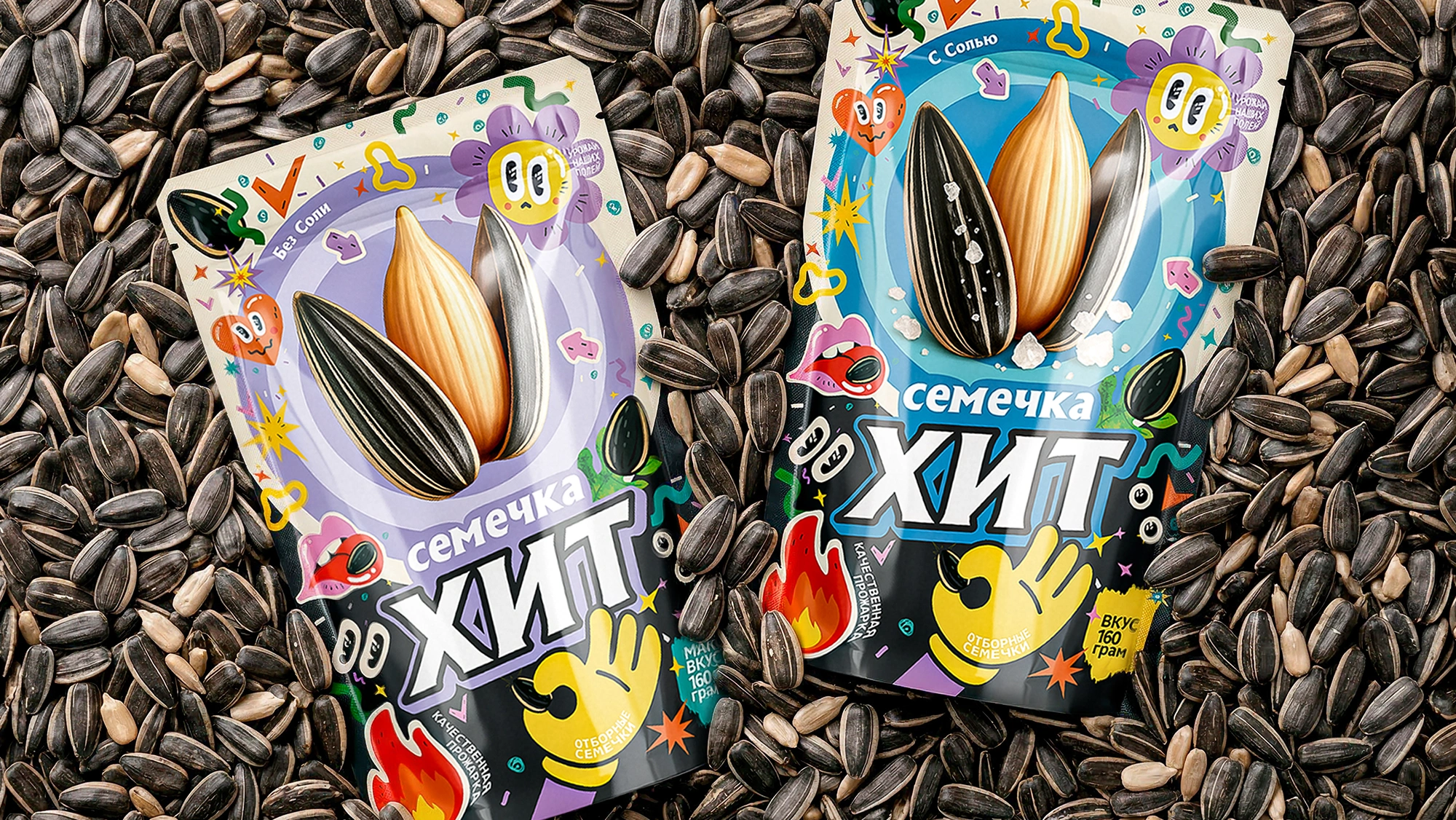
XIT – Sunflower Seed Packaging Design for a Youth-Focused Snack Brand
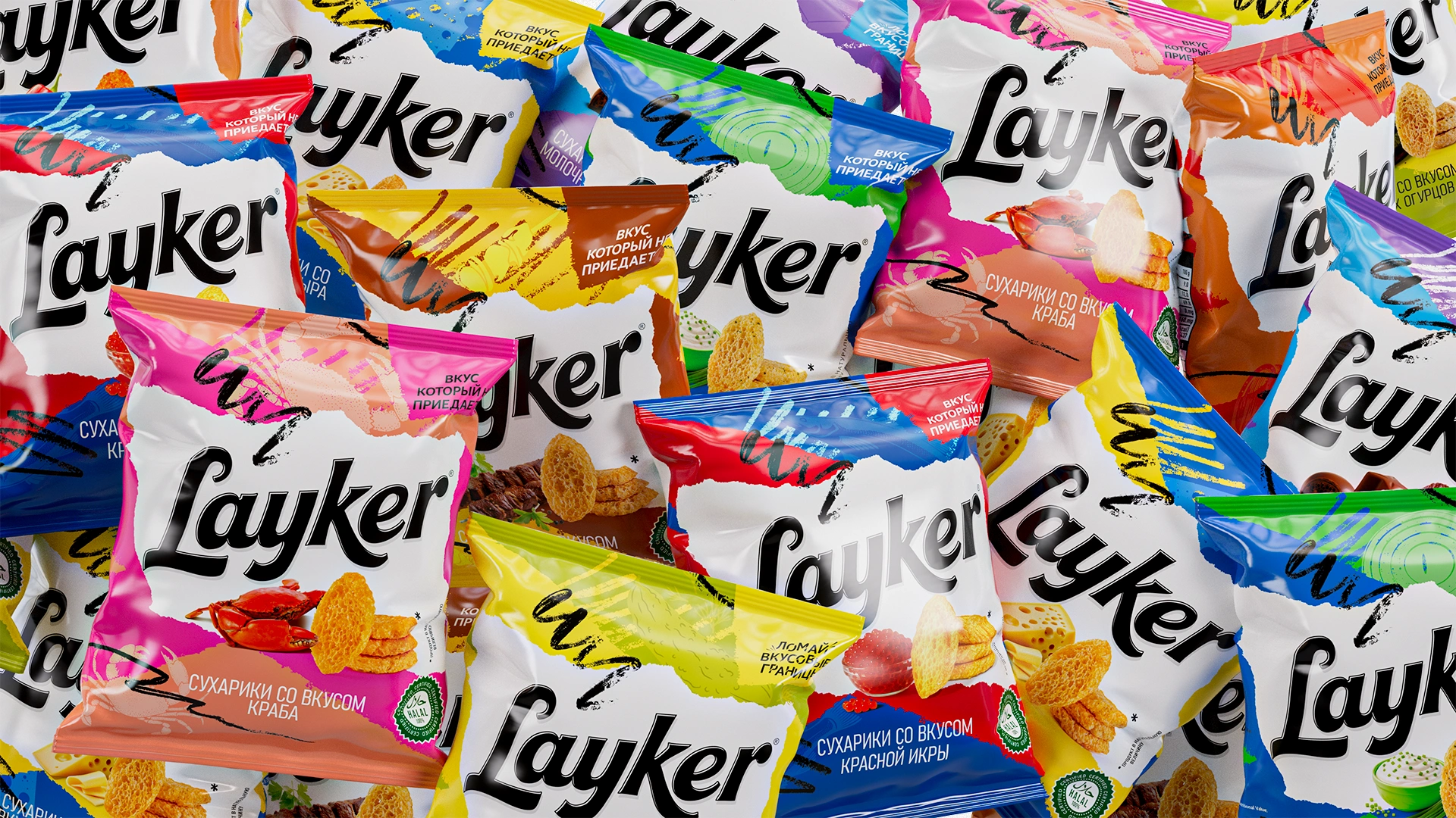
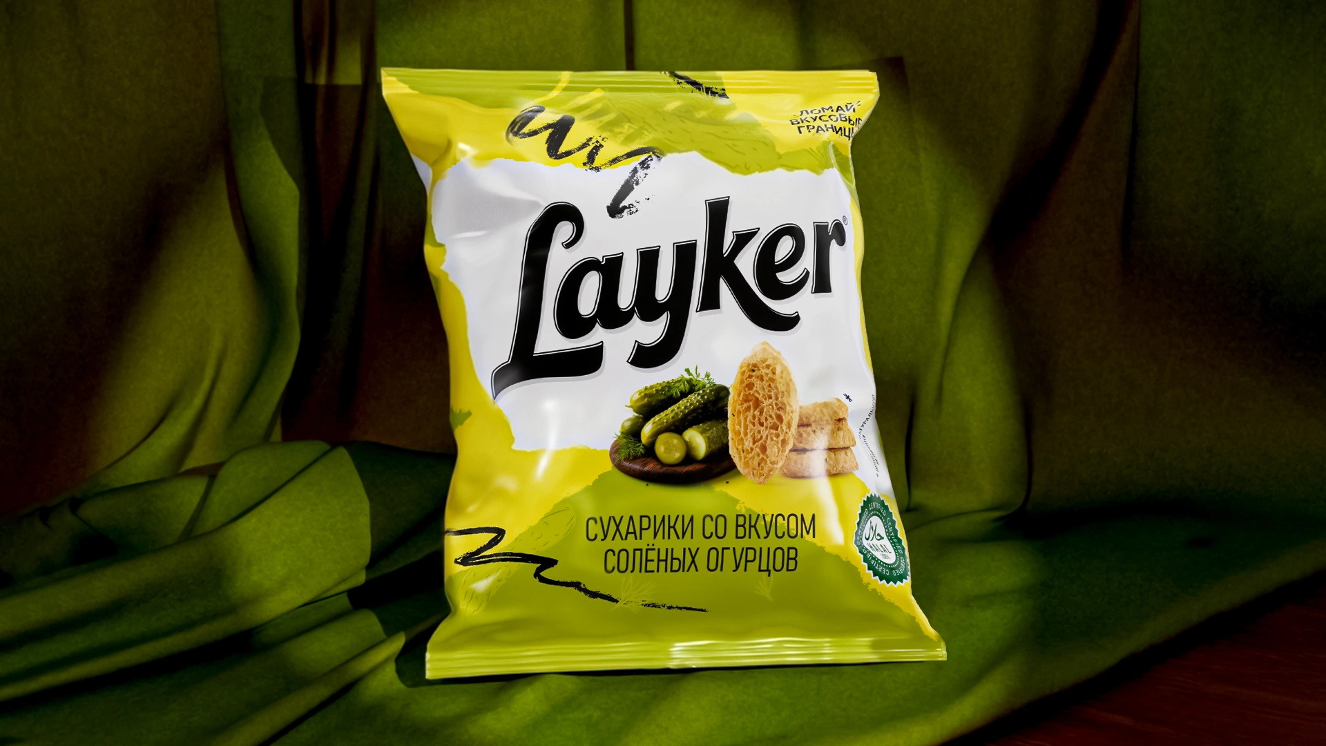
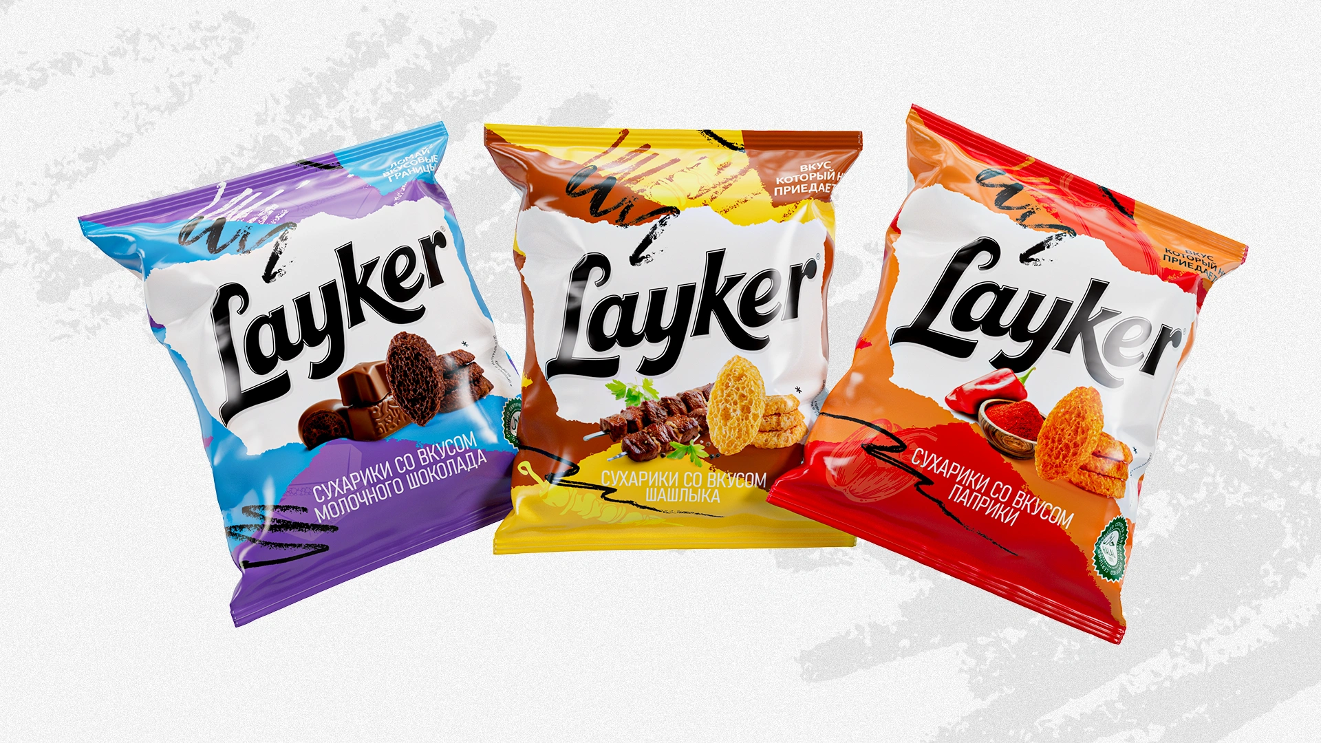
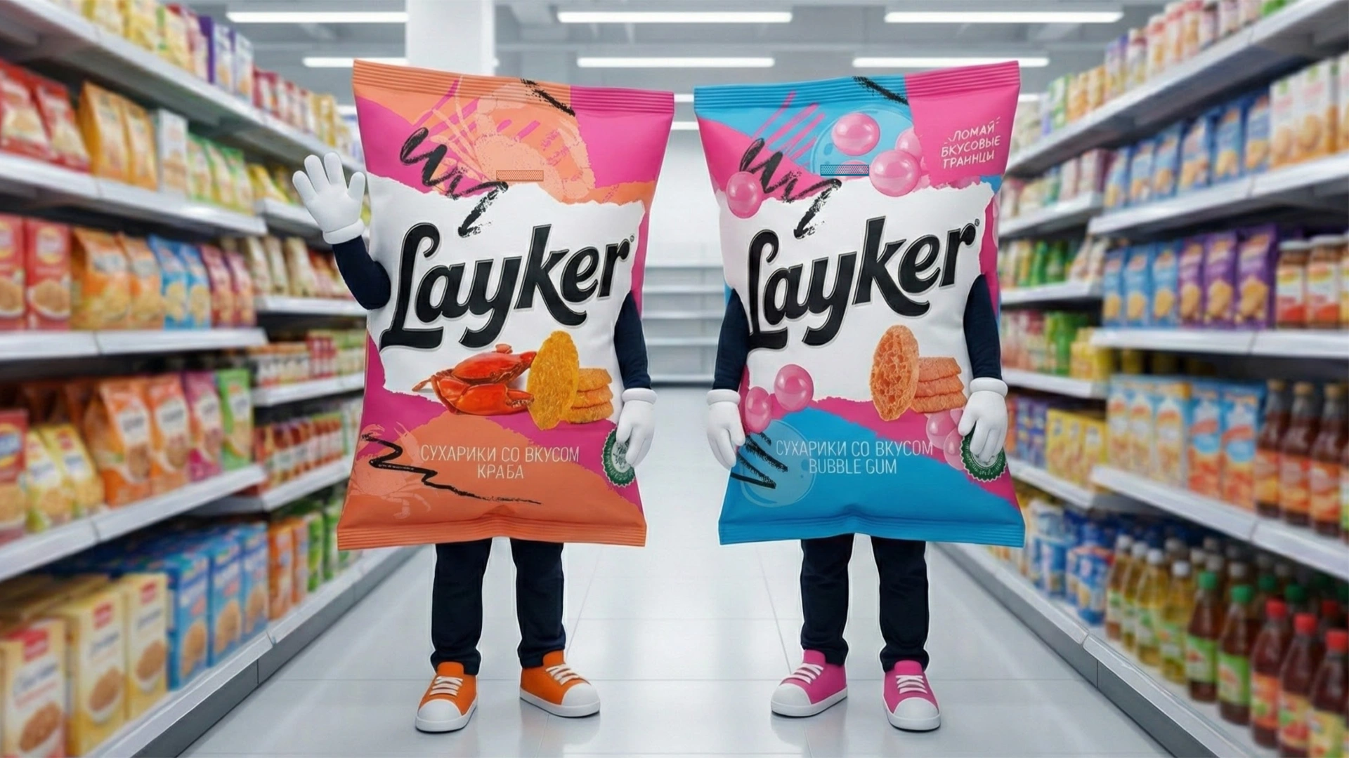
Layker – Snack Brand Naming and Packaging Design in Uzbekistan
Today you innovate — or you get pushed off the shelf! A shopper spends only 3–5 seconds choosing a product at the shelf. If your product doesn’t capture attention, there will be no purchase.

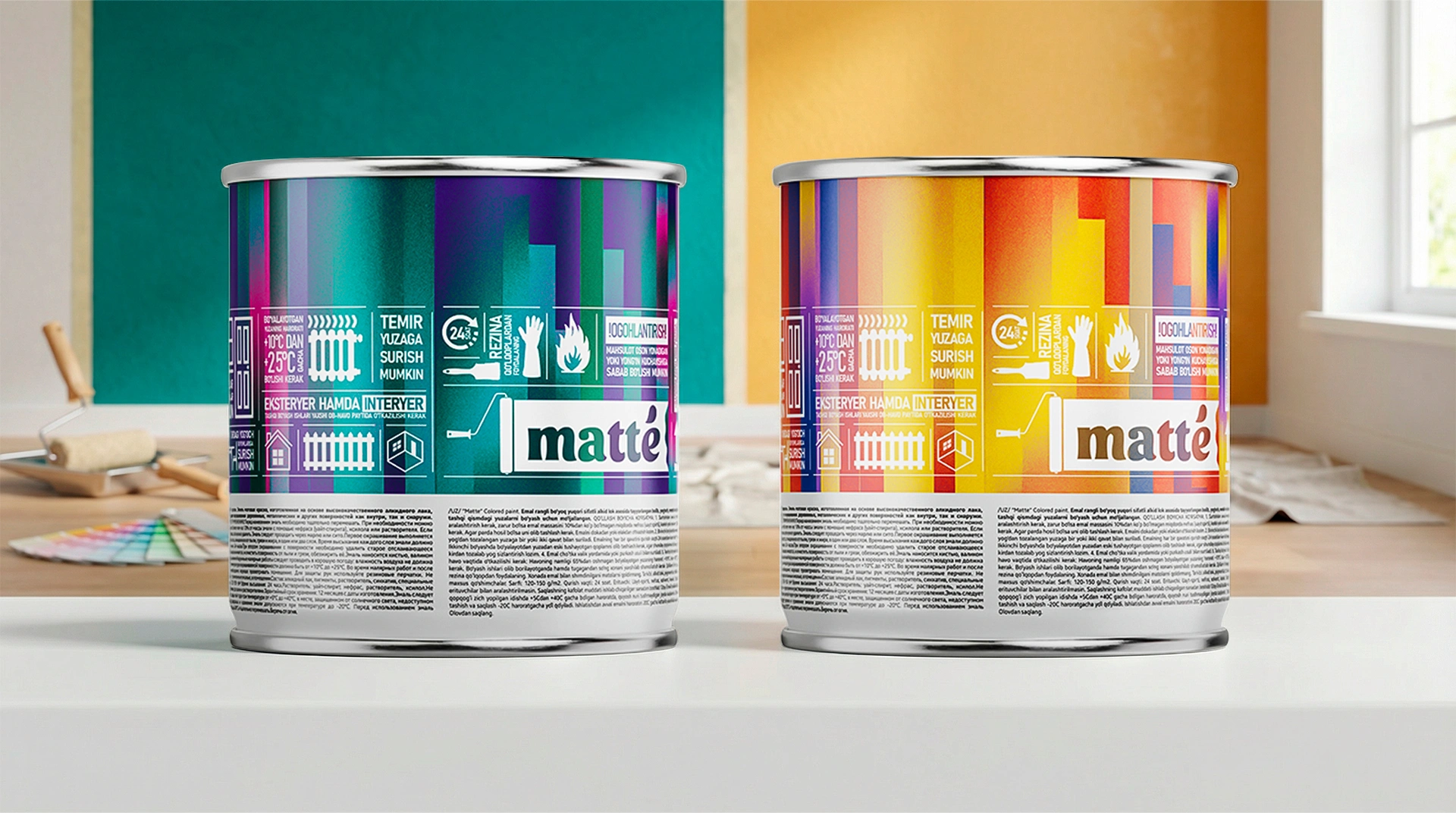
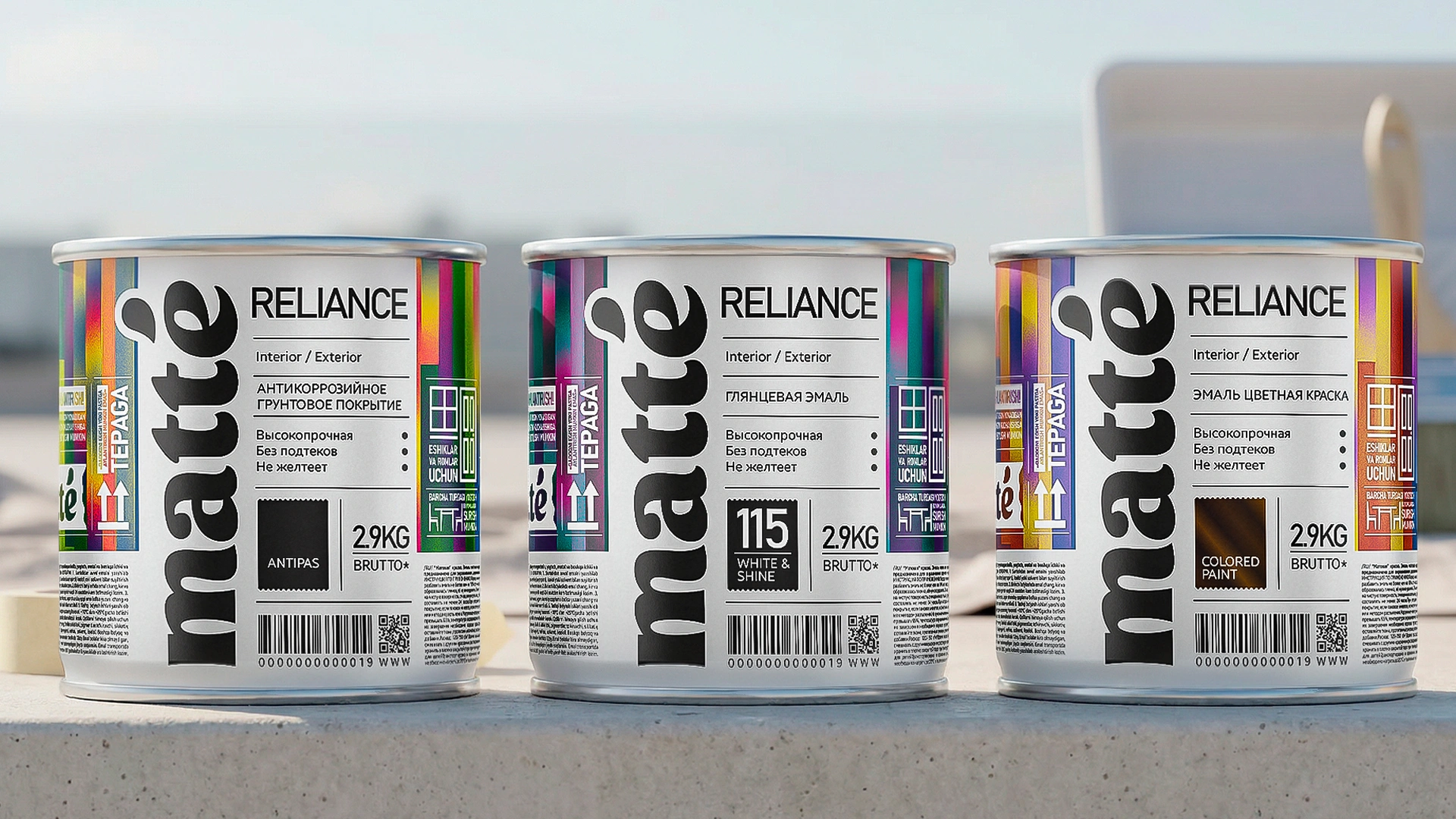
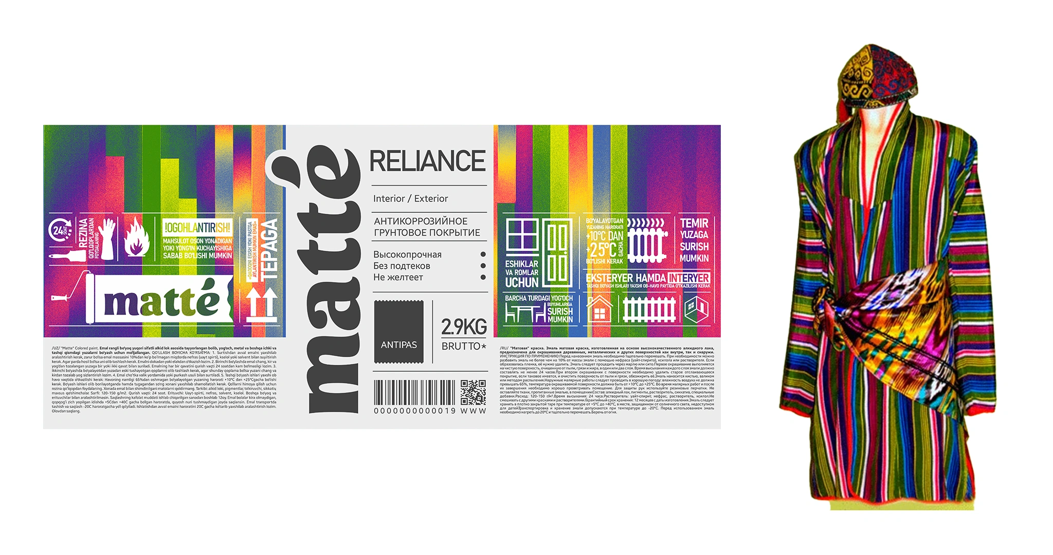
Matte – Naming, Logo and Packaging Design for Facade and Decorative Paints
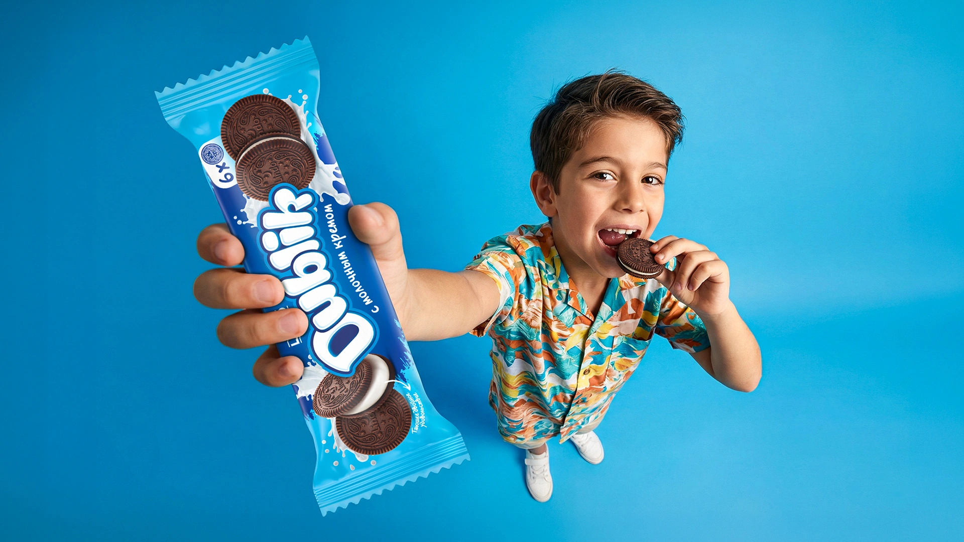
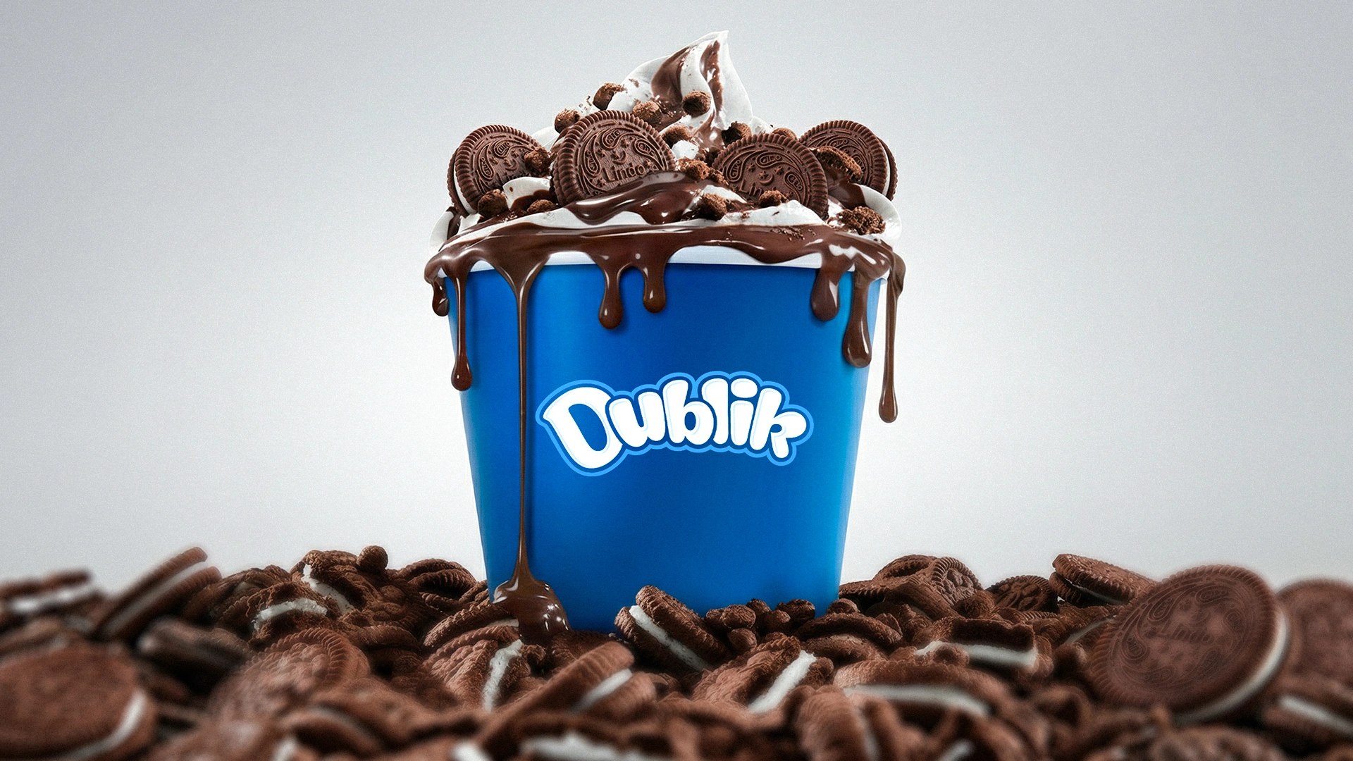
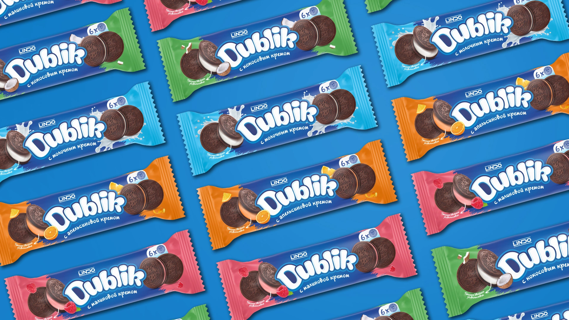
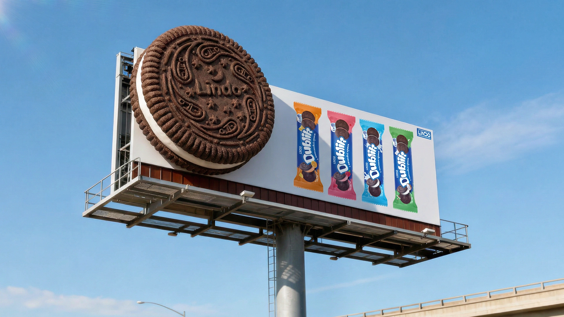
Dublik – Naming and Packaging Design for a Sandwich Cookie Brand in Uzbekistan
MONDAY – Express Branding for an Ice Cream Brand in Uzbekistan
Name, logo, and competitive packaging design developed within 2 weeks for an MVP product launch.