


10.11.2026
The Food Zone on Packaging: Photo, 3D or Illustration?

The food zone is often chosen by the designer’s taste or by the photo-shoot budget, although the decision should be made by the product, the range and the promise the packaging makes to the shopper. Photography, 3D visualization and illustration show filling, texture and scale differently, behave differently across a range of ten SKUs and carry different risks of disappointing after the first bite. Below is how to match the technique to the task, where each one is weak and how not to promise more with the picture than is in the pack.
In short. Photography is chosen when the product is beautiful in itself and can be shot the way the shopper will see it: meat, baked goods, dairy. 3D is needed for a range with shared angles, a filling in cross-section and a launch before production starts. Illustration suits children’s, craft and premium brands, where mood matters more than literal texture.
What is the food zone and what job does it do?
The food zone is the part of the packaging that shows the product itself or a dish made from it, and its job is to explain flavor, filling and texture in a second. The shopper cannot taste a wafer through the film, so they taste it with their eyes. Why the decision at the shelf takes only seconds is covered in our article on the 3–5 seconds at the shelf.
The food zone has three jobs:
- Show the flavor. A cross-section, the filling, ingredients next to the product: strawberries, cocoa, herbs.
- Set the expectation. The picture promises a size, color and juiciness that the shopper will later compare with what comes out of the pack.
- Tie the range together. One angle and one light across all flavors turn ten packs into a family rather than a random set.
The second job is the trickiest. In a study by Wageningen University (Timmerman, Piqueras-Fiszman, Foods, 20 August 2019), most participants did not notice a mismatch between the ingredients drawn on a juice label and the ingredient list. But when the mismatch was noticed — before purchase or after tasting the drink — the feeling of being deceived grew and the willingness to buy fell (Foods). The food zone sells the first pack; the second one is sold by a product that matched the picture.
When is it better to photograph the food zone?
Photography wins when the product’s real texture is more appetizing than any model: the fibers of meat, a bread crust, sour cream with herbs, juicy fruit. A photo reads as a document: the shopper sees that such a product really exists.
An important caveat: a shoot is not “taking a picture of the product on a table.” It needs a food stylist, studio lighting and the product in perfect condition, and for a range, the same angle and light for every flavor. If a new flavor appears a year later, it has to be shot under the same conditions, otherwise the pack drops out of the family.
Photography also strengthens an ingredient shown fresh. In an experiment by Japanese researchers (Shibuya, Miyamoto, PeerJ, 2025), 42 participants rated expected taste from pictures: an image of a can of pineapple produced noticeably lower expectations than an image of a fresh pineapple (PeerJ). The practical takeaway: a fresh ingredient in the frame works for flavor, while industrial packaging works against it.
The weak points of photography:
- a shot cannot be “rotated”: a new angle means a new shoot;
- glare, crumbs and overexposure turn into dirt in print; how to prepare such files for the printer is explained in our article on handing artwork over for print;
- if the line is only being launched and the product does not exist yet, there is nothing to shoot.
When does 3D visualization win?
3D is chosen when you need to show what is hard to photograph — a filling in a perfect cross-section, melting chocolate, flying ingredients — and repeat it across ten SKUs with the same light. The model is built once, and then the filling, color and angle are changed without a new shoot.
3D has two more advantages:
- Launch before production. The packaging can be approved and printed while the line is still being set up and there is no serial product.
- Angles for the marketplace and advertising. The same model provides shots for the product card, banners and video.
The risk of 3D is “plastic” food. Surfaces that are too smooth, perfect symmetry and sterile light give away the computer, and the product looks artificial. A good model reproduces the irregularities of the real product: the pores of a wafer, a crack in the glaze, layers of different thickness. The second risk is the temptation to draw more filling than the factory actually puts in. The model is built from a real sample cut in half, not from a marketer’s dream.
When is illustration needed?
Illustration is chosen when the packaging must convey mood and character rather than literal texture: in children’s products, in craft and farm brands, in premium and gift series, and for products that are not photogenic in themselves — flour, spices, grains.
The children’s segment in Uzbekistan is huge: according to the census, as of 15 January 2026 there were 11.9 million children under 14, or 30.4% of the population (stat.uz). For them, illustration and a character often work better than a photo: a child recognizes the hero, not the texture of a cookie.
Illustration promises less, so it disappoints less often. But in impulse categories — snacks, sweets, ice cream — it loses to photo and 3D on appetite appeal if it does not show the product recognizably enough. How color and shape work without a literal image is covered in our article on color and shape psychology.
How do photo, 3D and illustration compare by task?
The technique depends on the product, the size of the range and whether the product exists at the time of design.
| Criterion | Photo | 3D visualization | Illustration |
|---|---|---|---|
| Strength | Credibility, real texture | Control over light, cross-section and angle | Brand character and mood |
| Most often suits | Meat, baked goods, dairy, fruit | Ranges with many flavors, fillings, launch before production | Children’s, craft and premium products, spices, dry goods |
| New SKU in the range | A new shoot under the same conditions | Swapping filling and color in the existing model | Drawing more in the same style |
| Is a finished product needed | Yes | A sample for measurements and a cross-section is enough | No |
| Main risk | Inconsistent light and angles across the range | “Plastic” food, exaggerated filling | Weak appetite appeal in impulse categories |
Techniques can be combined: a product photo on an illustrated background, a 3D cross-section and drawn ingredients. There is only one rule: the chosen visual language is kept across the whole range.
How not to mislead the shopper with a picture?
The food zone shows only what is in the pack, in the form and scale in which the shopper will receive it, and a dish prepared from the product is labeled as such.
In Uzbekistan these requirements were spelled out in the General Technical Regulation on food safety in terms of labeling (Cabinet of Ministers Resolution No. 490 of 12.07.2017). Clause 85 prohibited depicting products that are not in the composition and whose flavor is not imitated, and clause 86 required an image of a dish to be accompanied by the words “serving suggestion” (text of the regulation). An important caveat: on 2 September 2025 the regulation lost force under Resolution No. 553 (lex.uz), and which document now governs images on labels could not be established from open sources. The rules themselves remain sound practice, and for export the norms of the destination country are checked separately.
A checklist for an honest food zone:
- Every ingredient in the picture is in the composition, and if a flavor is imitated, this is clear from the name: “strawberry flavored.”
- The filling in the cross-section matches the product from the line in volume.
- The size of the product in the picture does not mislead about the quantity in the pack.
- An image of a dish is labeled “serving suggestion” in all the languages on the pack.
- The product color after printing matches reality: the color proof has been approved.
- For export, the requirements of the destination country have been checked.
What this looks like in practice: food zones in Minim projects
Two of the agency’s projects show two different techniques.
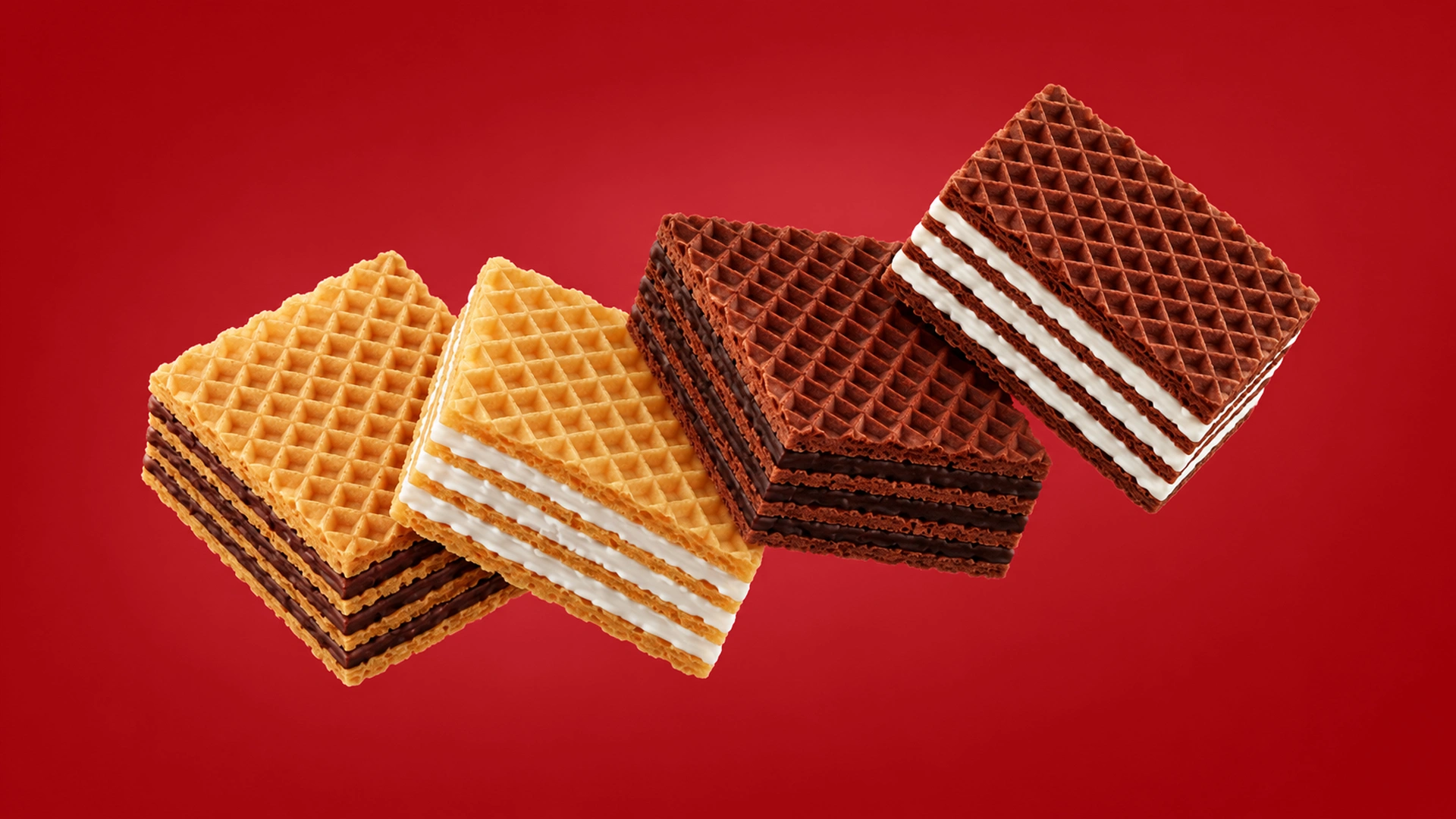
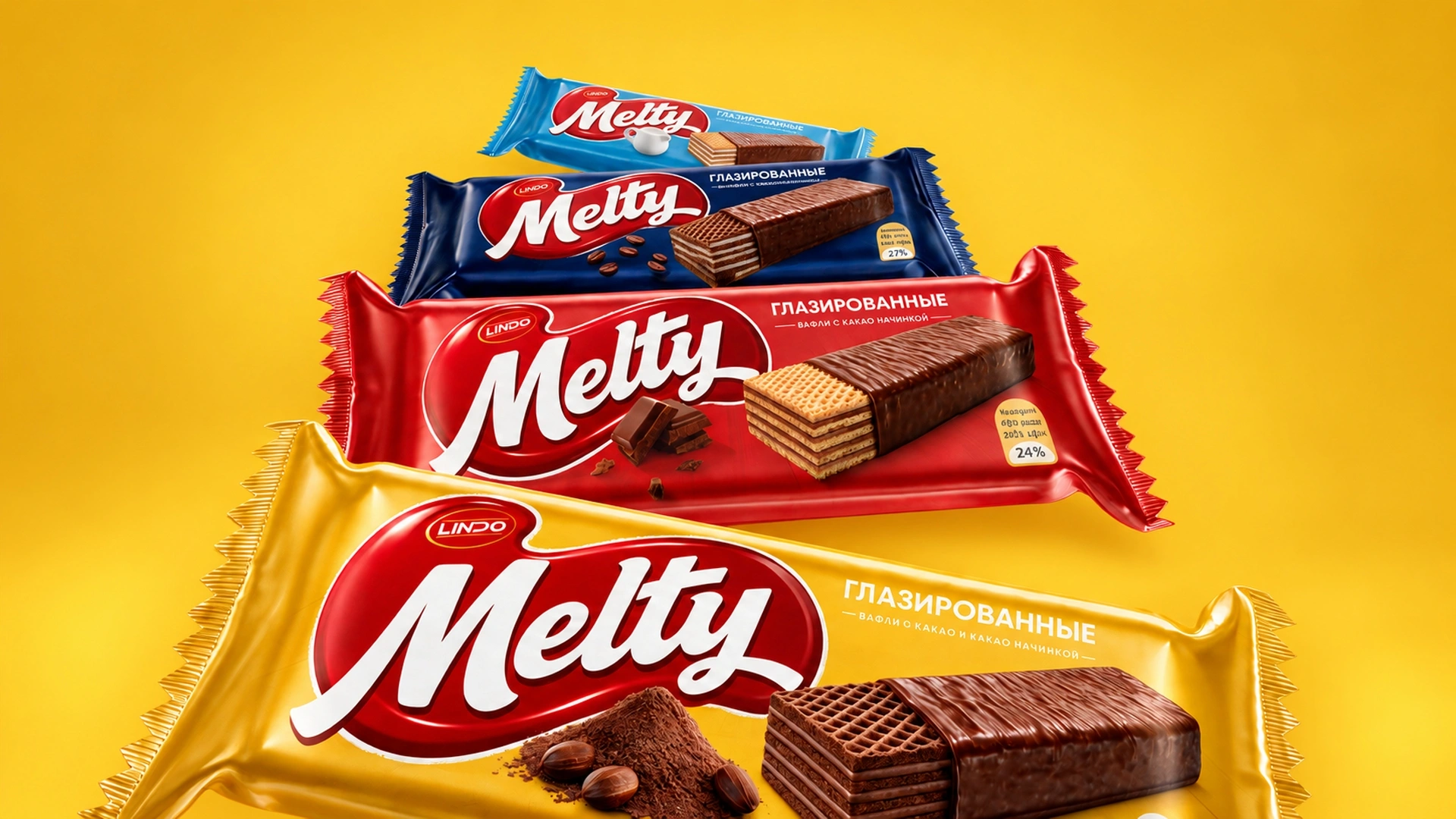
Melty: 3D for a wafer range. Lindo was launching a new line of wafers that had neither a name nor a design concept. To make the wafers and chocolate pieces look as realistic as possible and show the filling at once, Minim built 3D models of each element. The background color was tied to the flavor: light blue for baked milk, dark blue for cocoa with milk, yellow for chocolate wafers and red for classic. The system was adapted for 150 g family packs and large stand-up pouches. At the time the case was published, the project was at the launch stage.
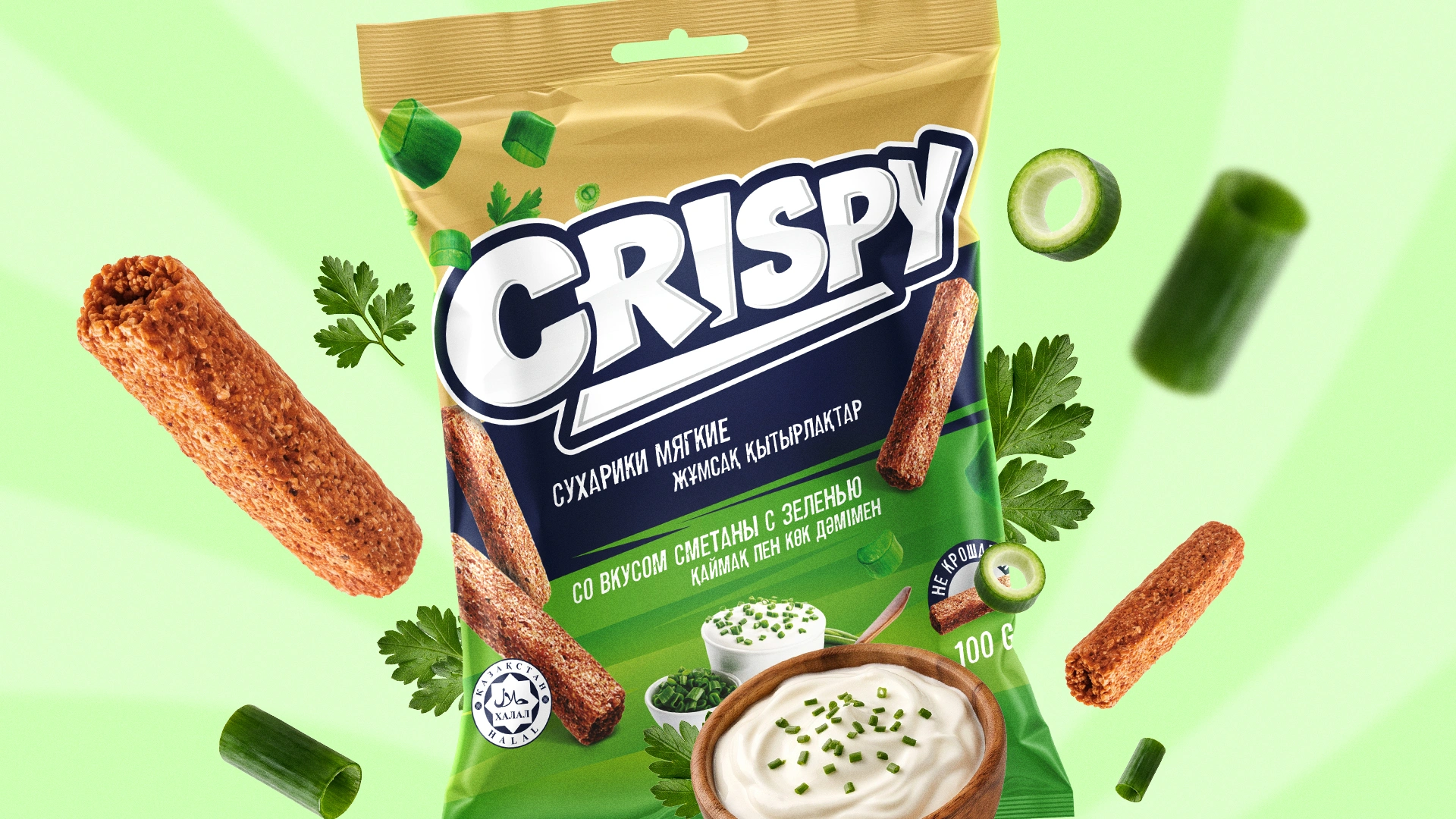
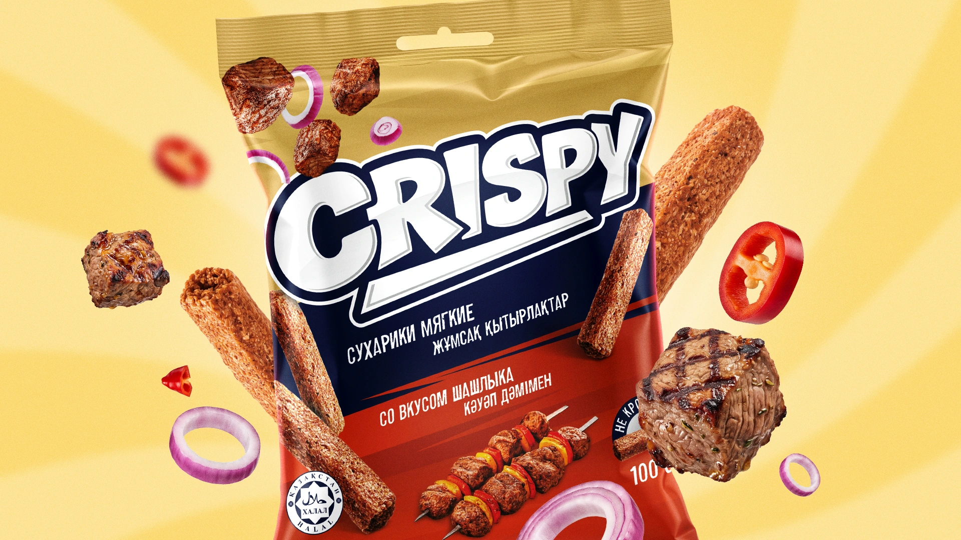
Crispy: photography and flying ingredients. For the soft croutons of the Shymkent producer Baraka N1, the client set conditions: brand first, no characters or mascots, a color line of its own for each flavor. The food zone was built from realistic photos of the croutons and an appetizing serving — a bowl of sour cream with herbs, cheese, meat — while green onion, parsley and pieces of meat and cheese fly around the logo. The client put the task in his own words: “The shashlik has to fly!” The first Crispy products are already on sale.
“The food zone is a promise that the shopper checks with the very first bite. That is why we choose the technique not by fashion but by the product: what it can show by itself, and what needs to be carefully built up.” — Lazizkhuja Sharipov, founder and director of Minim Design
Frequently asked questions
What is the food zone on packaging?
The food zone is the area of the packaging that shows the product itself or a dish made from it: a wafer in cross-section, yogurt with berries, croutons with sour cream. In a second it explains flavor, filling and texture and sets an expectation that the shopper will compare with the product after purchase. That is why the food zone has to be both appetizing and honest.
Which is better for the food zone: photo or 3D?
Photography is better when the product’s real texture is appetizing in itself and the range is small: meat, baked goods, dairy. 3D pays off for a range with many flavors, for a filling in cross-section and for a launch when the product does not exist yet. The model is built once, and then the filling, color and angle are changed without a new shoot.
When is it better to use illustration instead of a photo on packaging?
Illustration fits when mood and character matter more than literal texture: children’s products, craft and premium brands, gift series, as well as flour, spices and grains, which do not look good in photos. In impulse categories illustration must show the product recognizably; otherwise it loses to photo and 3D on appetite appeal.
Do you need to label an image of a dish on the packaging?
Yes, it is sound practice. Uzbekistan’s 2017 food labeling regulation (Resolution No. 490) required the words “serving suggestion” and prohibited depicting products that are not in the composition. In September 2025 the regulation lost force, so the current requirements and the norms of the export country should be checked before printing.
Why does 3D food on packaging sometimes look artificial?
Most often because of surfaces that are too smooth, perfect symmetry and sterile light: that is what a computer looks like, not food. A good model reproduces the irregularities of the real product — the pores of a wafer, cracks in the glaze, layers of different thickness. It is built from a real sample cut in half, and the final color is checked on a color proof before the run.
Key takeaway
The food zone sells the first pack; the second is sold by the picture matching the product. That is why the technique is chosen not by fashion or the shoot budget but by three questions: what the product can show by itself, how many flavors the range will have and whether the product exists at the time of design. Photography gives credibility, 3D gives control over the cross-section and one light for the whole range, and illustration gives character where literal texture is not the point. A good food zone is not the most beautiful picture on the shelf, but an honest promise that the product keeps from the first bite.
About the author. Lazizkhuja Sharipov is the founder and director of Minim Design and has led the agency since its founding in 2019.
About Minim Design. Minim Design is a packaging design agency from Tashkent, founded in 2019. The team has more than 20 specialists, and the agency has 1,156 completed projects and exports its services to 12 countries. Minim runs the entire project: naming, logo, packaging design, 3D visualization and print control. The agency’s work has been featured by Packaging of the World, Dieline and the World Brand Design Society.
Sources
- Foods (MDPI) — Timmerman, Piqueras-Fiszman, ingredient images on labels and the feeling of deception (20.08.2019): mdpi.com
- PeerJ — Shibuya, Miyamoto, visual stimuli and taste expectations (2025): peerj.com
- National Statistics Committee — 2026 population census results, age structure: stat.uz, PDF
- Lex.uz — Cabinet of Ministers Resolution No. 490 of 12.07.2017 and its status “lost force on 02.09.2025”: lex.uz
- Rosselkhoznadzor — copy of the text of Regulation No. 490, clauses 85–86: fsvps.gov.ru, PDF
Share

Other articles

10.11.2026
Packaging Design Development Stages: How the Minim Agency Works
Before ordering packaging design, a manufacturer wants to know three things: how long it will take, what they will see and at what point they can influence the result. And an explanation of why the result matters to us as much as it does to the client.

10.11.2026
Packaging for Uzum Market: How to Sell from the Screen and After Delivery
A shopper on Uzum Market only holds the packaging after they have paid. Below is what changes in packaging design when the main sales channel is a marketplace.

10.11.2026
How Much Does Packaging Design Cost in Uzbekistan and How to Choose a Contractor
“How much does packaging design cost?” is a question whose honest answer is “it depends,” which is exactly why it is irritating. Below is what the price is made of, how to compare quotes, what to put in the contract and how to choose a contractor.