Our works
Dive into the world of solutions we have created that inspire, build trust and make businesses successful
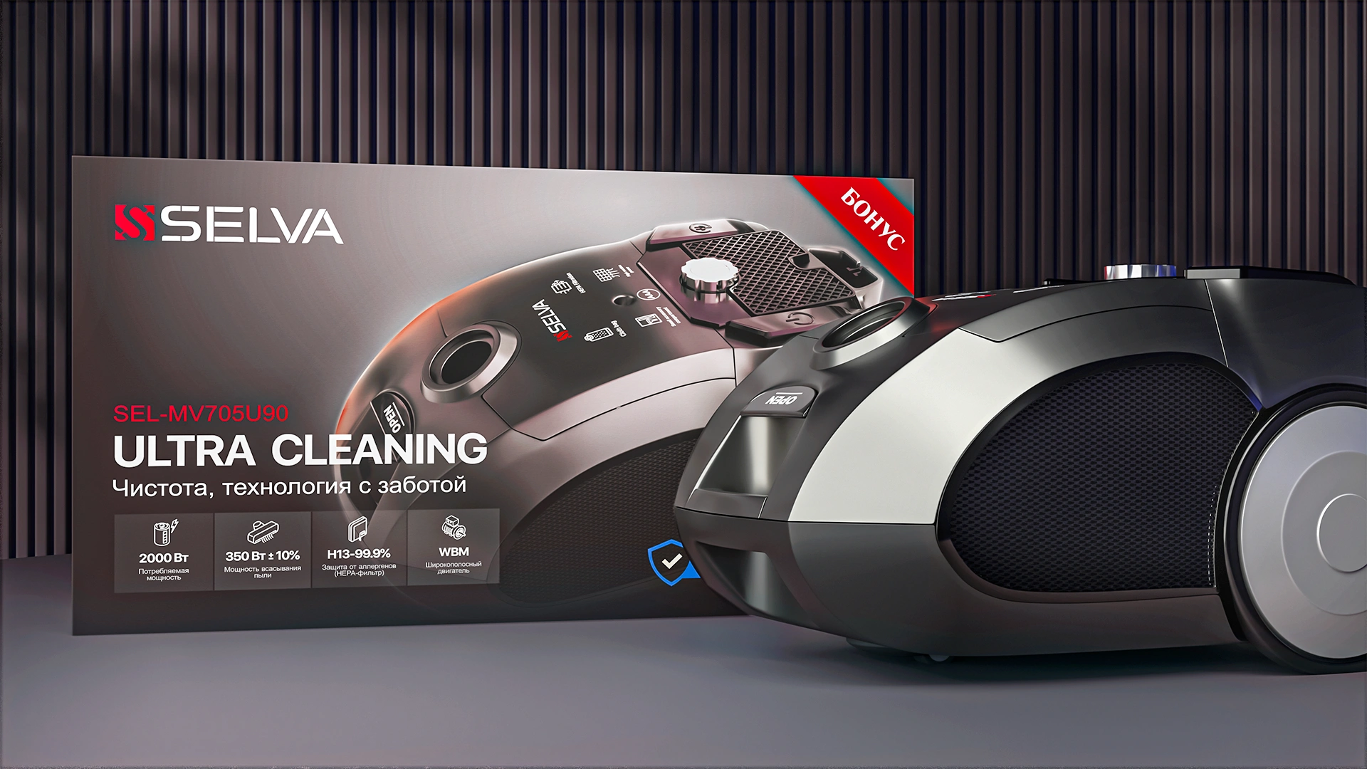
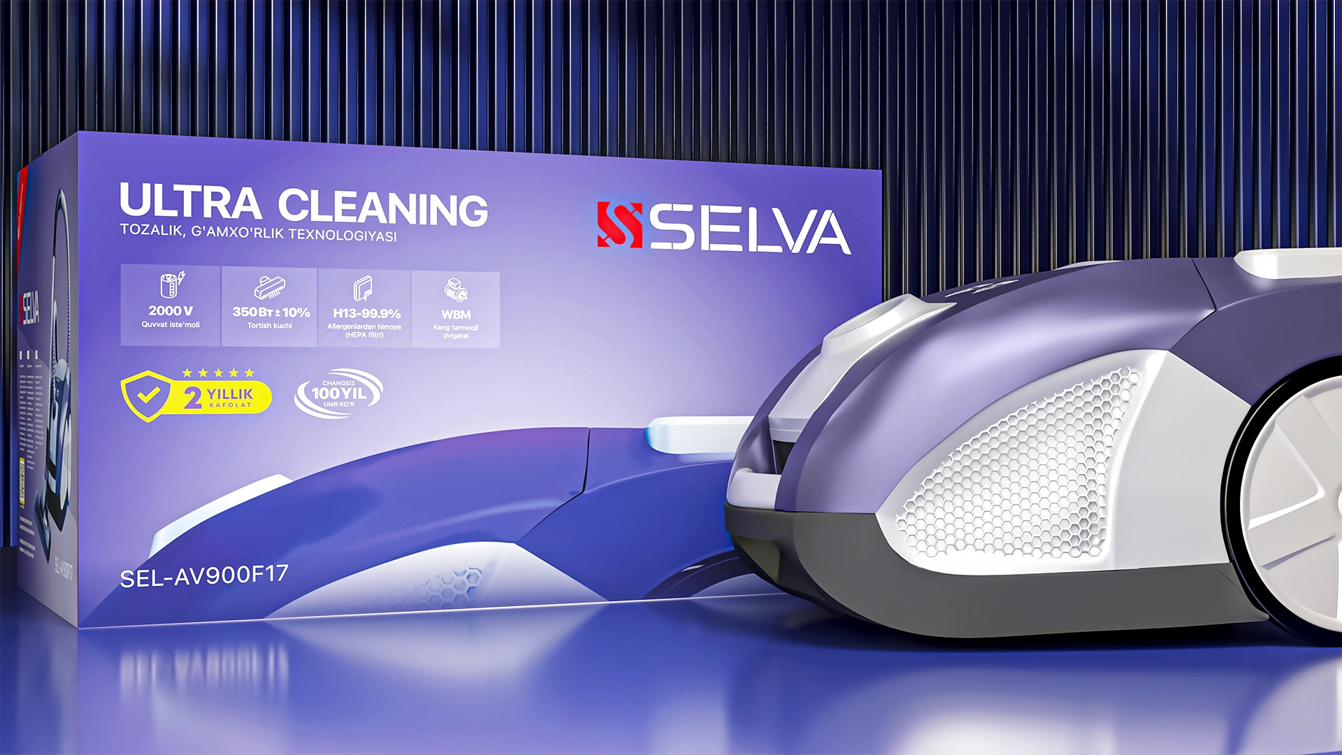


Selva — Vacuum Cleaner Packaging Design
Selva – Vacuum Cleaner Packaging Focused on Technology and Clarity
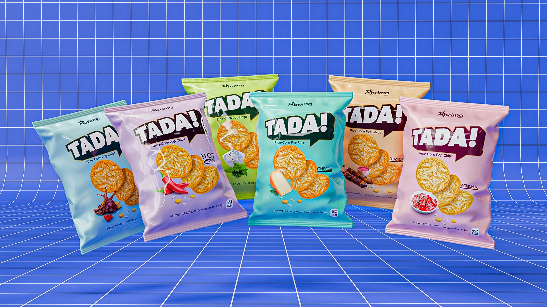

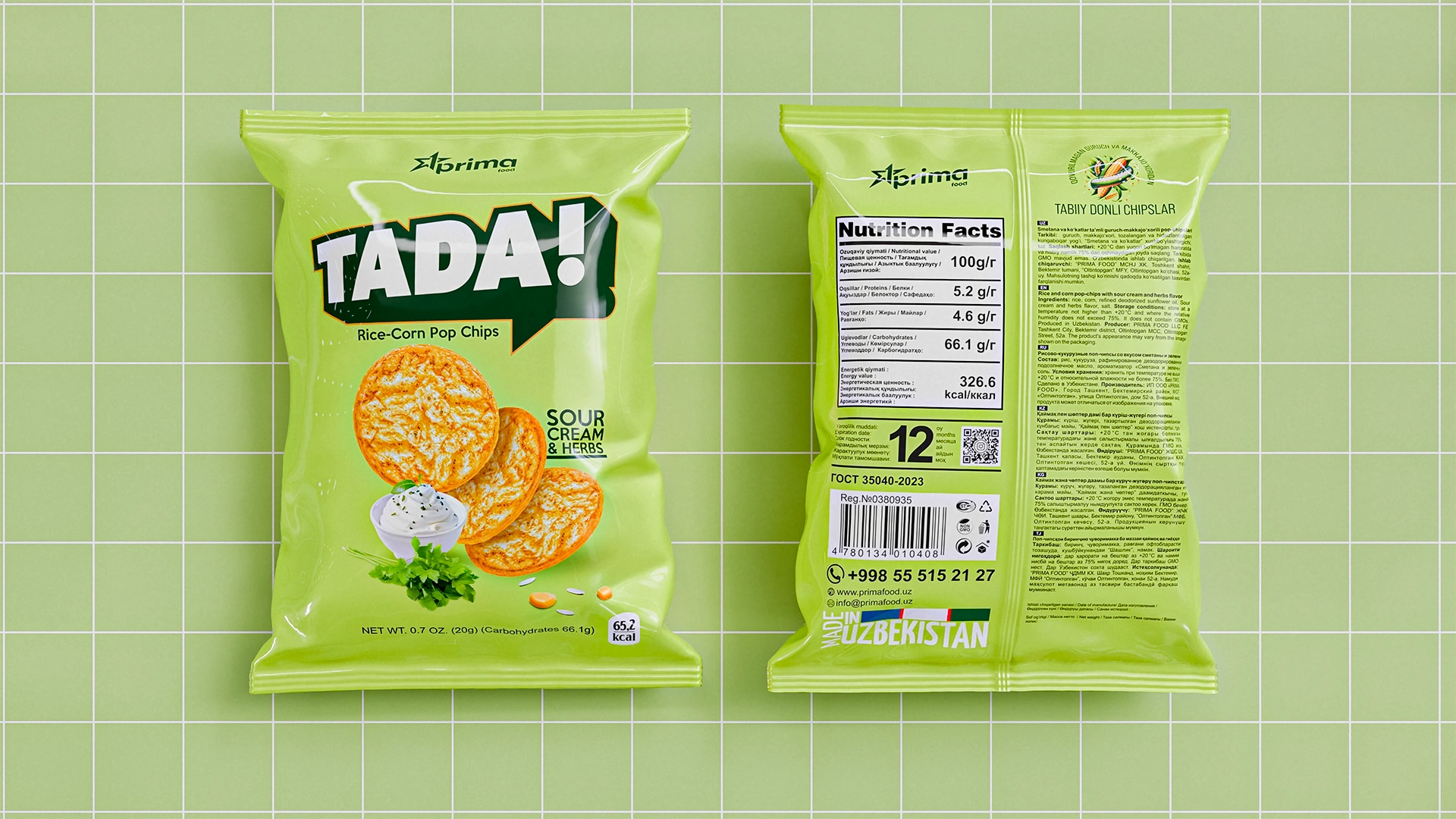
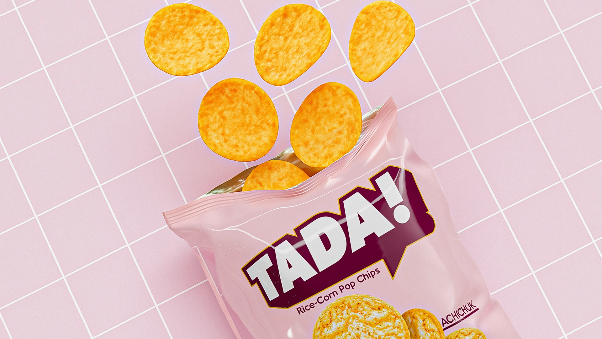
TADA! — Rice & Corn Chips Packaging Design
We developed a minimalist yet expressive packaging design for TADA! healthy chips (unfried). The pastel palette and clean chip visual convey health benefits. The contrasting logo ensures attention on the shelf.
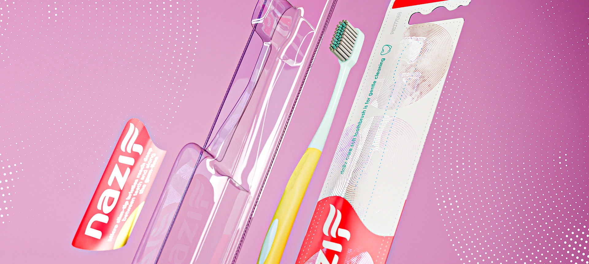

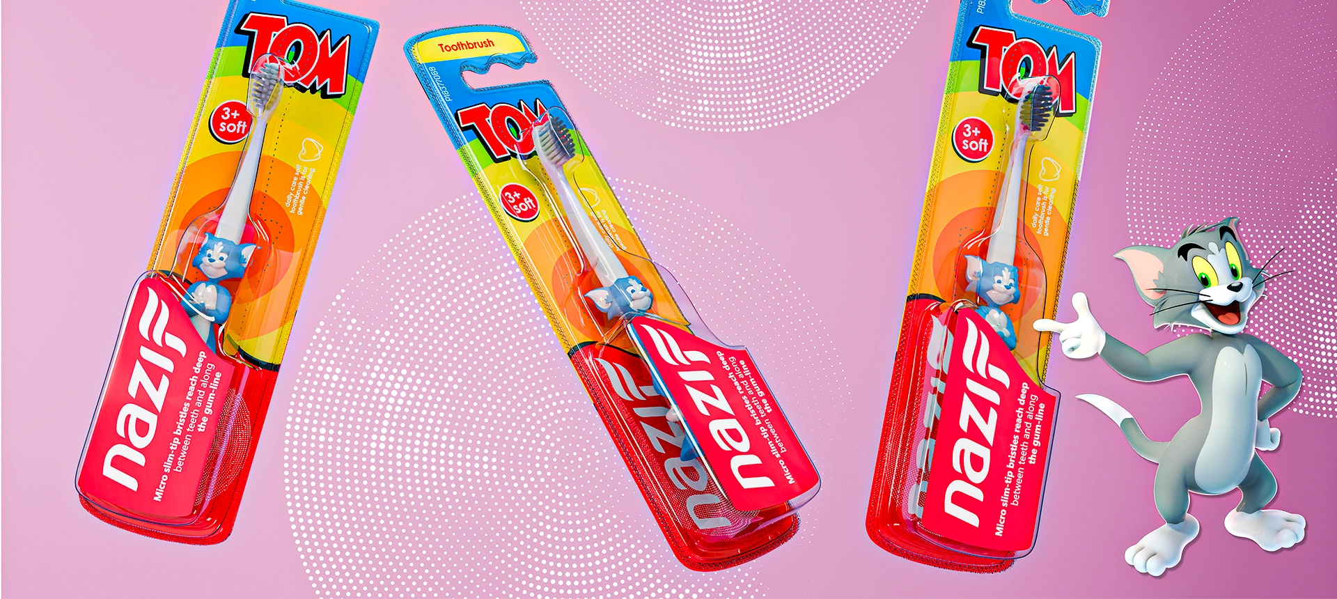
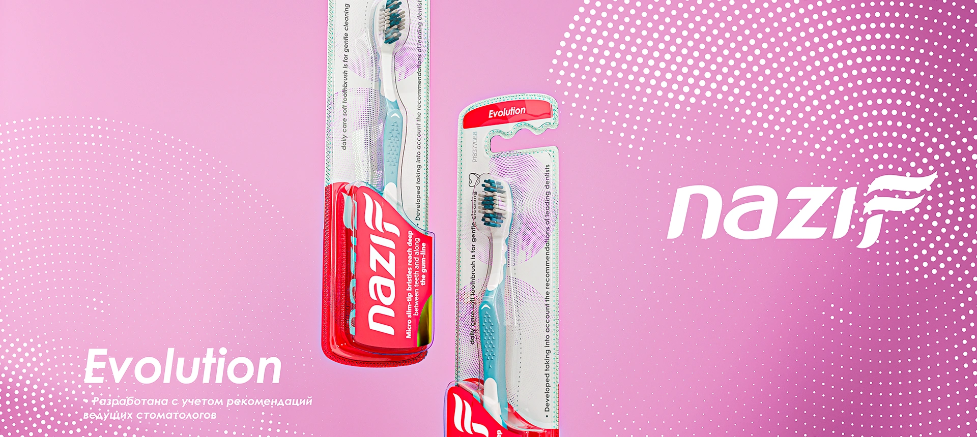
Nazif — Toothbrush Packaging Design
A unified and recognizable visual system was developed for Nazif ("clean") toothbrushes. Saturated red color, a toothpaste stream logo, and a clear blister structure ensured immediate standout on the shelf and communication of brand values.
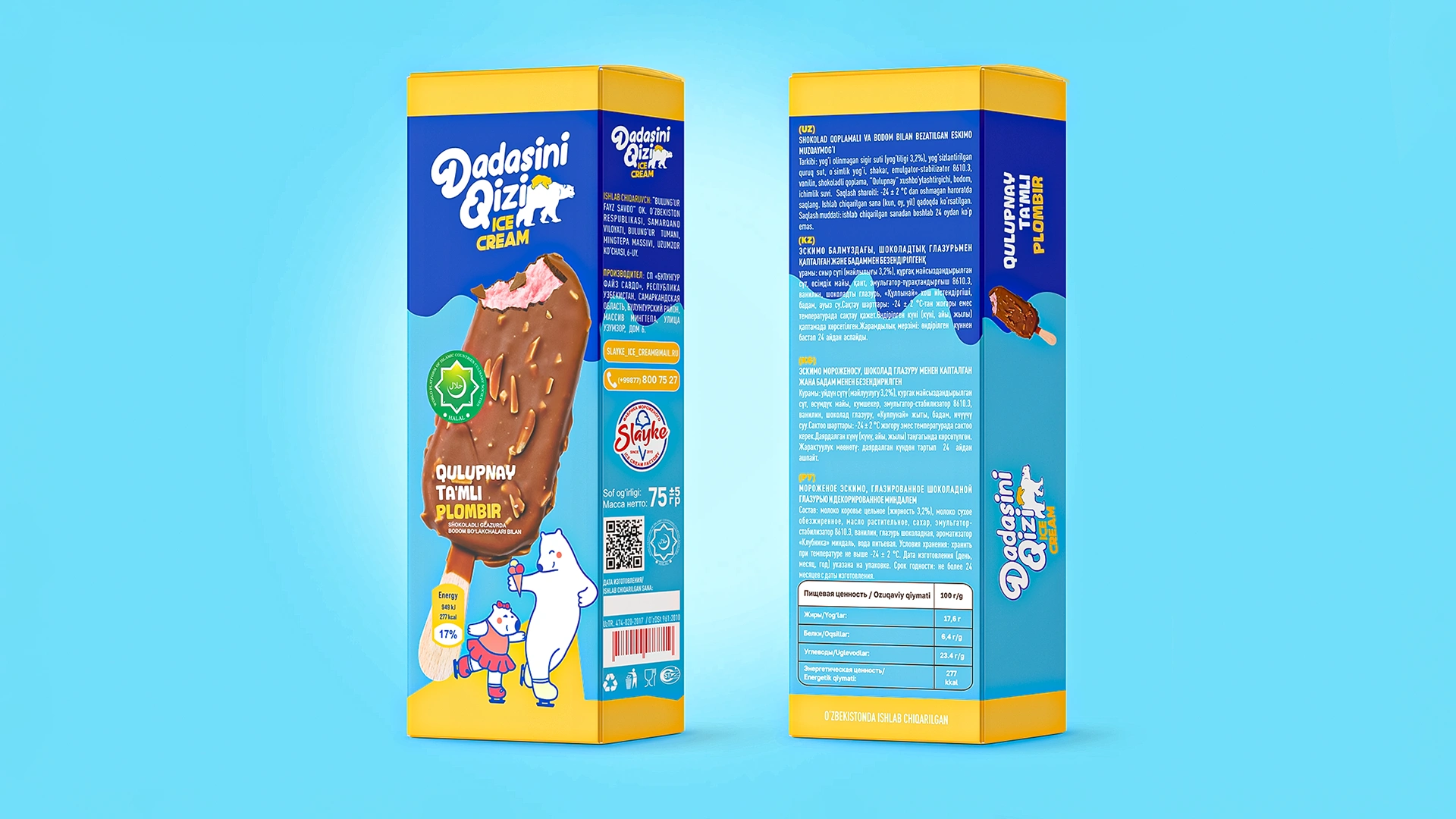
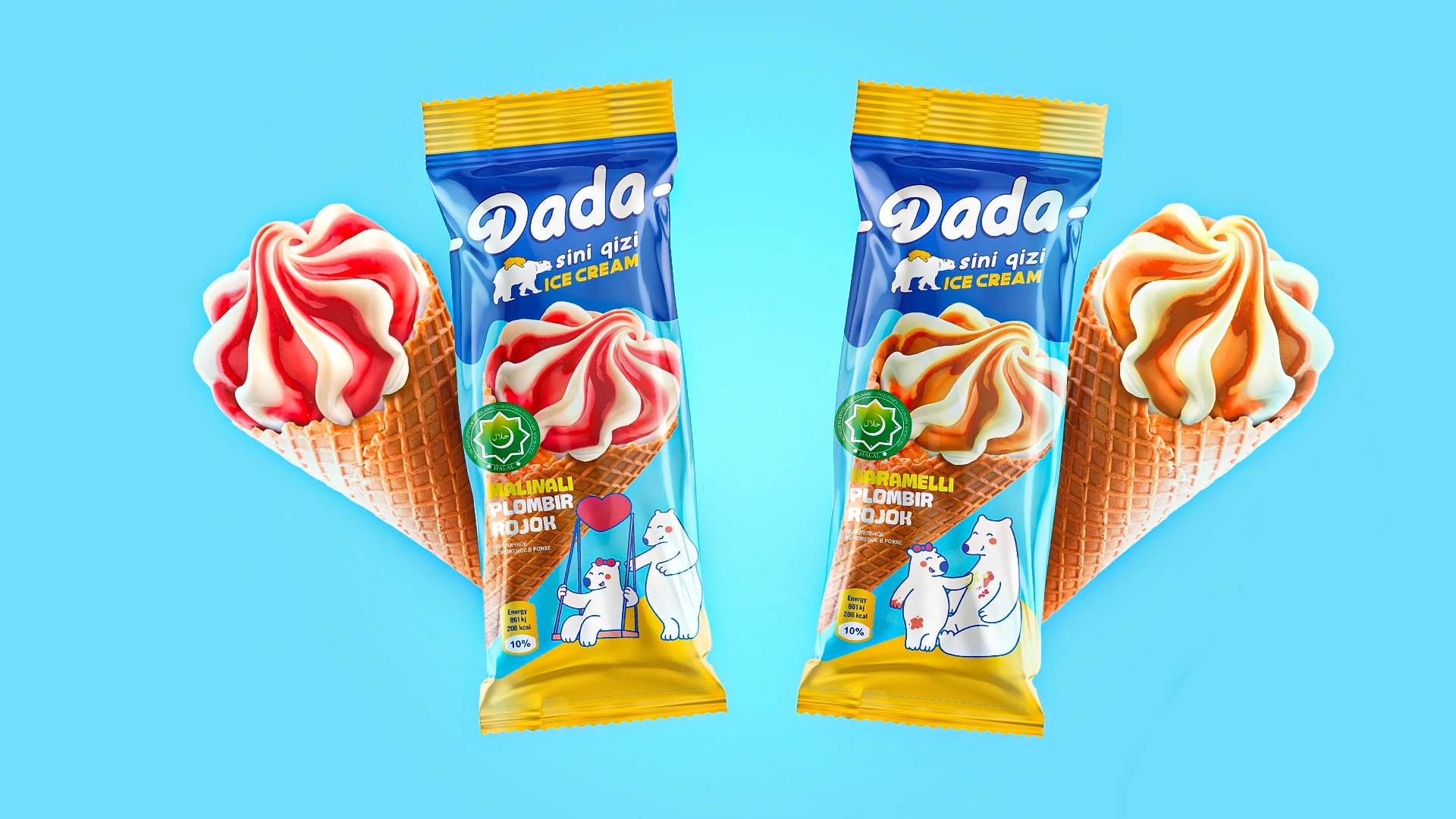
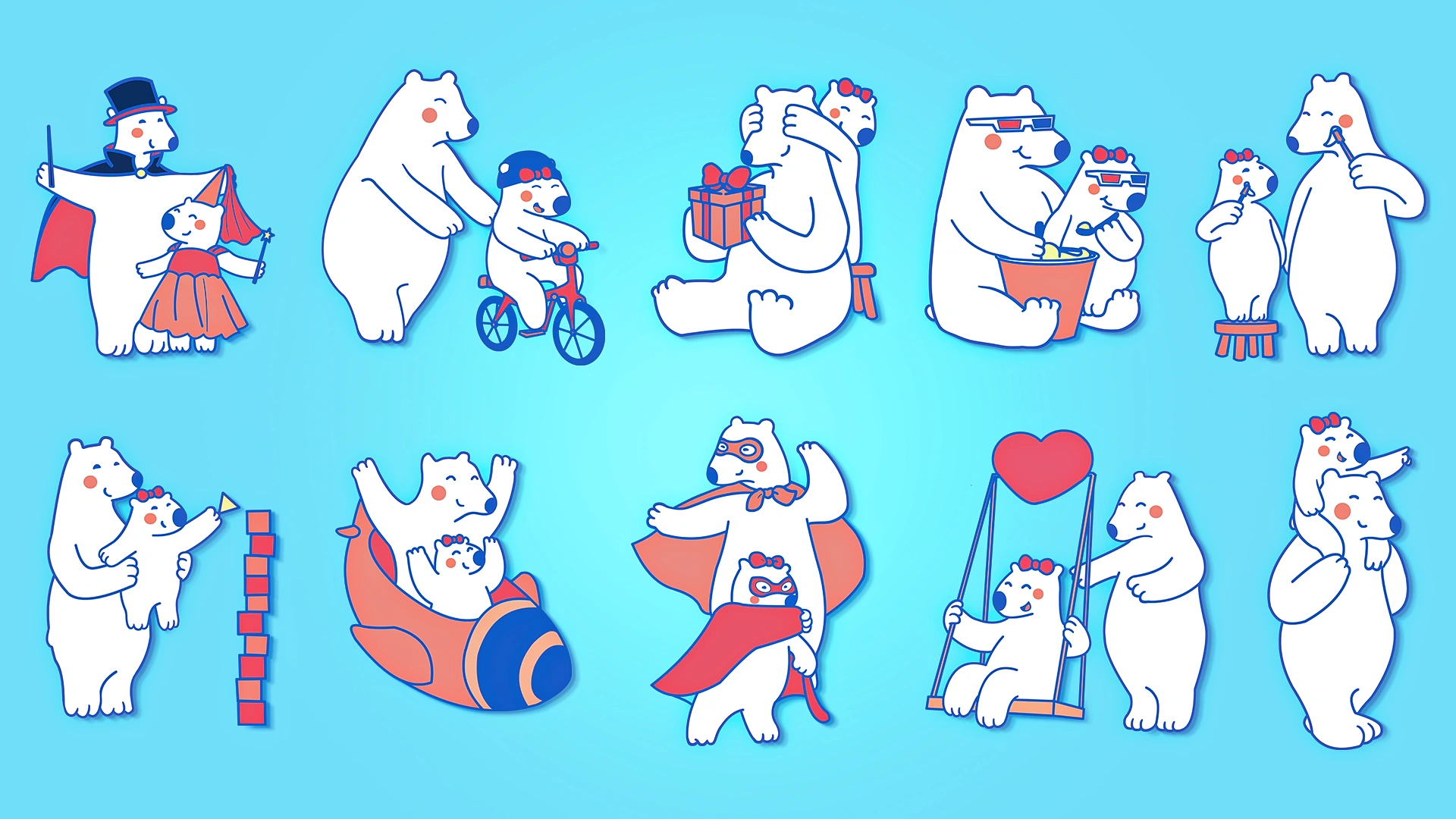
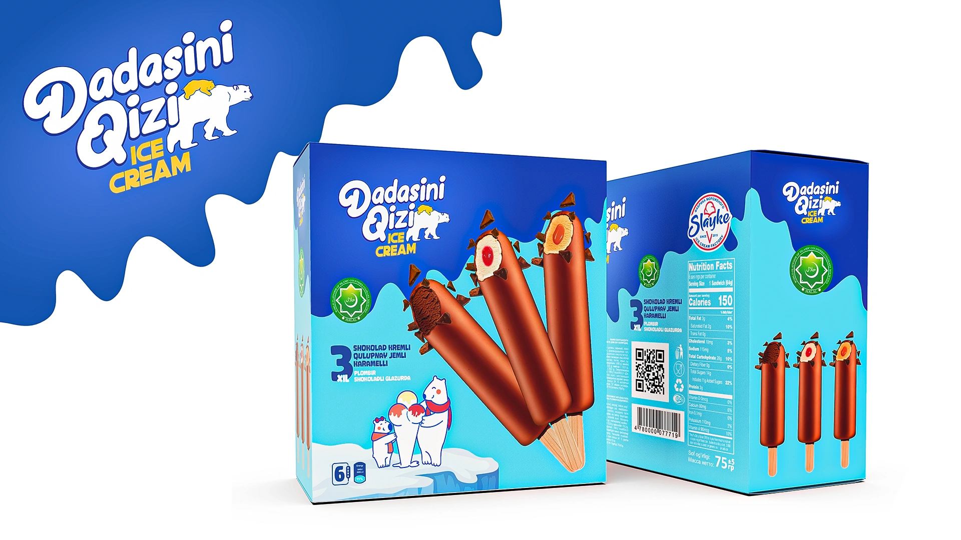
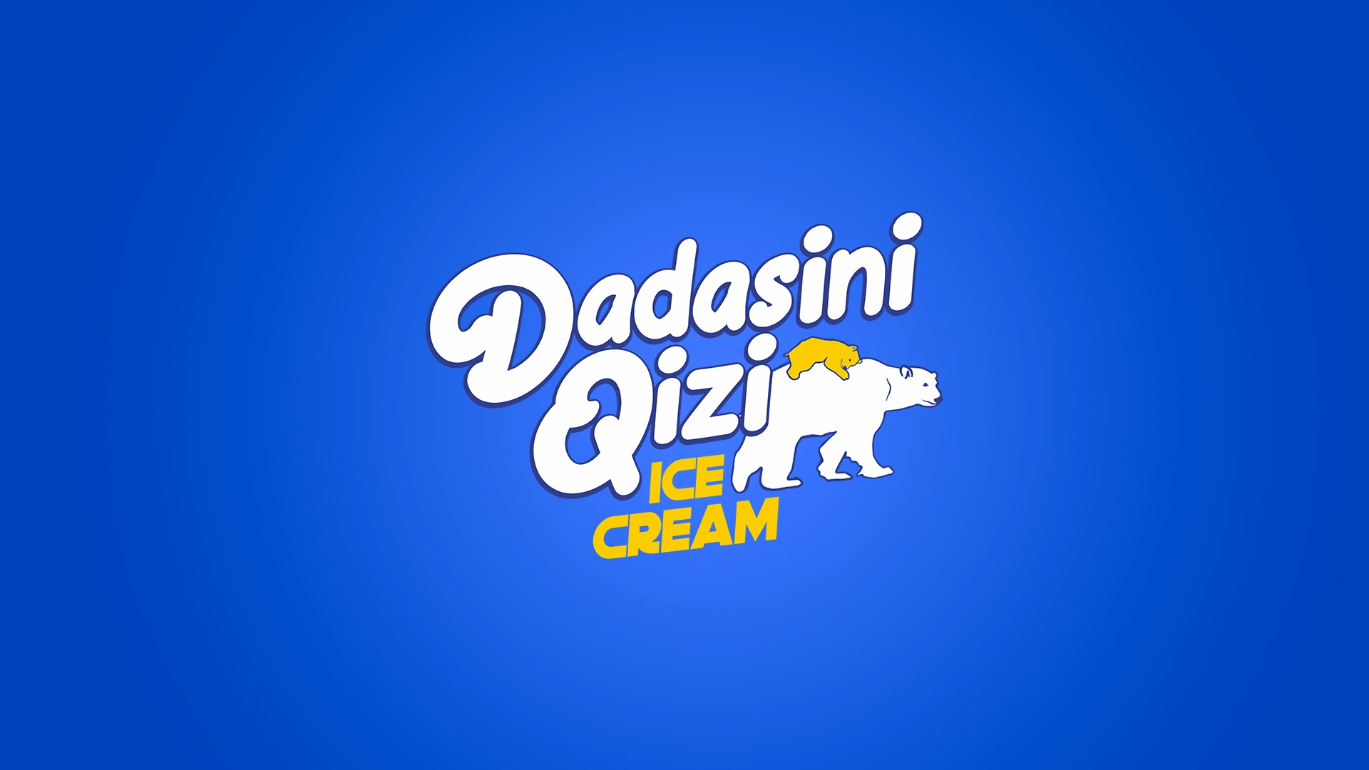
Dadasini Qizi: Family Ice Cream Branding
Complete branding for Dadasini Qizi ("Daddy's Daughter") ice cream was developed. The design with mascots (father bear and daughter) and a unique palette (blue/yellow) reflects family values, joy, and care, creating a strong emotional connection.
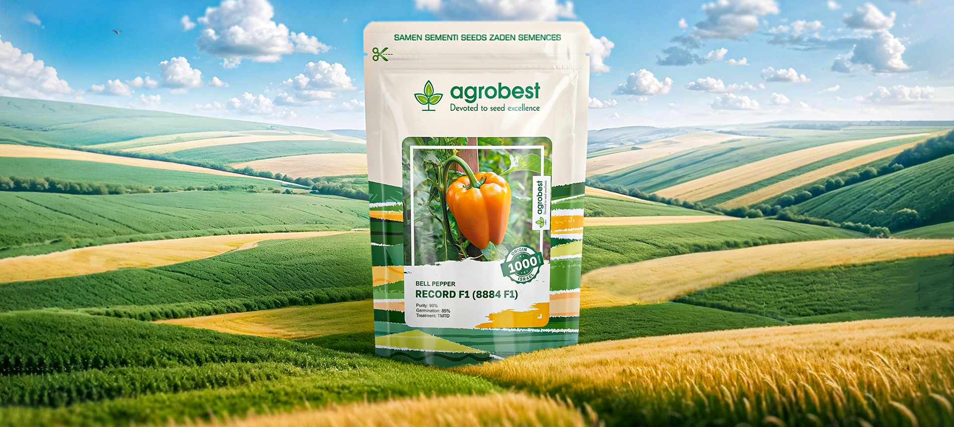
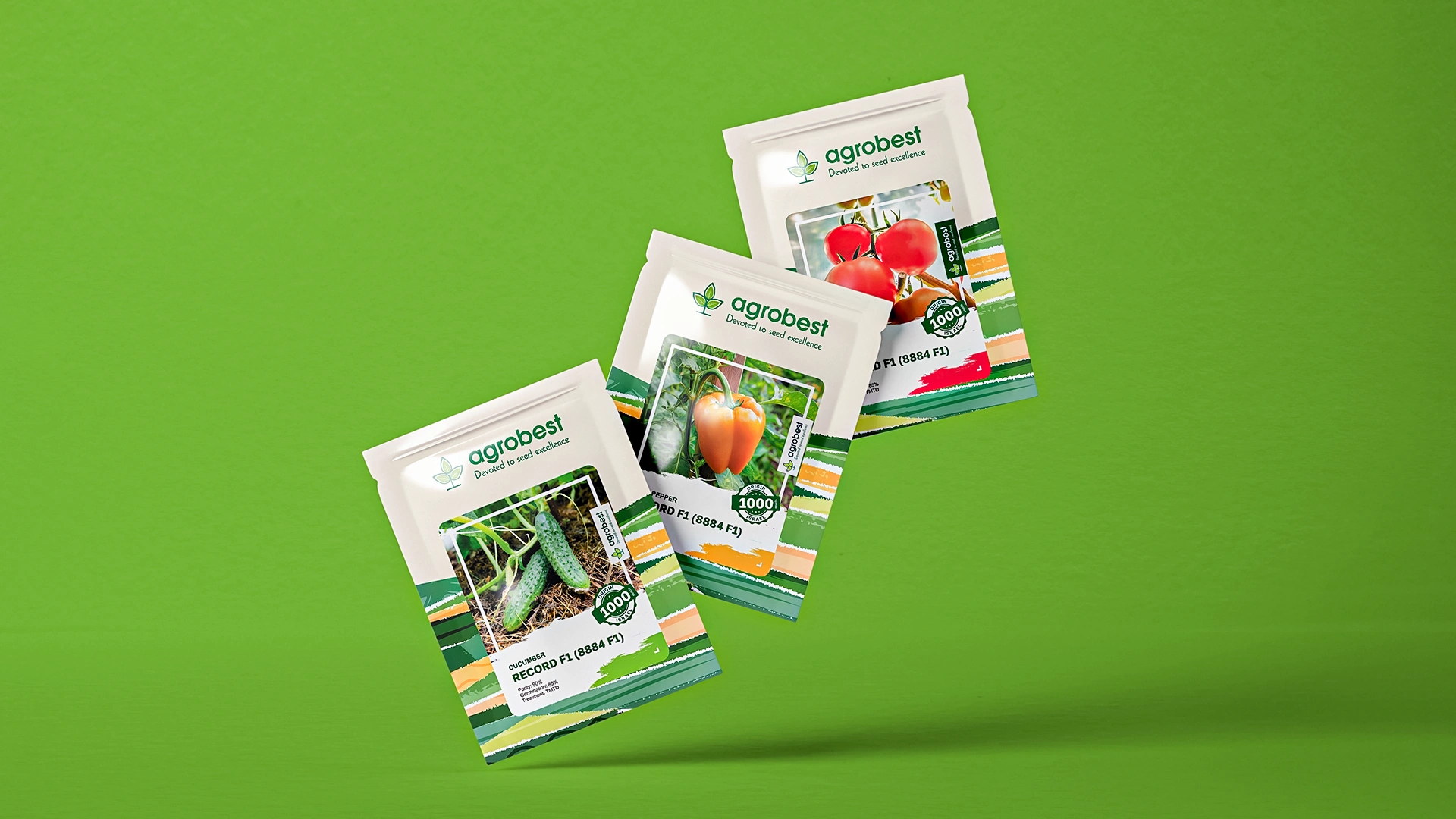
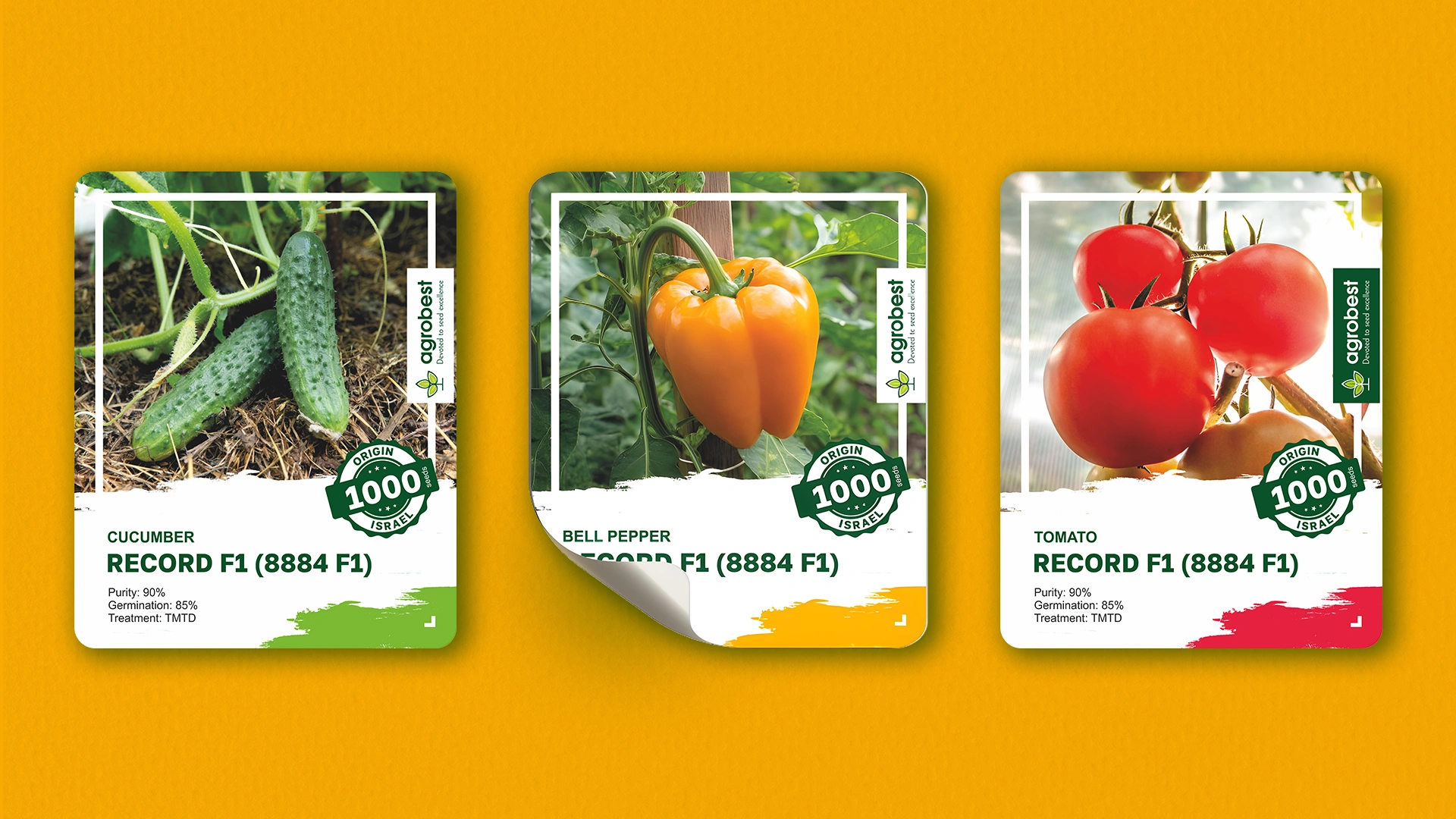
Agrobest — Organic Seed Packaging Design
A modular packaging design was developed for Agrobest organic seeds. The "field from above" visual code and the sticker color system build trust with the B2B audience and allow for easy adaptation across the entire product range.

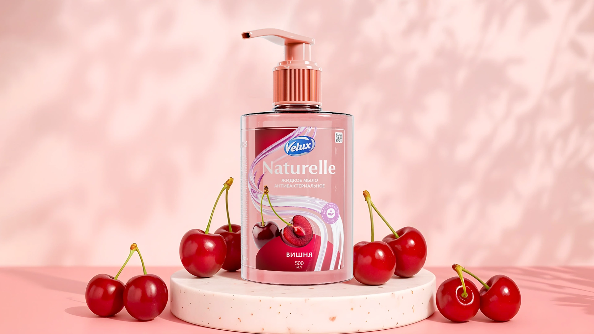

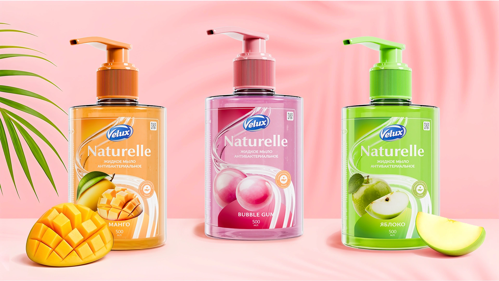
Velux: Liquid Soap Packaging Design
We developed a "delicious" packaging design for Velux liquid soap (mango, cherry, apple). The "Visual Gastronomy" concept uses realistic fruit images and bright coding to attract attention on the shelf.

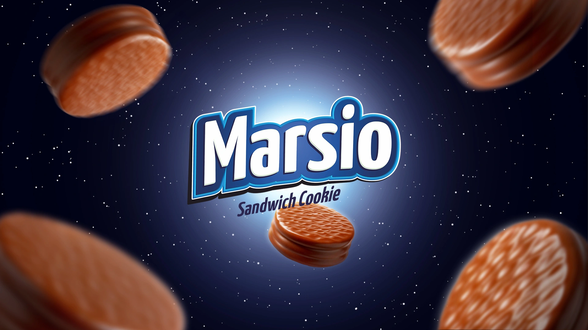


Marsio: Cosmic Sandwich Cookie Packaging Design
We created the Marsio brand (sandwich cookies): naming derived from the word "Mars." The design features deep blue tones with astronauts and stars. The concept merges dreams of space and modern technology, forming an emotional connection with the buyer.
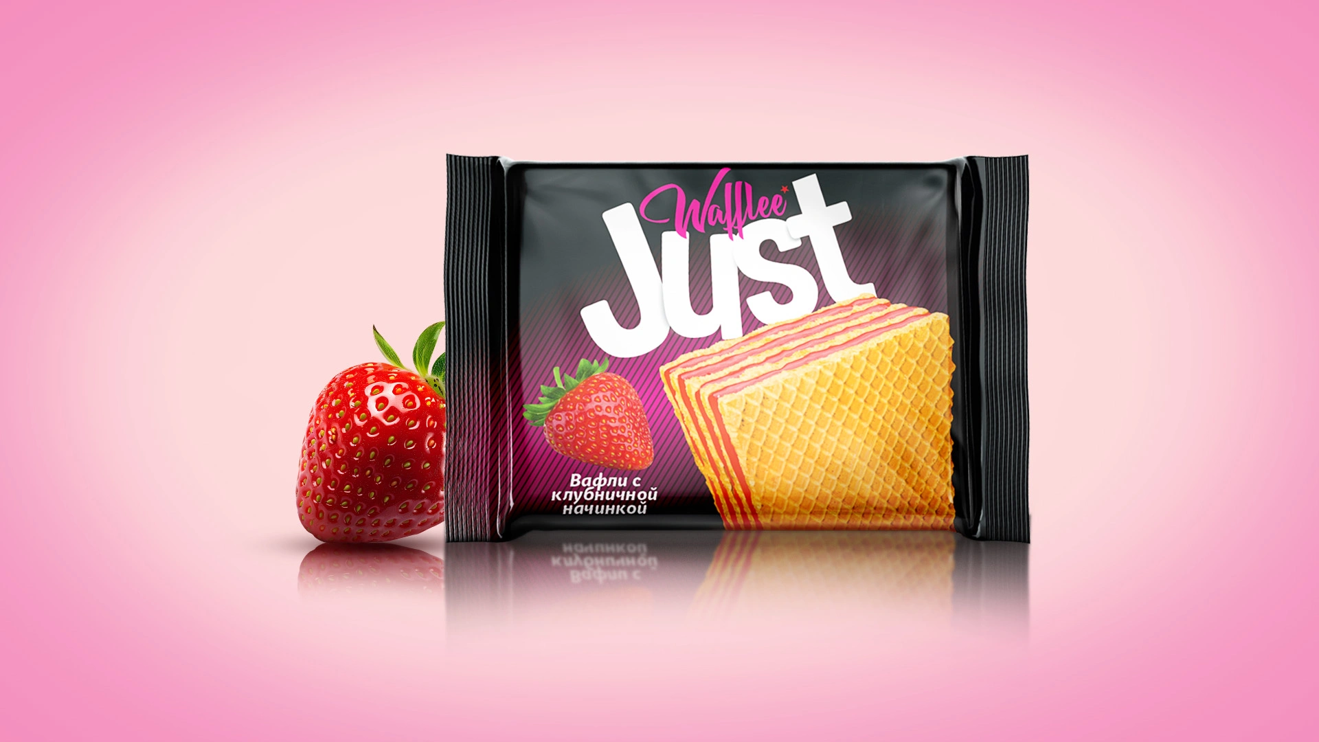
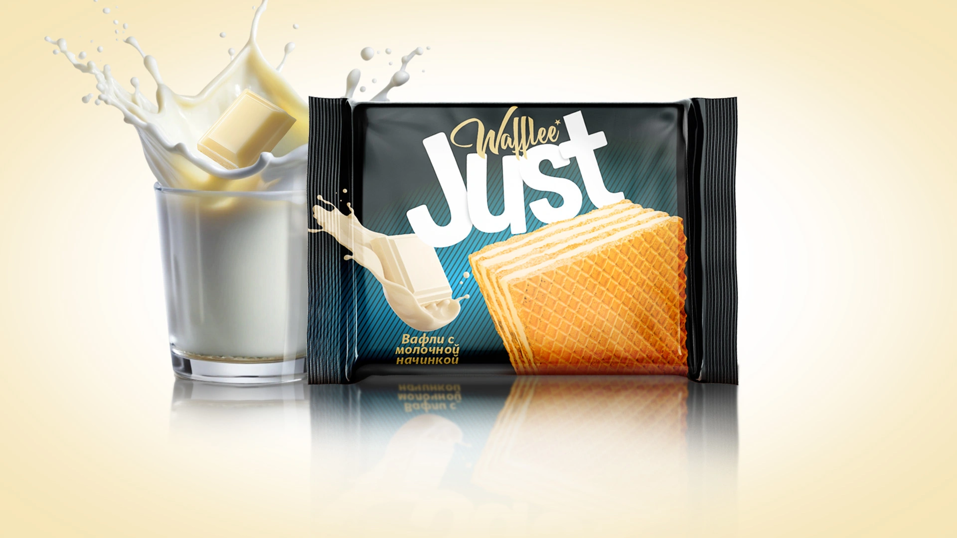

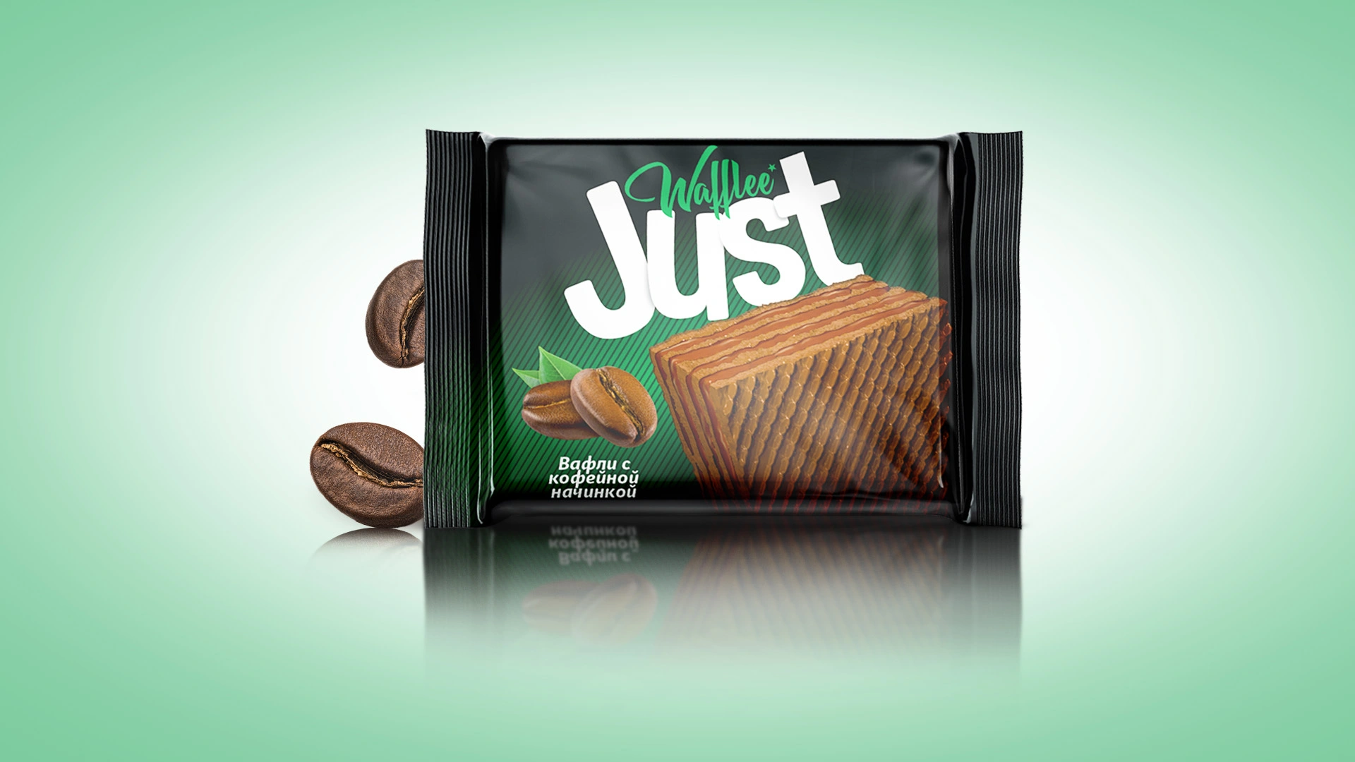
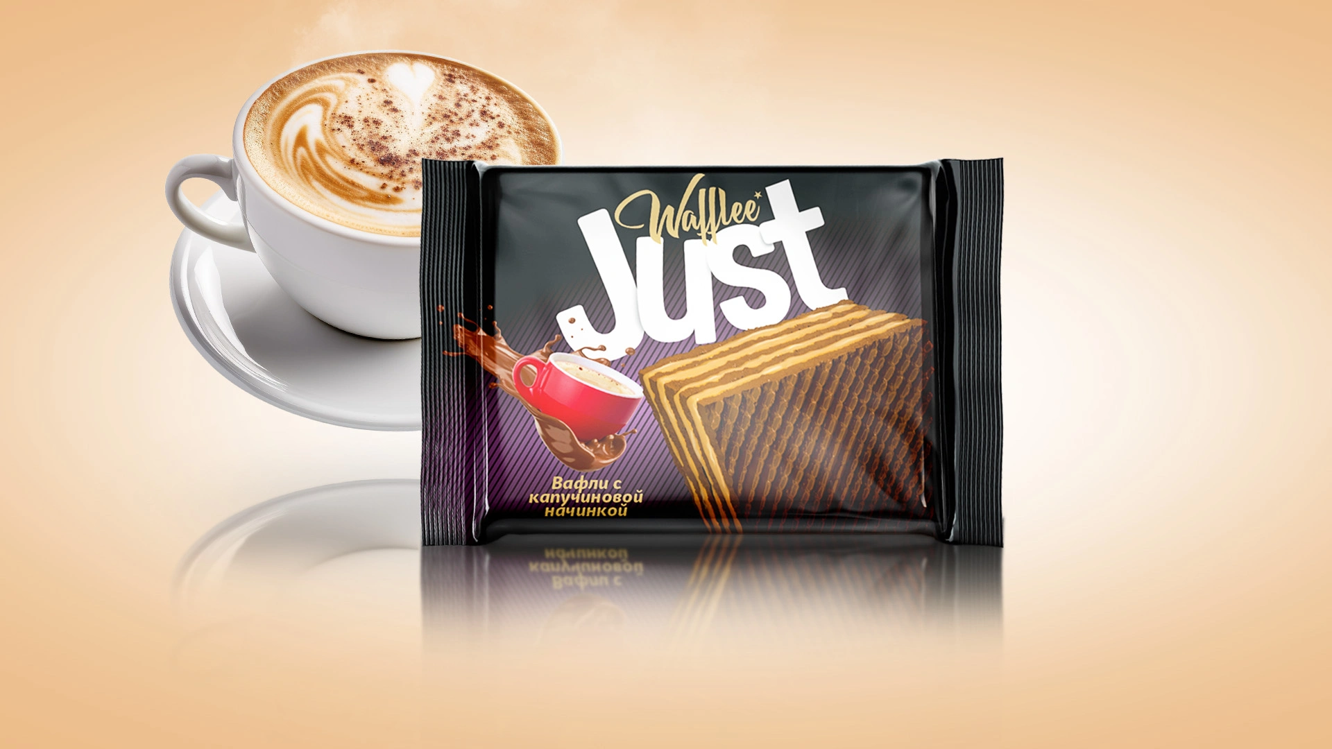
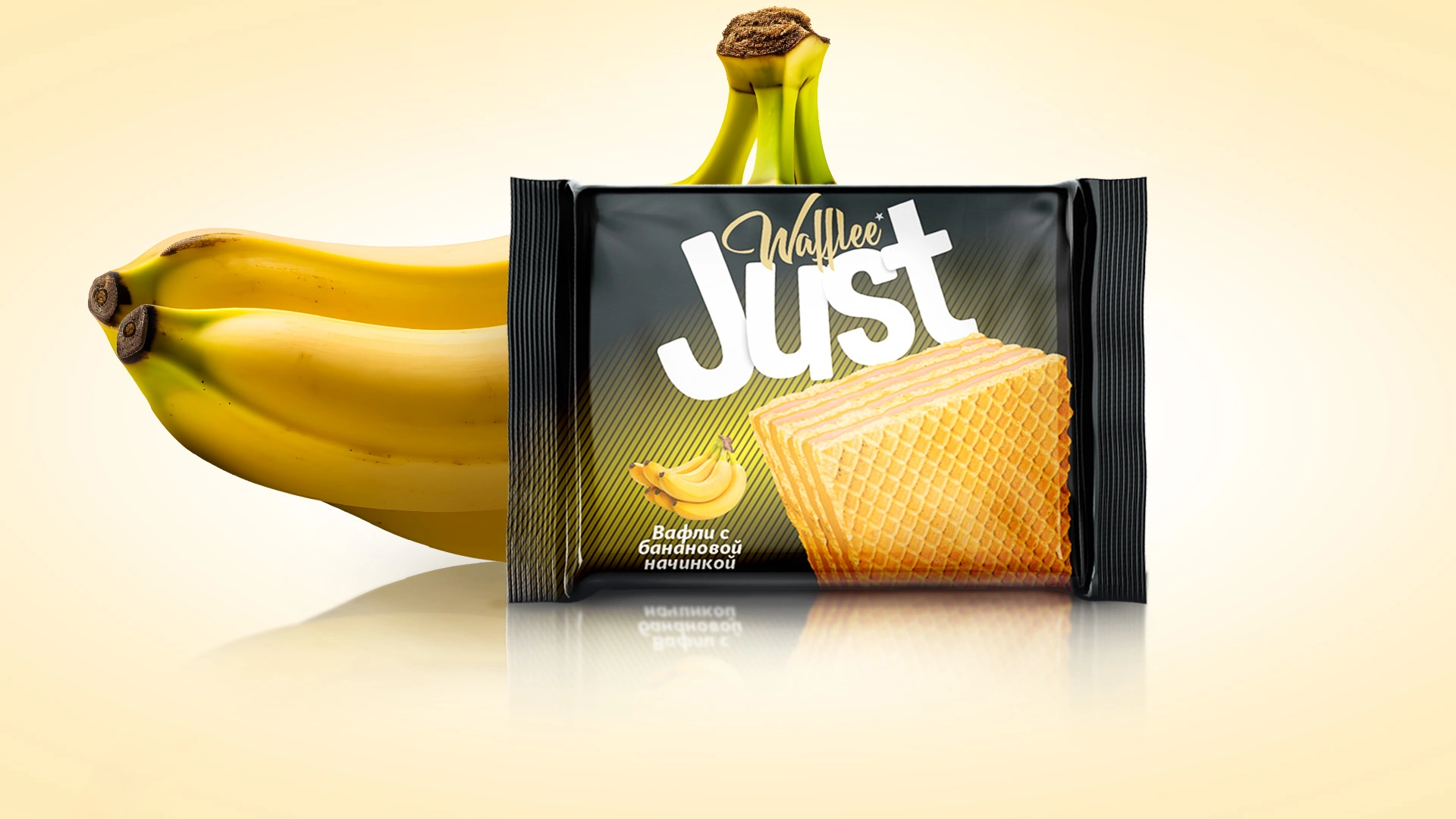
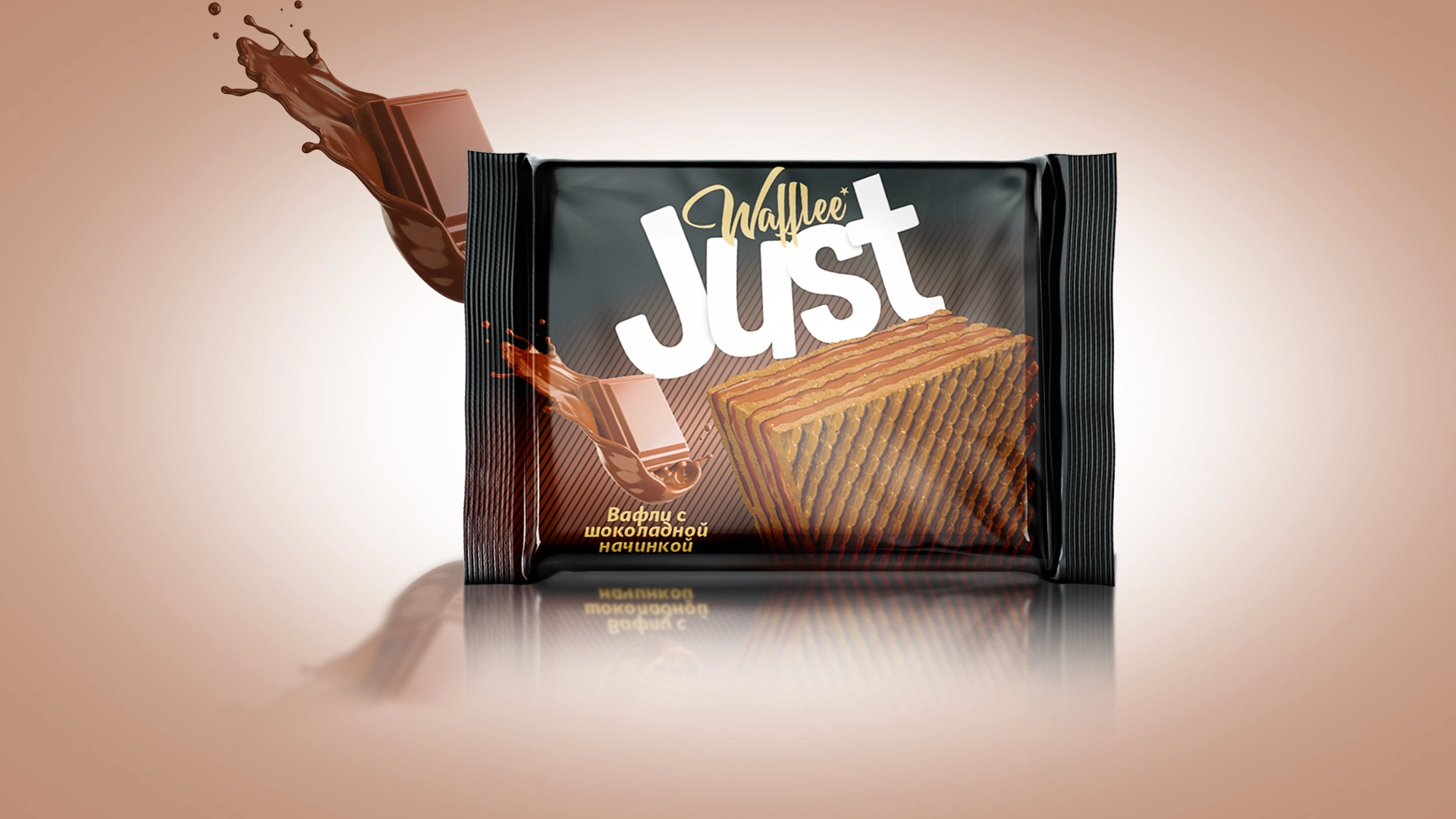
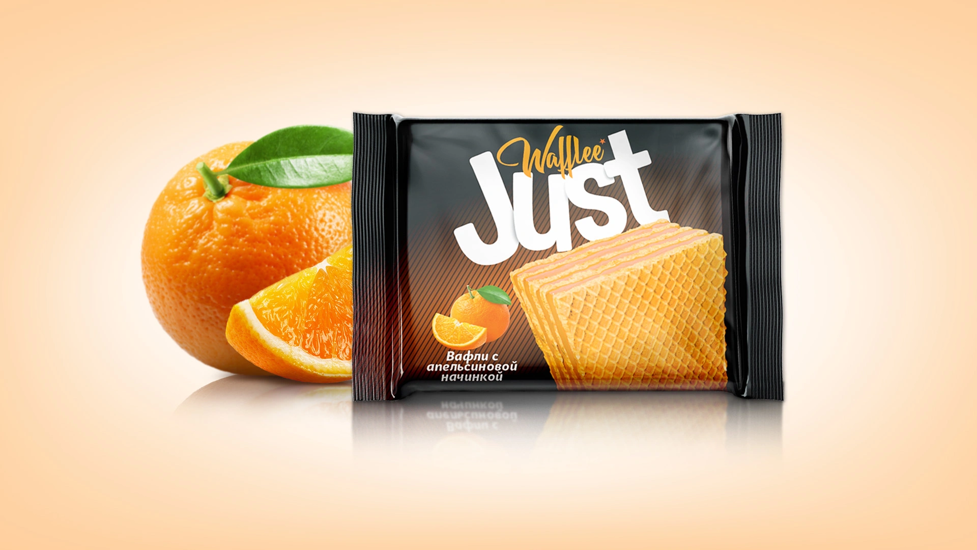
Just: Wafer Packaging Design
A bright, minimalist packaging design was developed for Just wafers. Black background with color accents and realistic wafer visualization. The naming Just reflects the simplicity and clarity of the product.
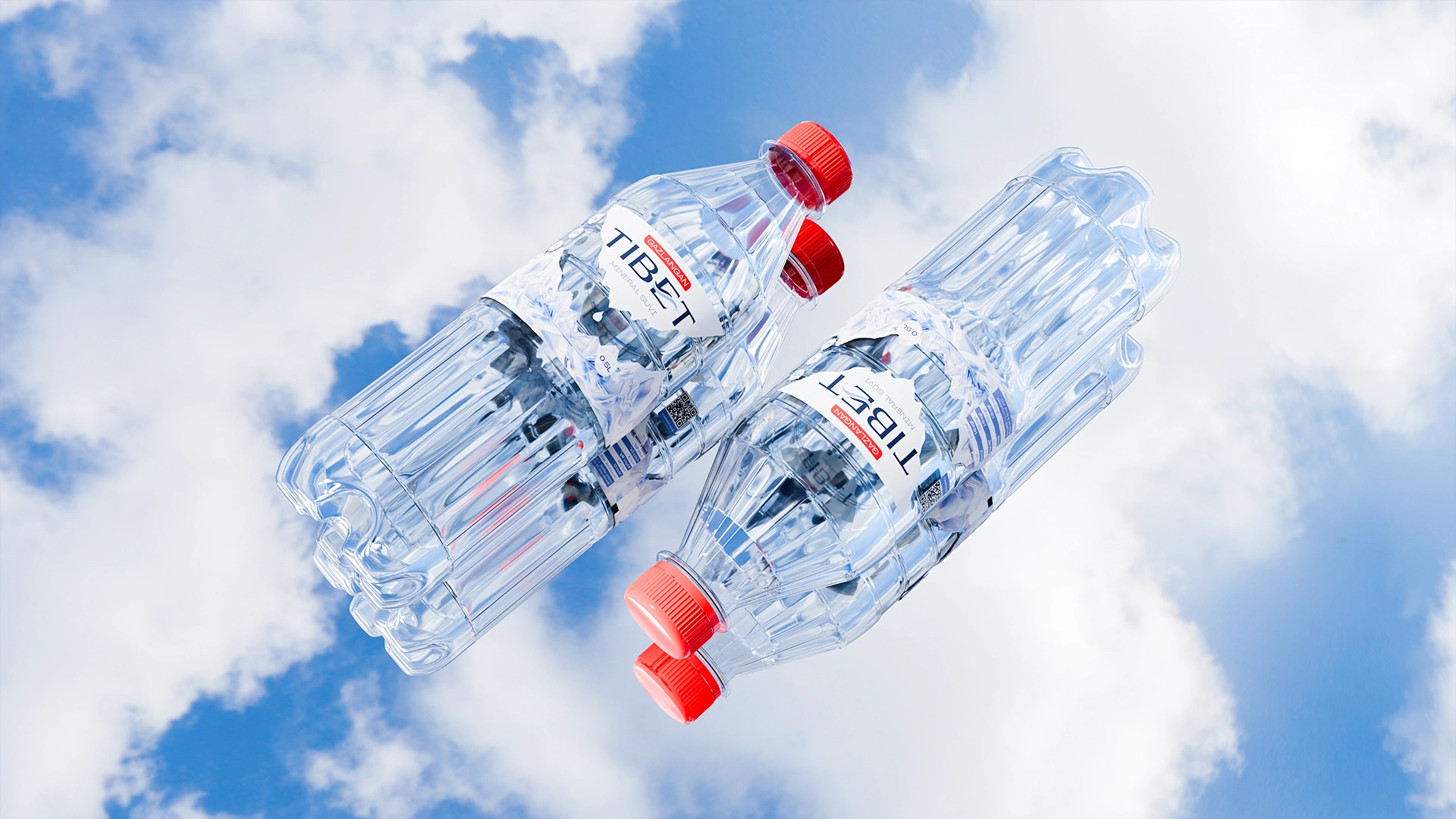


Tibet: Premium Mineral Water Branding and Packaging Design
Tibet branding was developed for mineral water (Uzbekistan market). Design features: a crystal drop on an ice cave. Bottle ergonomics, color coding (red/blue), and premium label transparency.
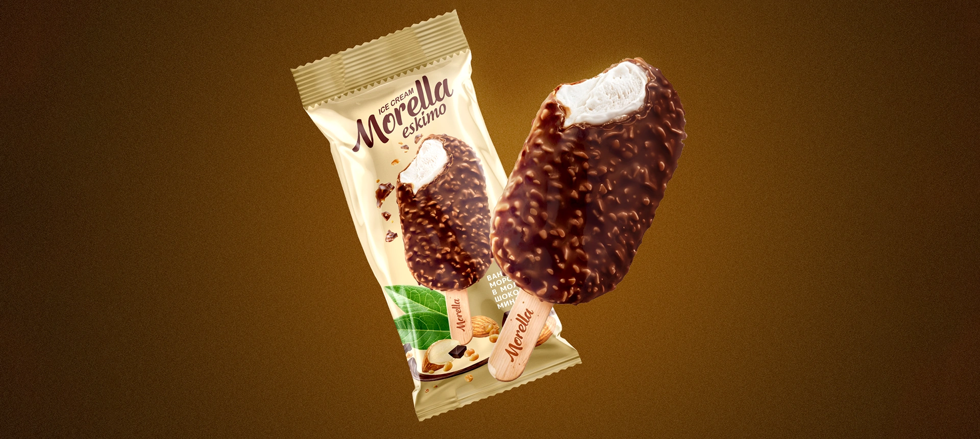
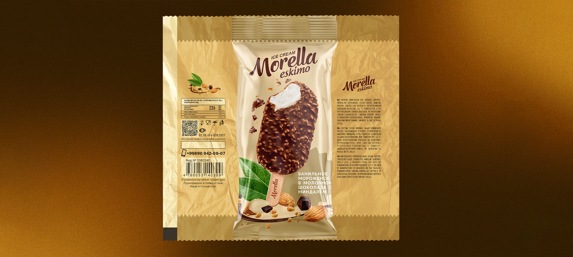

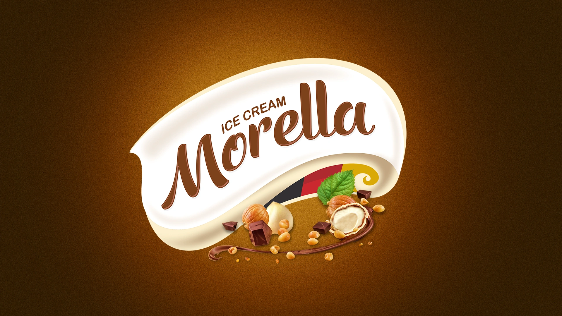
Morella: Premium Ice Cream Packaging Design
An appetizing packaging design was developed for Morella ice cream with 3D models (coconut, vanilla, almond). The design creates an "instant appetite effect," contributing to sales growth and the brand's entry into the Uzbekistan market.