Our works
Dive into the world of solutions we have created that inspire, build trust and make businesses successful
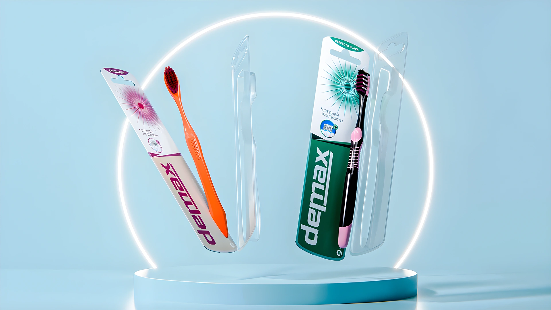

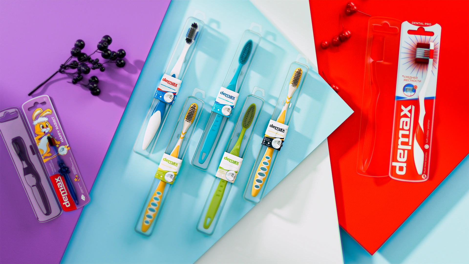
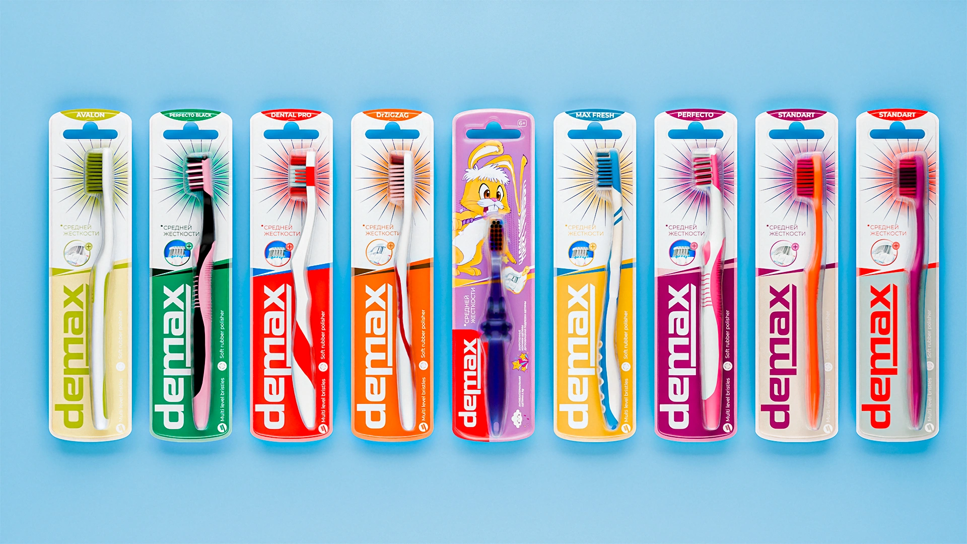
Demax — a unified concept for a toothbrush line
A unified visual concept was developed for the Demax toothbrush line. Graphic rays became the signature accent, symbolizing cleanliness and freshness, uniting different series into a single recognizable family.

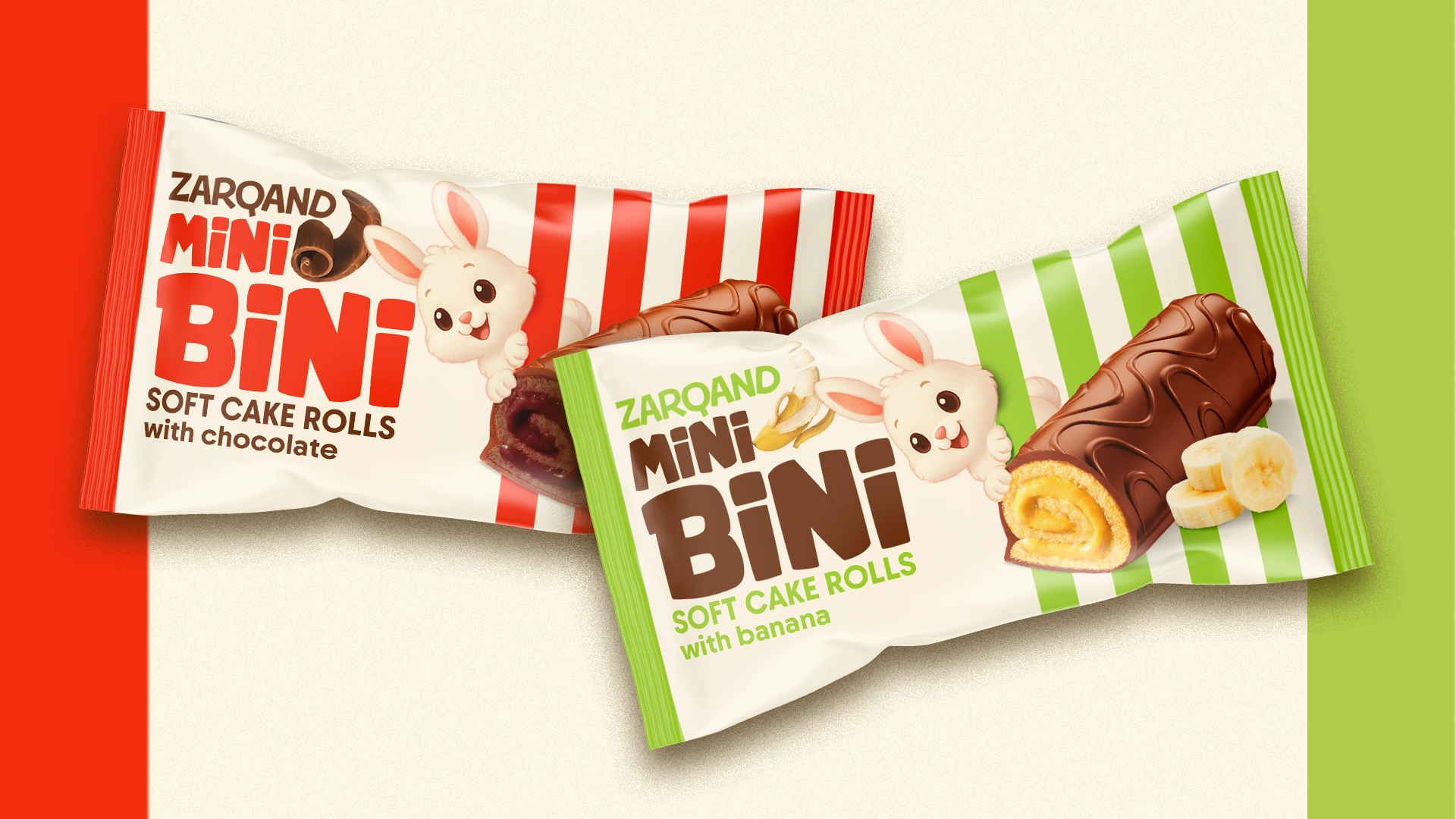
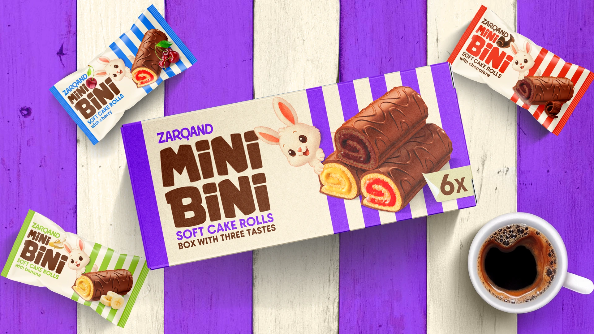
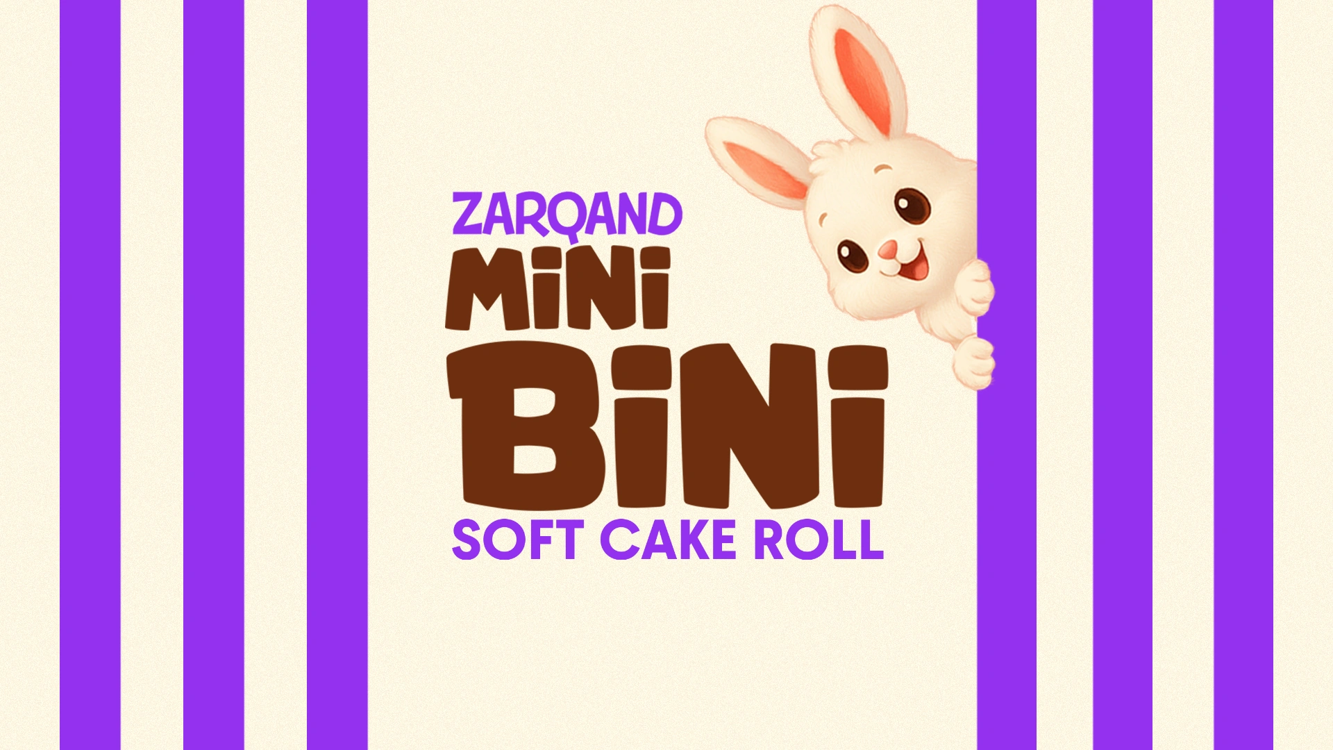
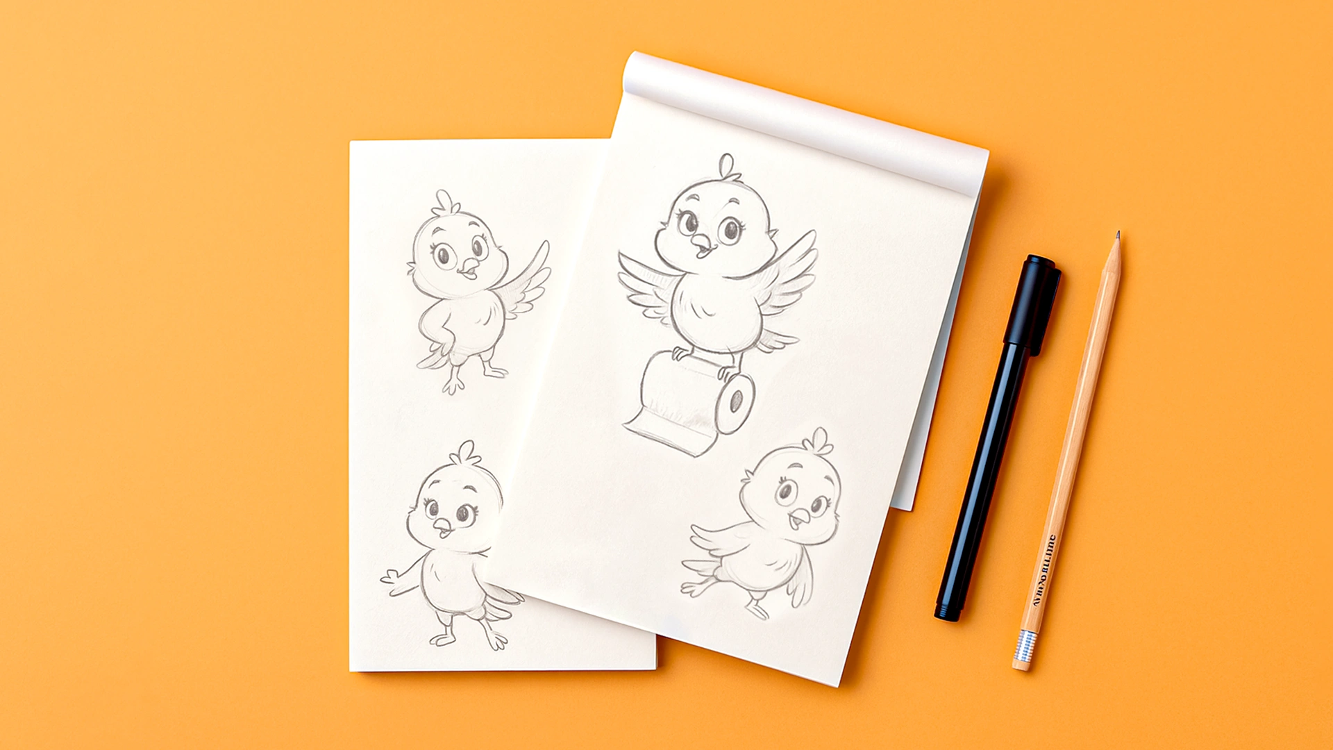
Mini Bini — packaging design for a mini roll
Mini Bini: the mini roll that says “take me with you”
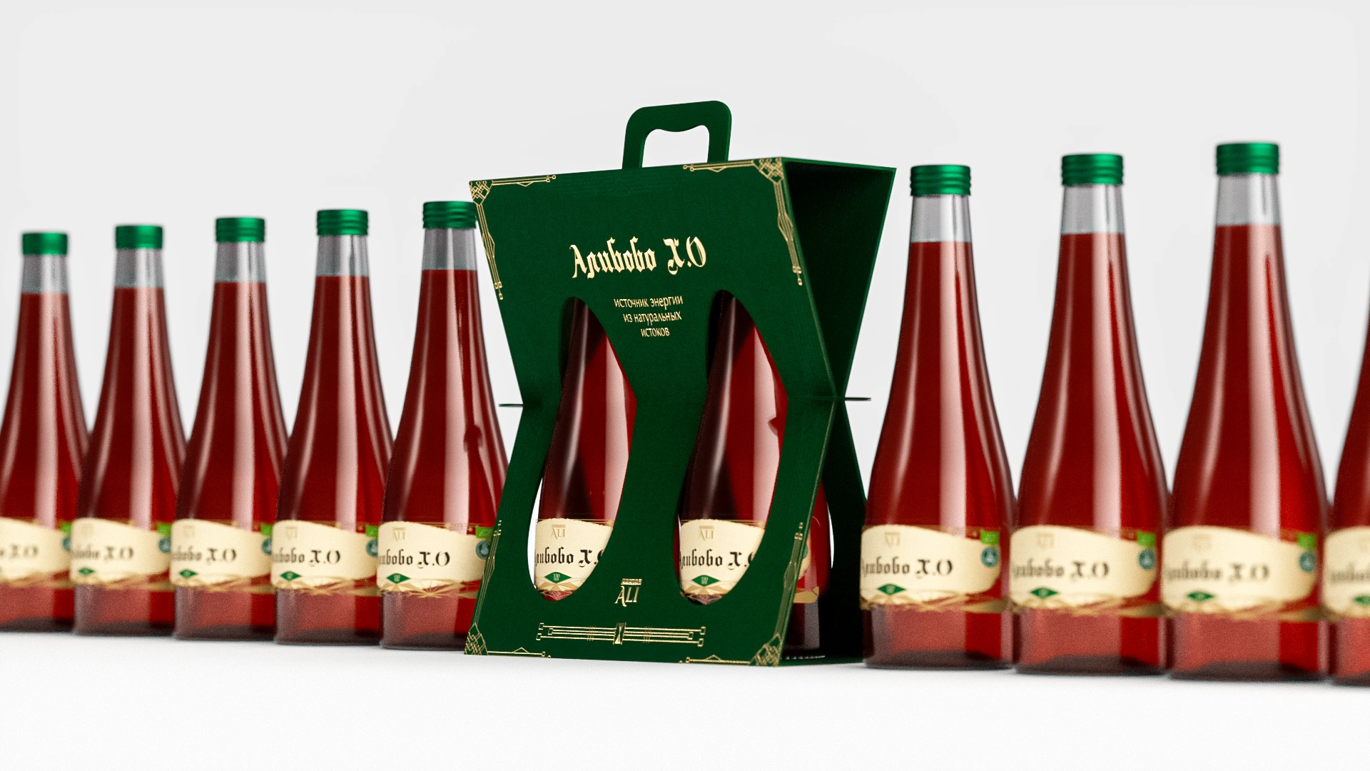
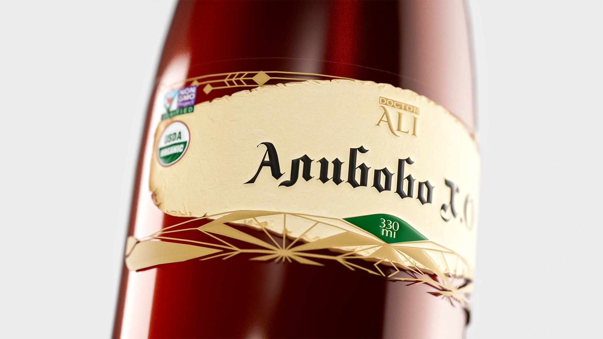
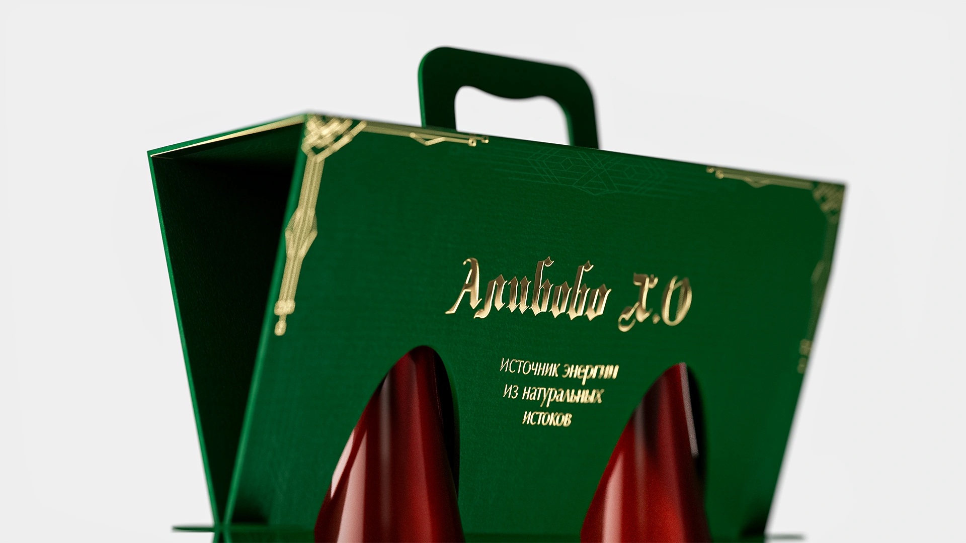
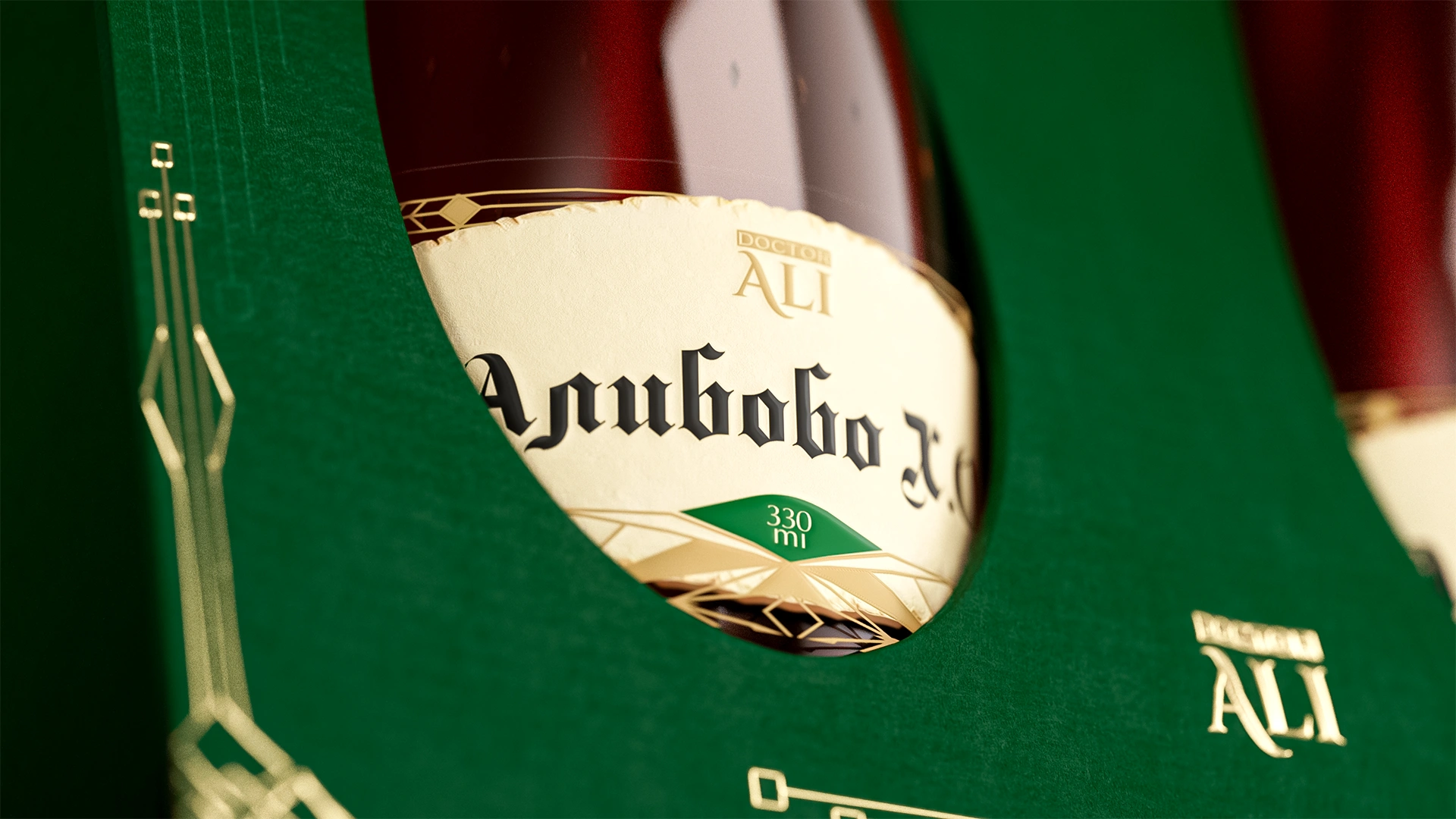
Doctor Ali — Packaging Design for a Health Elixir
We developed a premium and functional packaging design for "Alibobo X.O" (health elixir). The "2-in-1" format, display windows, deep green background with gold embossing, and an ergonomic handle transformed the packaging into a stylish, trust-enhancing accessory.
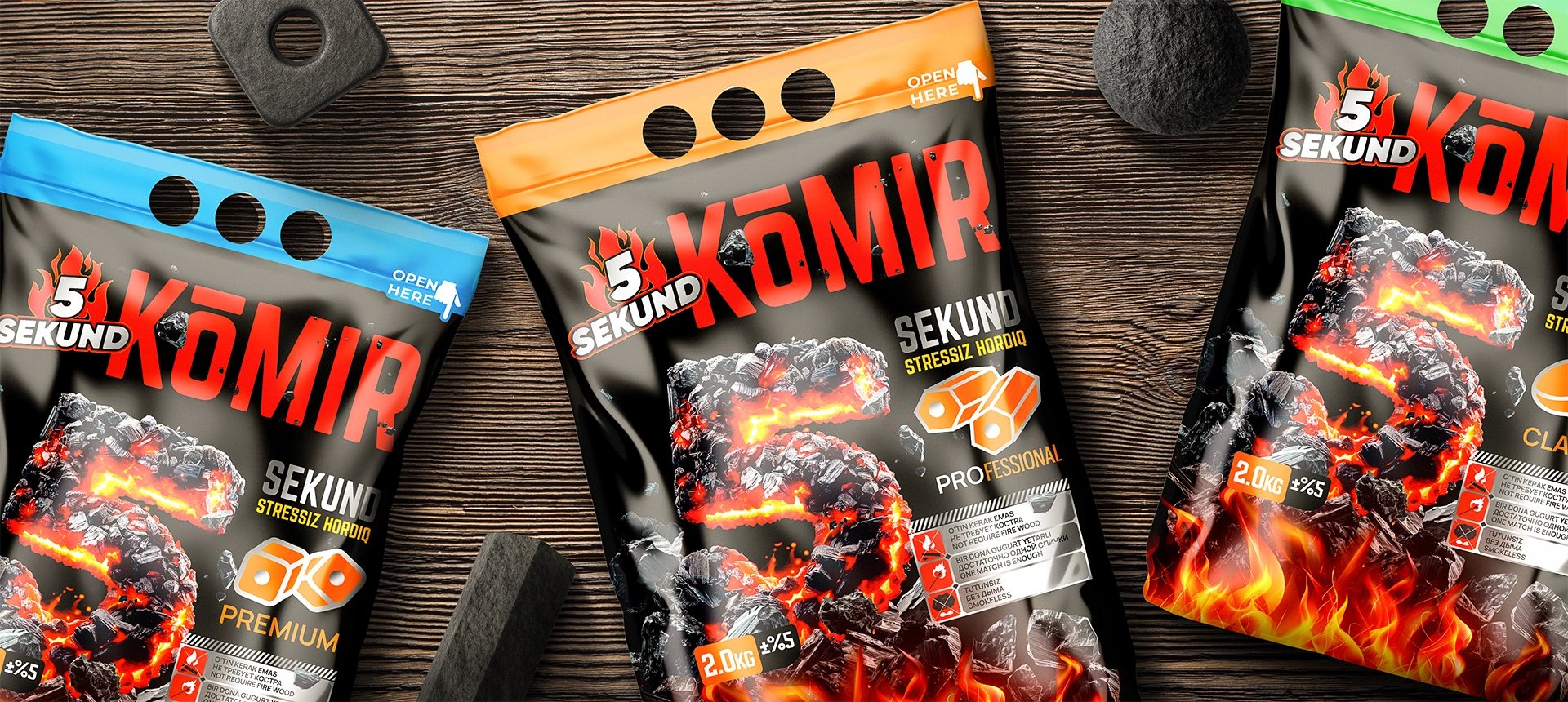
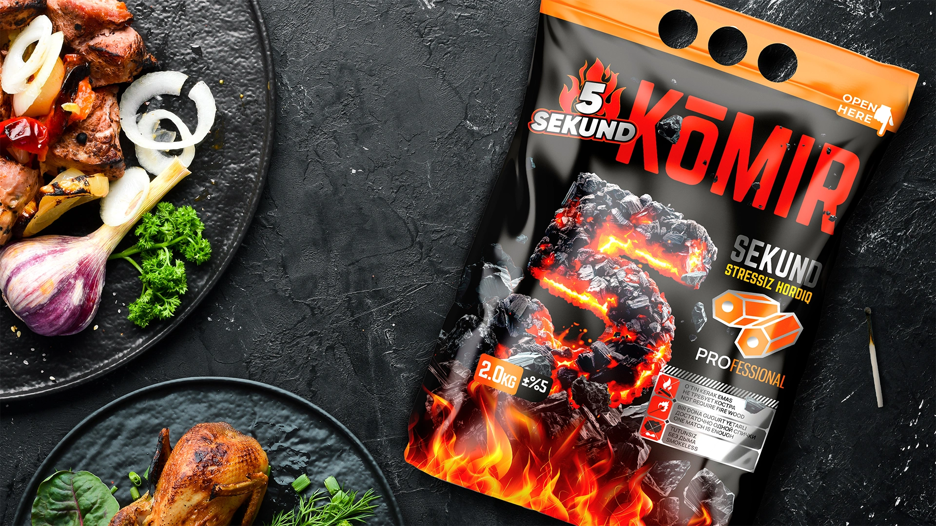
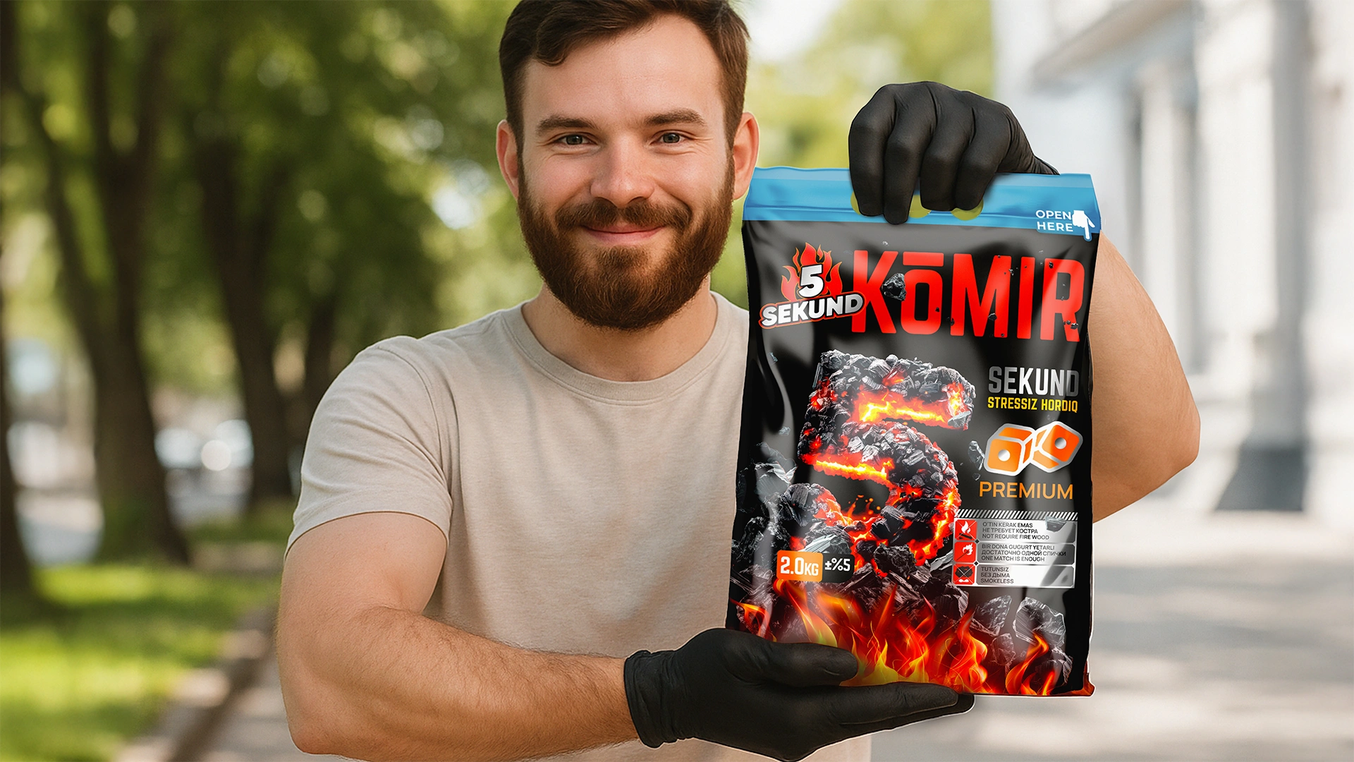
5 SEKUND — Naming and Packaging Design for Briquette Charcoal
The 5 SEKUND brand (charcoal) was developed: the naming emphasizes instant ignition. The design features a glowing "5" on a black background and infographics to instantly explain the product's uniqueness and ease of use.
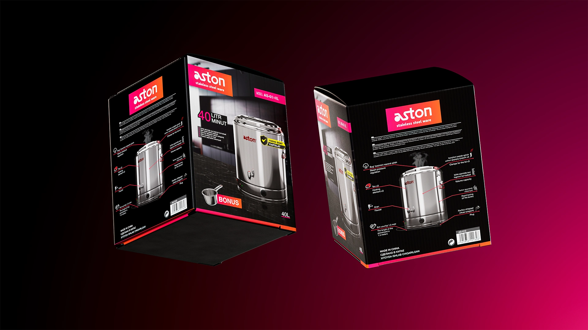
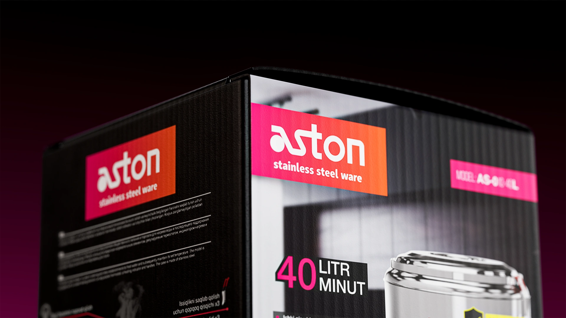
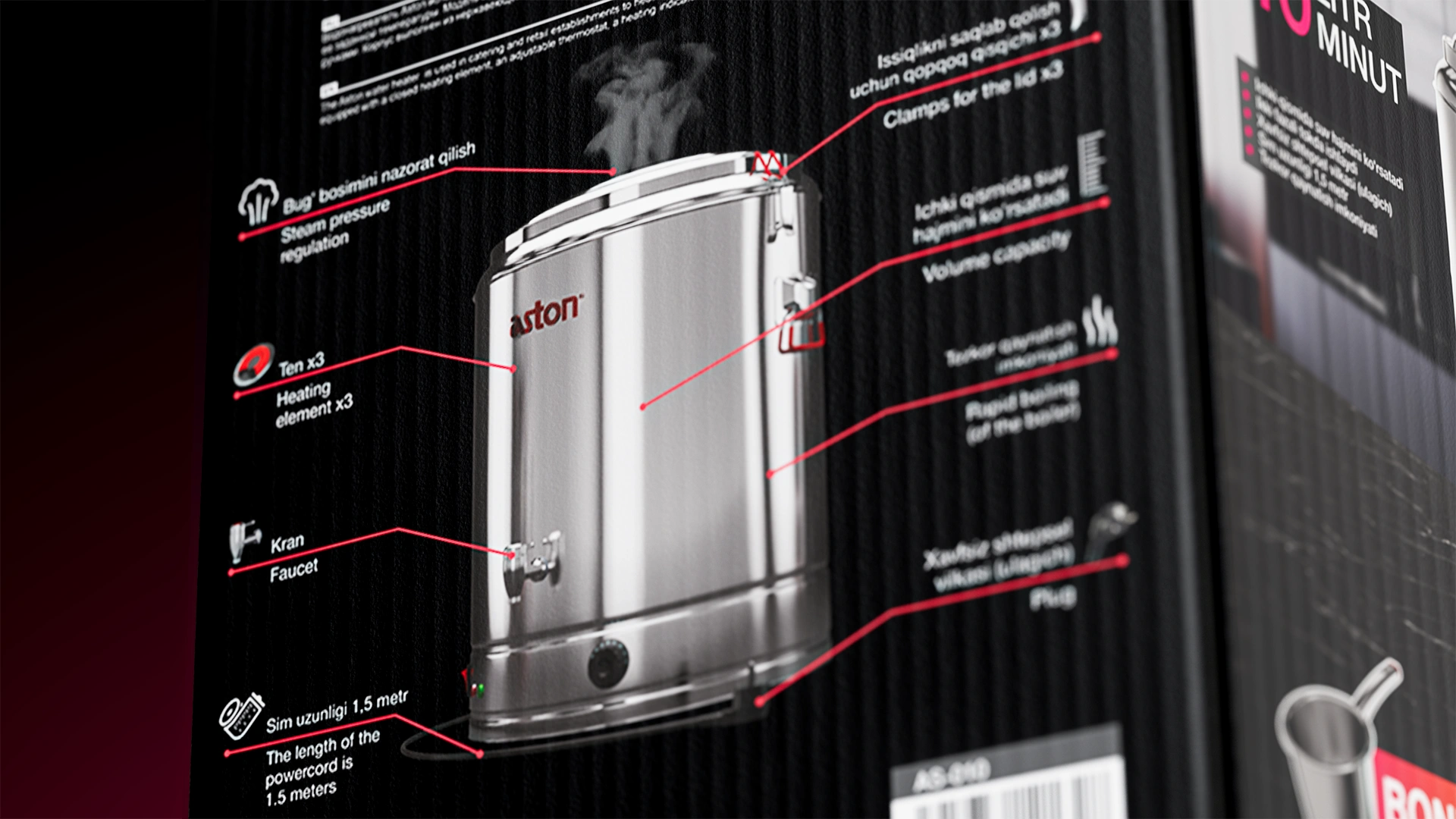
Aston — Naming and Packaging Design for Kitchen Appliances
We developed the Aston naming (association with Europe) and packaging design for stainless steel kitchen appliances. The black background and red-pink accents emphasized technological sophistication and premium quality, securing the brand's leadership in the Uzbekistan niche.
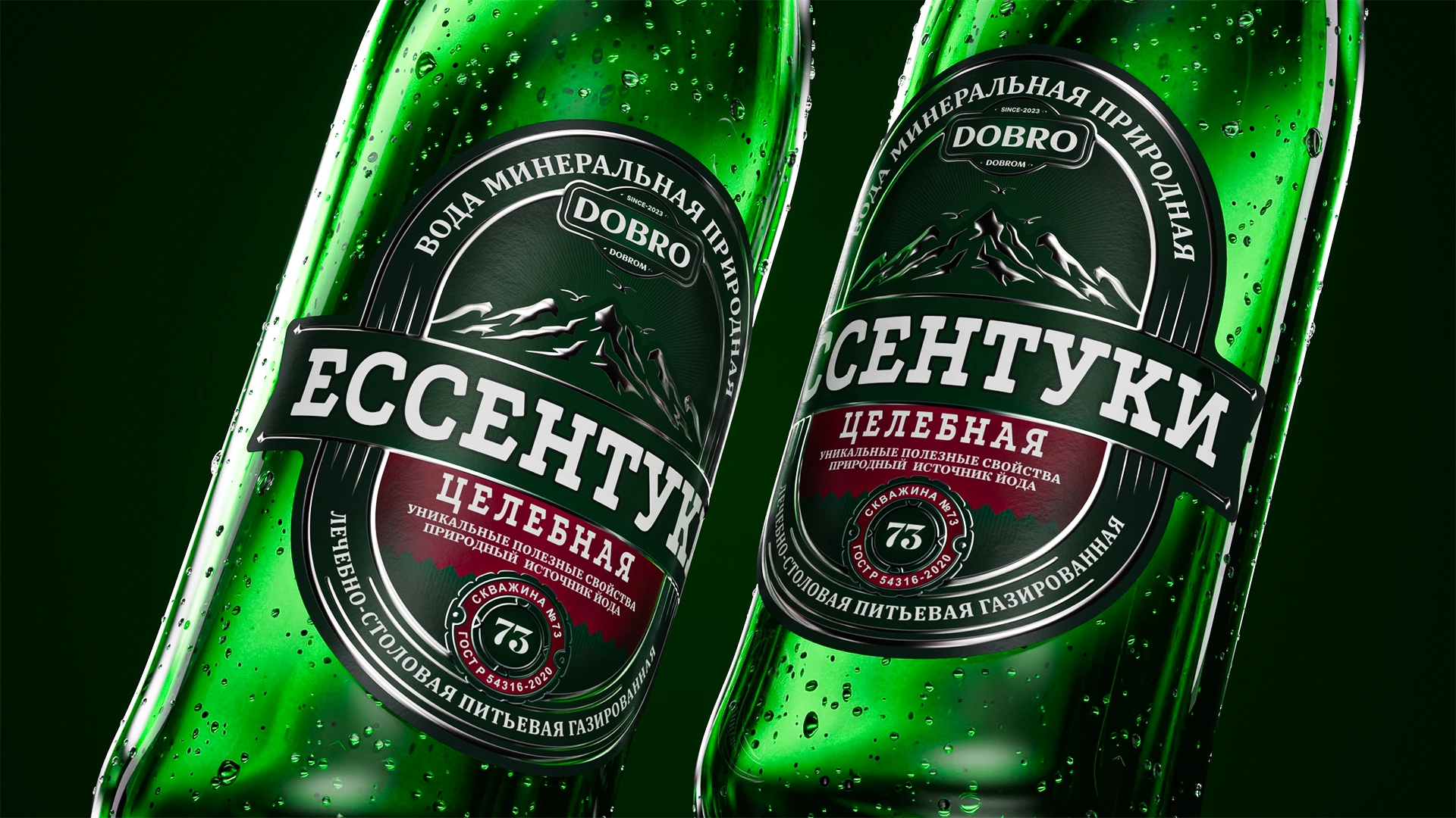
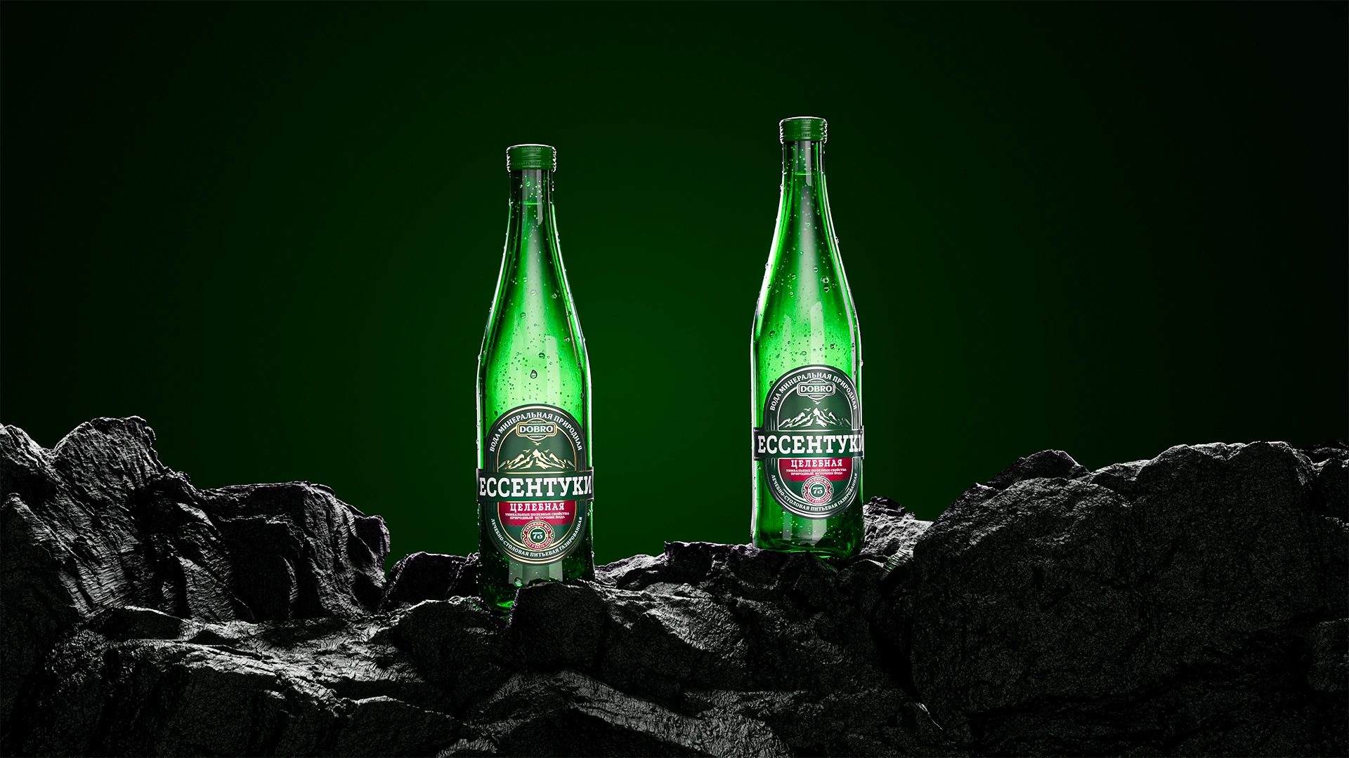
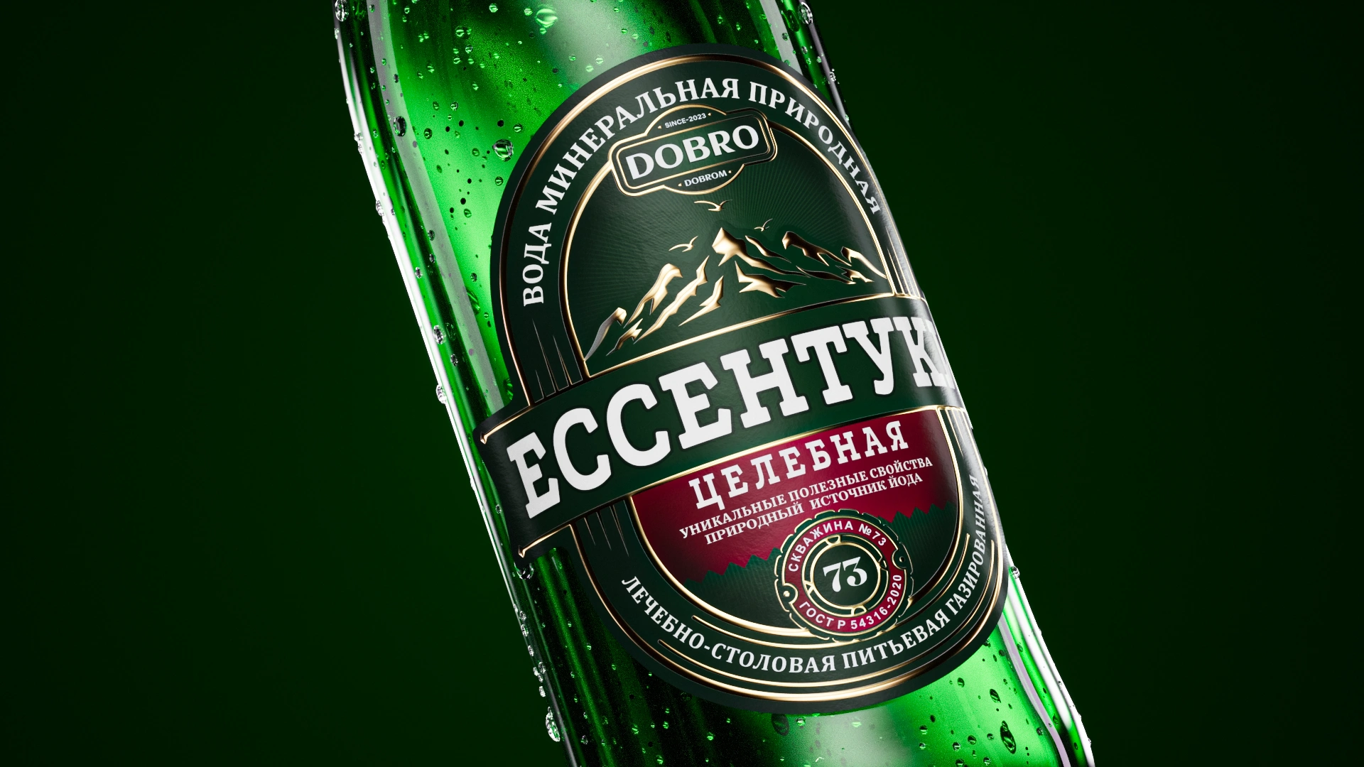
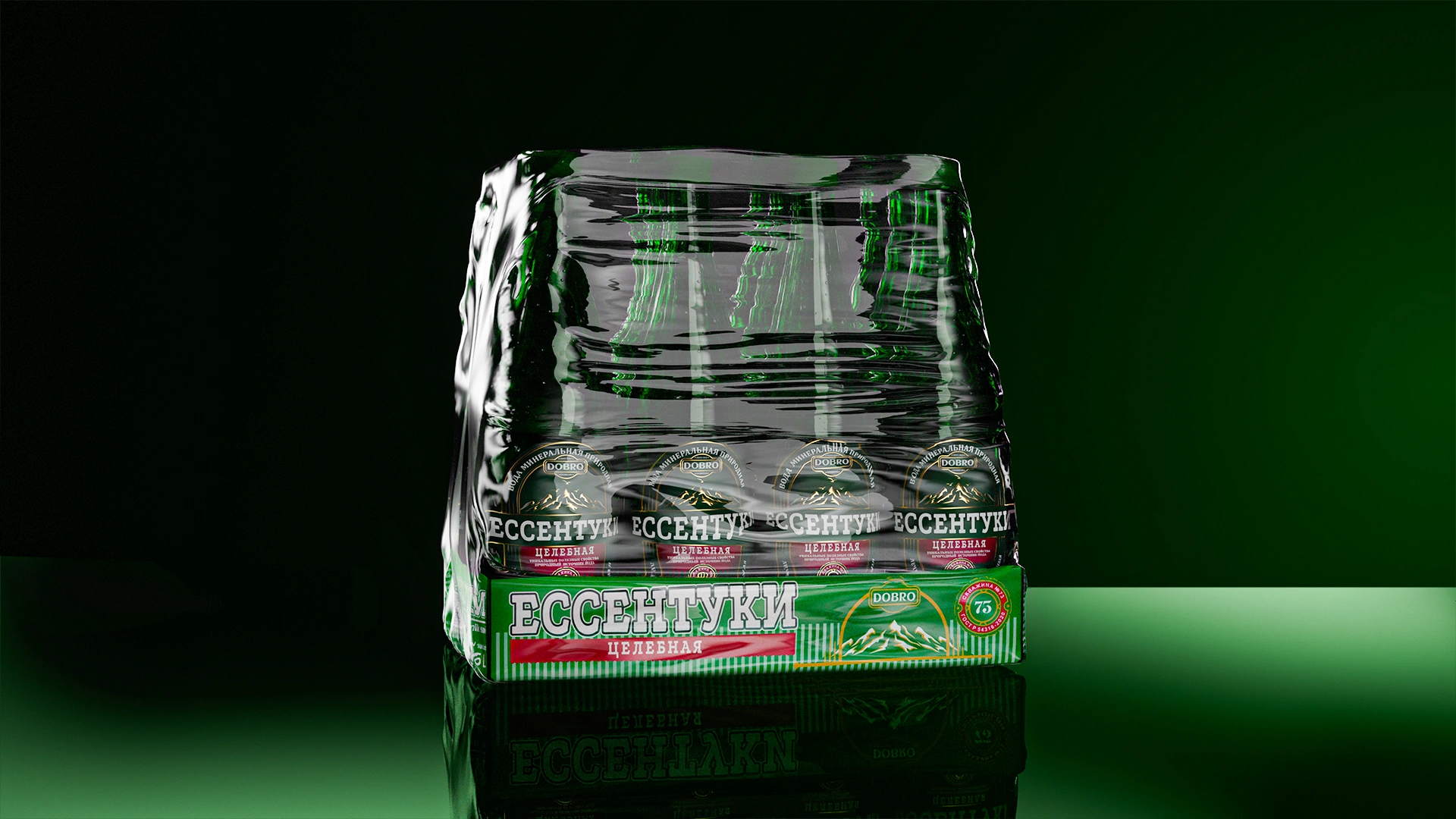
Essentuki: Premium Water Packaging Design for the Uzbekistan Market
The "Essentuki" packaging design was adapted for the Uzbekistan market in a Private Label format. Solution: gold lines, debossing effect, preservation of traditions, and integration of the "Good by Goodness" (Dobro Dobrom) logo to enhance premium quality and trust.

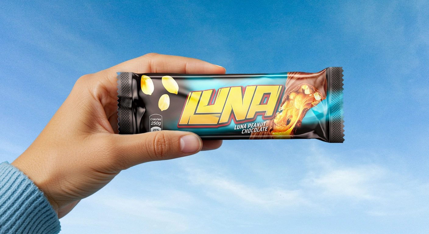
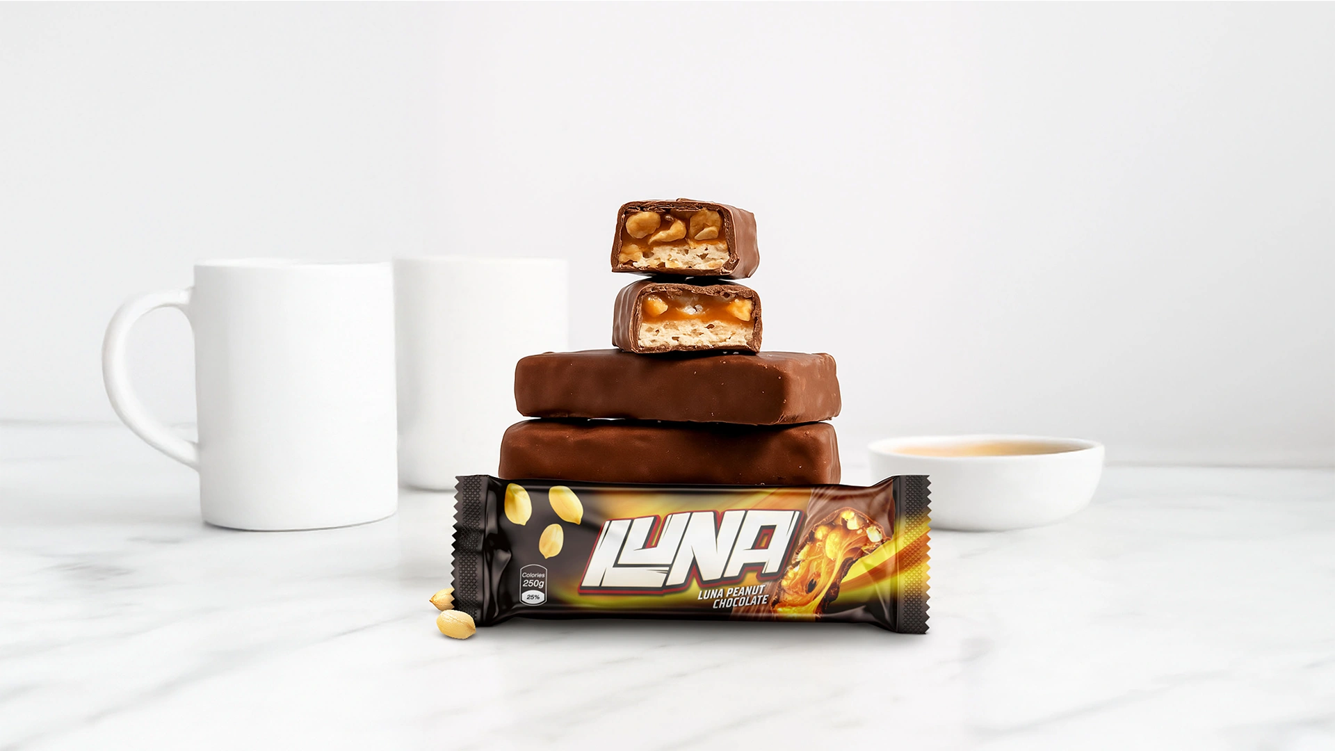
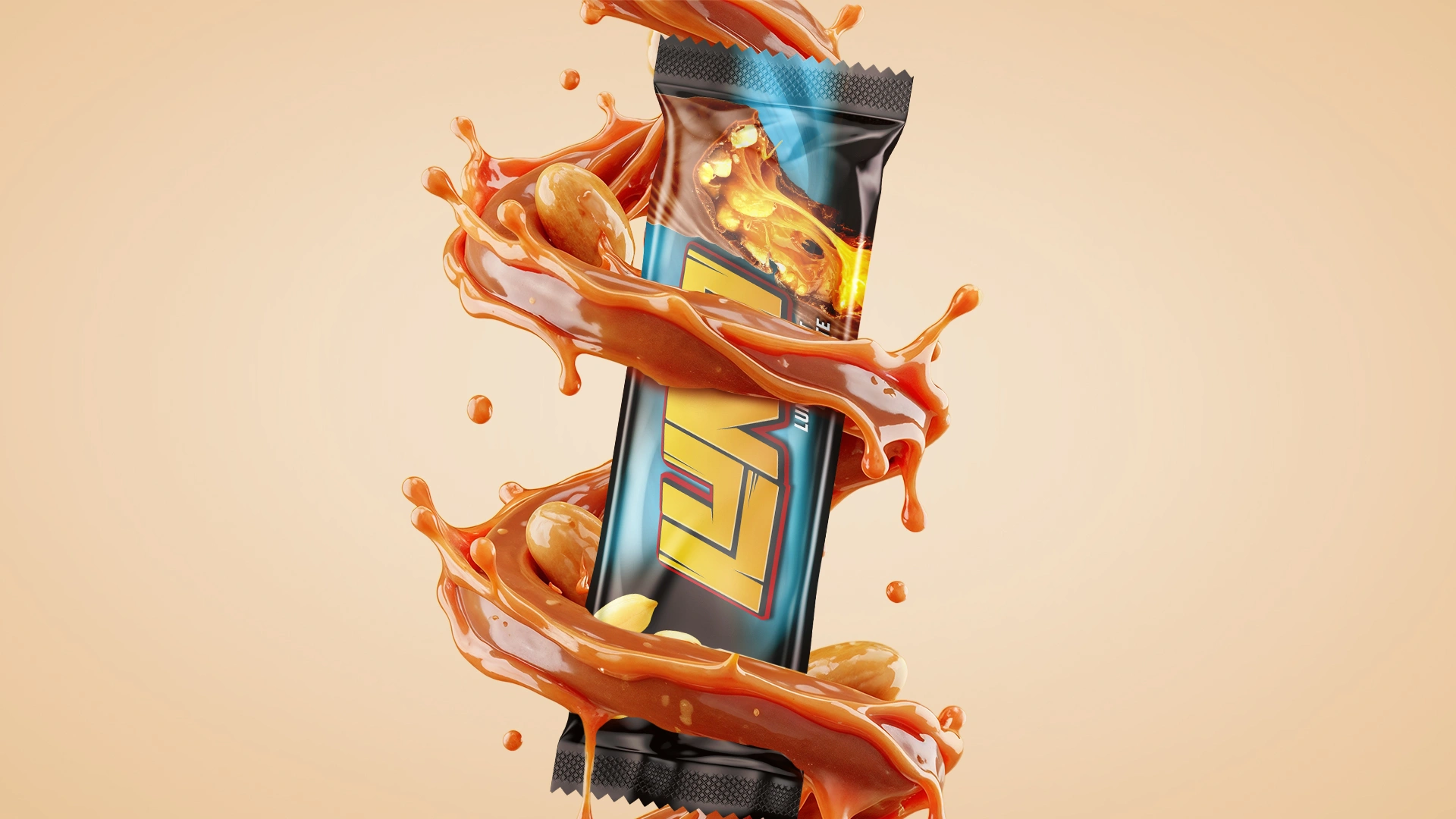
Luna – Chocolate Bar Packaging Design
We developed a bright and dynamic packaging design for Luna (chocolate with peanuts). The concept is inspired by comics: aggressive typography, black background, 3D visualization of the bar, and two contrasting packages for visual dominance on the shelf.
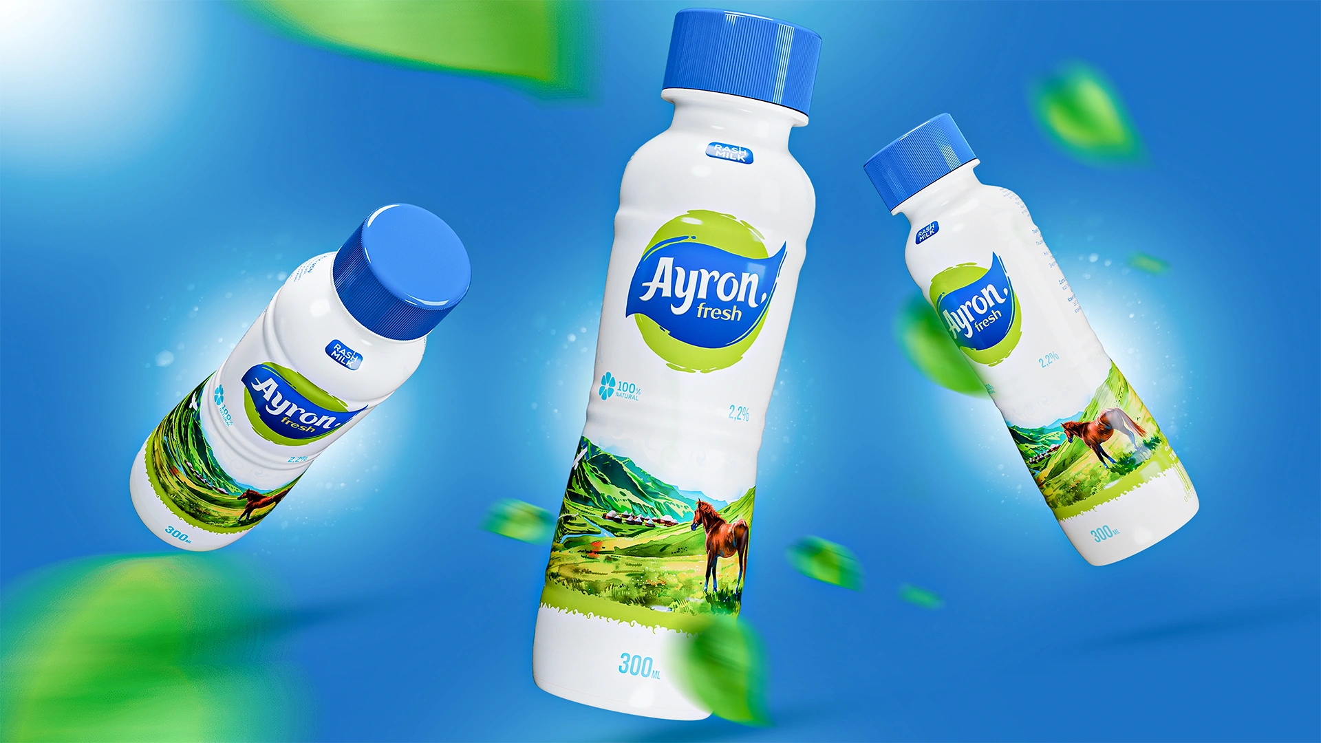

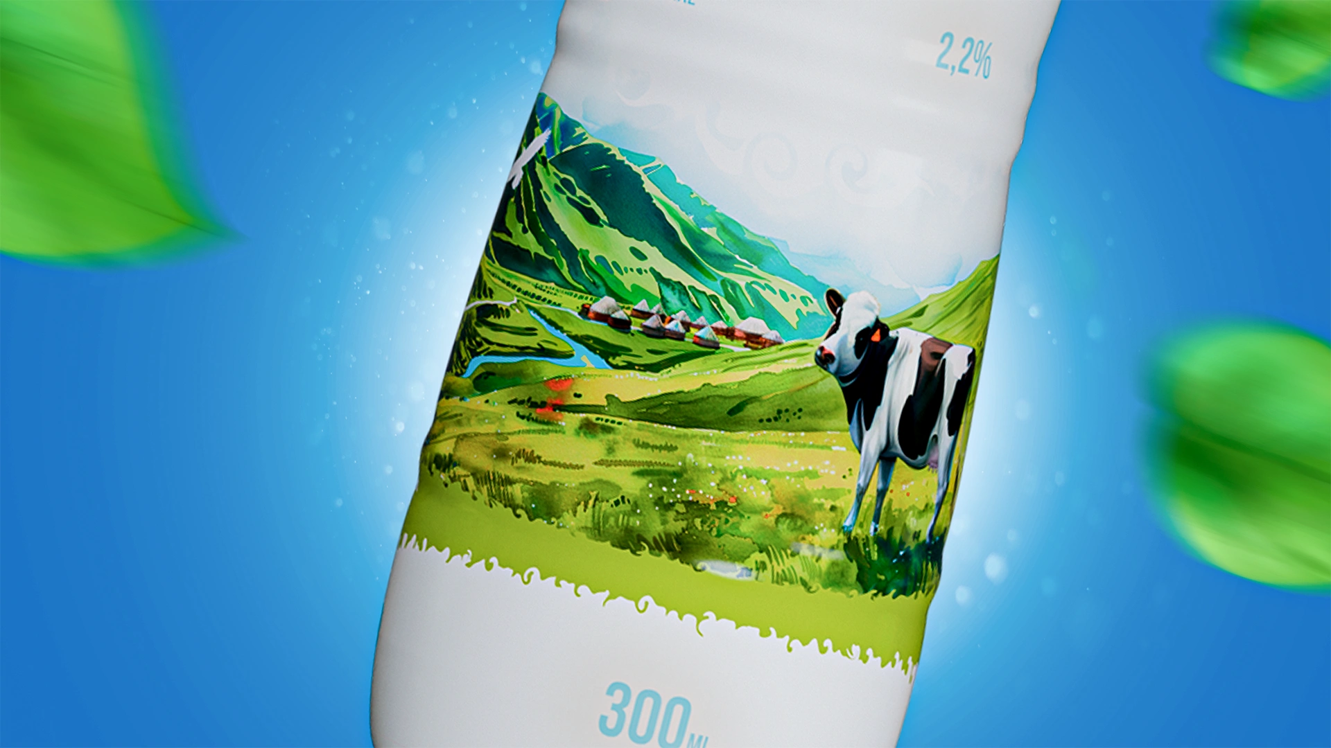
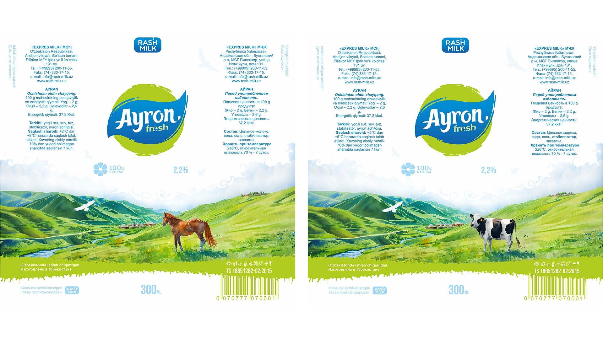
Rash Milk: Ayran Packaging Design
We developed the packaging design for Rash Milk Ayran: a clean, light image with a visual metaphor of a pastoral landscape (hills, yurts). The design stands out on the shelf, conveying freshness, natural purity, and association with summer relaxation.
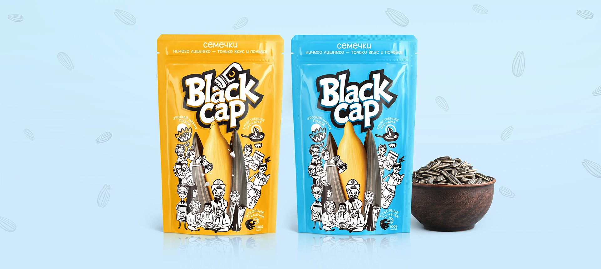
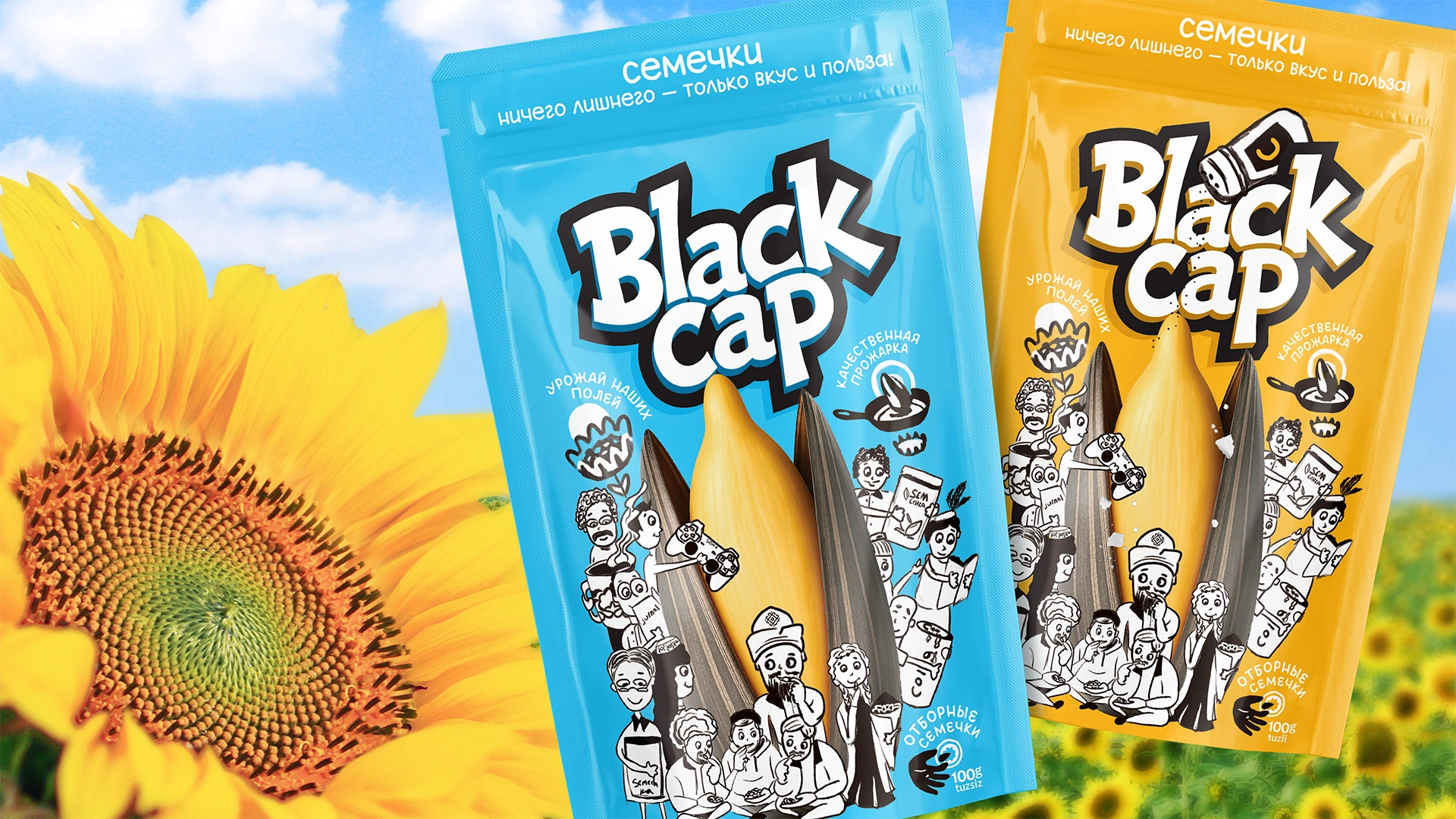
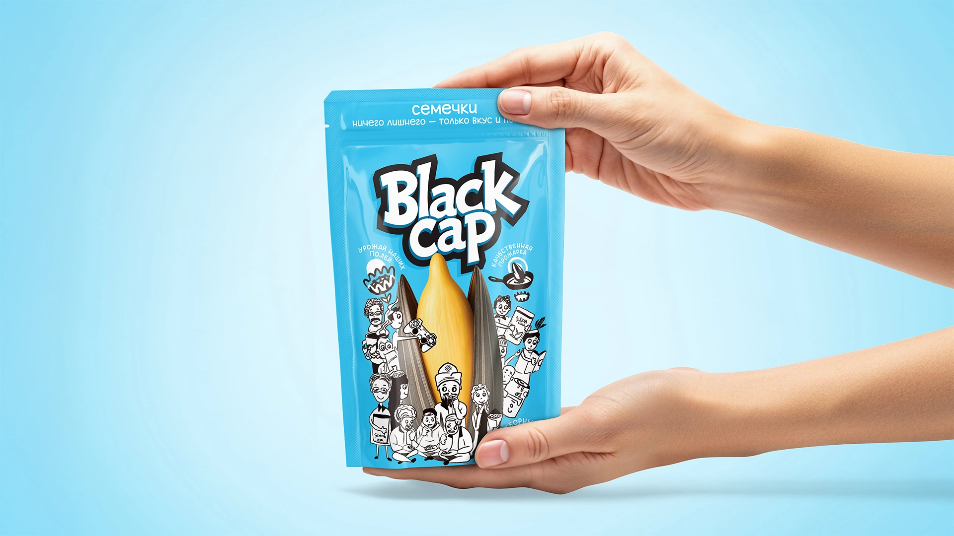
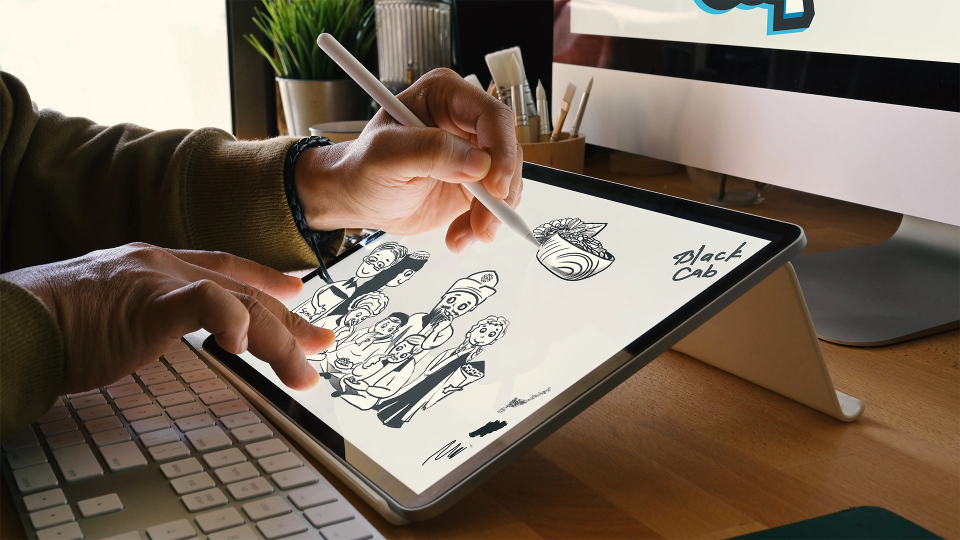

Black Cap – Sunflower Seeds Packaging Redesign
Black Cap is a sunflower seed brand redesigned with inspiration from everyday life and traditions in Karakalpakstan. It features a bold new name, local characters, and a visual identity that resonates with the people.
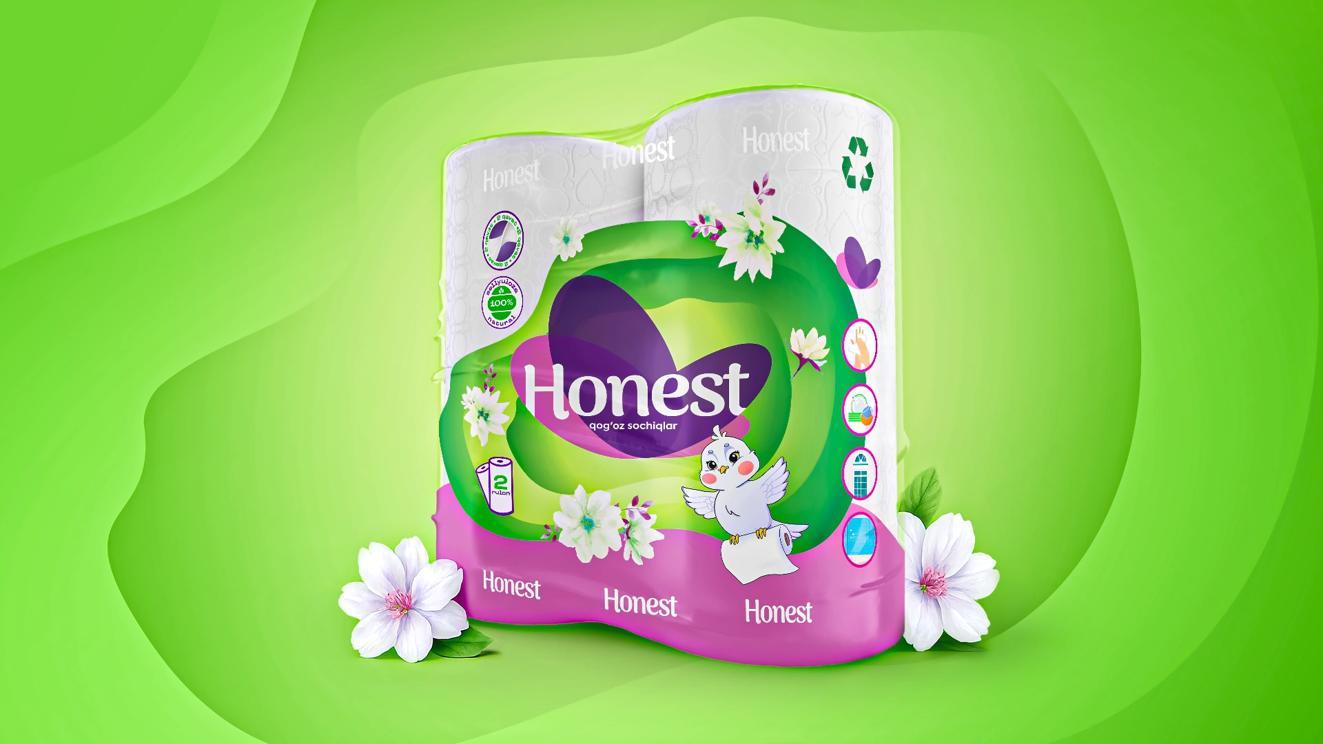
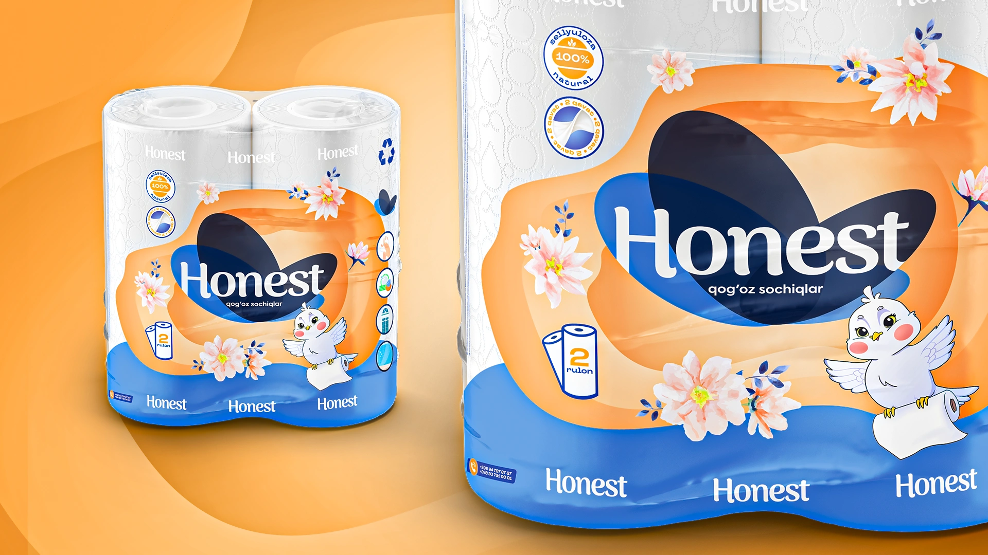

Honest — Paper Towel Packaging Design
Honest – Paper Towel Packaging Redesign Focused on Clean Aesthetics and Trust