Our works
Dive into the world of solutions we have created that inspire, build trust and make businesses successful
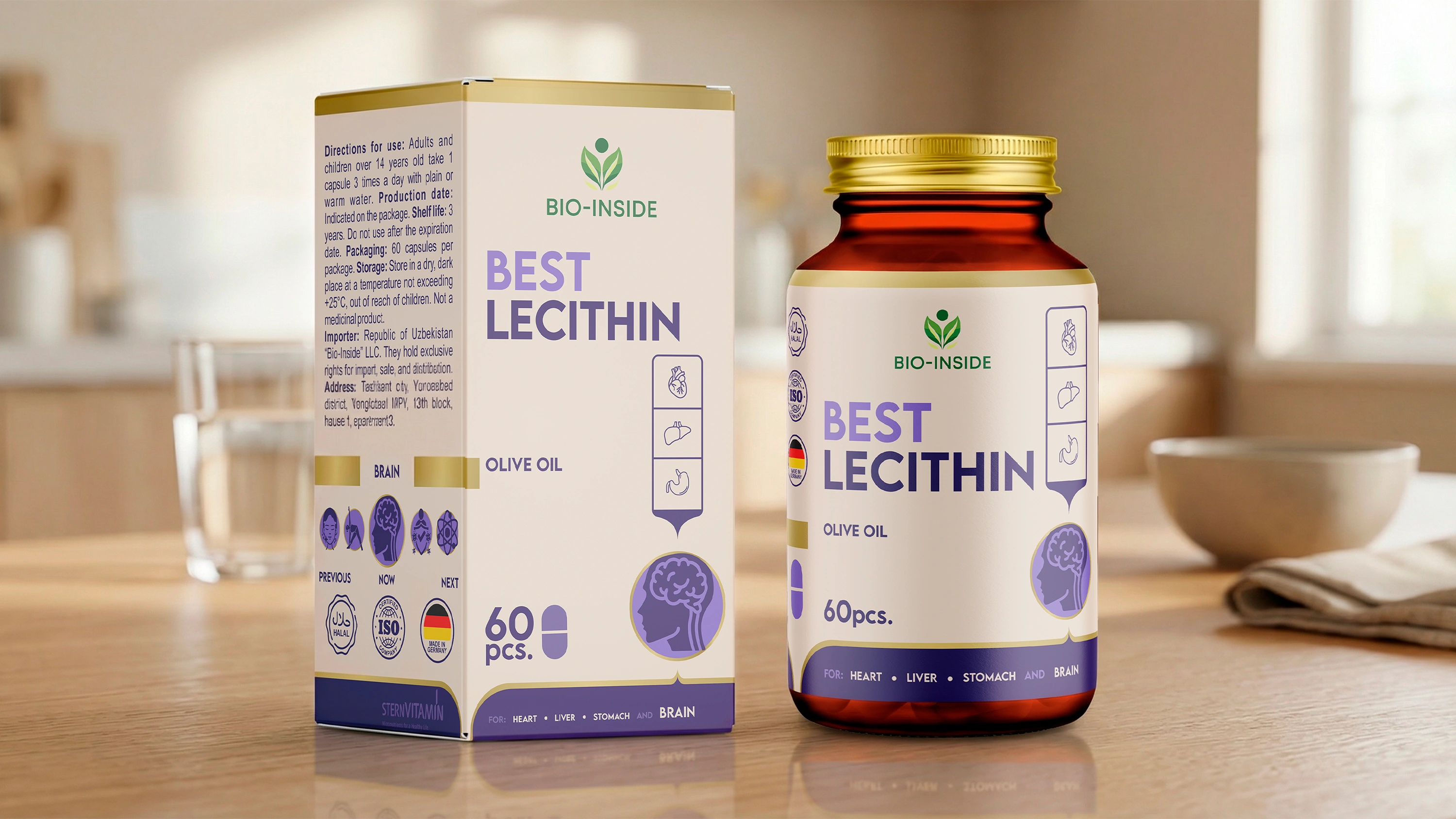
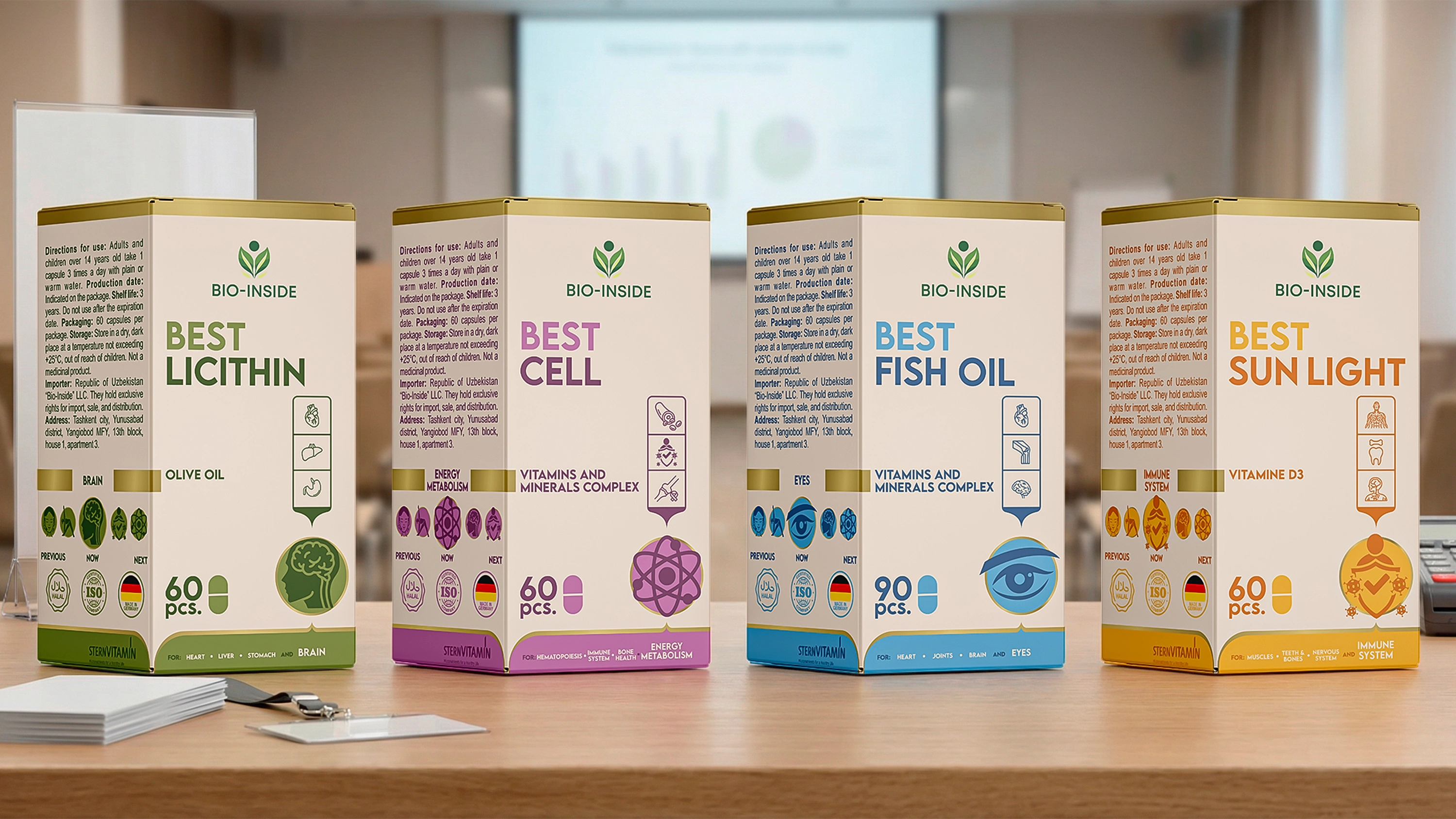
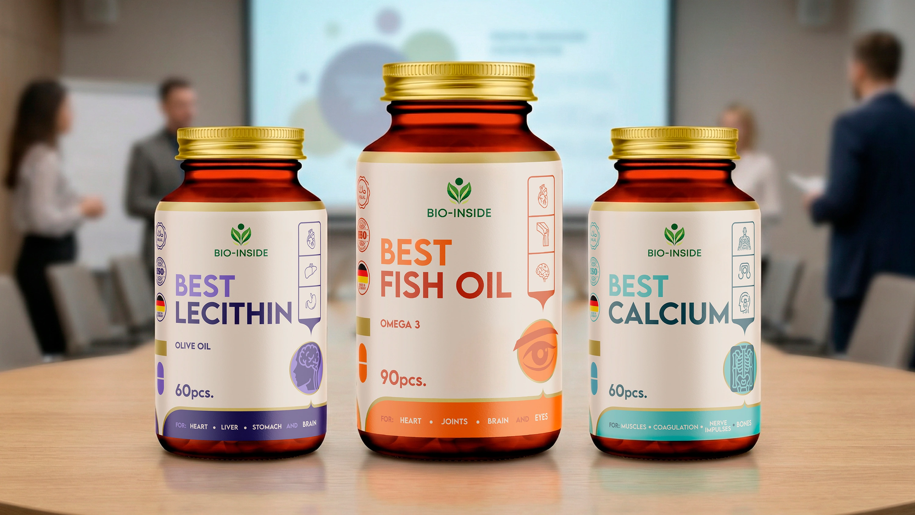
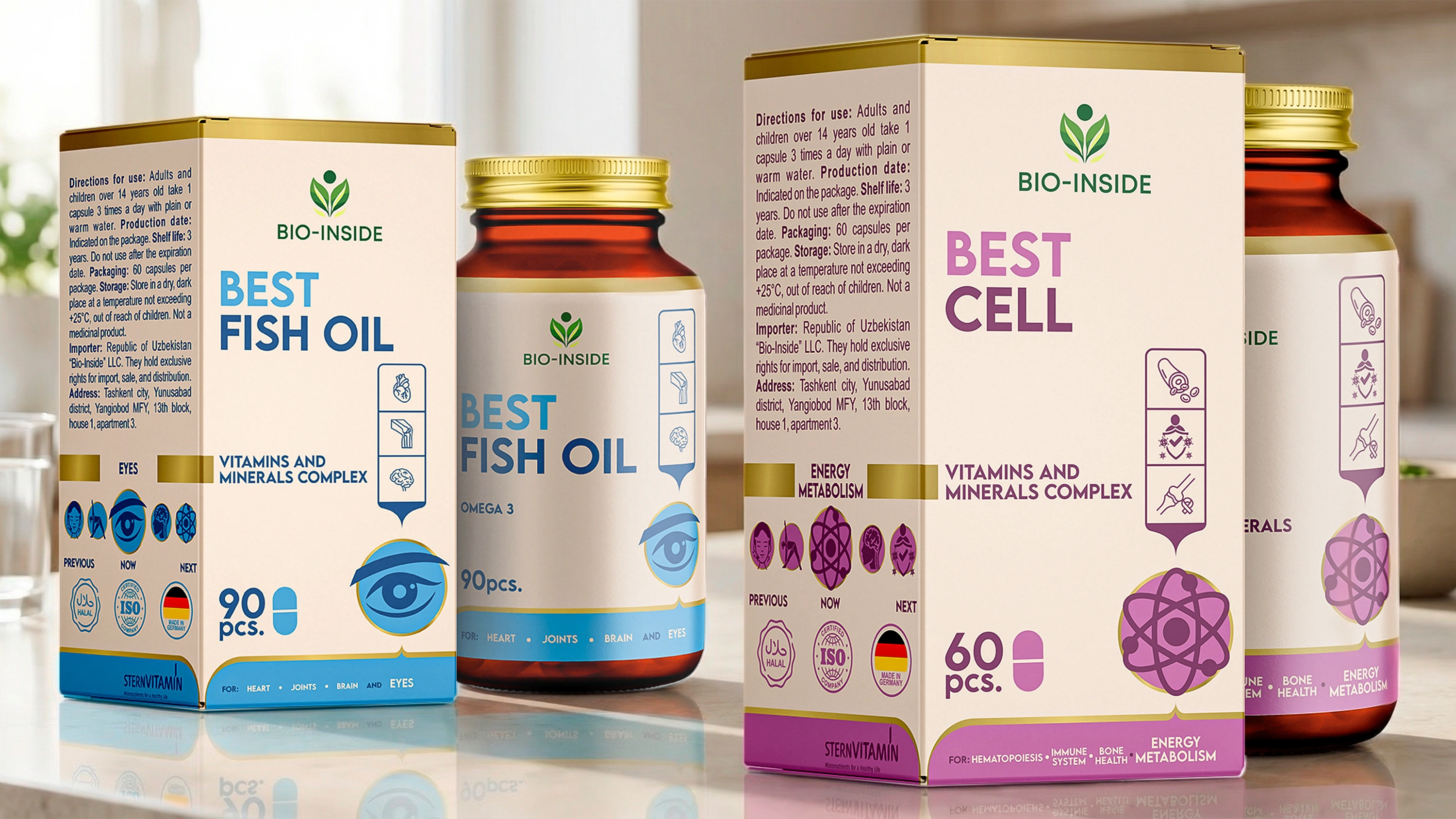
Bio-Inside – Dietary Supplement Packaging Design (BEST Line)
We have developed packaging for numerous pharmaceutical and supplement brands. We know the ins and outs of this industry. However, every new project brings its own unique insights. The Bio-Inside case was no exception. Usually, when discussing a new project, we look at it through a strictly professional lens: the market, competitors, color palettes... But this time, something magical happened: while the client was describing the product (which didn't even have a design yet), half of our team wanted to buy these supplements for themselves right then and there.
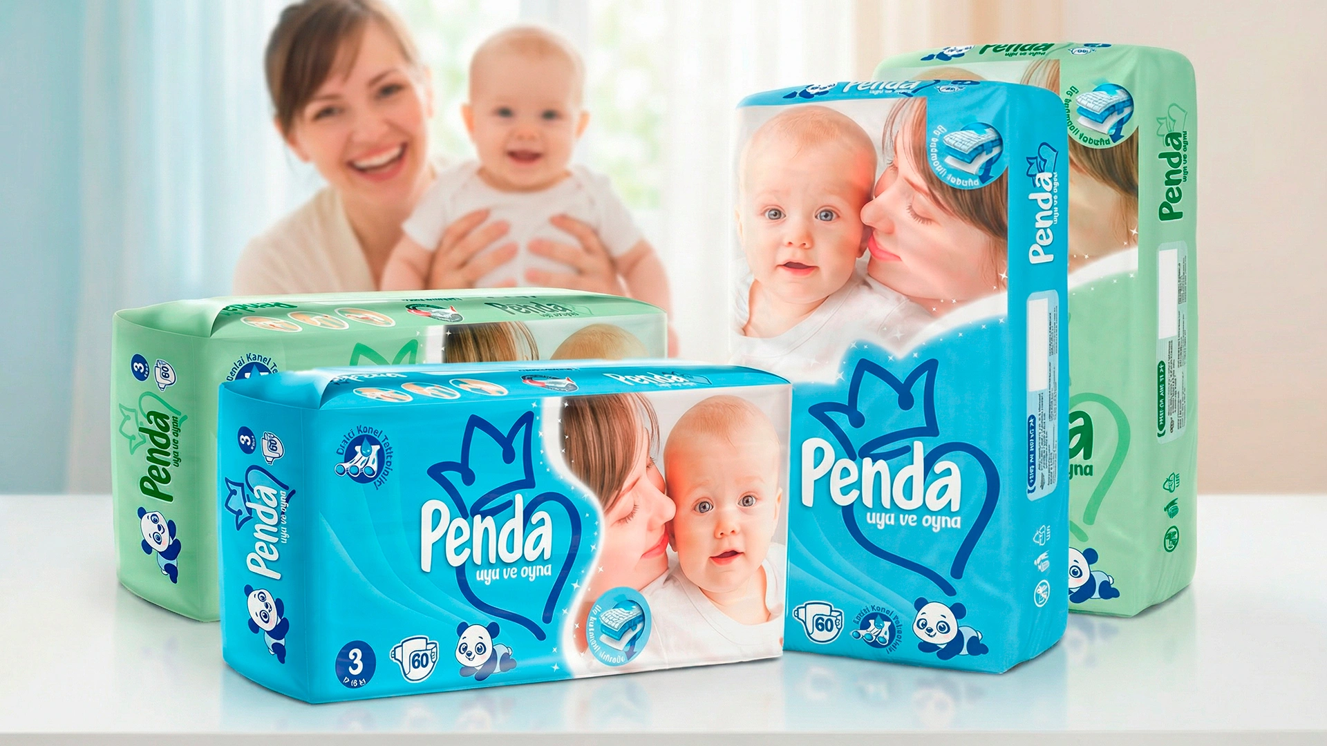

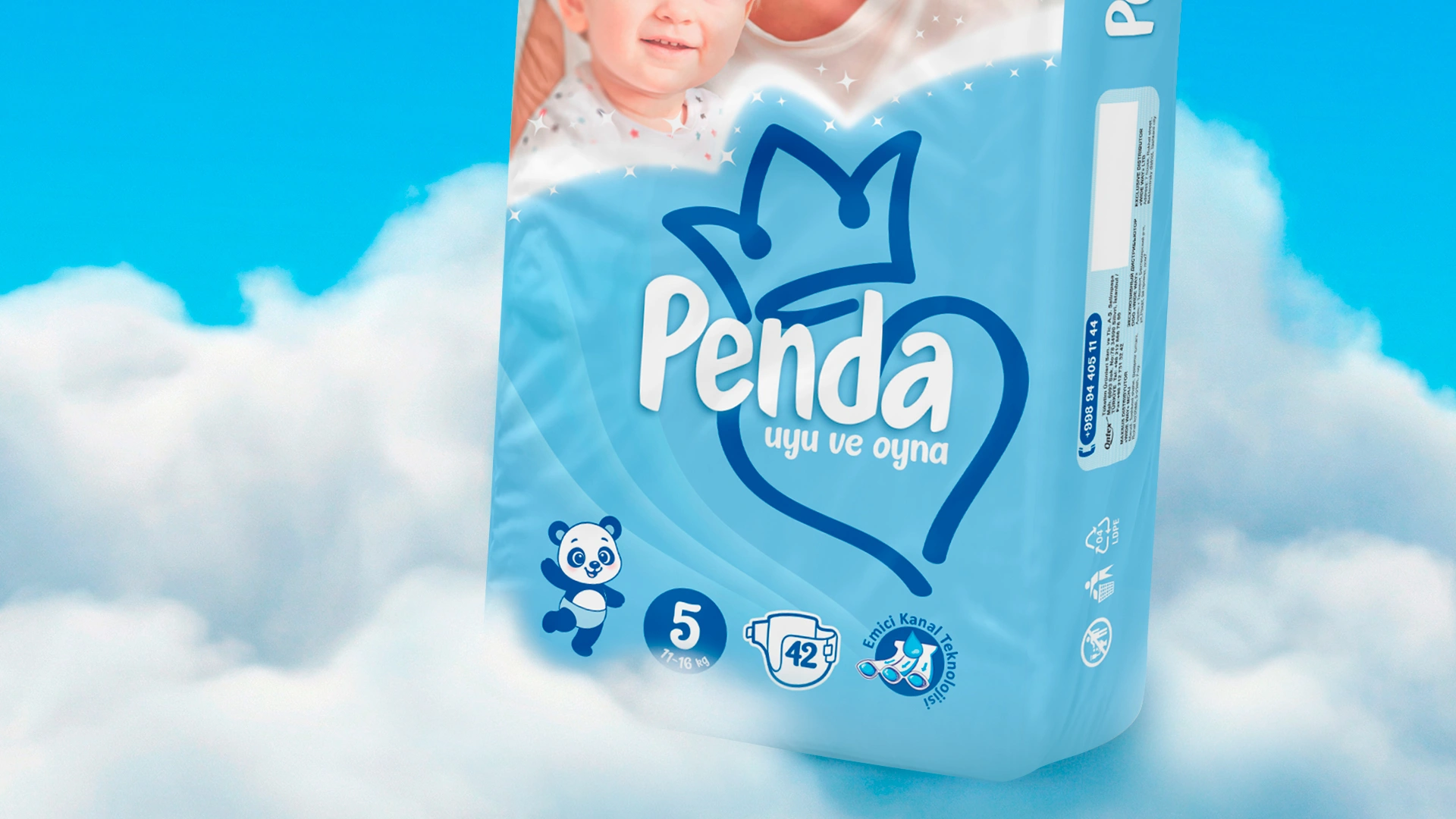
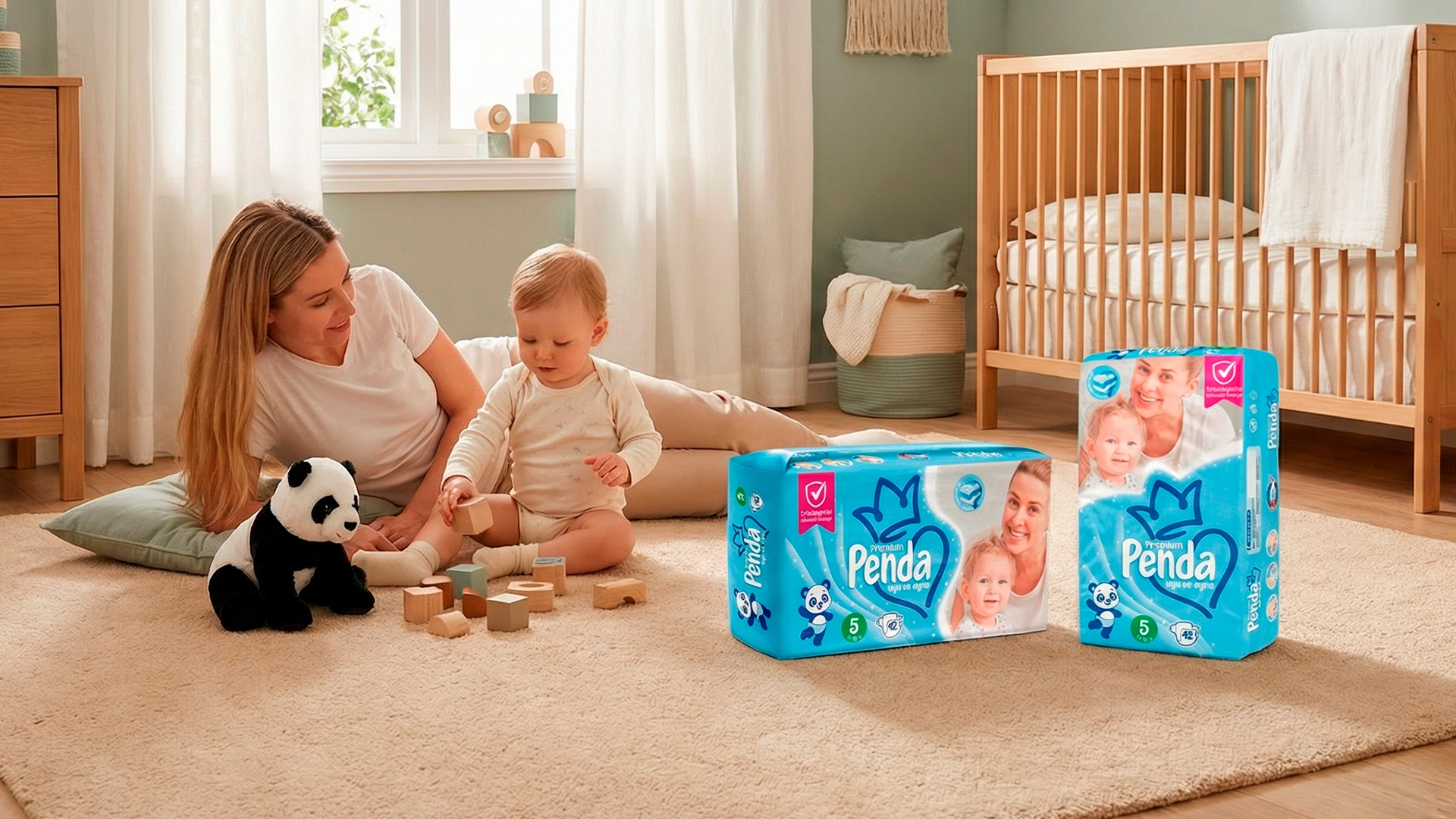
Penda – Logo and Packaging Design for Diapers
Client: "Penda" Industry: Hygiene products
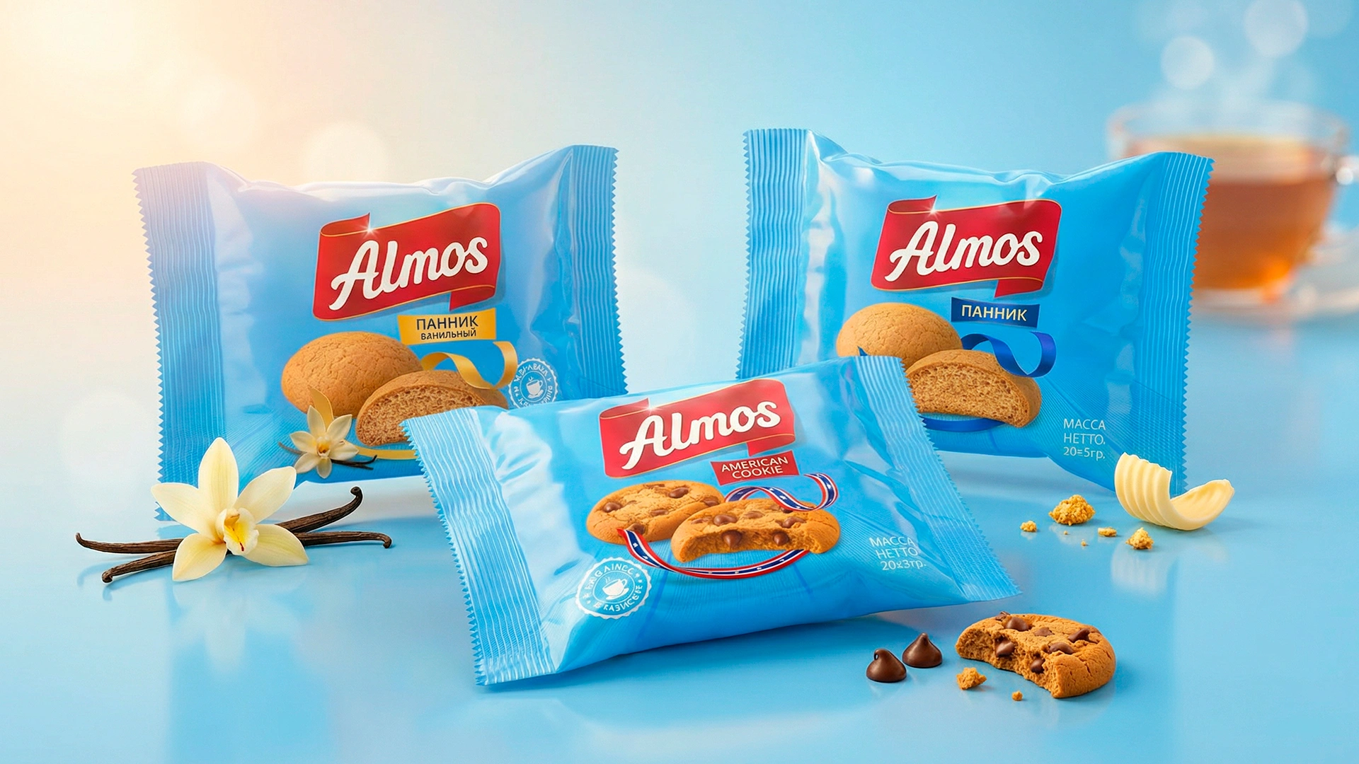
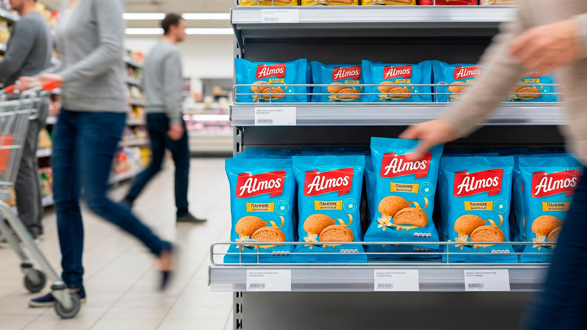
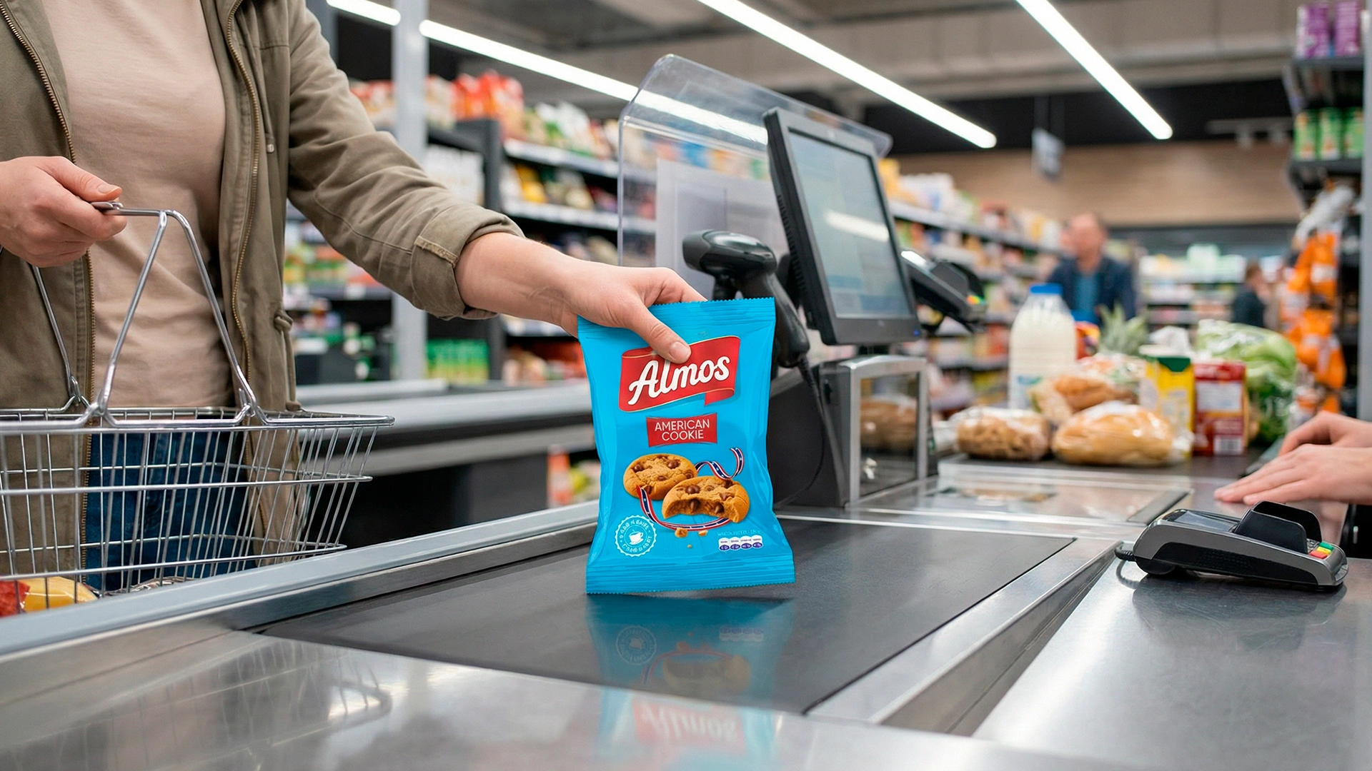
ALMOS – Branding and Packaging Design for Confectionery Products in Tajikistan
Client: Almos (Tajikistan) Industry: Confectionery Project: Full rebranding, logo, packaging design, design system Timeline: August 11 — November 11 (3 months of intensive work)
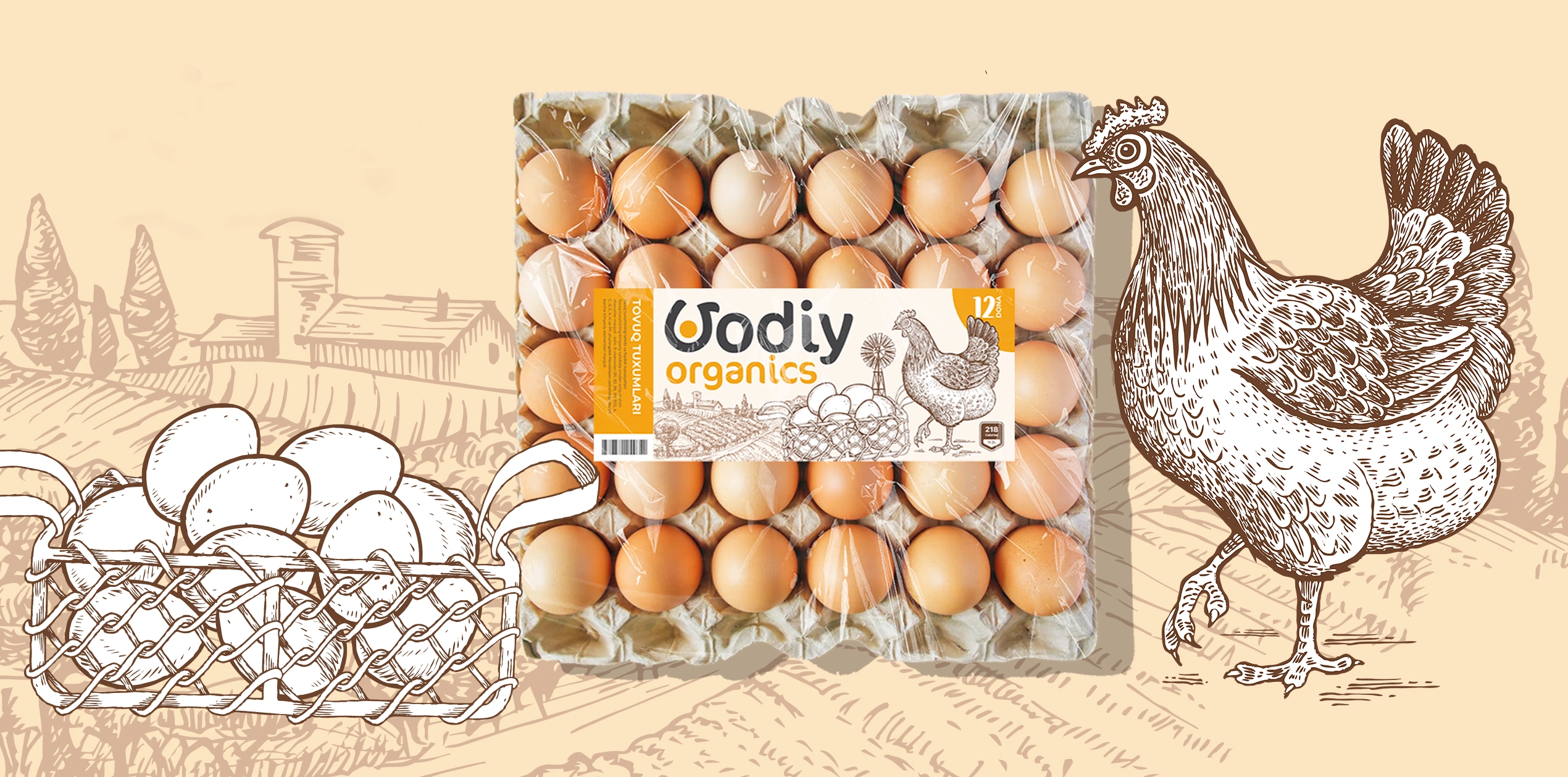
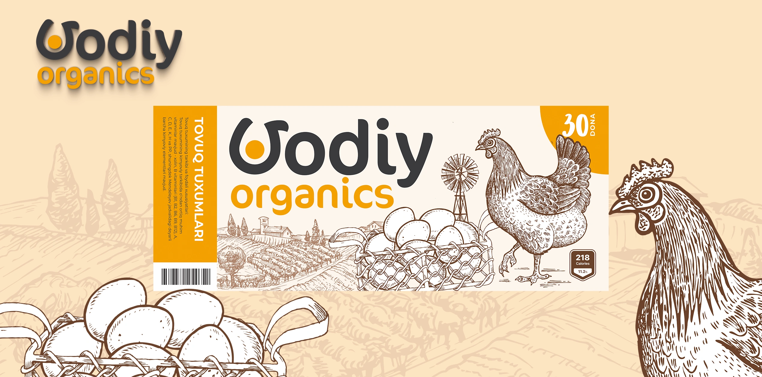
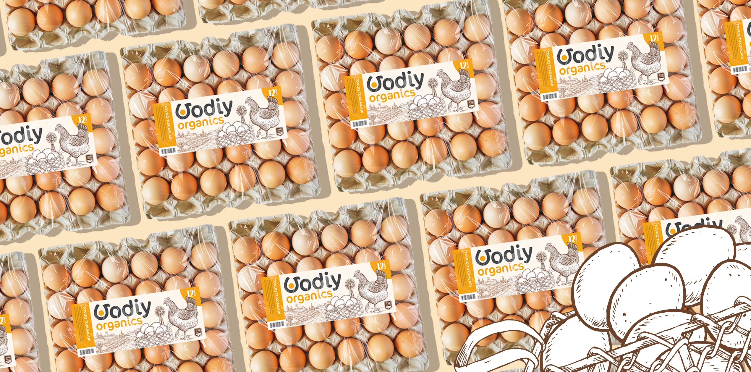
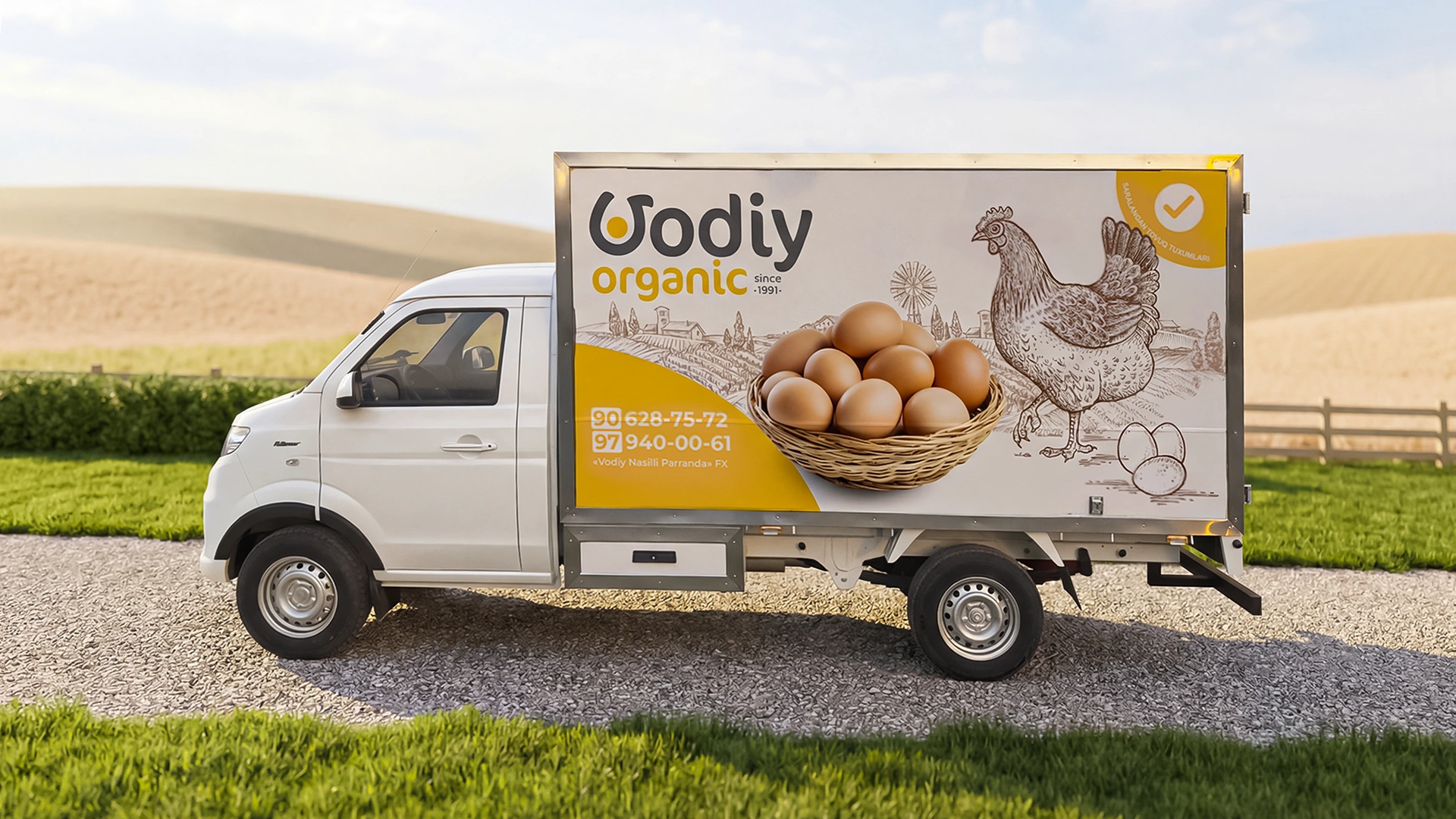
Vodiy Organics – Organic Egg Brand and Packaging Design
We’re sharing a case study that was completed some time ago but has only now "ripened" for release. This is the story of creating the logo and label design for Vodiy Organics.
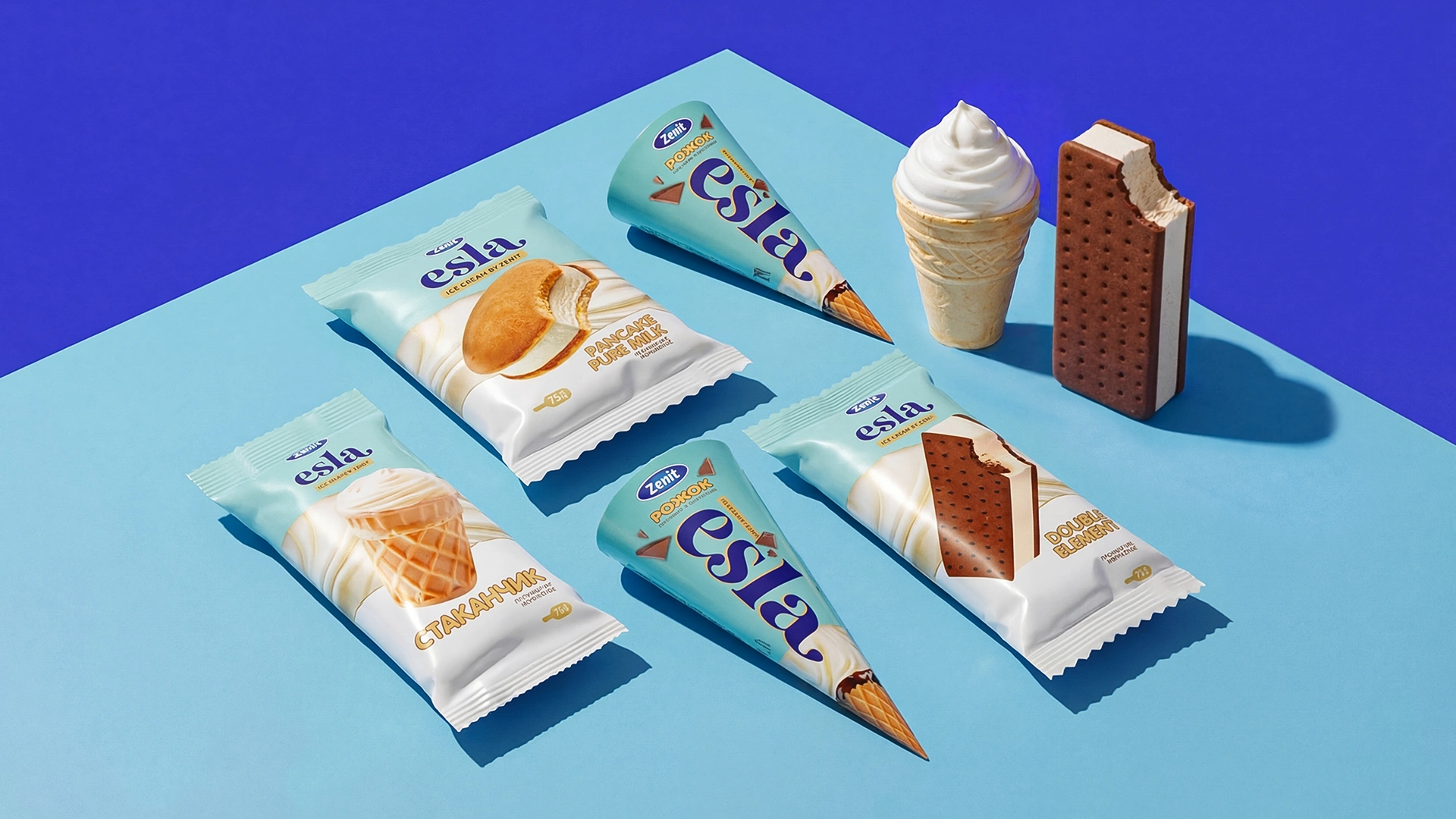
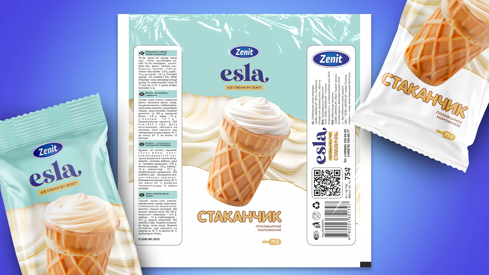
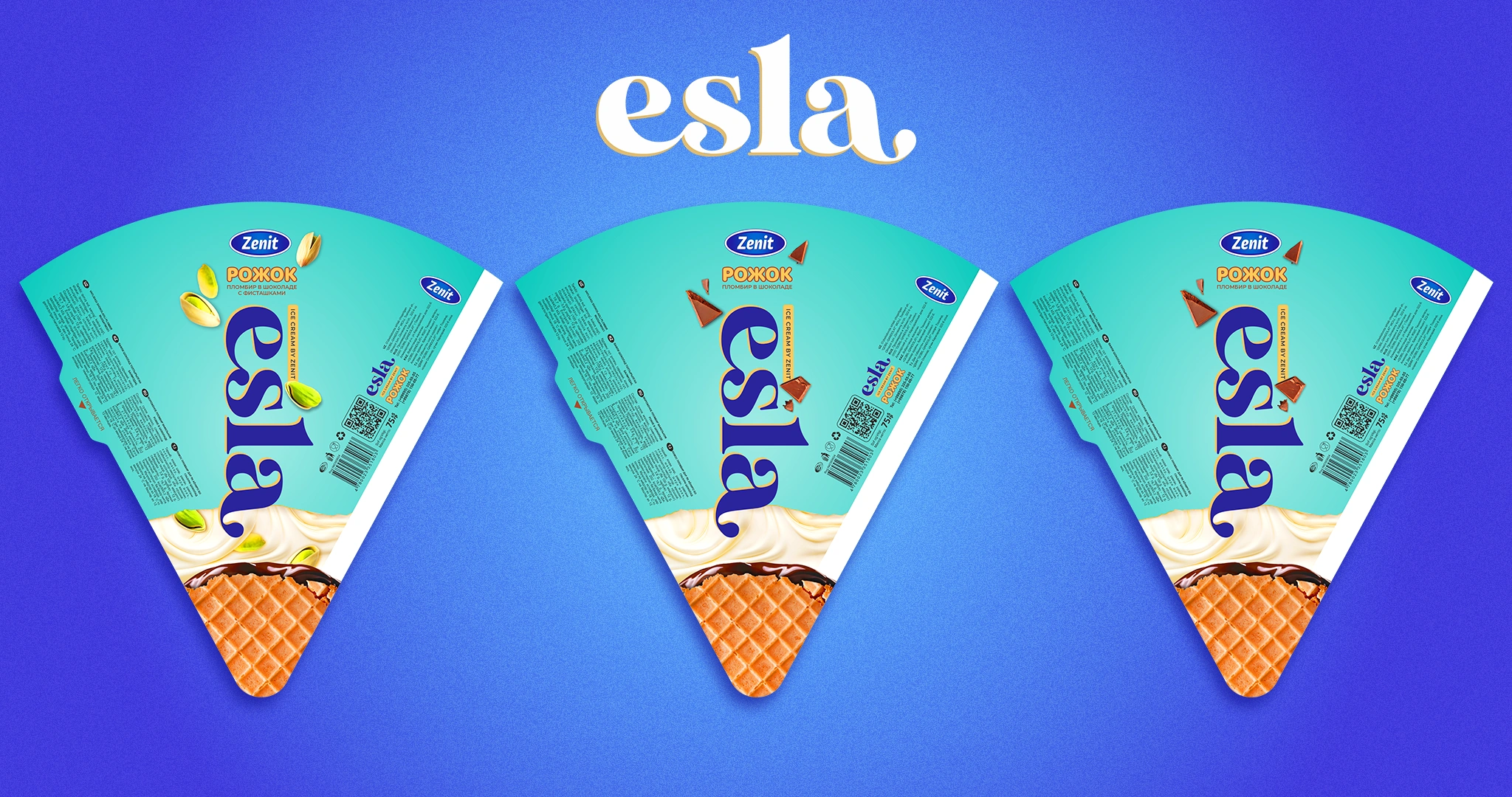
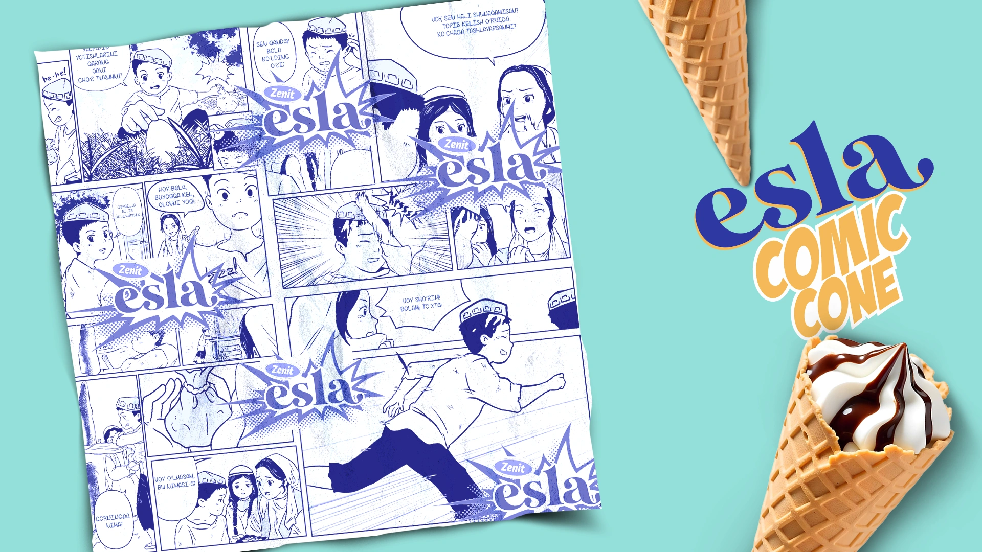
Esla — packaging Design & naming for an Ice Cream Brand
The Uzbek ice cream brand Zenit faced a challenge: they needed to create a unique identity for a new product line that would distinguish it from competitors and emotionally connect it with cultural values. The company's previous state did not reflect its individuality or communicate the high quality of its products.
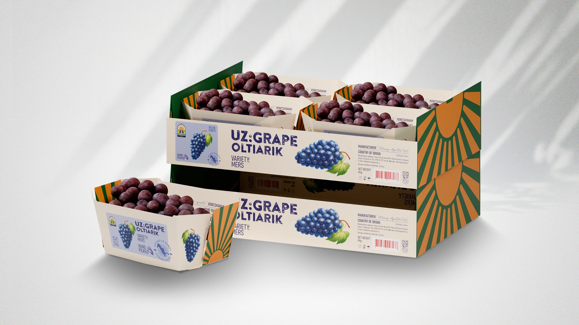
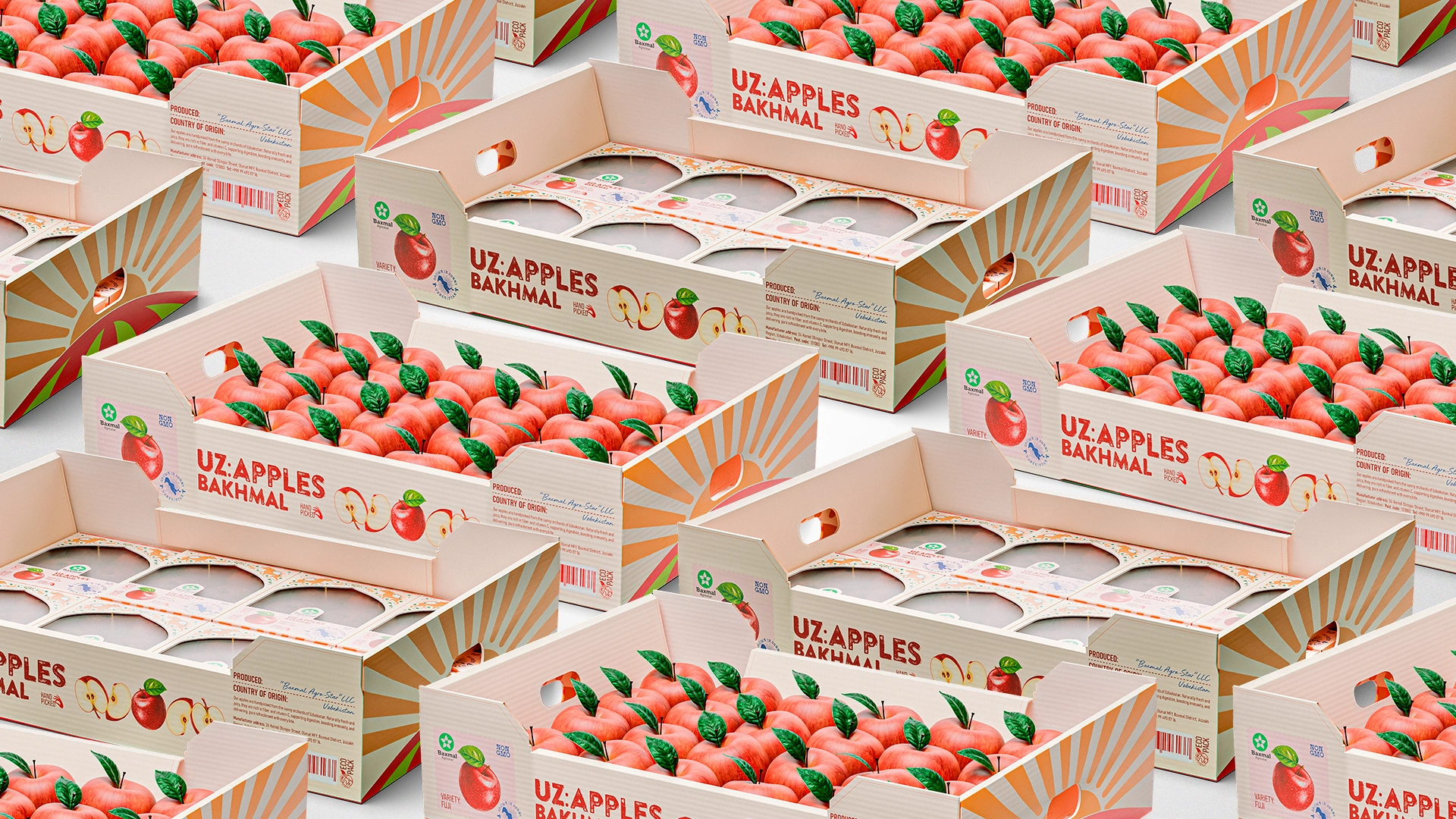
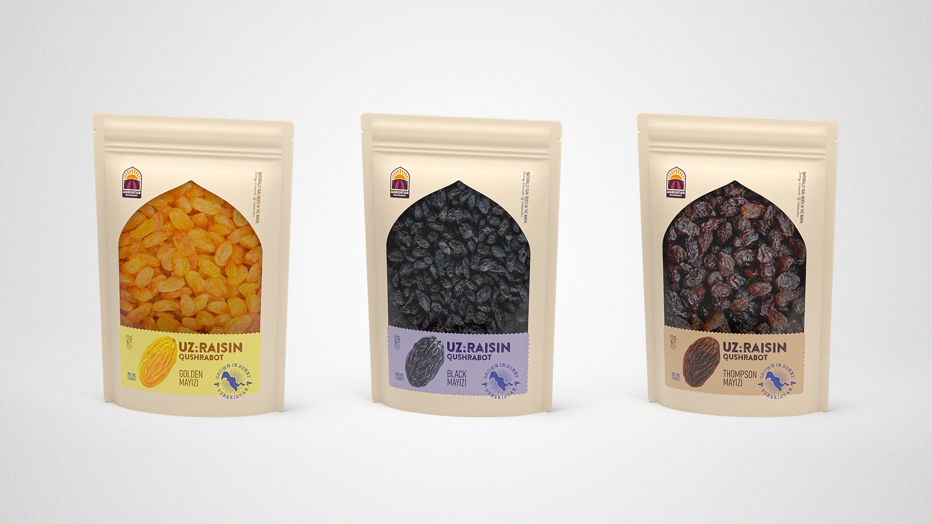
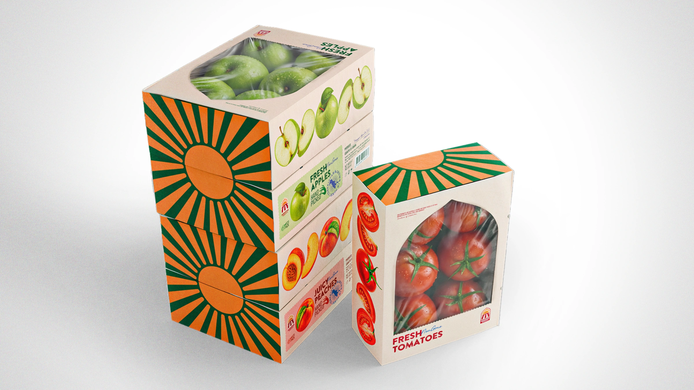
UzAgroStar — Packaging Design for Fruit and Vegetable Export
Export packaging design was developed for UzAgroStar. The cultural code (arches with Sherdor/Simurg symbols) and the "parcel" metaphor (stamps, Hand Picked) transform the product into a national brand, increasing its value on the global market.
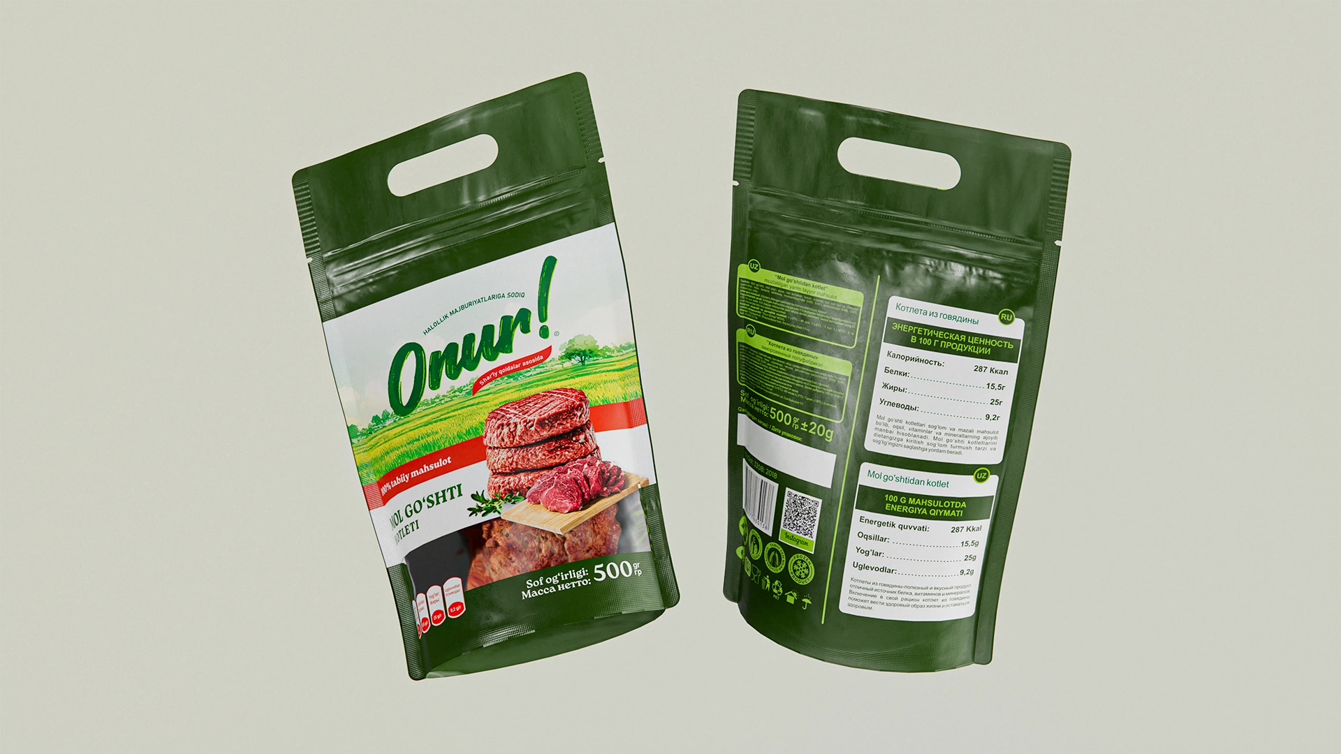
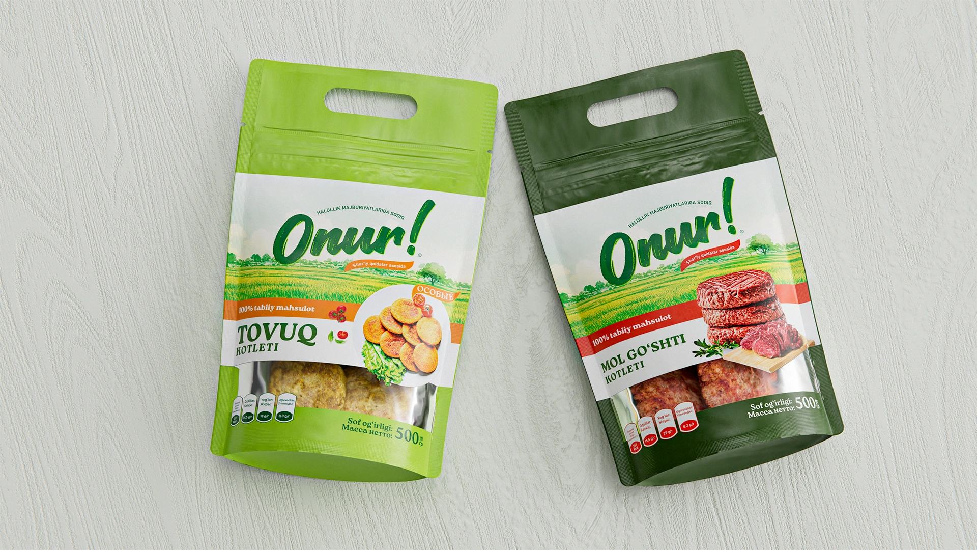
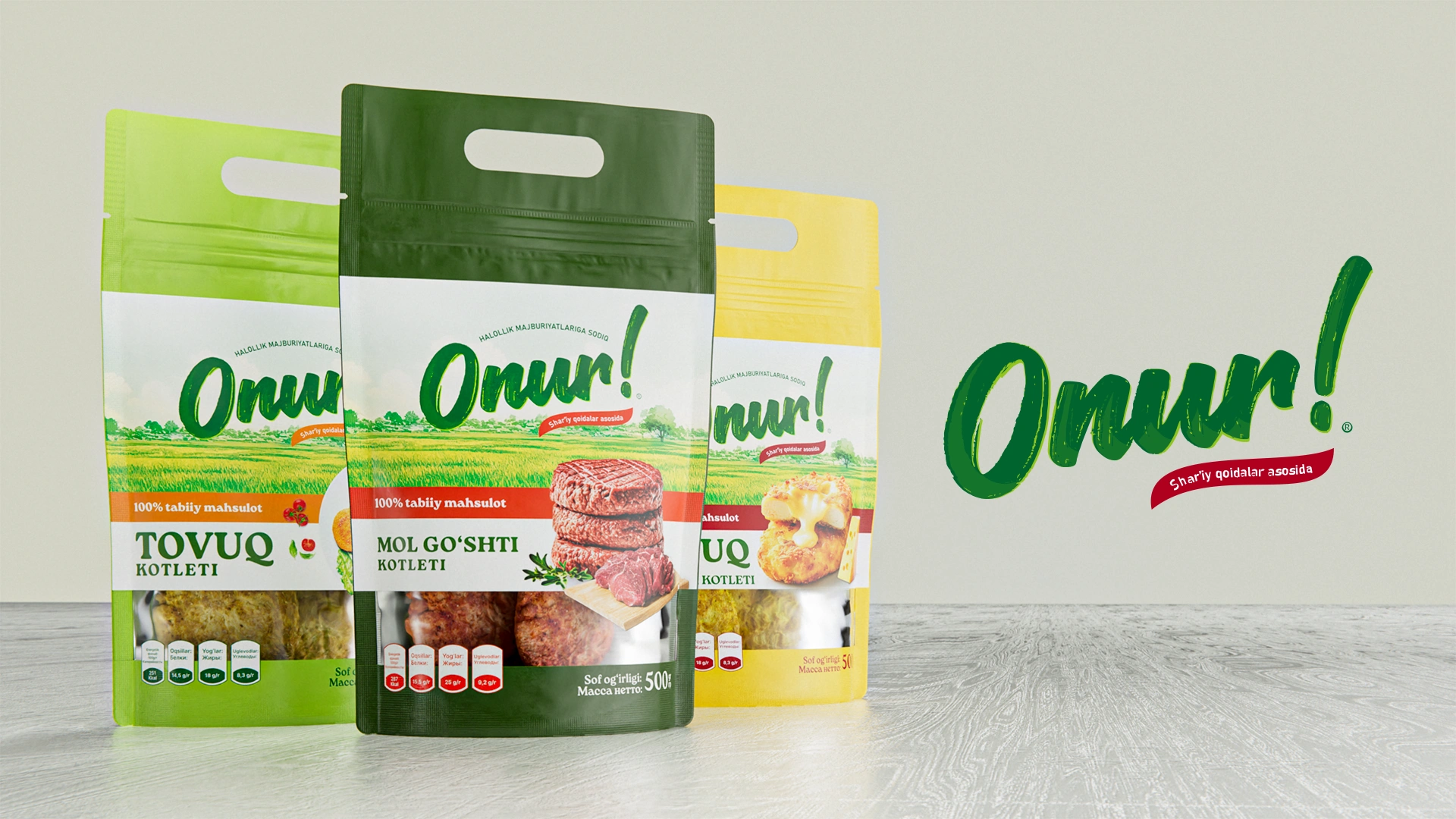
Onur — Naming and Packaging for Meat Semi-Finished Products
Onur – Naming and Packaging Design for Meat Semi-Finished Products
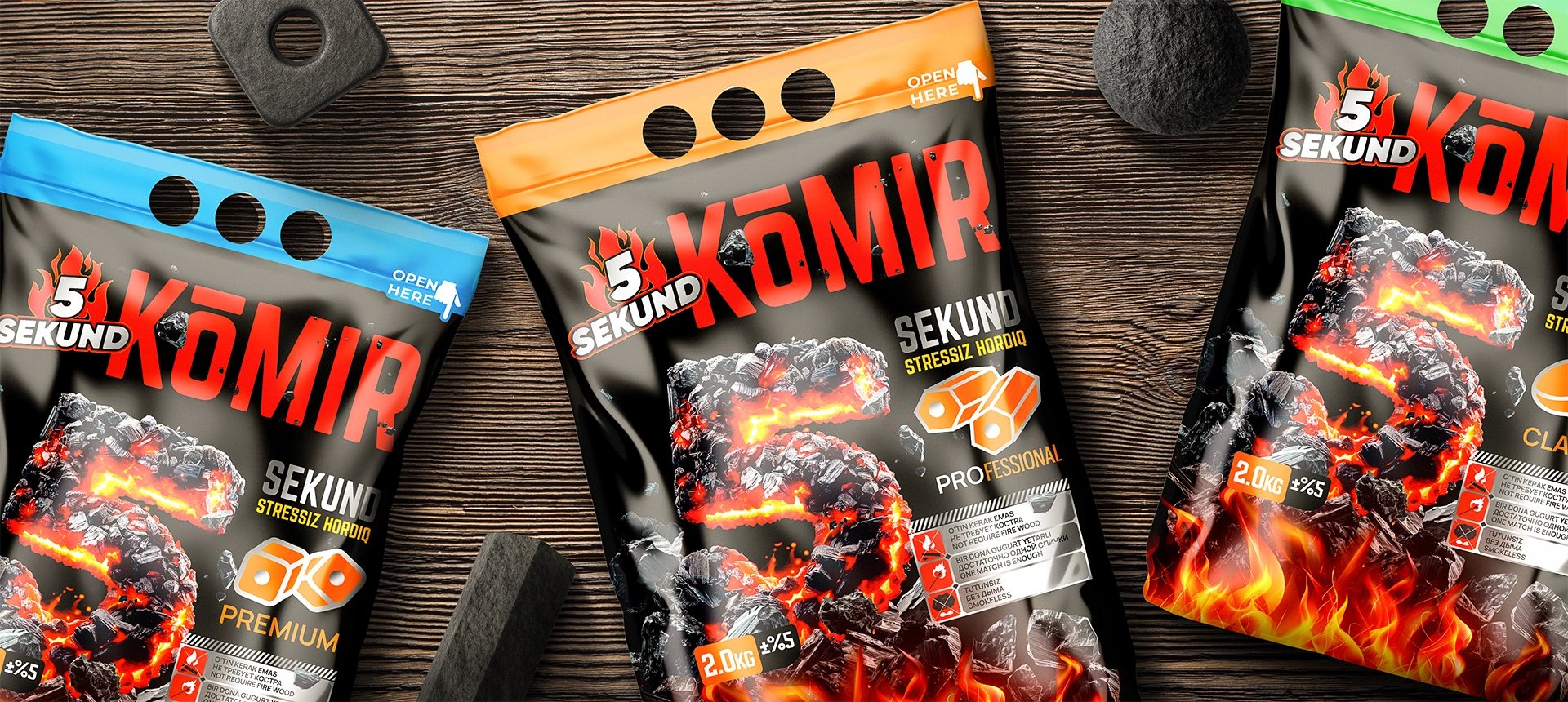
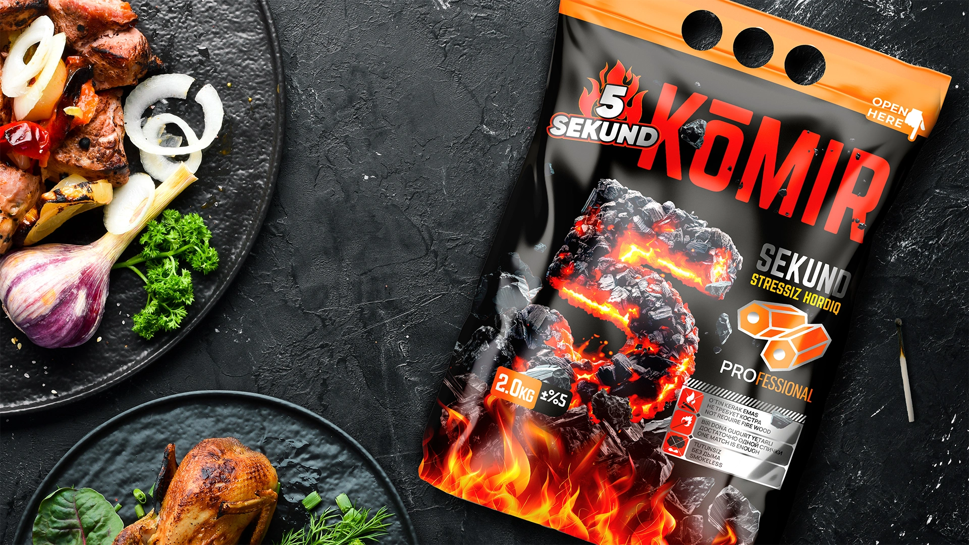
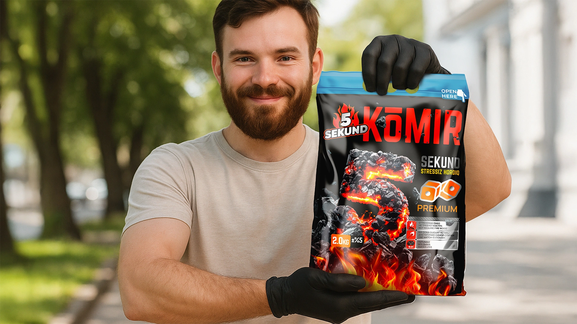
5 SEKUND — Naming and Packaging Design for Briquette Charcoal
The 5 SEKUND brand (charcoal) was developed: the naming emphasizes instant ignition. The design features a glowing "5" on a black background and infographics to instantly explain the product's uniqueness and ease of use.
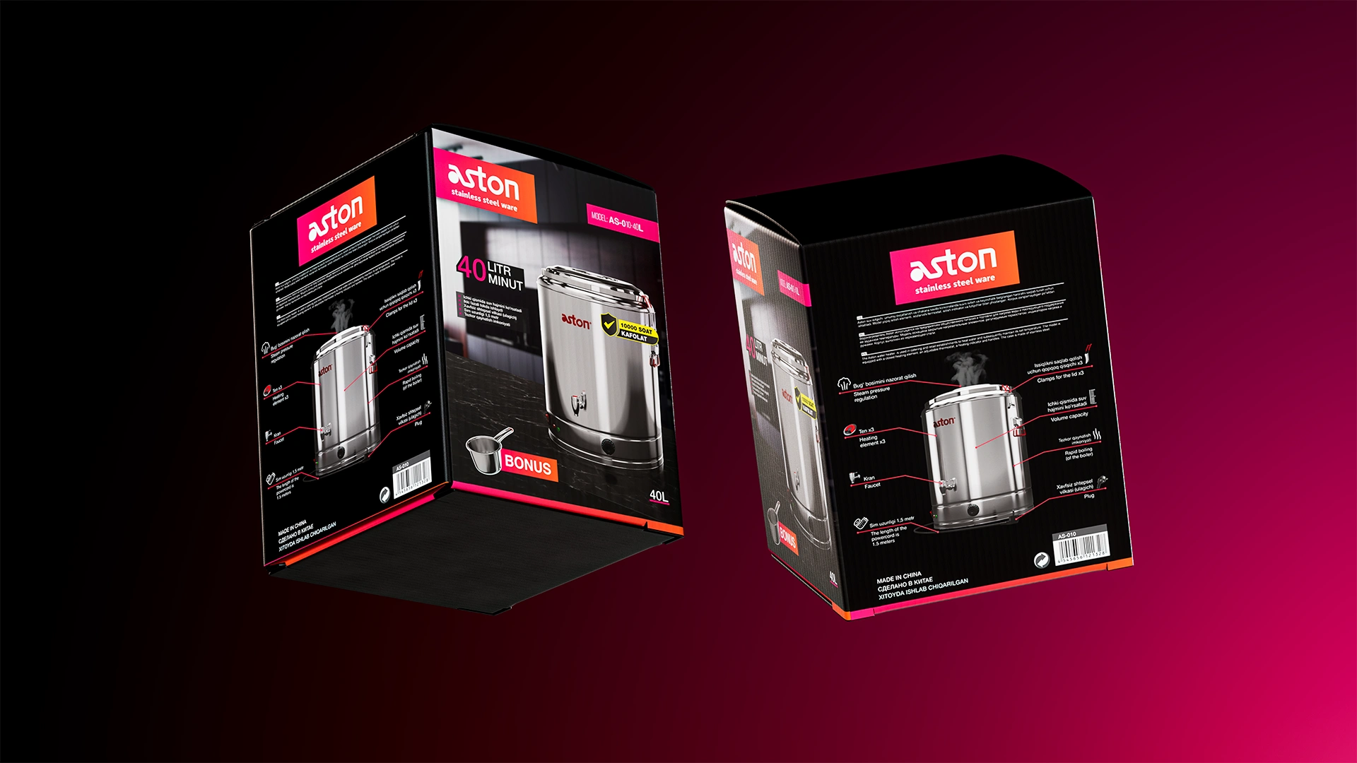
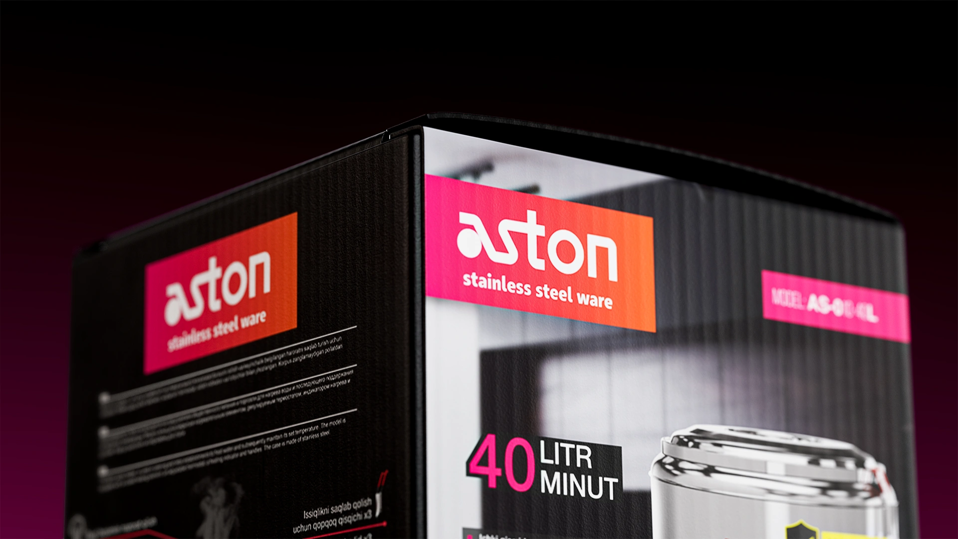
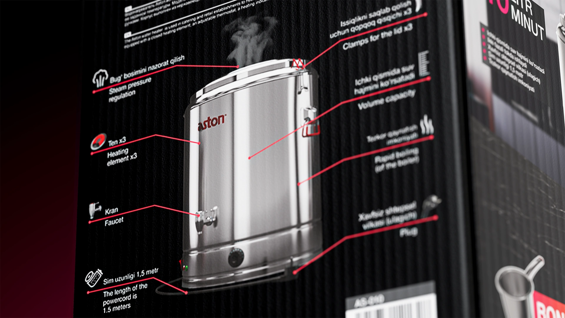
Aston — Naming and Packaging Design for Kitchen Appliances
We developed the Aston naming (association with Europe) and packaging design for stainless steel kitchen appliances. The black background and red-pink accents emphasized technological sophistication and premium quality, securing the brand's leadership in the Uzbekistan niche.
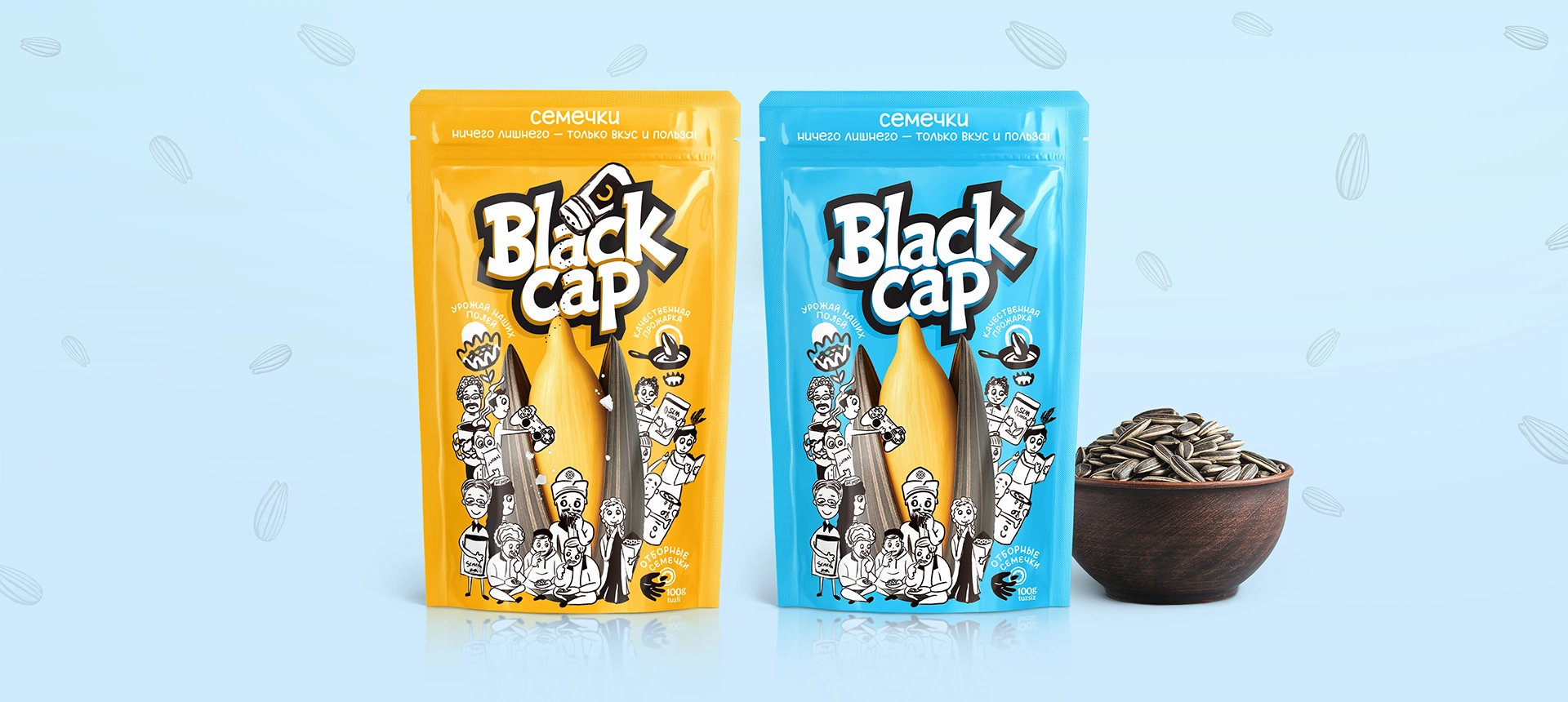
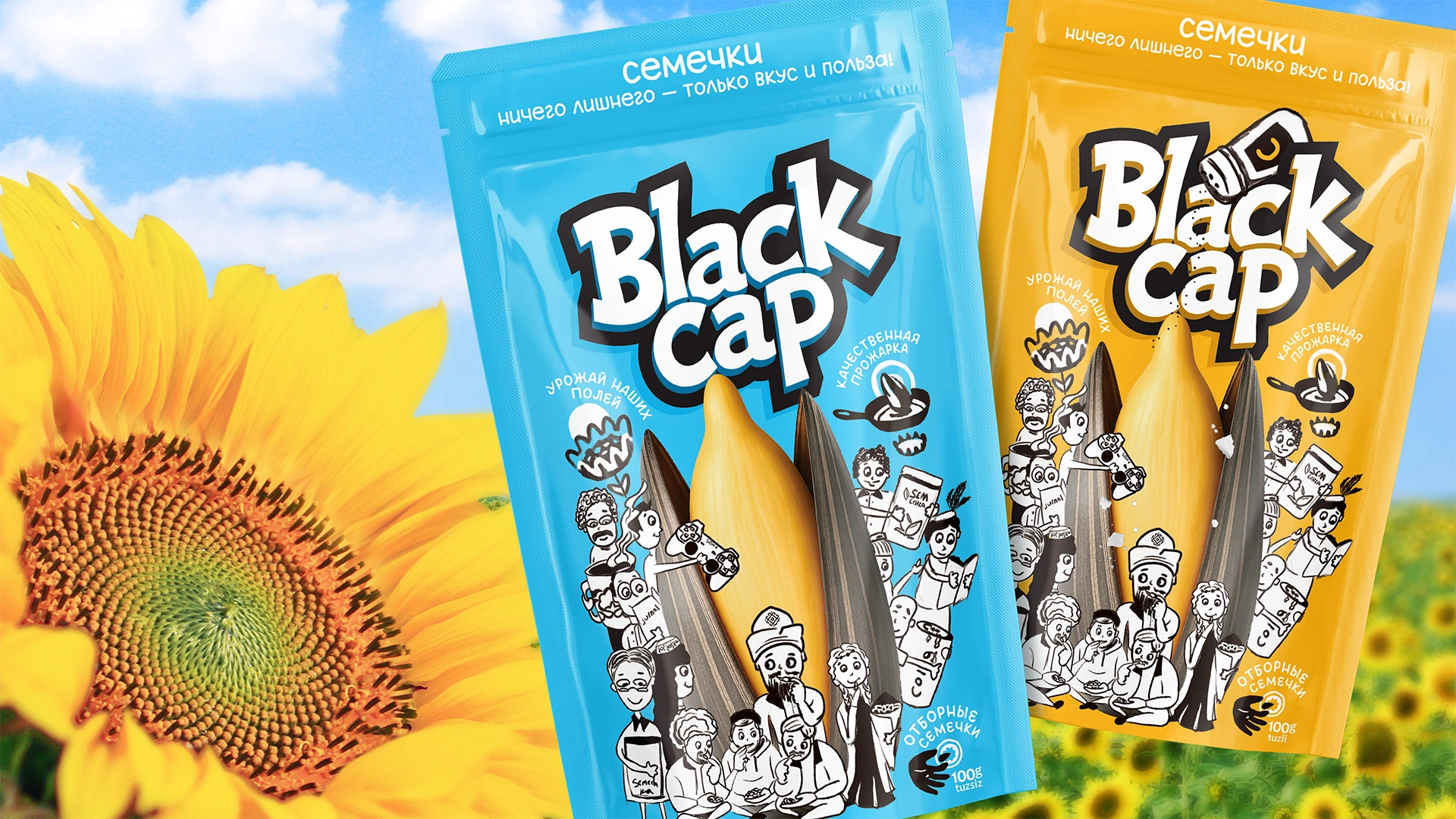
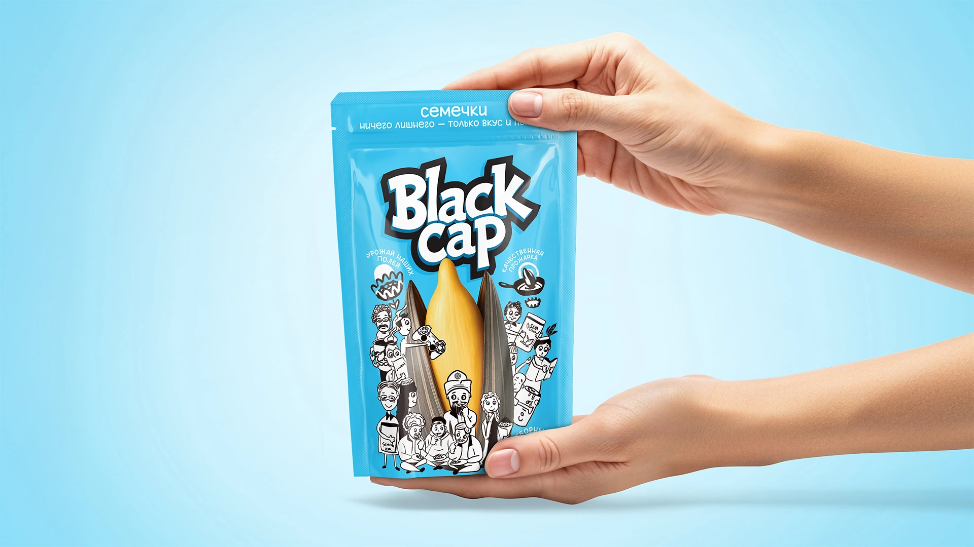

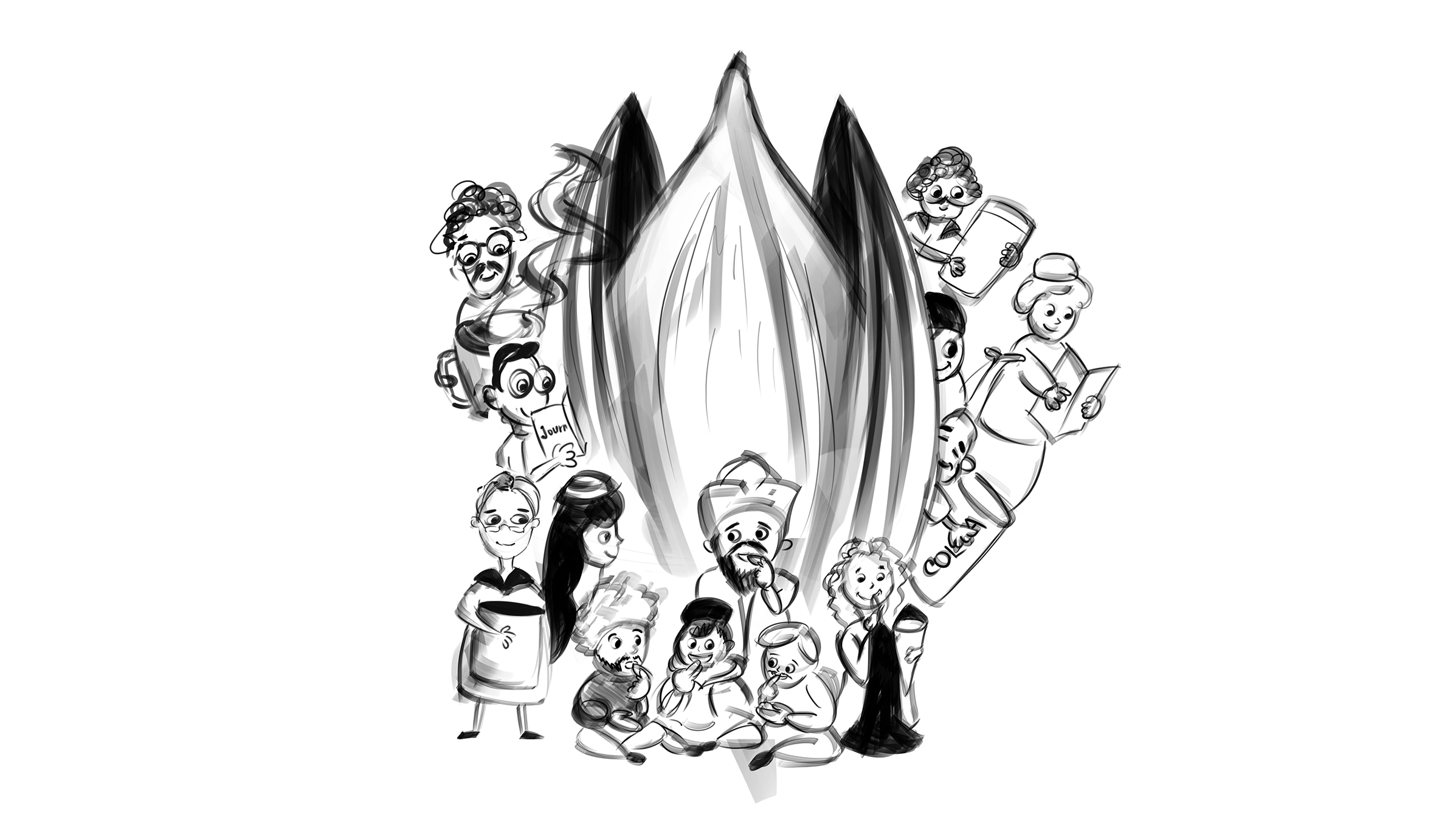
Black Cap – Sunflower Seeds Packaging Redesign
Black Cap is a sunflower seed brand redesigned with inspiration from everyday life and traditions in Karakalpakstan. It features a bold new name, local characters, and a visual identity that resonates with the people.