Our works
Dive into the world of solutions we have created that inspire, build trust and make businesses successful
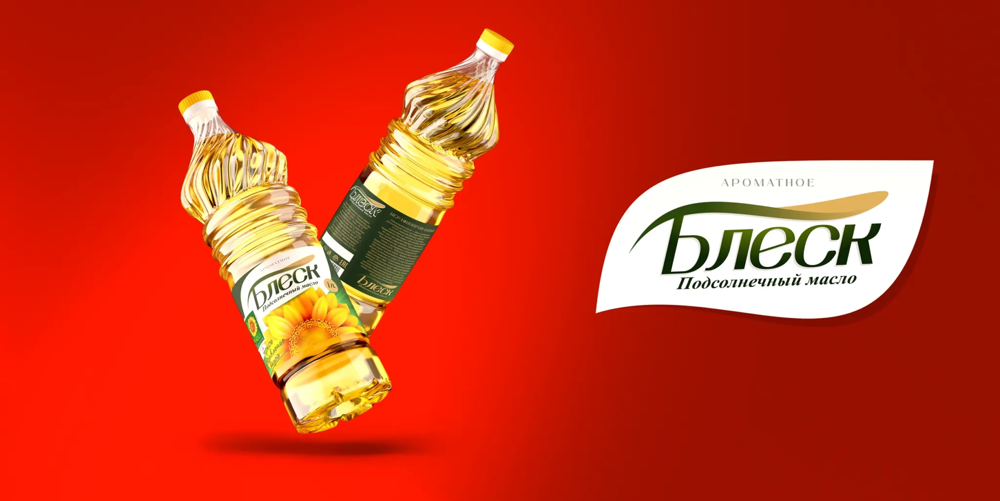


Blesk: Naming and Packaging Design for Sunflower Oil
Our team developed the naming and packaging design for the sunflower oil product. We started the work by conducting a marketing analysis, studying the market and the needs of the target audience. The first important insight we received was that consumers are more loyal to sunflower oil brands that have a Russian name and spelling. Moreover, we took into account that the name should express the purity and quality of the product.
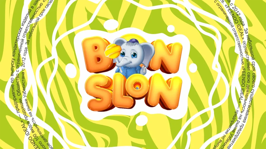


Bon Slon: Naming & Brand Concept for a Confectionery Company
Name for a confectionery company Task: Come up with a memorable name, for example, Chupa Chups. Found name: Bon Slon
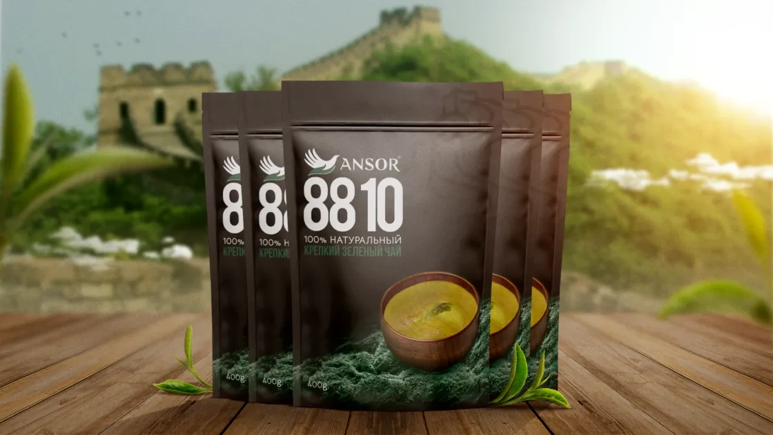
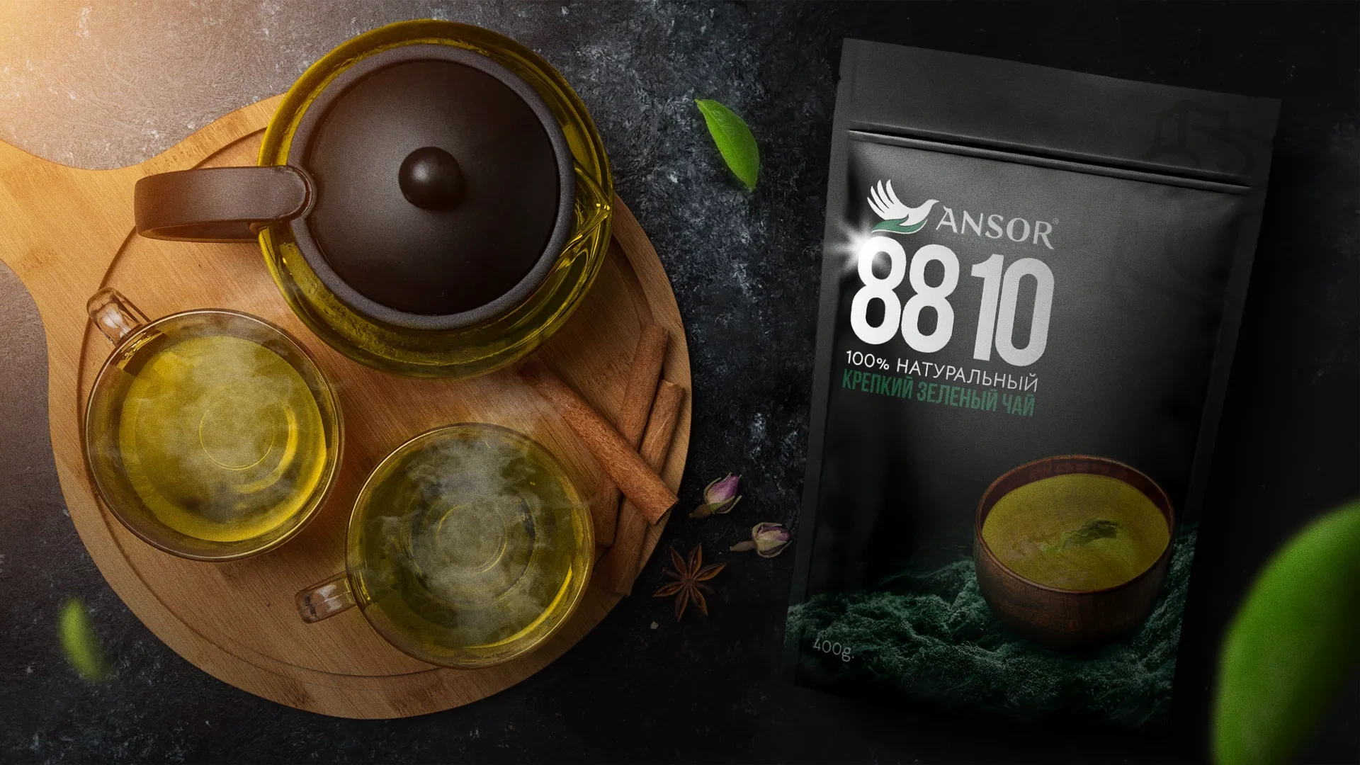

Ansor 8810 — Packaging Design for Premium Green Tea
Ansor 8810 is a premium green tea variety that is popular among wealthy audiences in the regions of Uzbekistan.
MVD Stickerpack — Sticker Design for the Ministry of Internal Affairs
Together with the Department of Public Relations of the Ministry of Internal Affairs, we developed the idea of a unique sticker pack, in which law enforcement officers and traffic police are depicted in a friendly and welcoming manner.

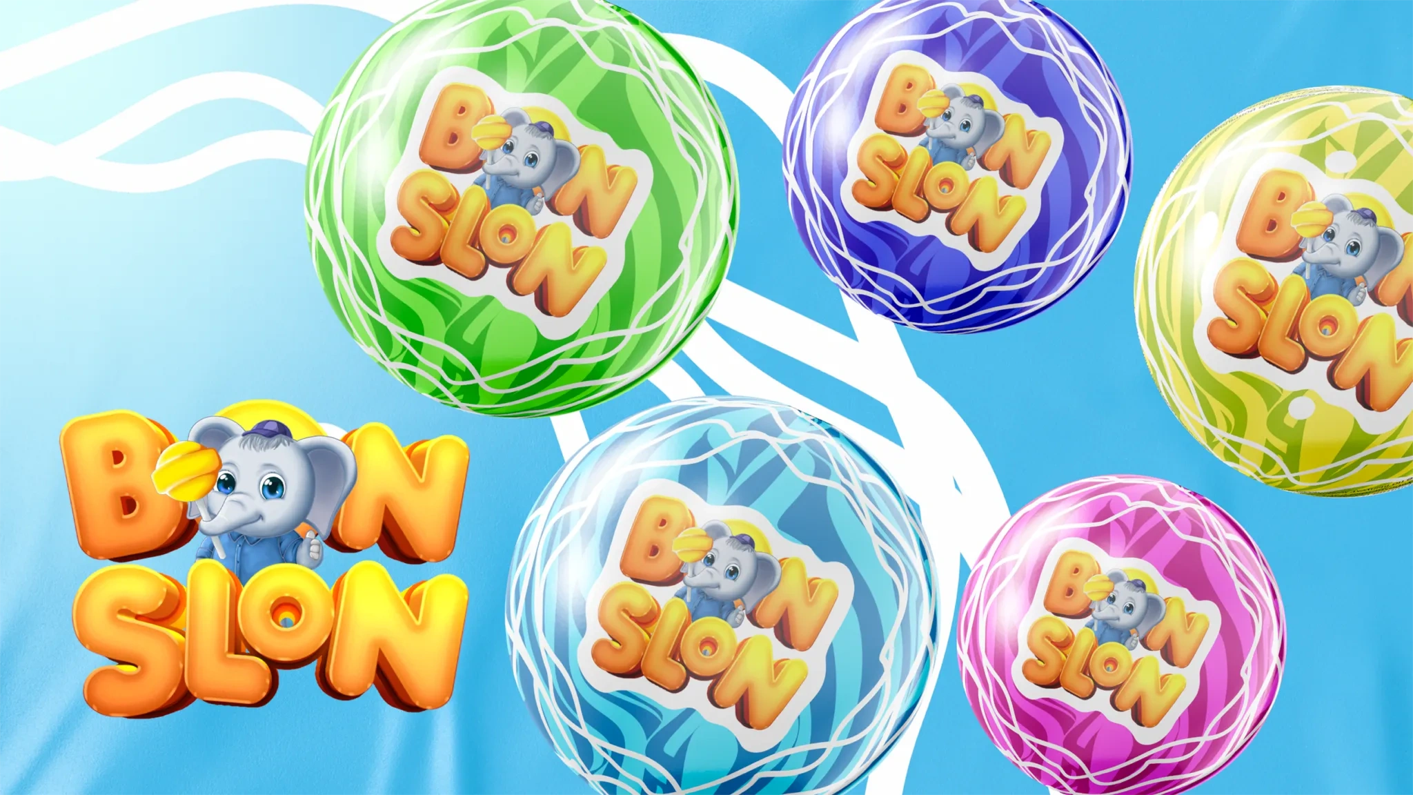
Bon Slon — Naming and Brand Concept for a Confectionery Company
Name for a confectionery company Task: Come up with a memorable name, for example, Chupa Chups. Name found: Bon Slon
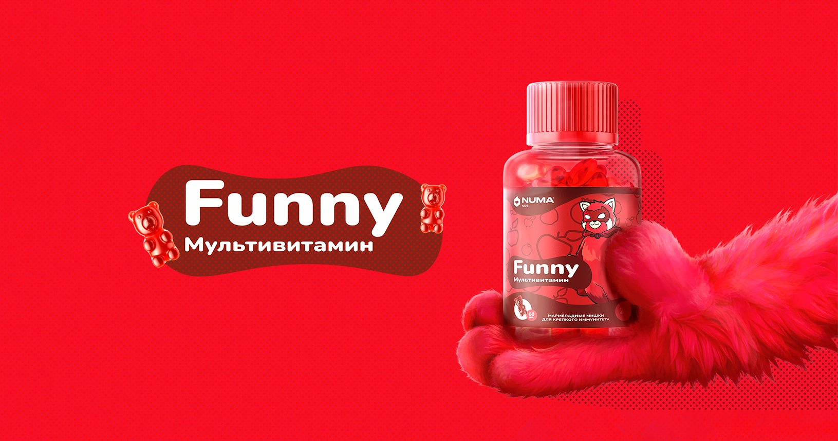
Numa Kids — Packaging Design and Characters for Children's Supplements Line
Проблема Возрастает важность запоминающегося дизайна упаковки c ростом популярности БАД. Покупатели часто выбирают продукты исходя из внешнего вида, доверяя визуальным впечатлениям, прежде чем ознакомиться с инструкцией. Цель — создание индивидуальной упаковки для каждого продукта в новой линейке БАД.
Samandar Milk Food — Packaging Redesign for Dairy Products
What does the quality of dairy products mean to the people of Uzbekistan? This is the image of an aunt who brings fresh dairy products directly to the entrance of high-rise buildings every morning, loudly announcing “Milk, kefir, yogurt, cottage cheese…”. The image of this aunt is not just a unique delivery tradition, but a symbol of quality familiar to every Uzbek. Damas is more than just a vehicle; it’s a symbol of delivery that has been popular in Uzbekistan for generations.
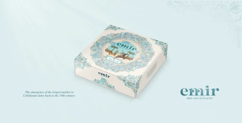
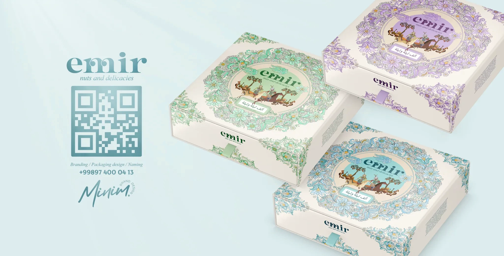


Emir — Branding and Packaging Design for Uzbek Dried Fruits
Uzbekistan is famous for its sunny weather, healthy and tasty fruits and vegetables. It is also a historical country that attracts many tourists every year. Tourists usually take souvenirs with them to share with family and friends, and Uzbek dried fruits are often one of these souvenirs. Compared to watermelons, melons and some handicrafts, dried fruits are convenient, sweet, tasty and valuable gifts for any guest of Uzbekistan. To help our client make dried fruits more suitable for the tourist trade, we created a brand named after the famous Uzbek military leader Amir Temur.
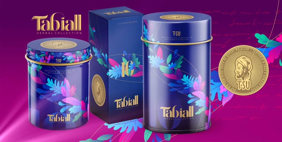


Tabiall — Naming and Packaging Design for Herbal Tea
We created the packaging design and naming of herbal tea set based on Abu Ali ibn Sina’s recipes, for the T-SU brand. The client’s request was to create a naming, colorful and premium packaging design for a new product.


Pokiza — Packaging Design for Sausage Products (Tajikistan Market)
Cooperation with a neighboring country The next customer is the Pokiza brand, a top 3 sausage producer in the domestic market of Tajikistan.