Our works
Dive into the world of solutions we have created that inspire, build trust and make businesses successful
MONDAY – Express Branding for an Ice Cream Brand in Uzbekistan
Name, logo, and competitive packaging design developed within 2 weeks for an MVP product launch.
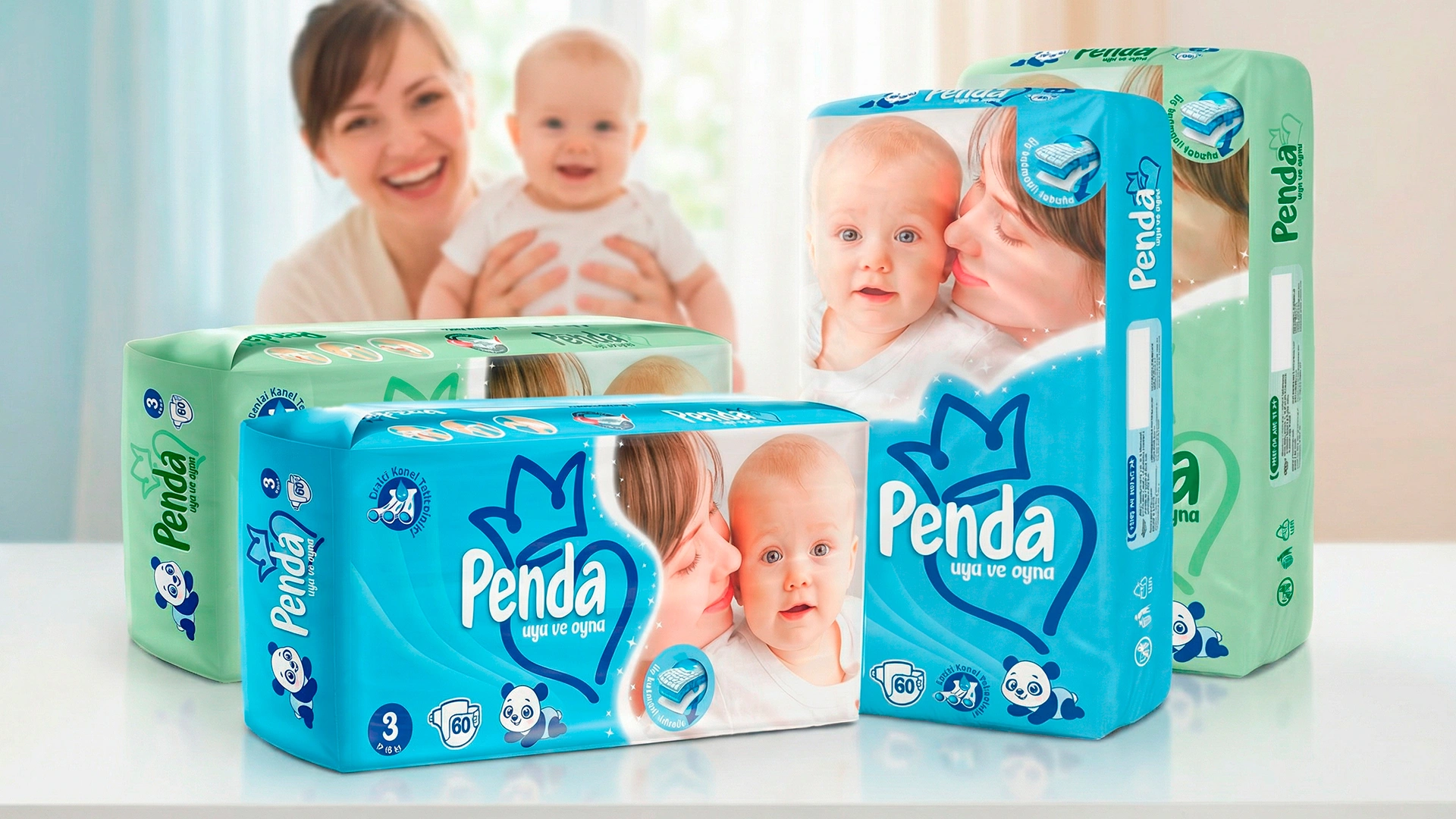

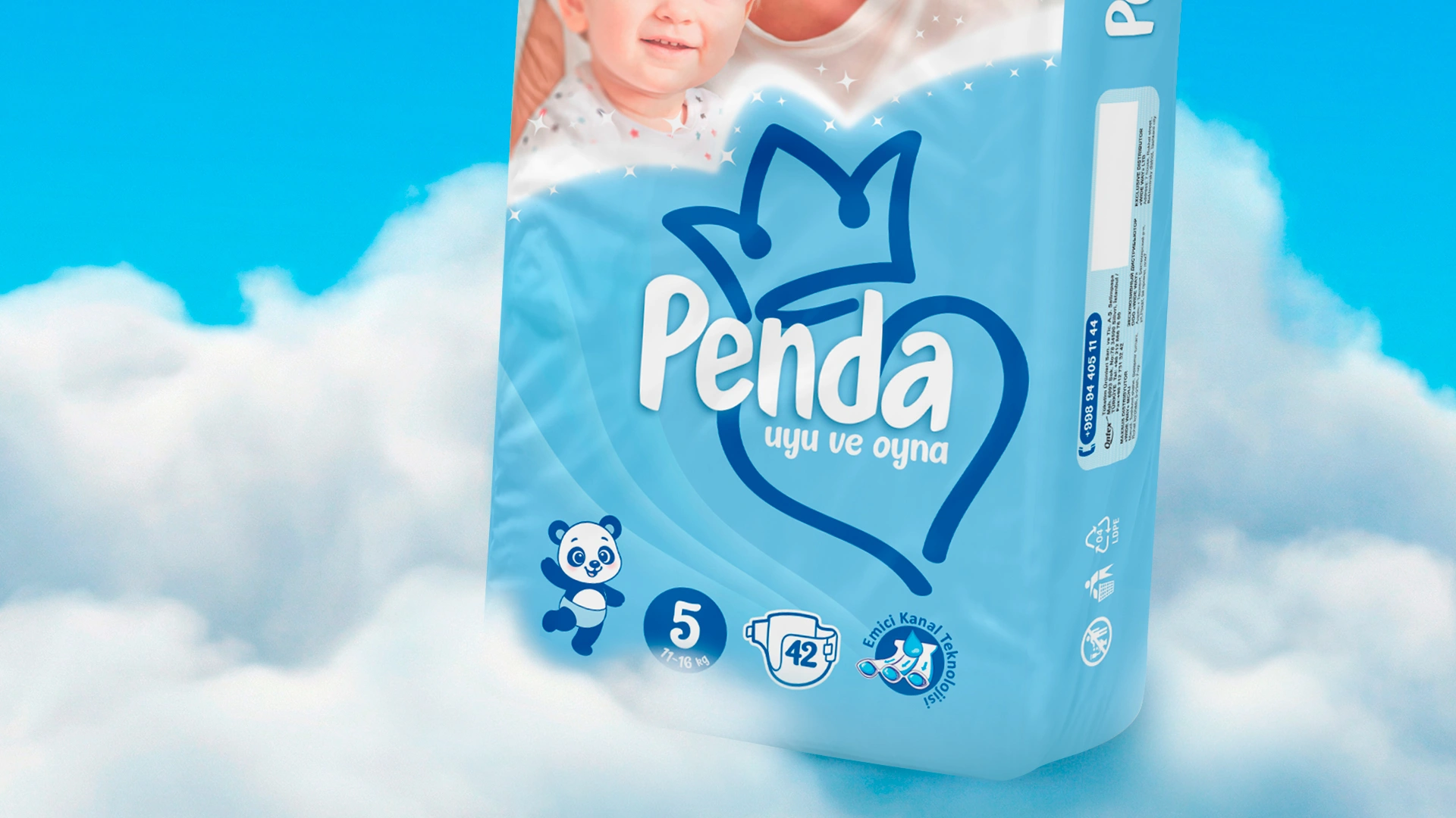
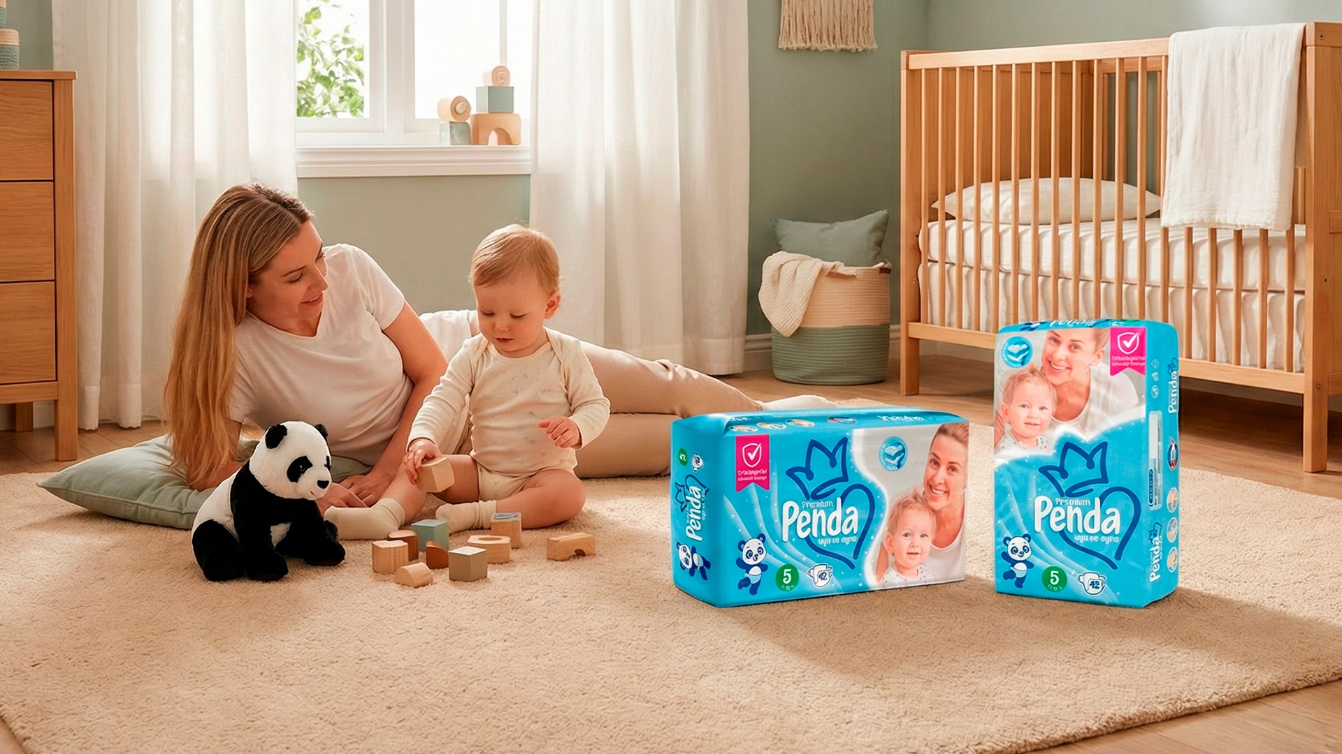
Penda – Logo and Packaging Design for Diapers
Client: "Penda" Industry: Hygiene products
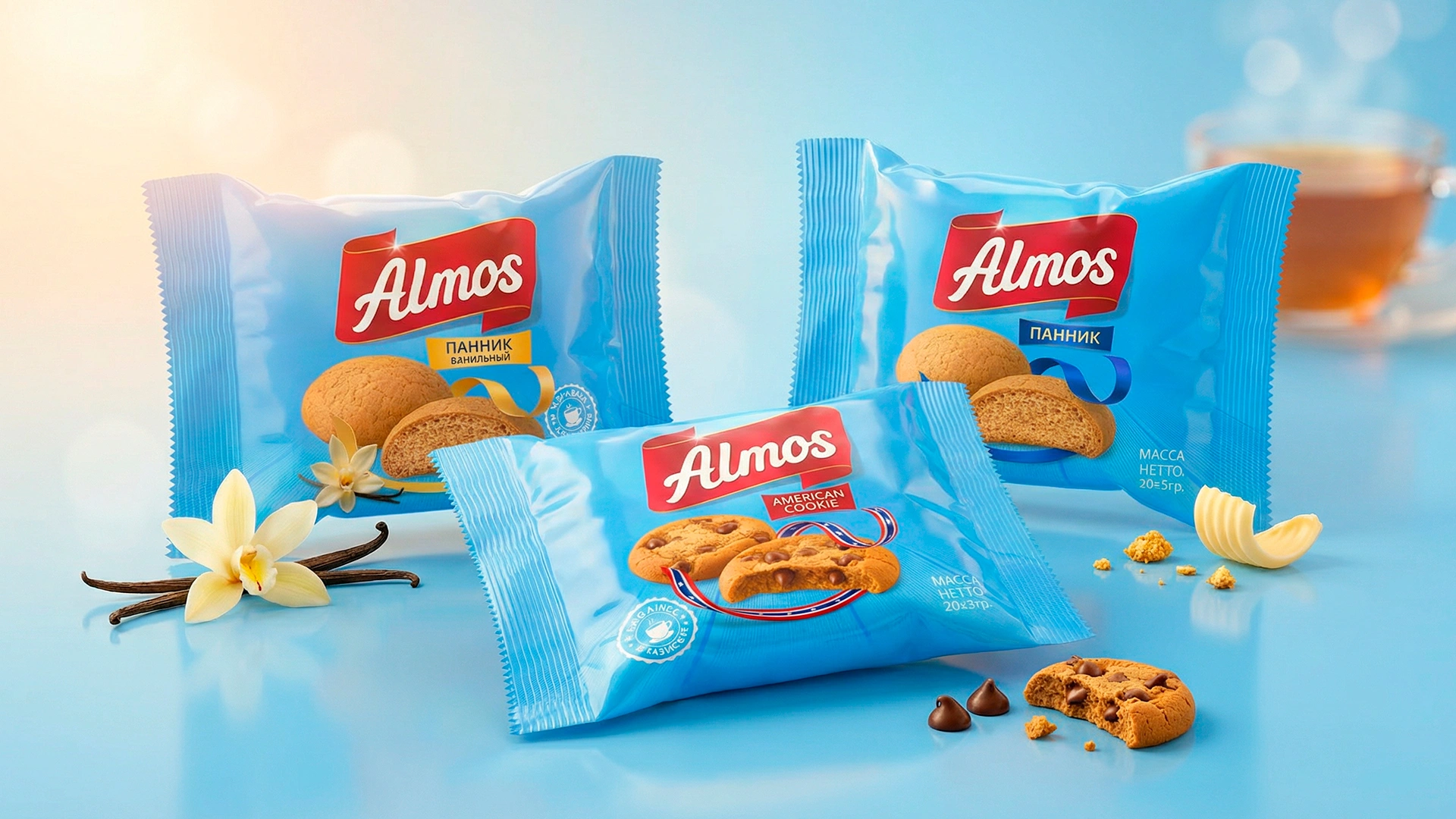
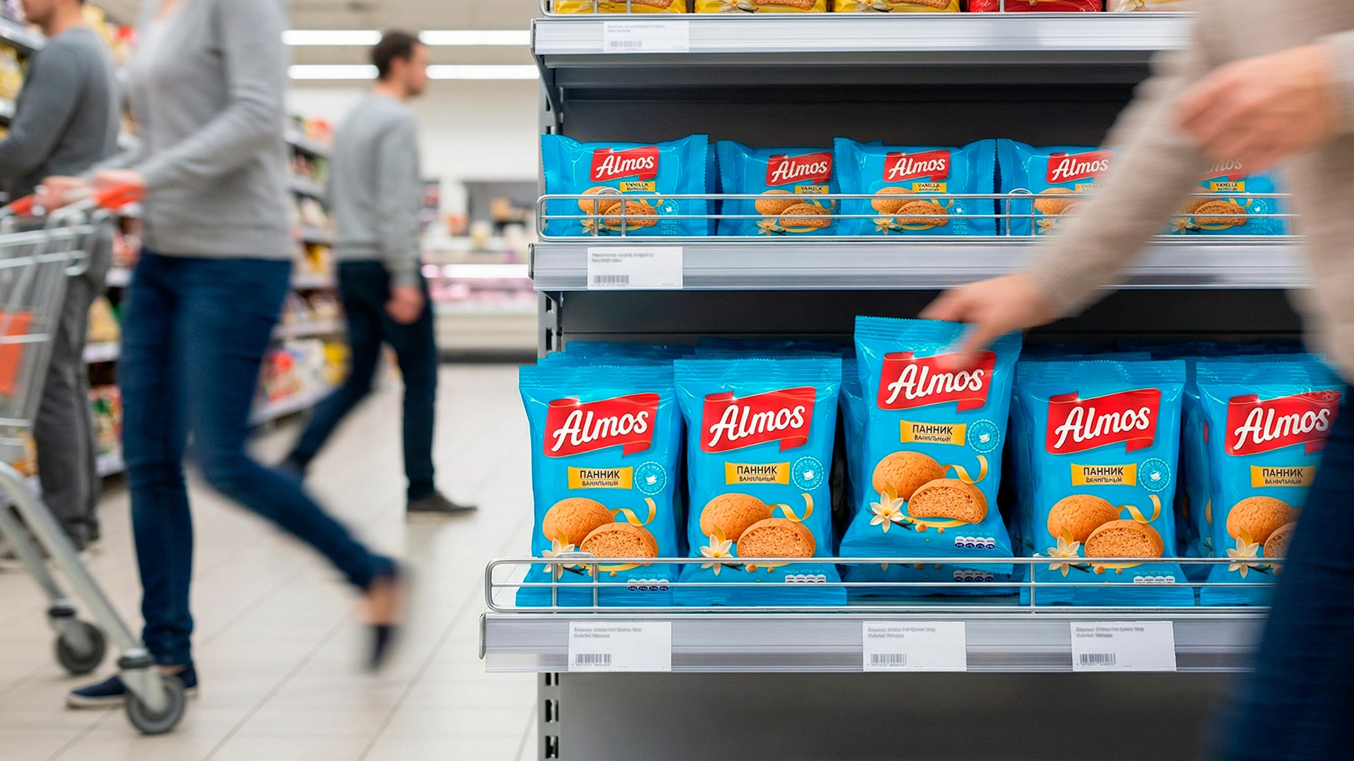
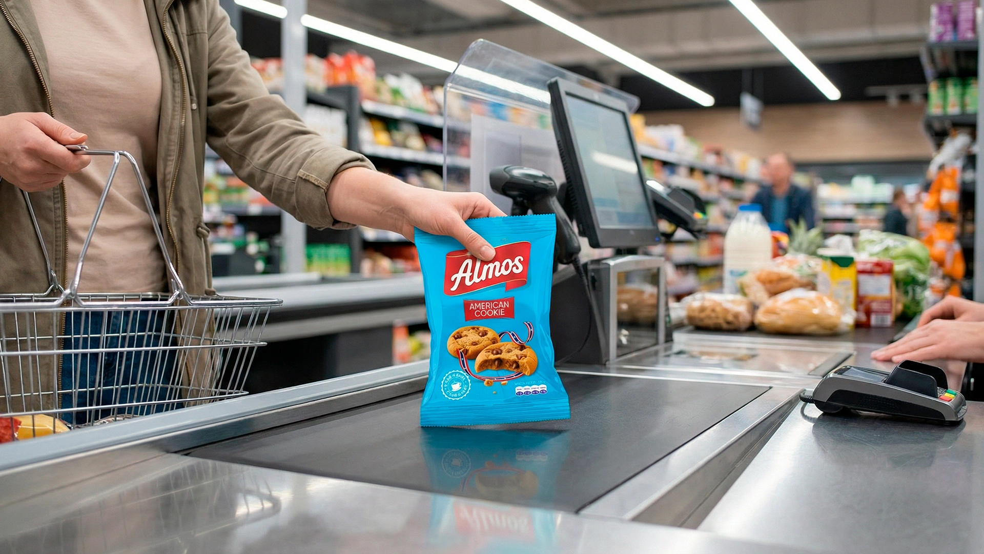
ALMOS – Branding and Packaging Design for Confectionery Products in Tajikistan
Client: Almos (Tajikistan) Industry: Confectionery Project: Full rebranding, logo, packaging design, design system Timeline: August 11 — November 11 (3 months of intensive work)
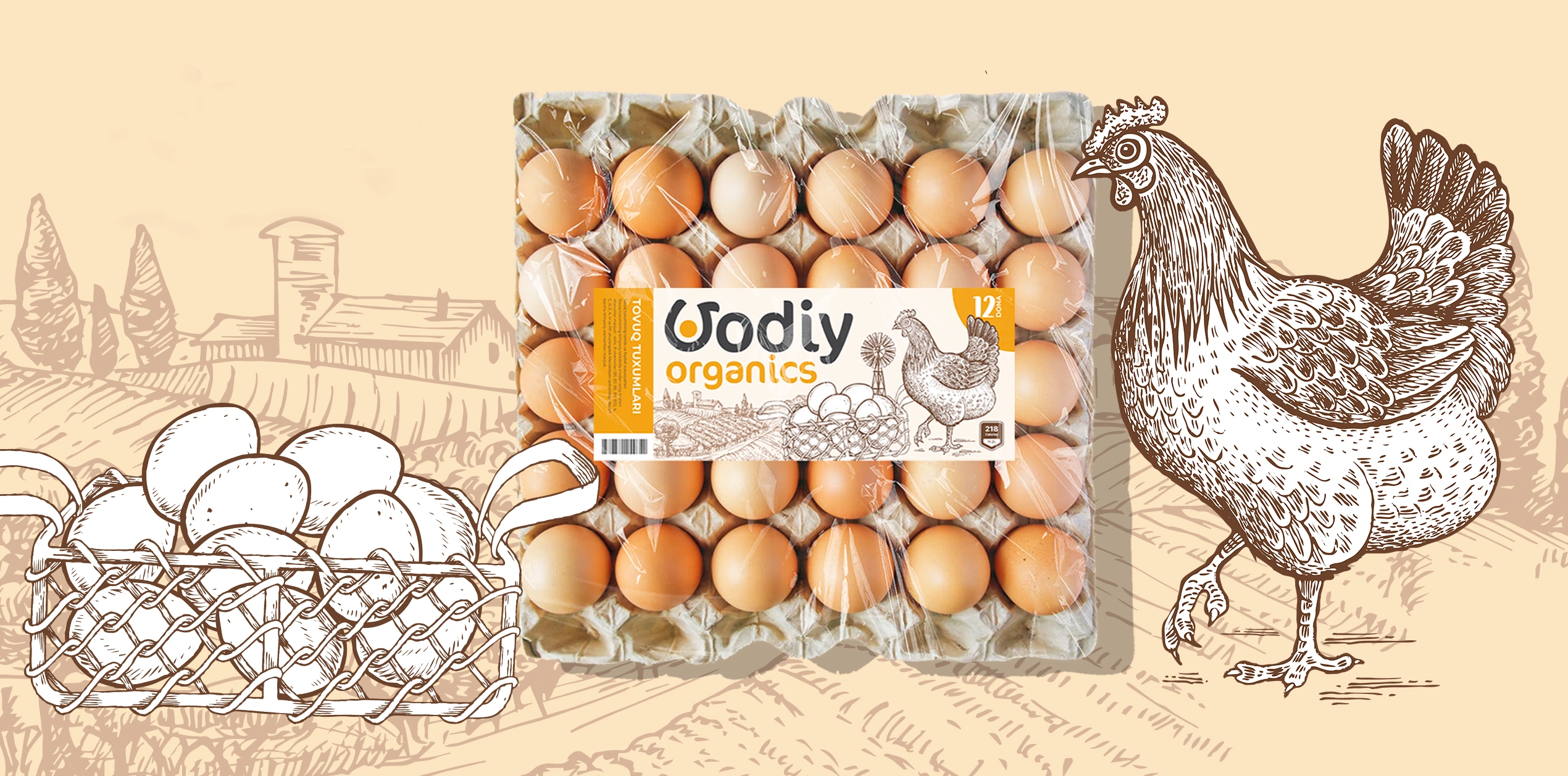
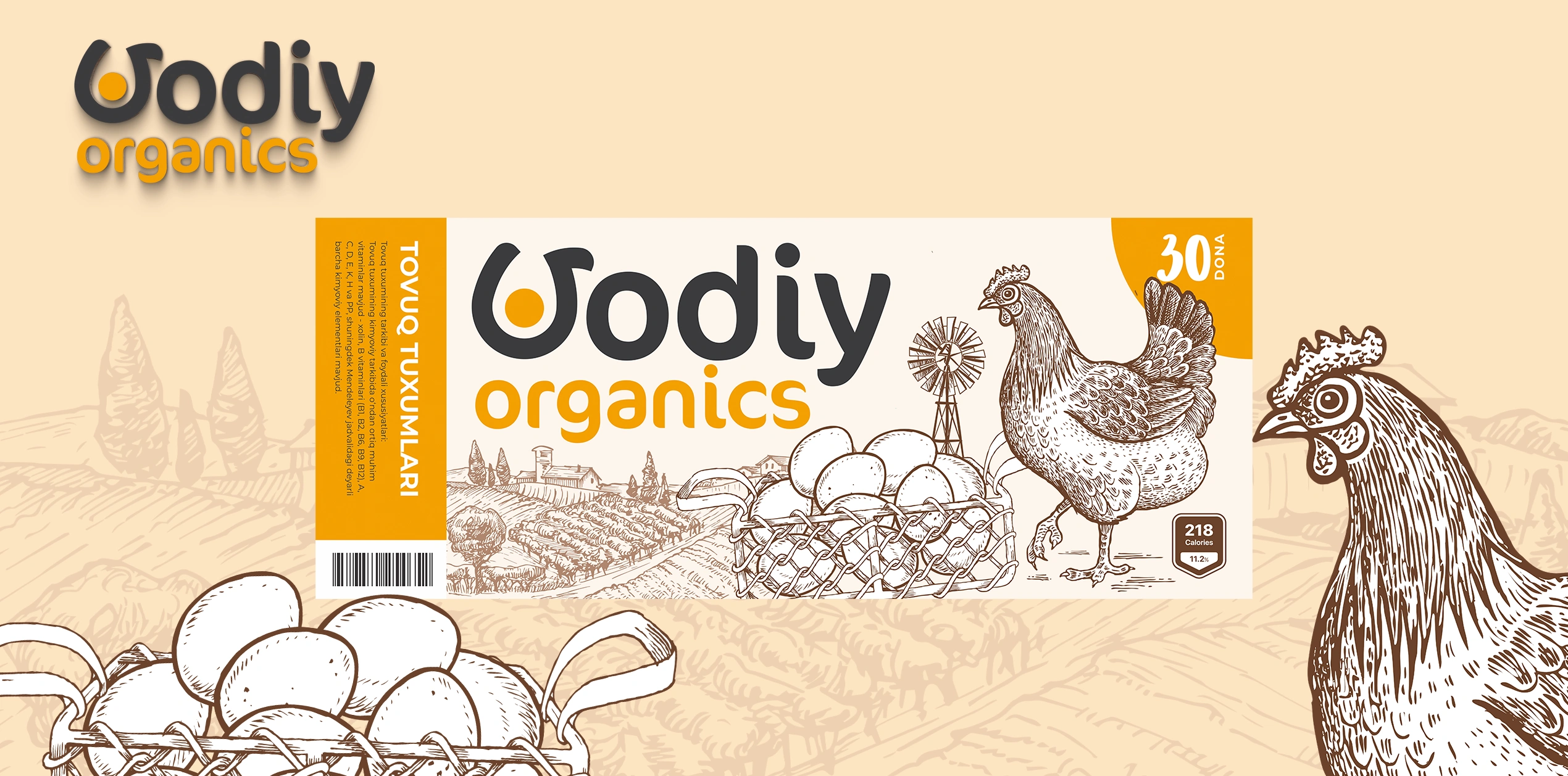
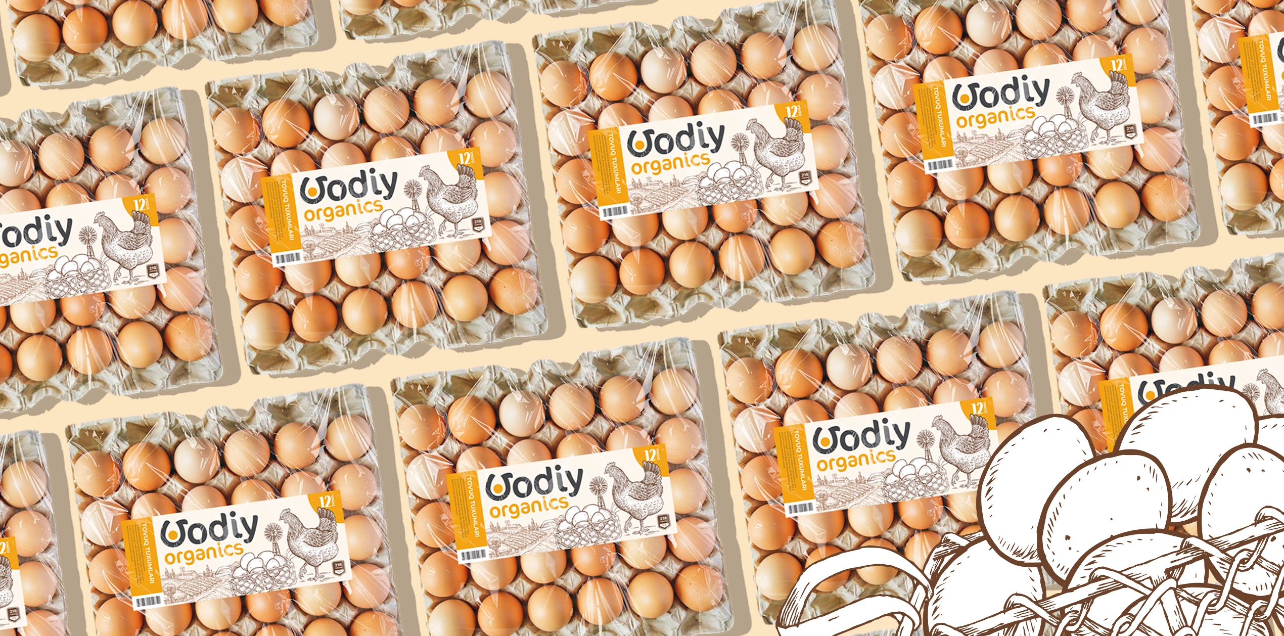

Vodiy Organics – Organic Egg Brand and Packaging Design
We’re sharing a case study that was completed some time ago but has only now "ripened" for release. This is the story of creating the logo and label design for Vodiy Organics.
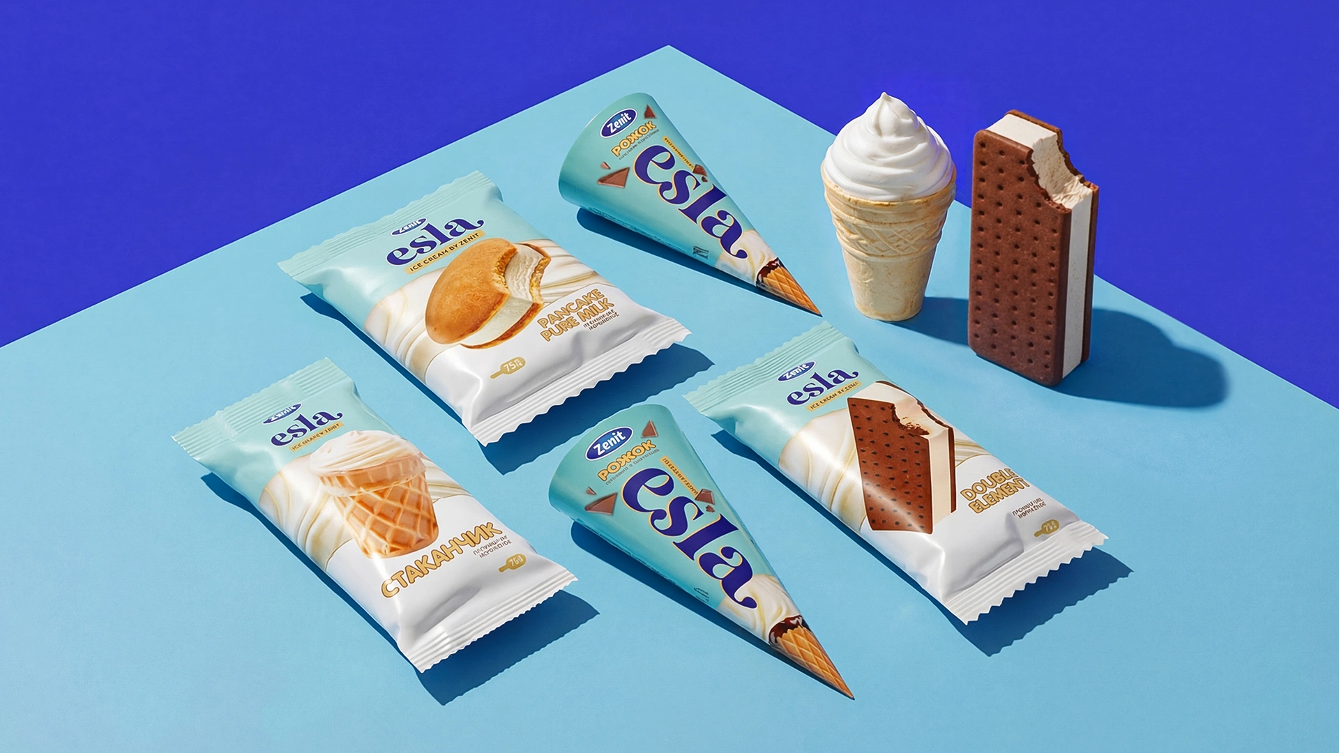
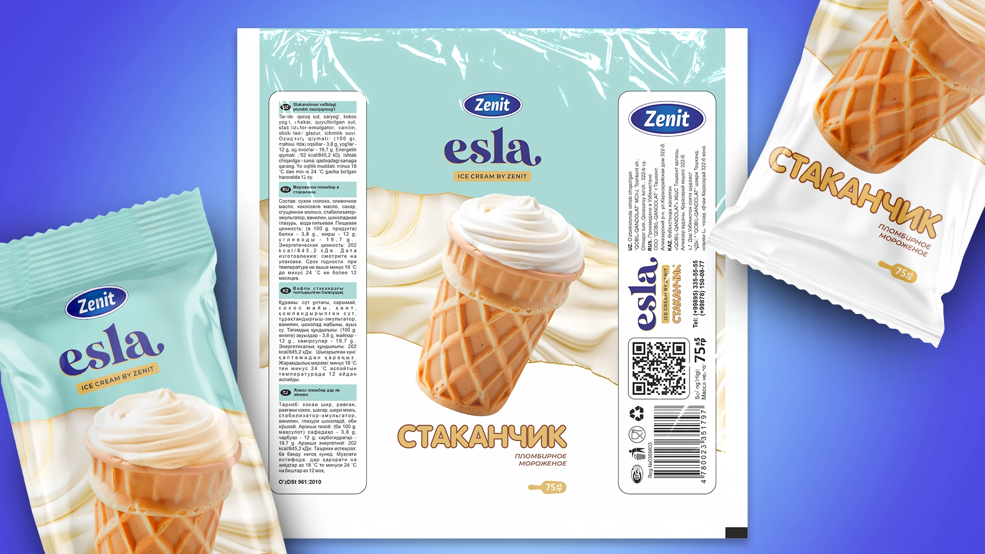
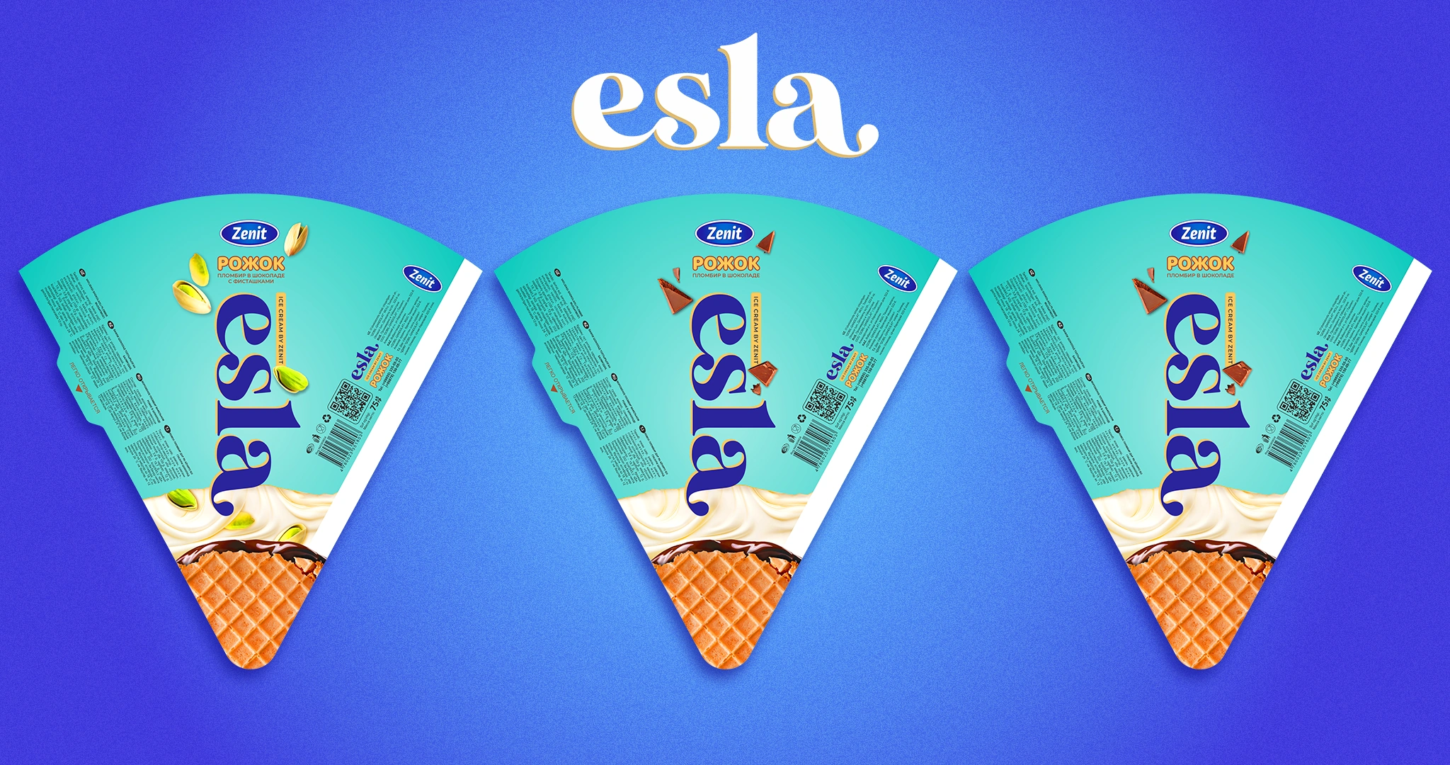
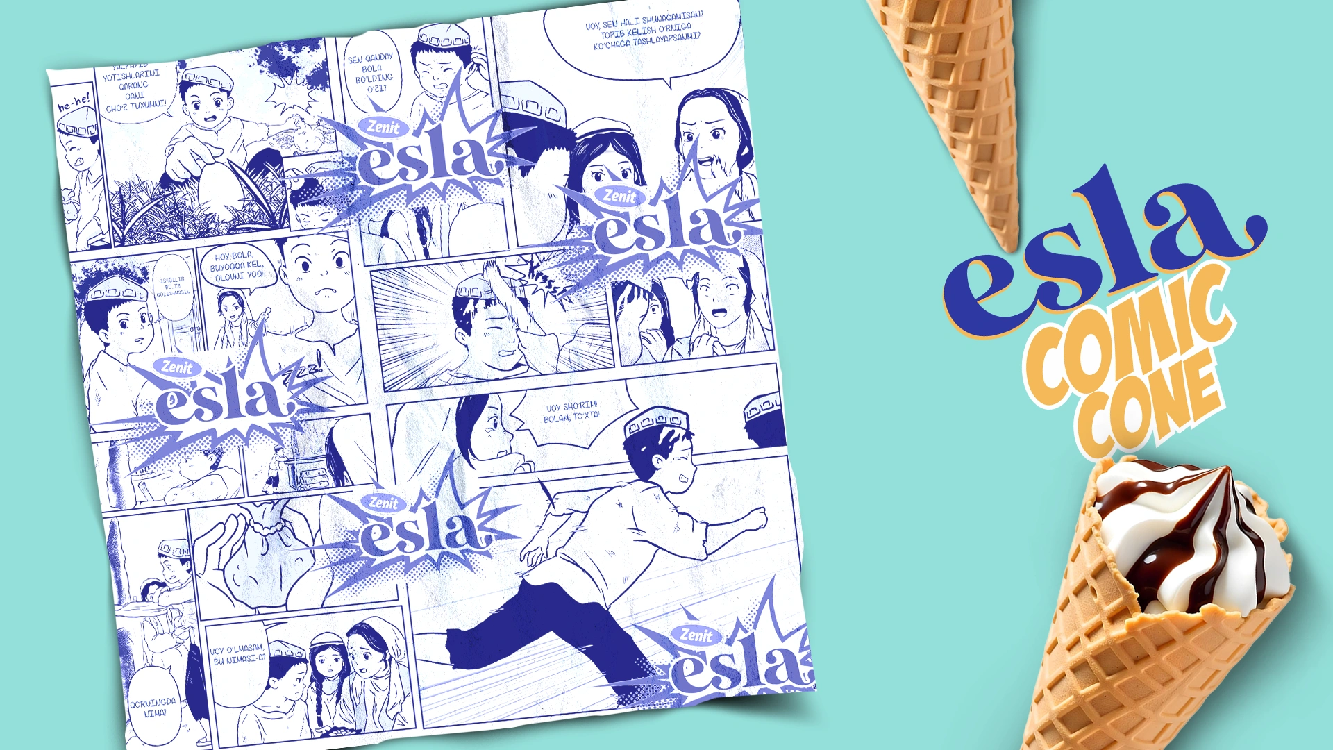
Esla — packaging Design & naming for an Ice Cream Brand
The Uzbek ice cream brand Zenit faced a challenge: they needed to create a unique identity for a new product line that would distinguish it from competitors and emotionally connect it with cultural values. The company's previous state did not reflect its individuality or communicate the high quality of its products.
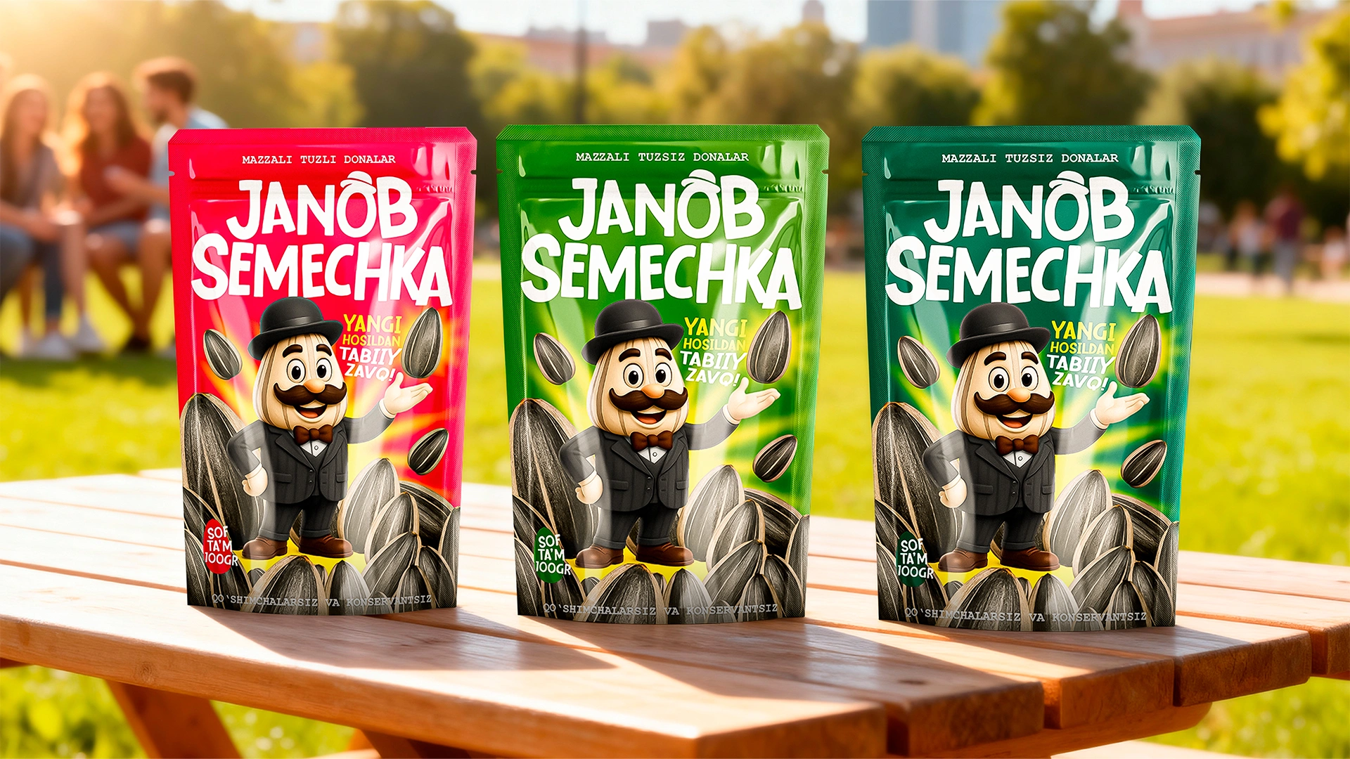
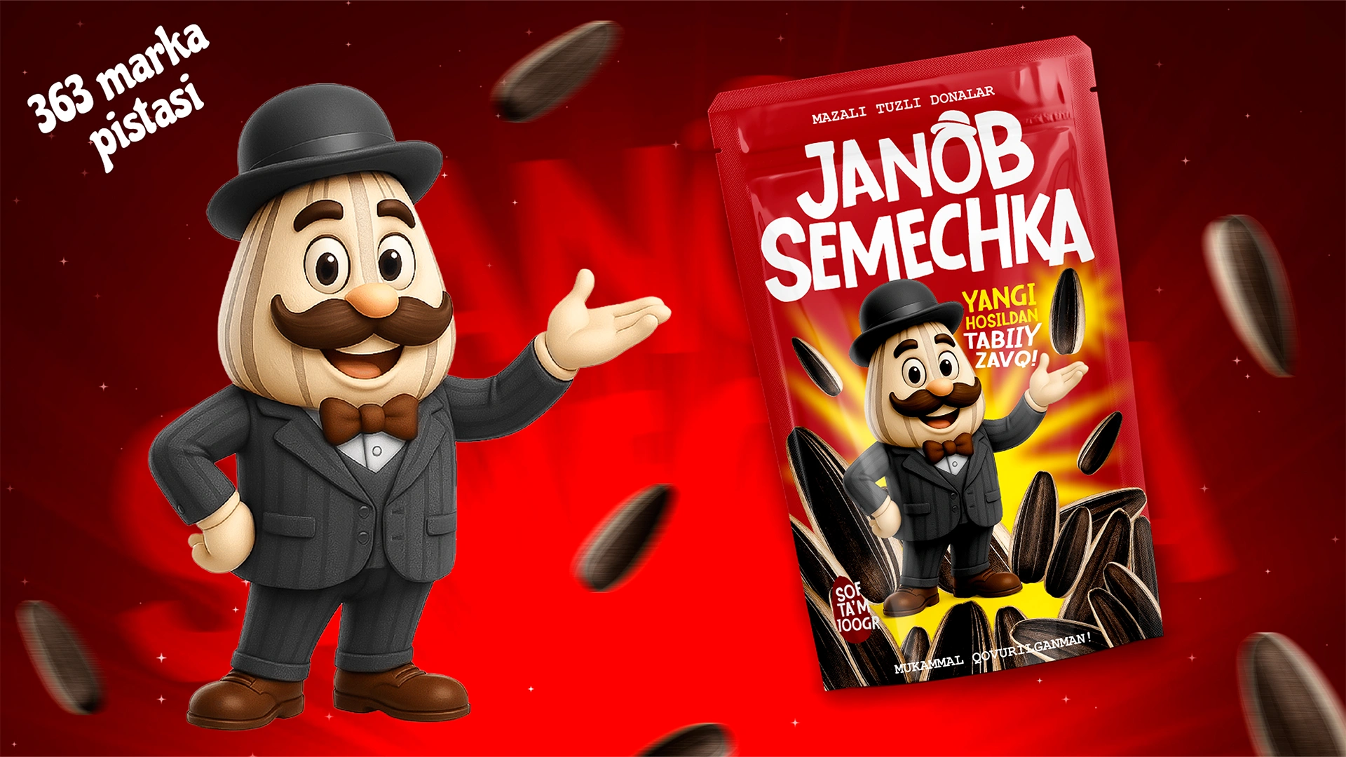
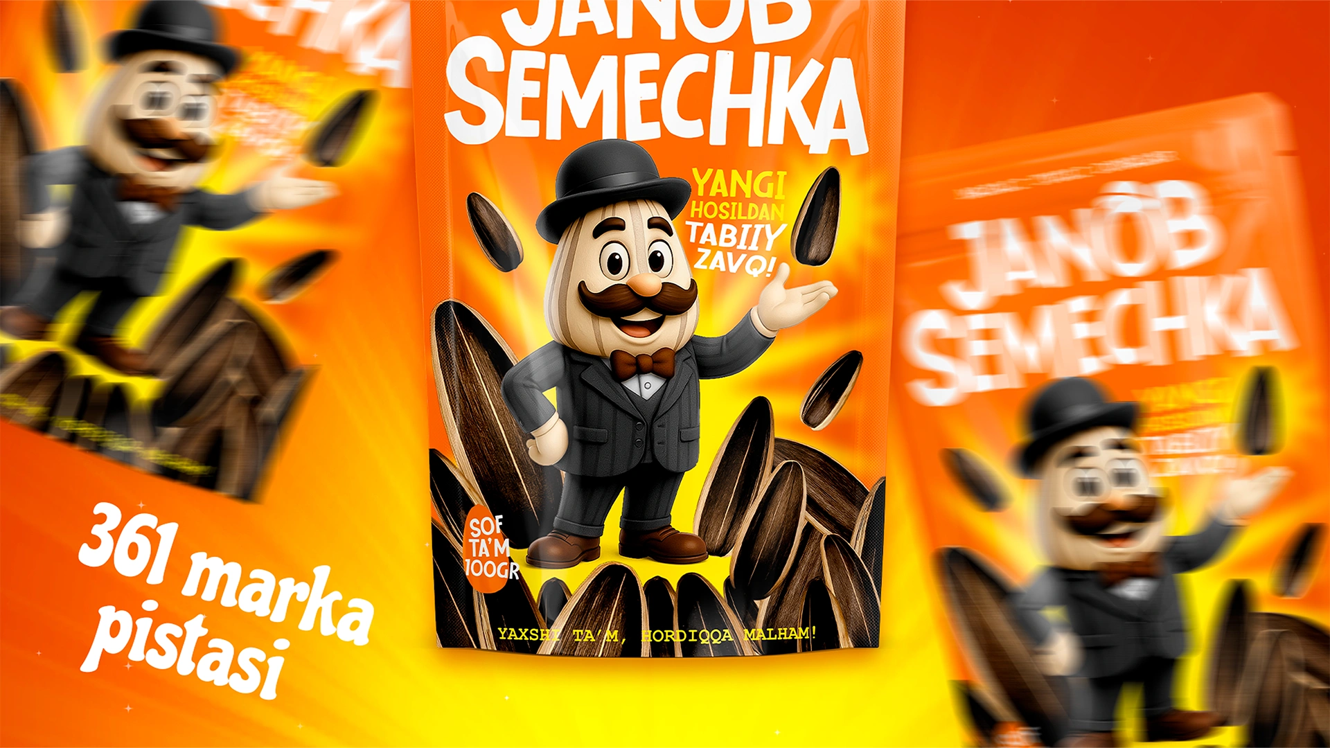

Janob Semechka – Sunflower Seeds Packaging Design & Mascot
Selling sunflower seeds in Uzbekistan is like selling sand in a desert. The market is saturated. Every corner store offers dozens of options. Mass imports of high-quality raw materials from China have completely filled the market. Surprising a sophisticated buyer with "just seeds" is virtually impossible today. How do you launch a new product in such a crowded territory, especially for the demanding customers of the Valley?
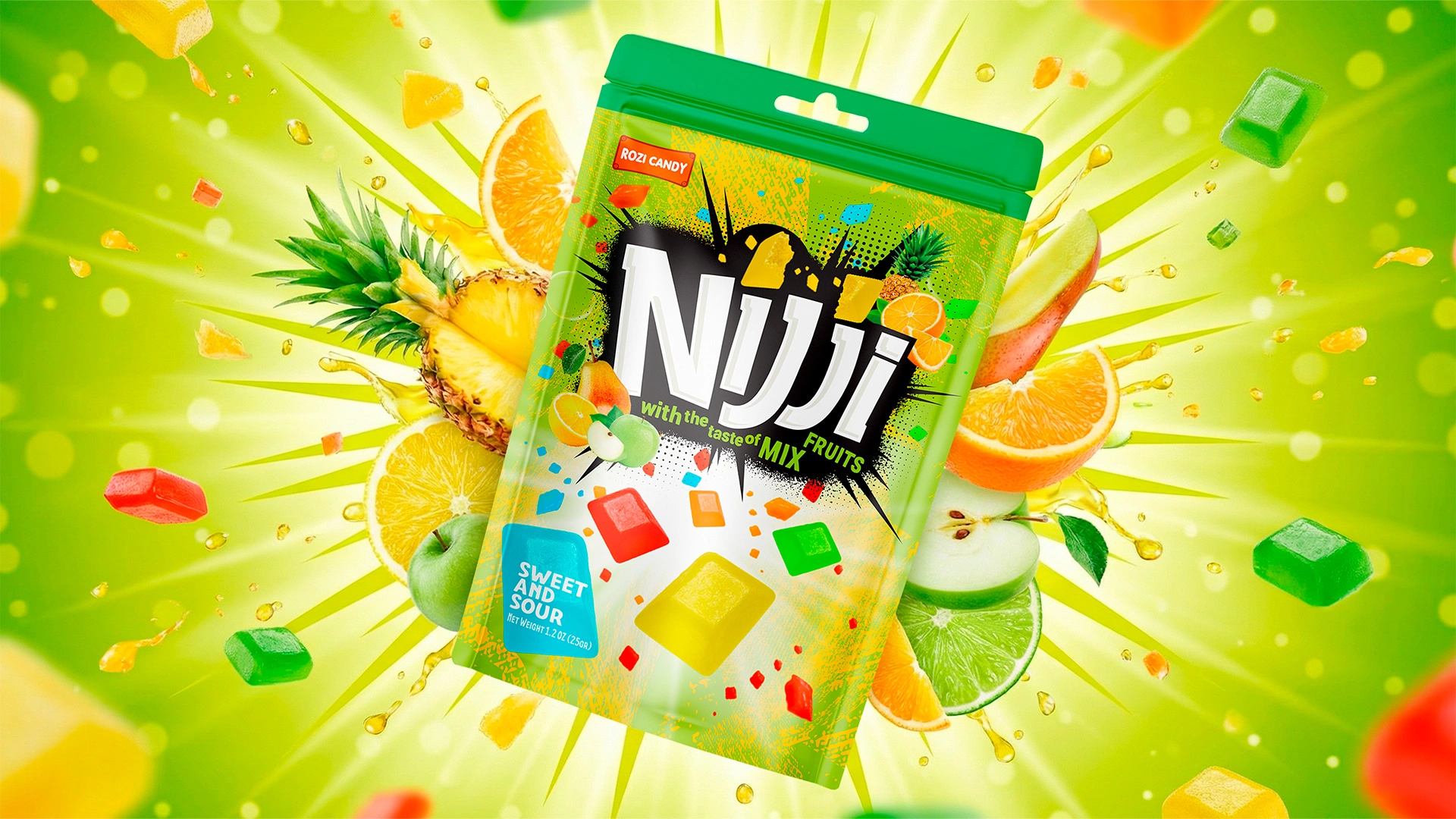
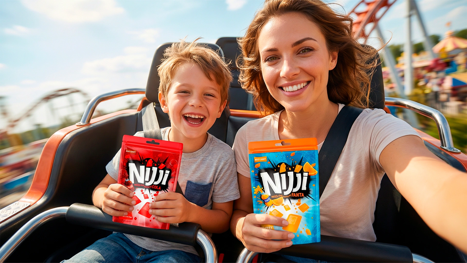
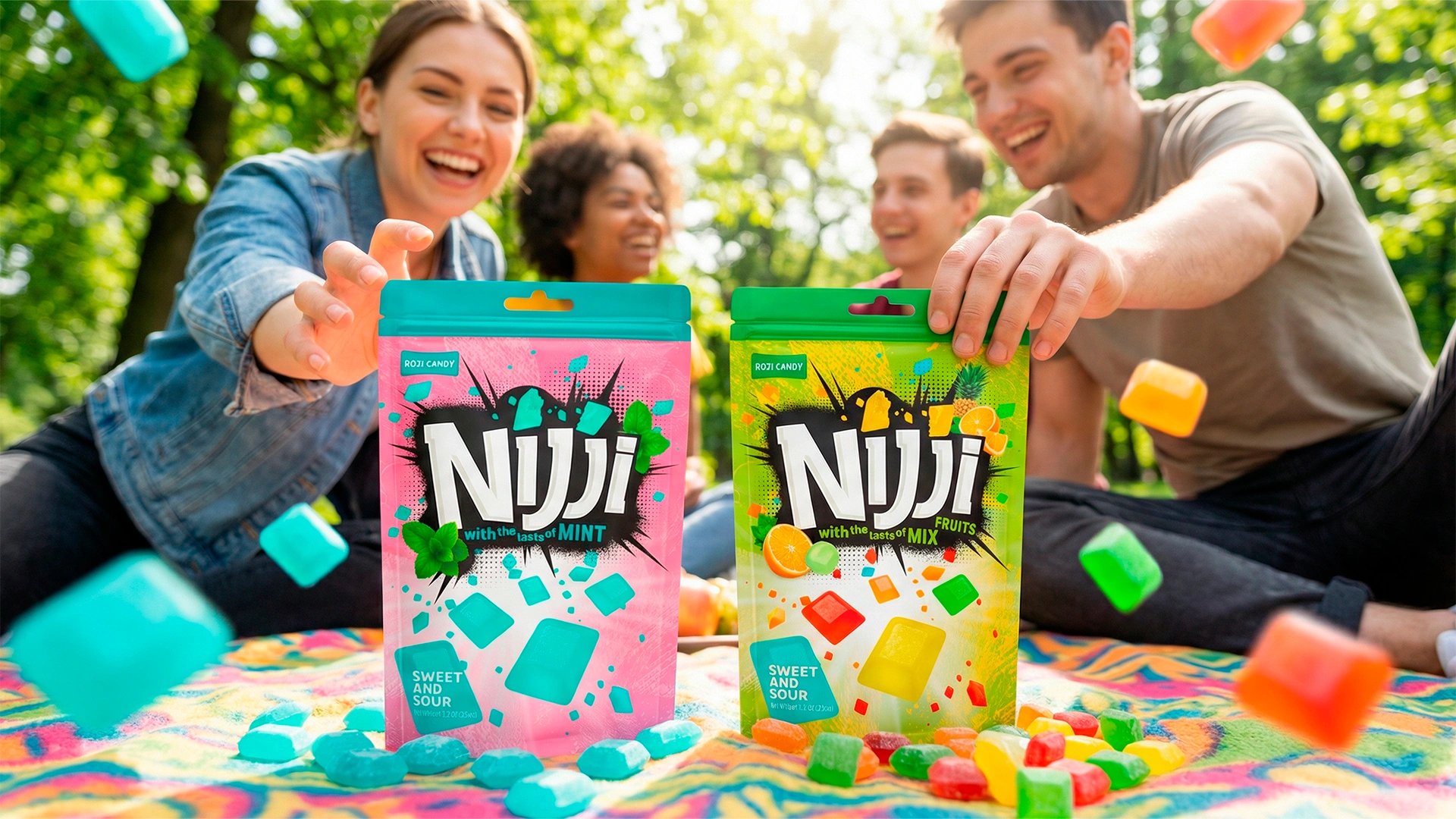
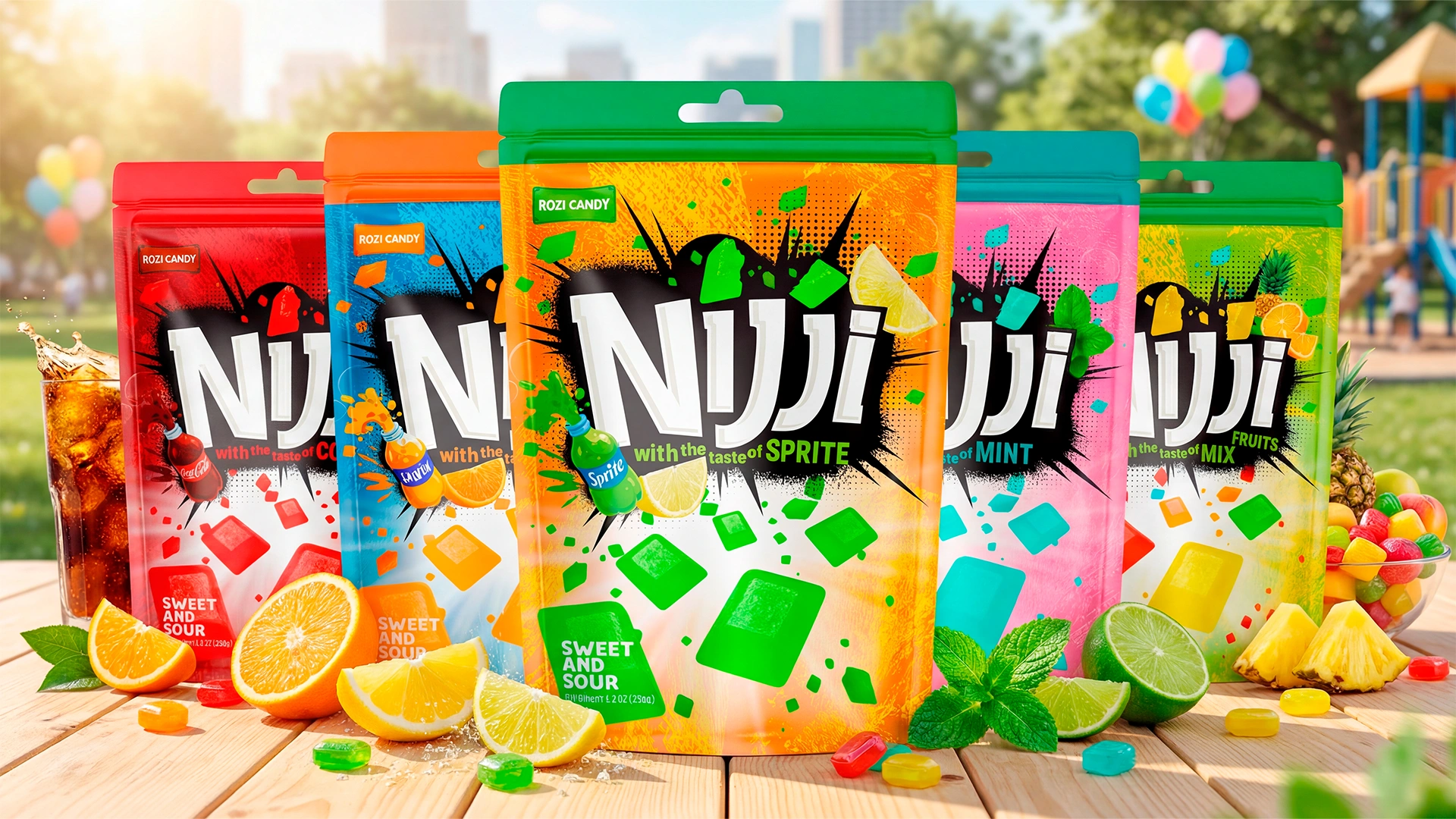
Rozi Candy — Candy naming and Packaging Design
Rozi Candy is a confectionery manufacturer with a strong production legacy. However, in the FMCG sector, product quality alone cannot guarantee sales. Even a superior product can suffer from “shelf invisibility” due to weak packaging. We executed a comprehensive brand overhaul for Rozi Candy to solve this critical bottleneck.
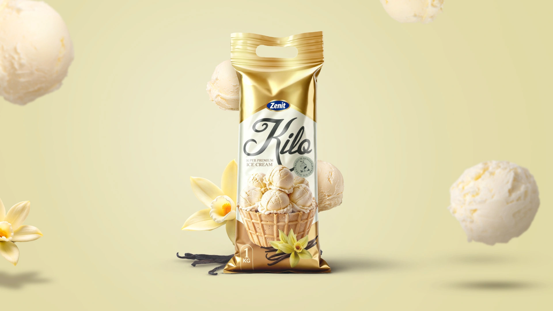
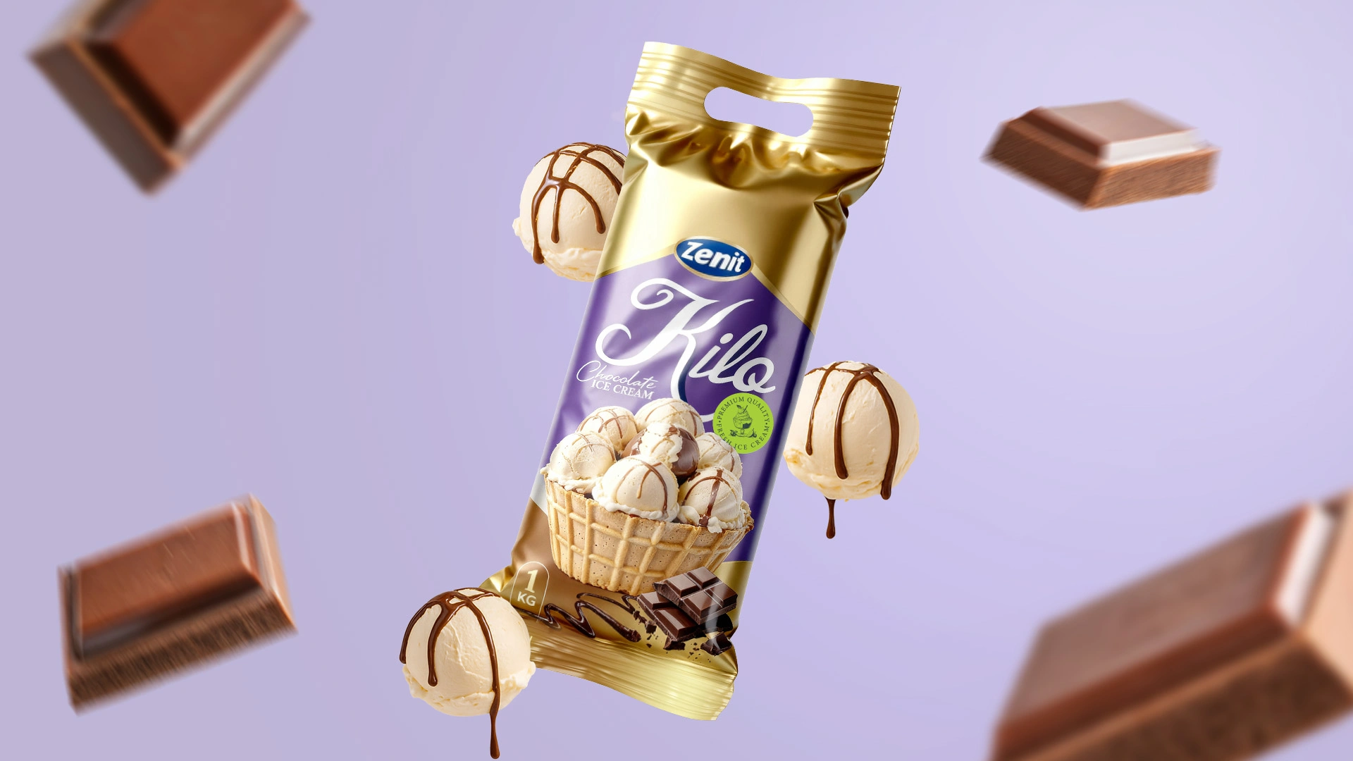
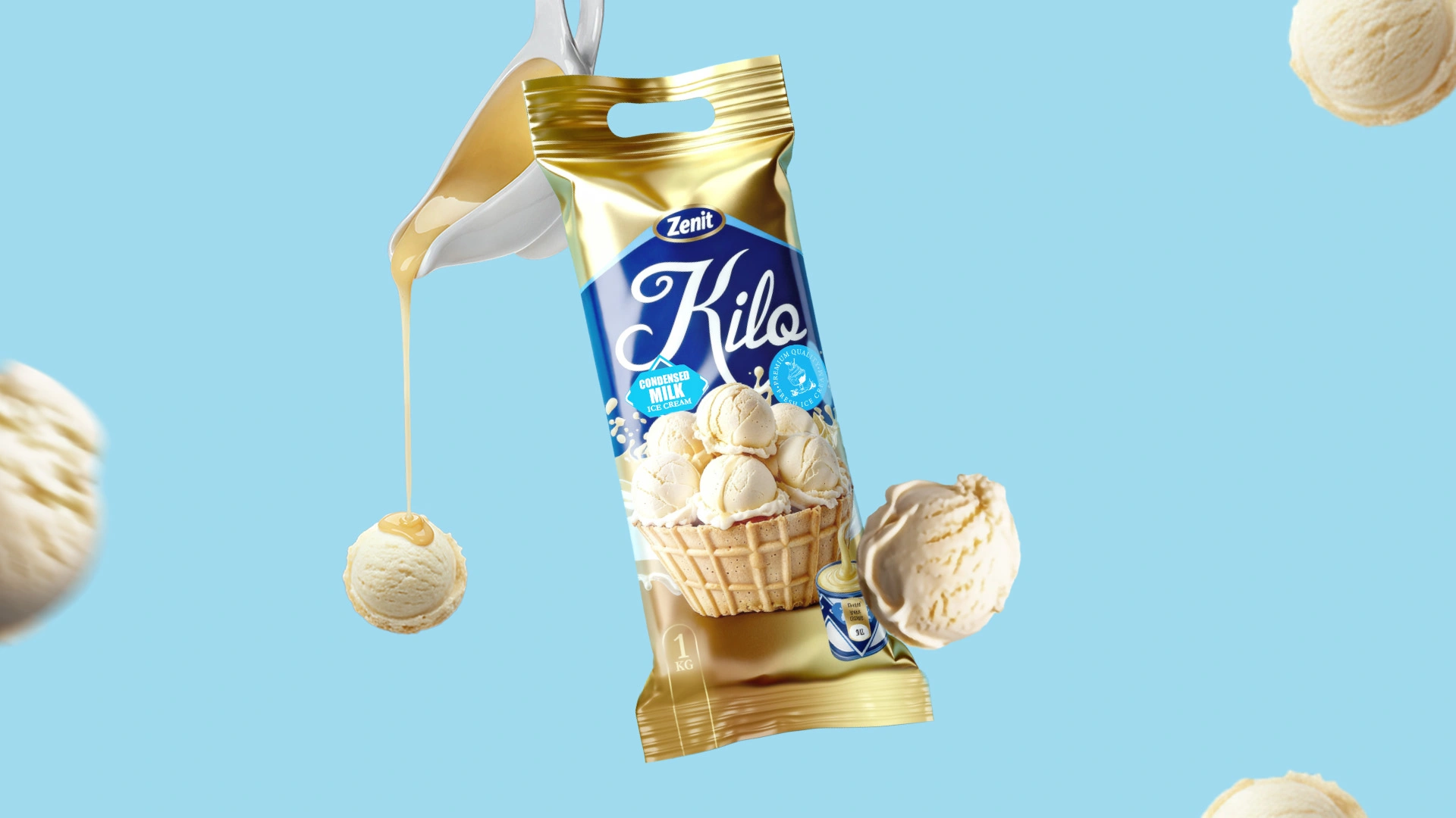
Zenit Kilo — Packaging Design & Naming for Family Ice Cream
In Uzbekistan, family-format ice cream is more than just a dessert—it is a distinct cultural phenomenon. It serves as a "strategic reserve" for hospitality, always ready for the warm welcome of guests. For our long-standing client, Zenit , we developed the packaging design and naming for their 1kg ice cream line. Note: We have previously developed packaging for other Zenit product lines. You can view that case study here .
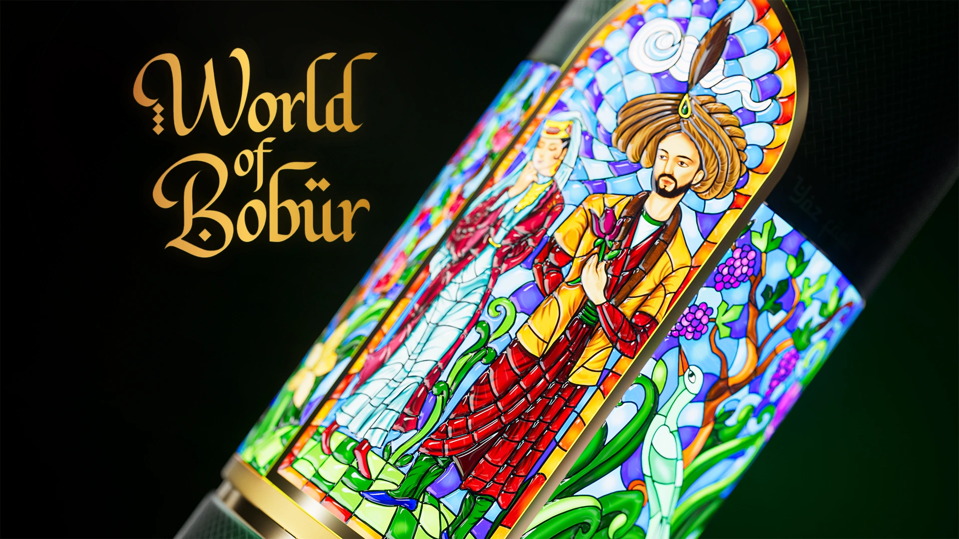

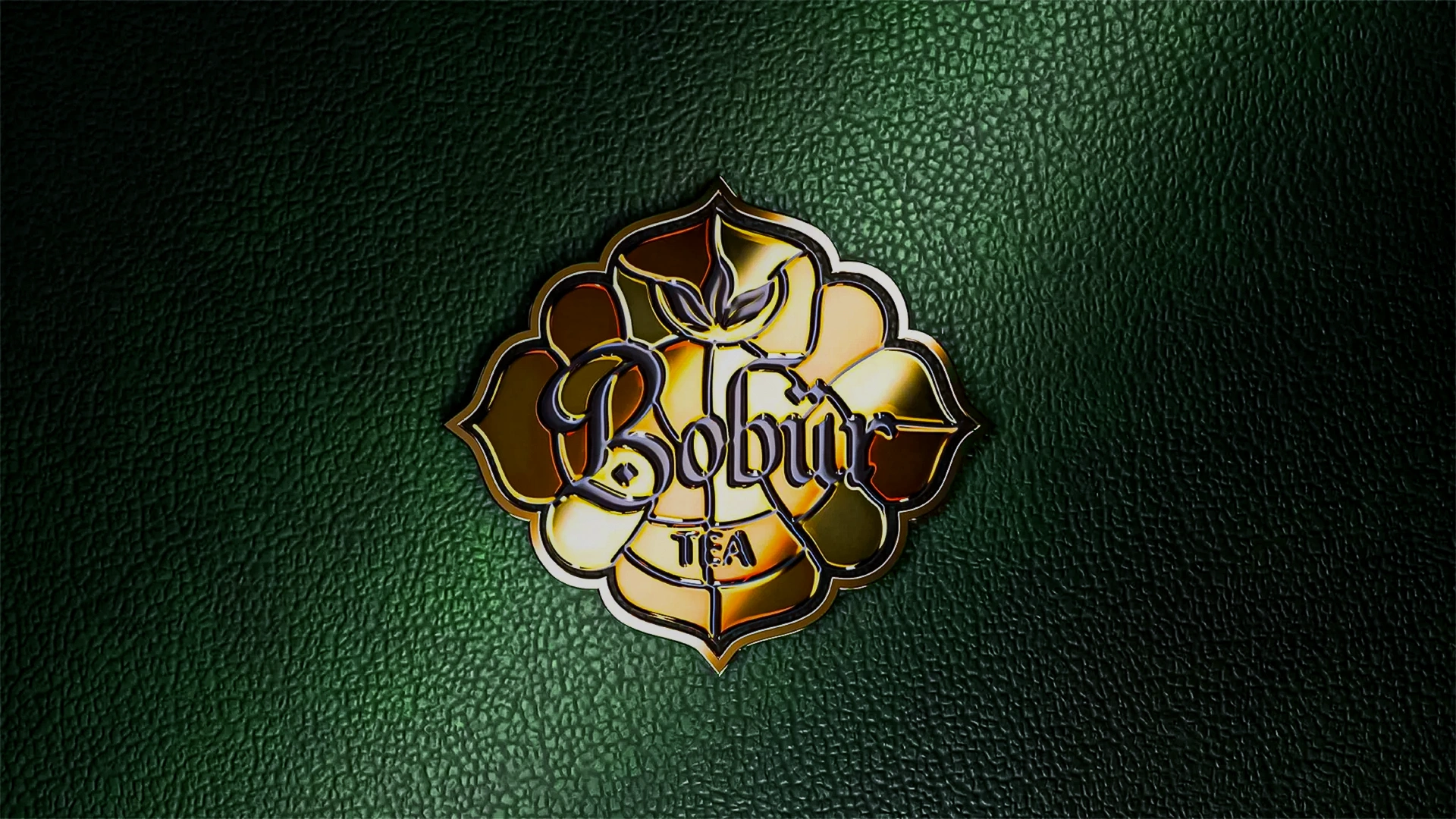

Bobur Tea – Tea packaging that brings the World of Bobur to life
Bobur Tea – Premium Tea Brand with Cultural Identity

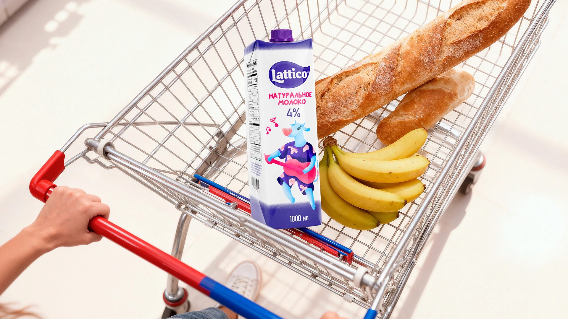
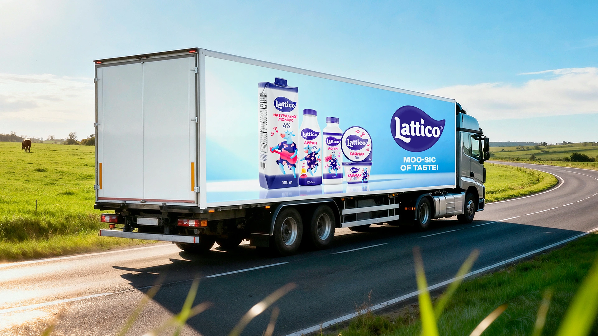
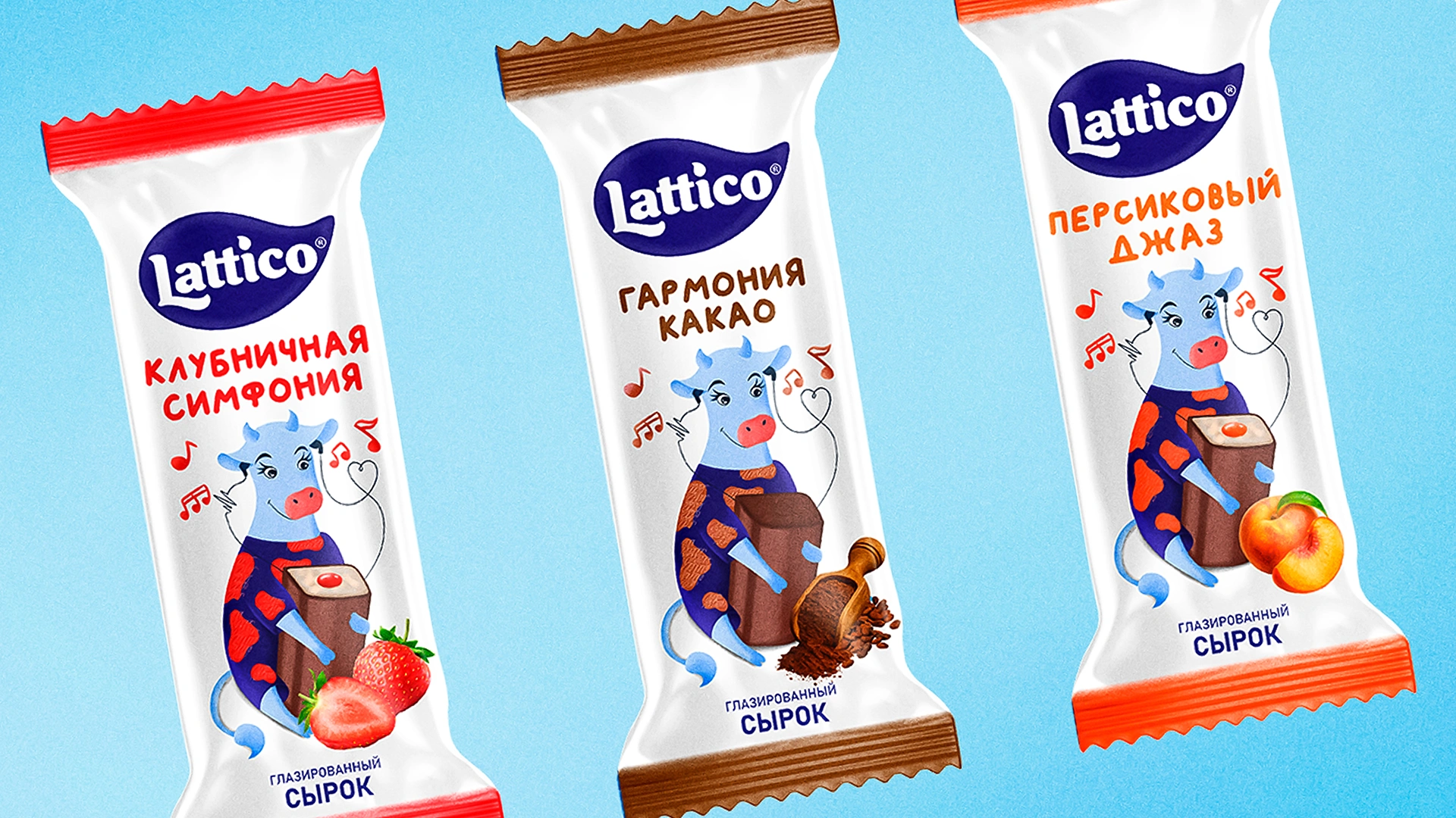
Lattico – Brand Identity & Packaging Design for Dairy Products
Lattico – Musical Brand Identity & Packaging Design for Dairy Products