Our works
Dive into the world of solutions we have created that inspire, build trust and make businesses successful
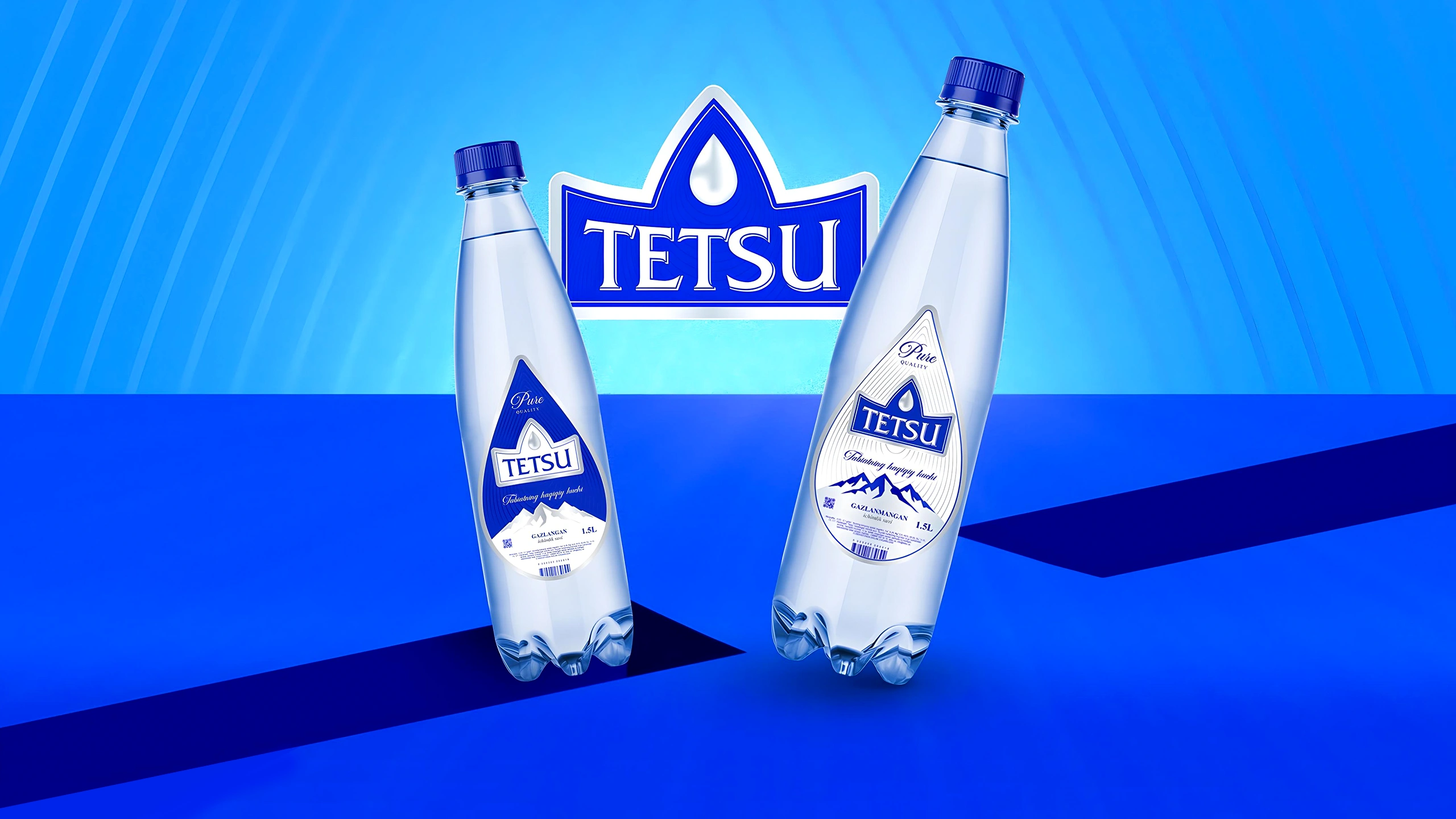
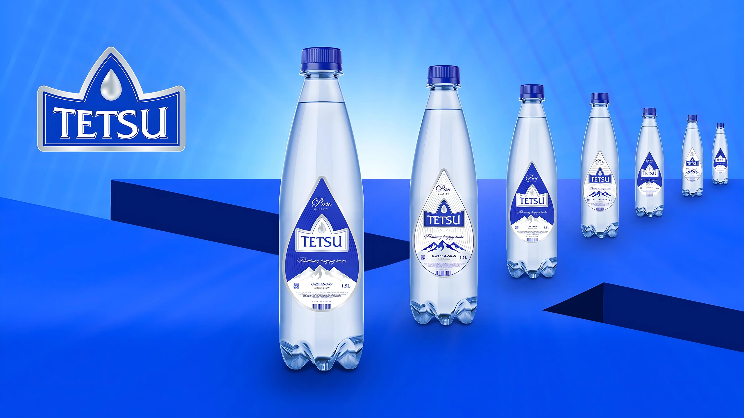


Tetsu: Premium Drinking Water Branding and Design
Tetsu branding was developed — premium water from a 1968 source. The naming reflects the power of nature: "tetiklantiruvchi suv," which means "water that invigorates." Premium design features: a crown logo, color inversion for carbonated water, and "under-ice" packaging.
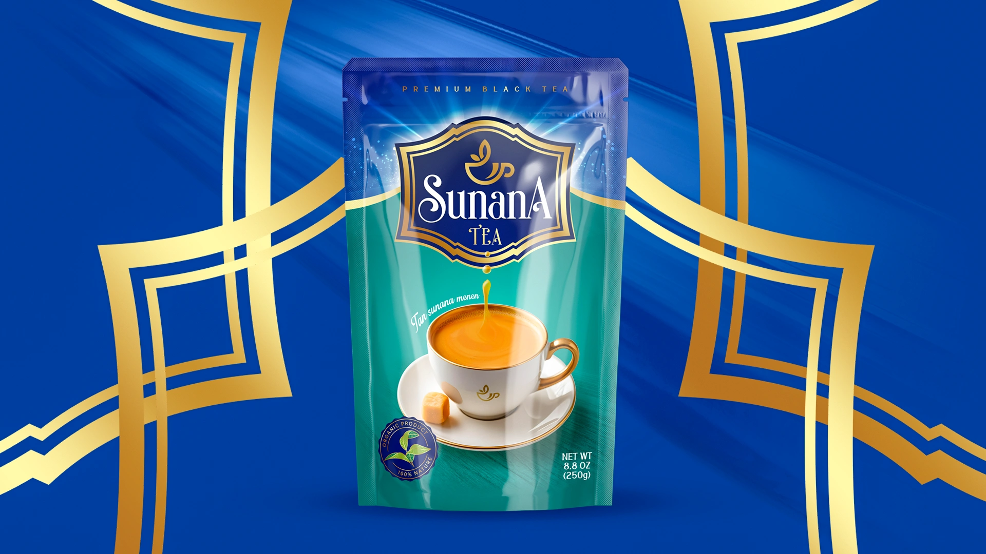

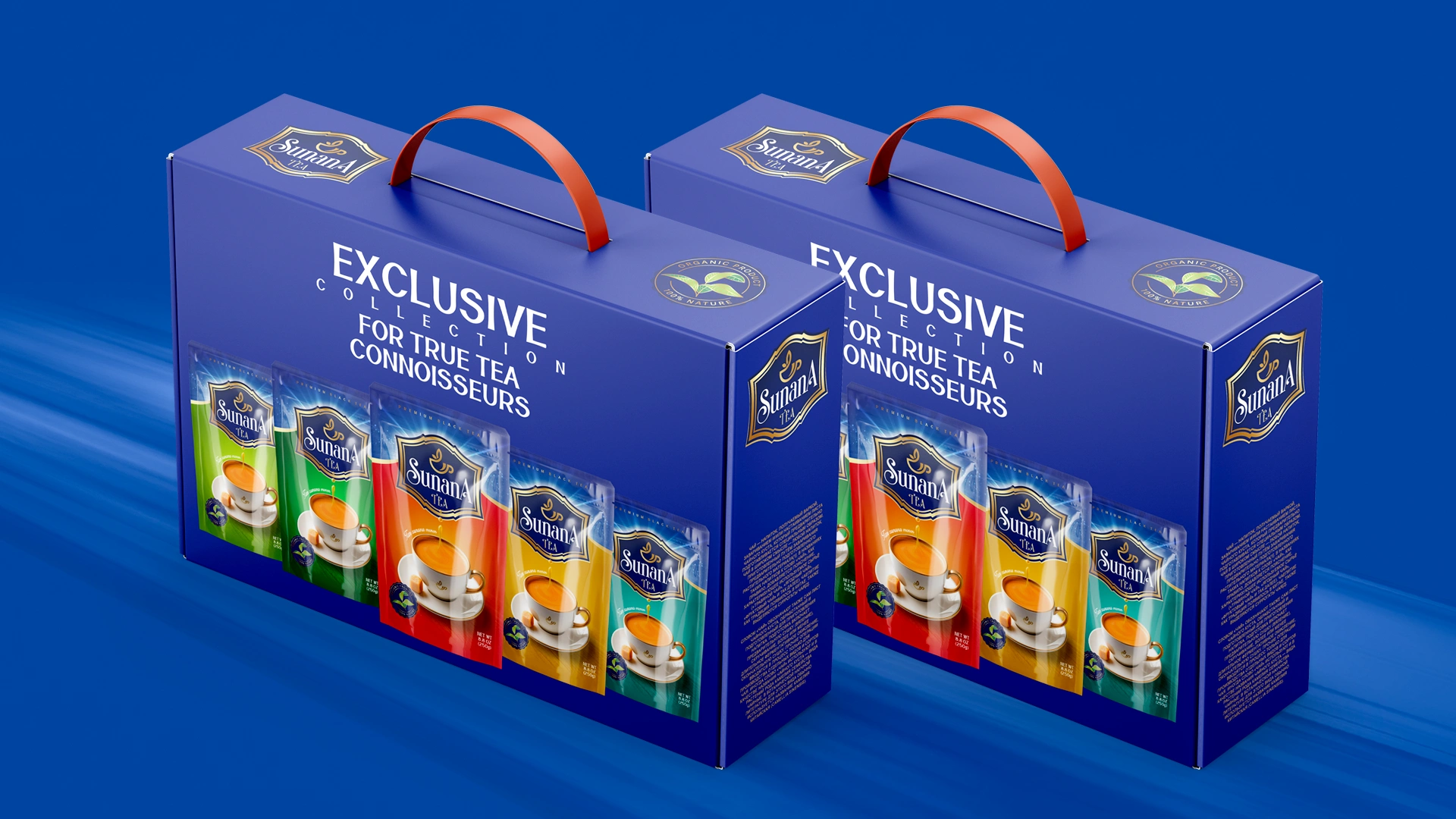

Sunana: Premium Tea Packaging Design
A unified packaging design concept was developed for Sunana tea. The logo symbolizes warmth. The "stain effect" and bright accents make the brand stand out on the shelf, while Ziplock packaging guarantees freshness and convenience.


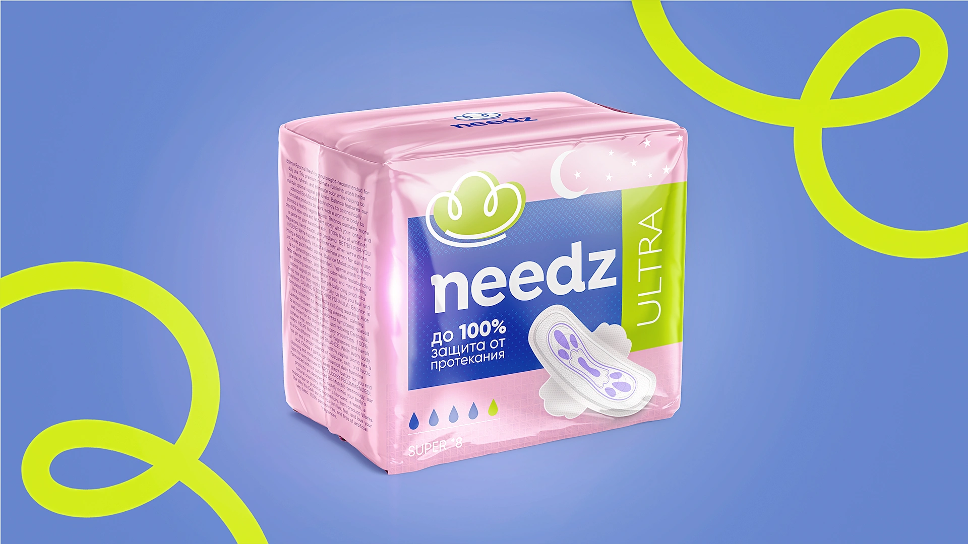
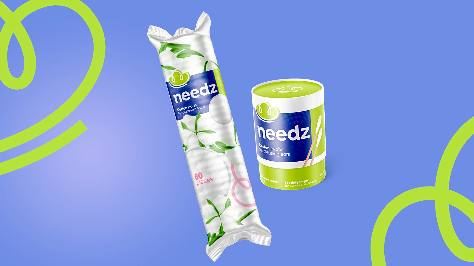

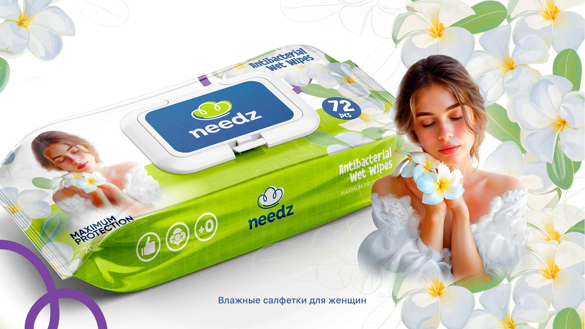

Needz: Comprehensive Personal Hygiene Products Branding
Needz branding was developed for diapers and personal hygiene products. The naming refers to needs, the logo to cotton (care, tenderness). A unified design concept in pastel tones for recognition.
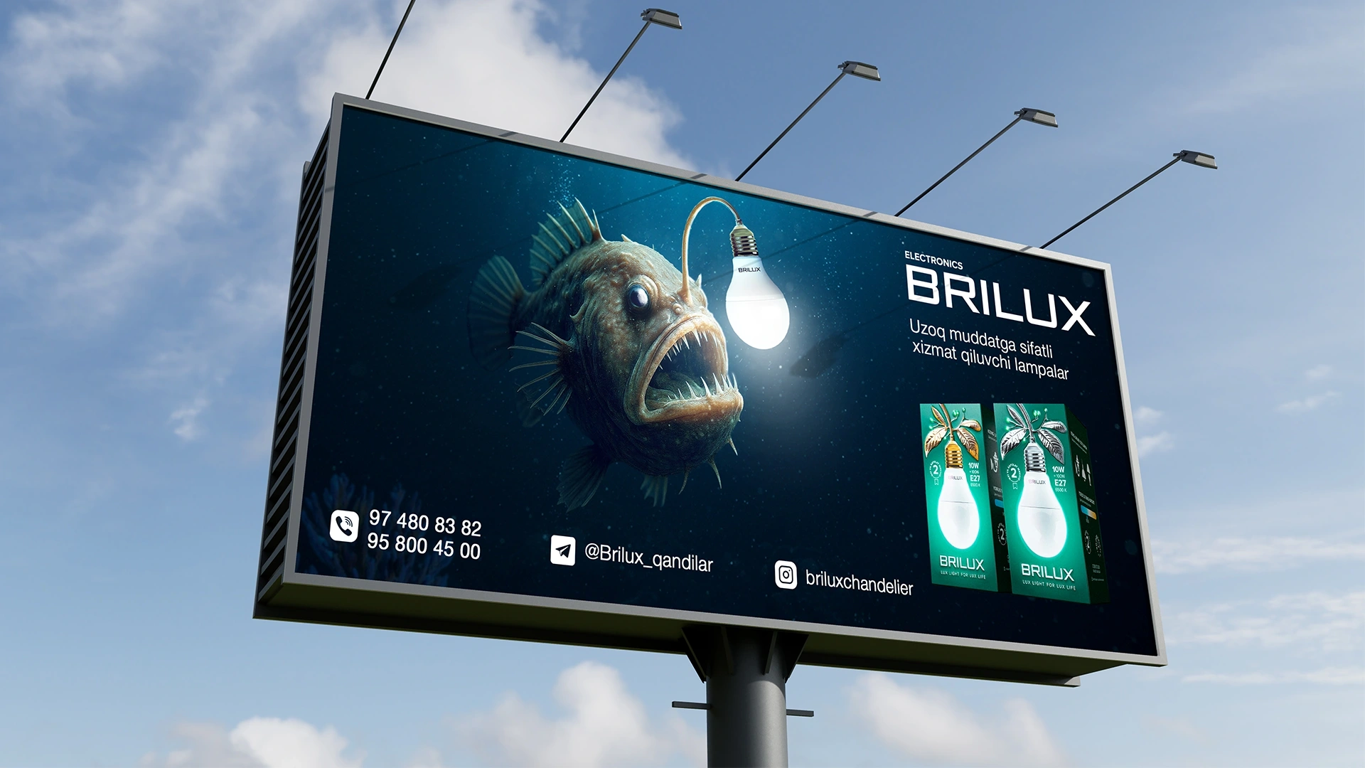


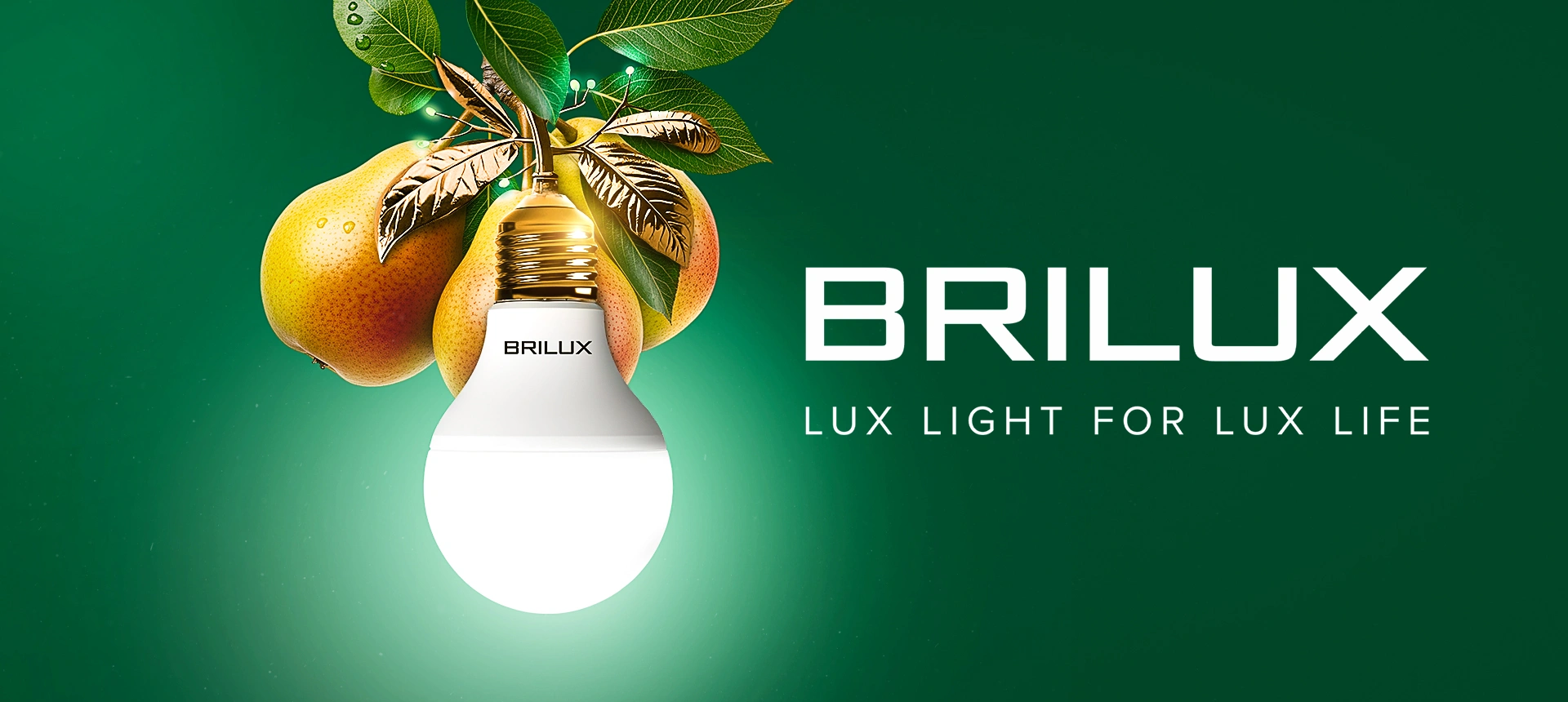
Brilux: "Light of Nature" Lamp Packaging Design
An original packaging design was developed for the Brilux lamp under the "Light of Nature" concept. The use of dark green color and the "pear-lamp" metaphor ensured recognition and distinguished the product from competitors.

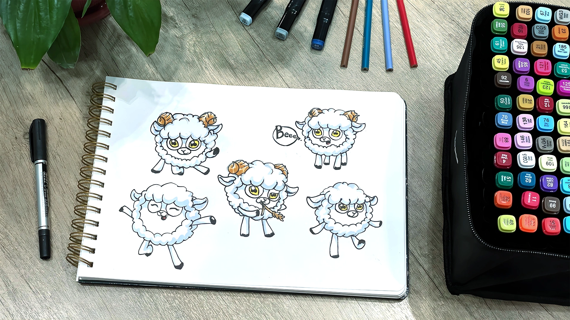
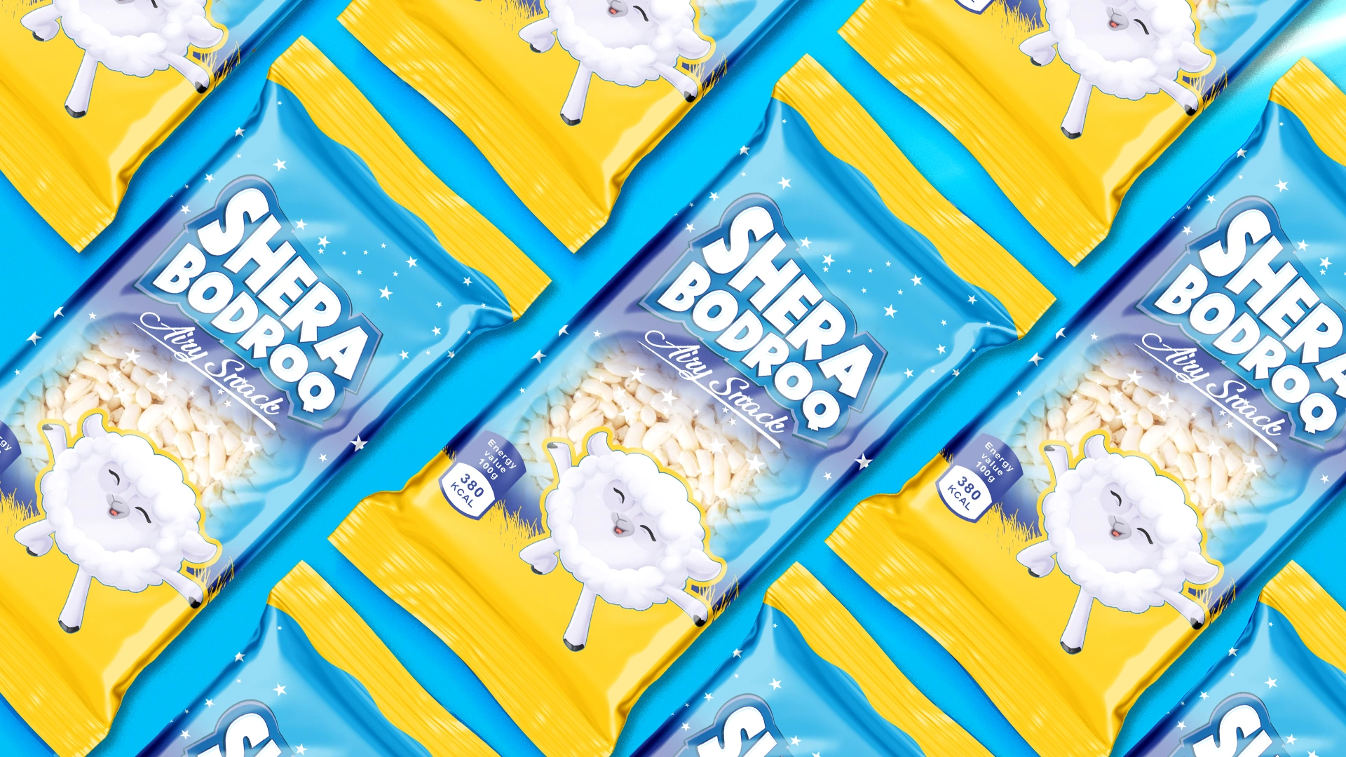
Shera Bodroq – Puffed Rice Snacks Packaging Design | Minim Design
The Shera Bodroq packaging conveys the lightness and airiness of the product through bright colors, a playful font, and a friendly sheep character. The design combines an aesthetic of purity and freshness, making the snack appealing to consumers.


Sunlight: Disposable Floor Wipes Packaging Design
A stylish and clear packaging design was developed for Sunlight disposable alcohol wipes. The design emphasizes convenience (1 wipe for 4 rooms) while maintaining the corporate identity of the detergent brand.


Chaomi: Comprehensive Branding for a Milk Tea Chain in Tashkent
A full design cycle for Chaomi (Milk Teas according to Eastern traditions). Strategic naming, a logo with cultural symbols, a princess mascot, and localization. Successful launch in the Uzbekistan market.


AquaDiamond Moxito: Packaging Design for a Refreshing Beverage
We created a vibrant and stylish packaging design for AquaDiamond Moxito, using appetizing 3D fruit visuals and the trendy pomegranate flavor. The design boosted sales within the first weeks of launch in the Uzbekistan market.

Nillo (Candy Gold): Naming, Logo, and Packaging Design for Cupcakes
We created the branding for Nillo (Candy Gold), including the logo and cupcake packaging design. The appetizing cutaway cupcake image and bright red-blue color scheme attract a young audience.
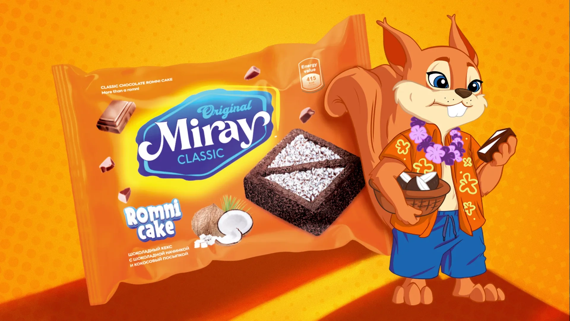


Miray: Comprehensive Branding for a Confectionery Factory
We developed the full branding for Miray confectionery: a bright orange packaging design featuring a cheerful squirrel mascot. The strategy helped the brand stand out among market giants (Roshen, Yashkino) and establish partnerships with 112 distributors in Tashkent.