Our works
Dive into the world of solutions we have created that inspire, build trust and make businesses successful
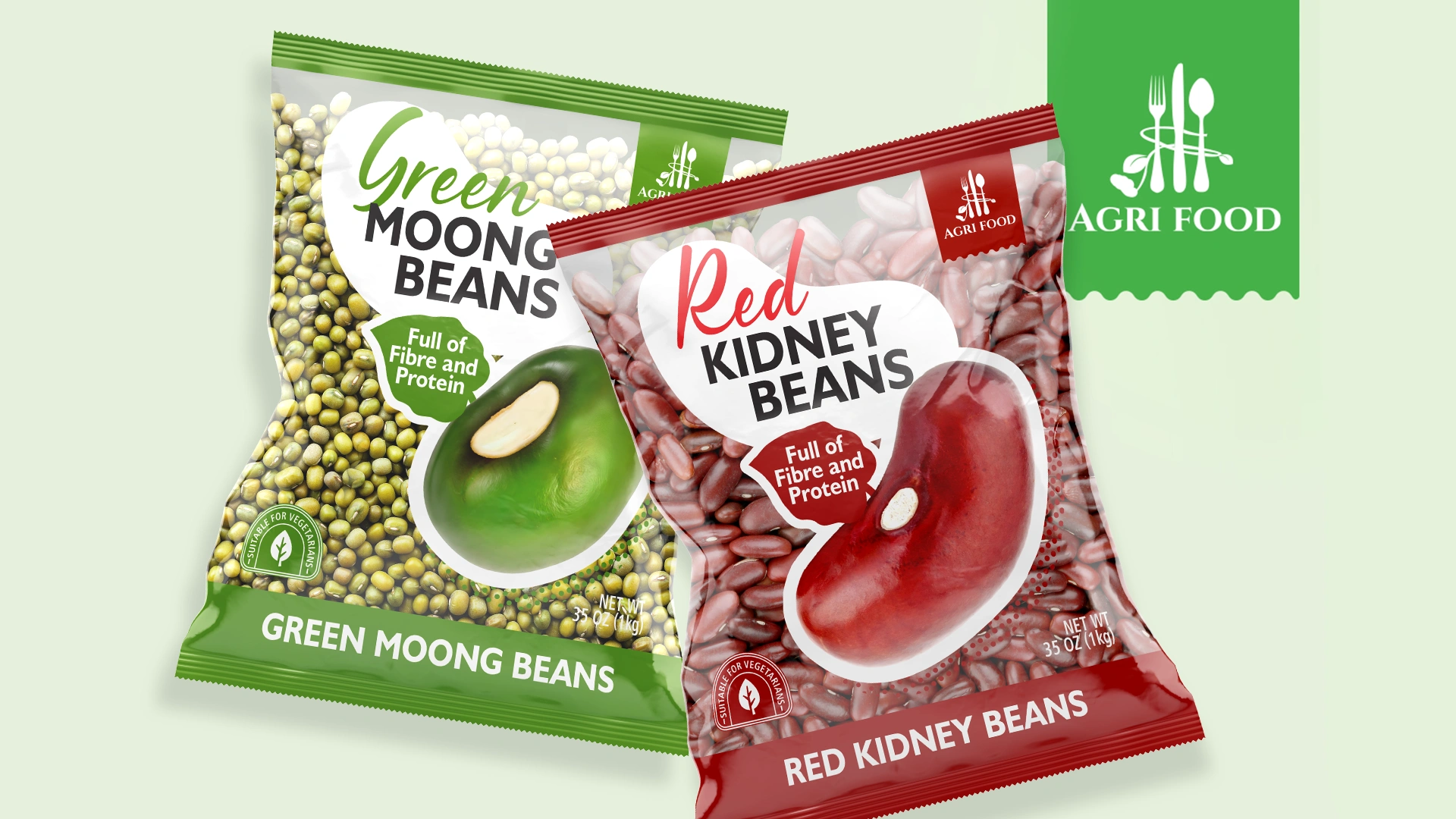
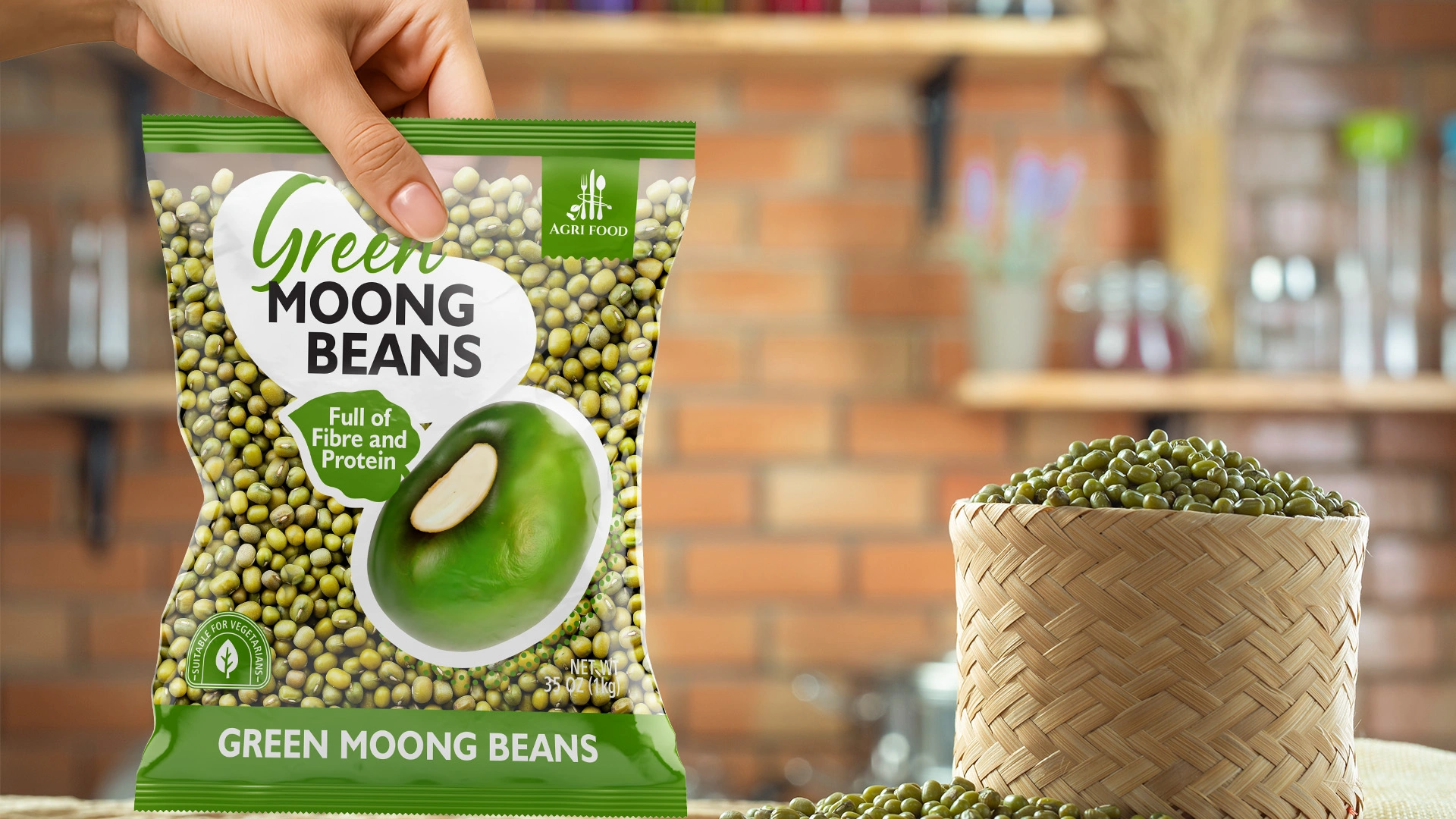
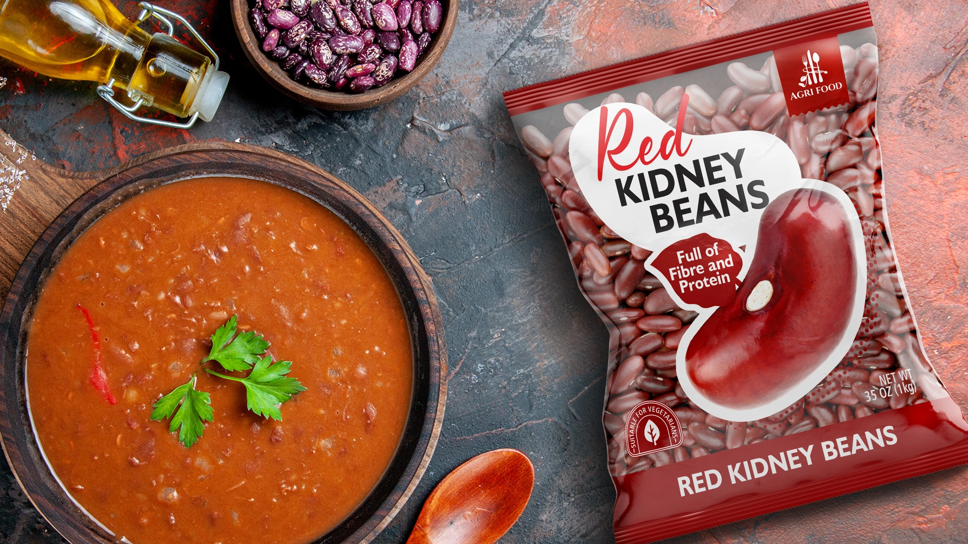
Agri Food — European Packaging Design for Agricultural Products
Agri Food – European Packaging Design for Pulses from Uzbekistan
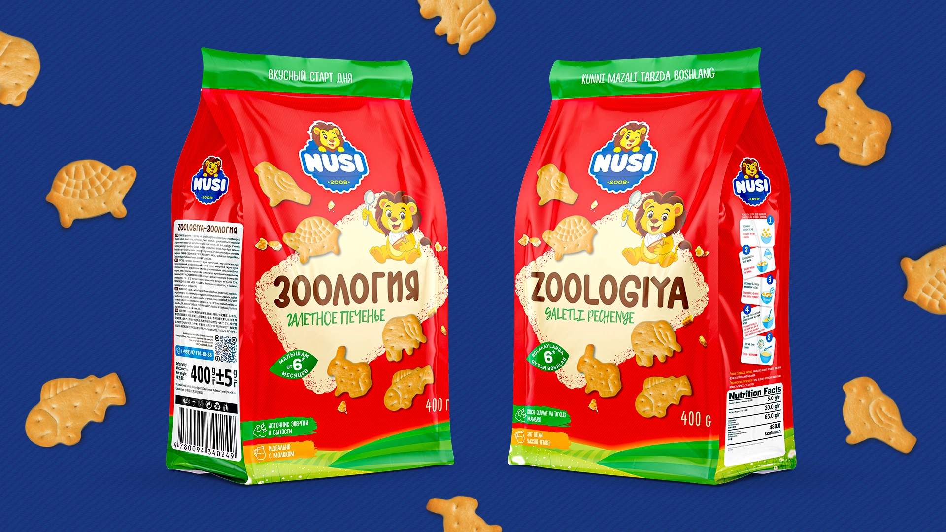
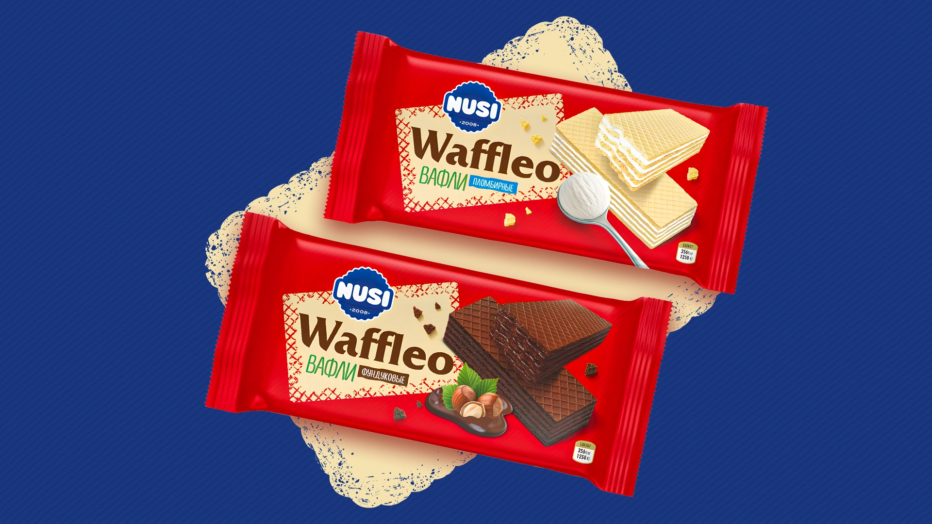
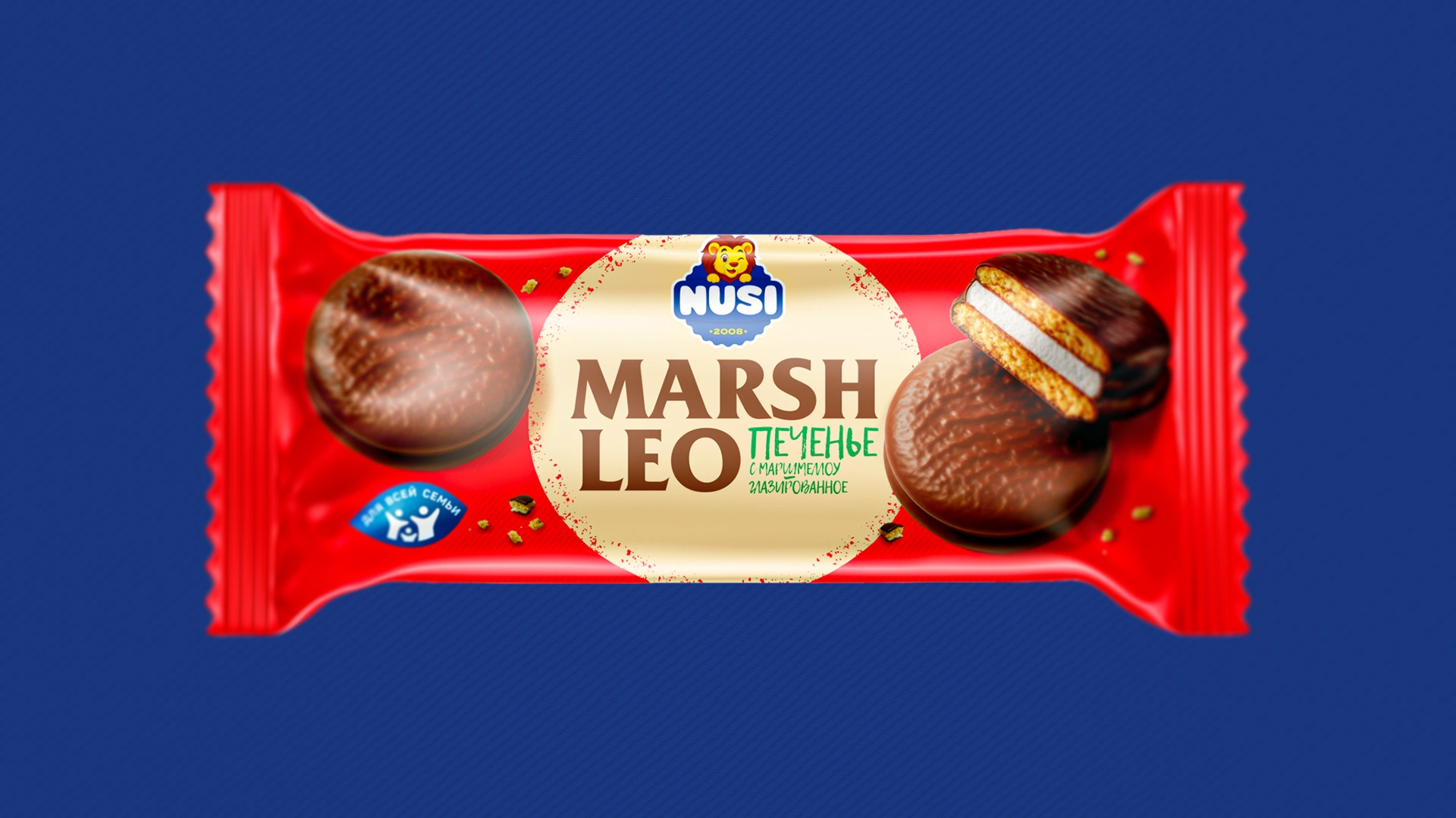

Nusi – Rebranding for a Confectionery Brand
A unified concept, a new character, and a vibrant design — a strategic solution aimed at boosting sales.
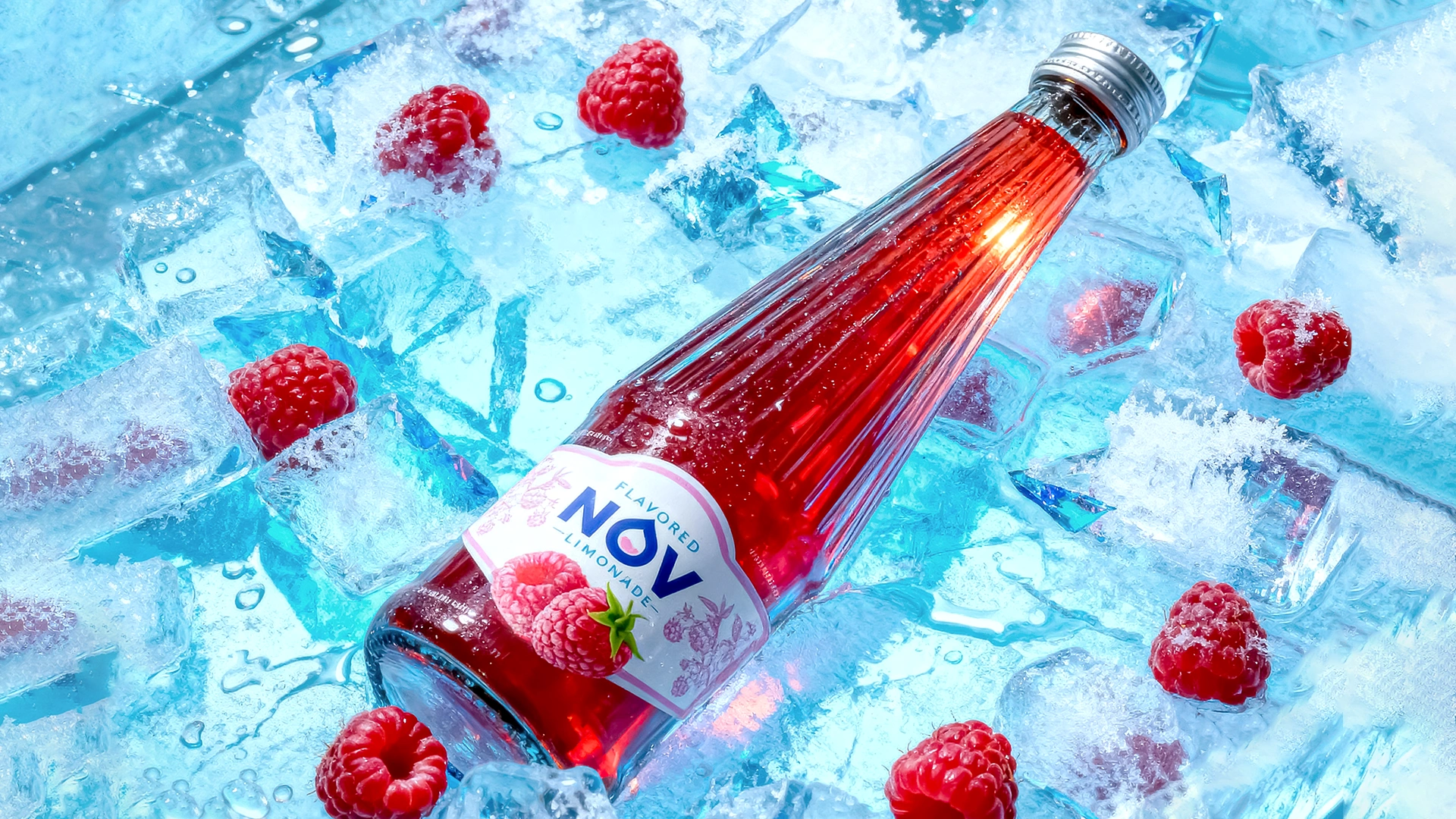
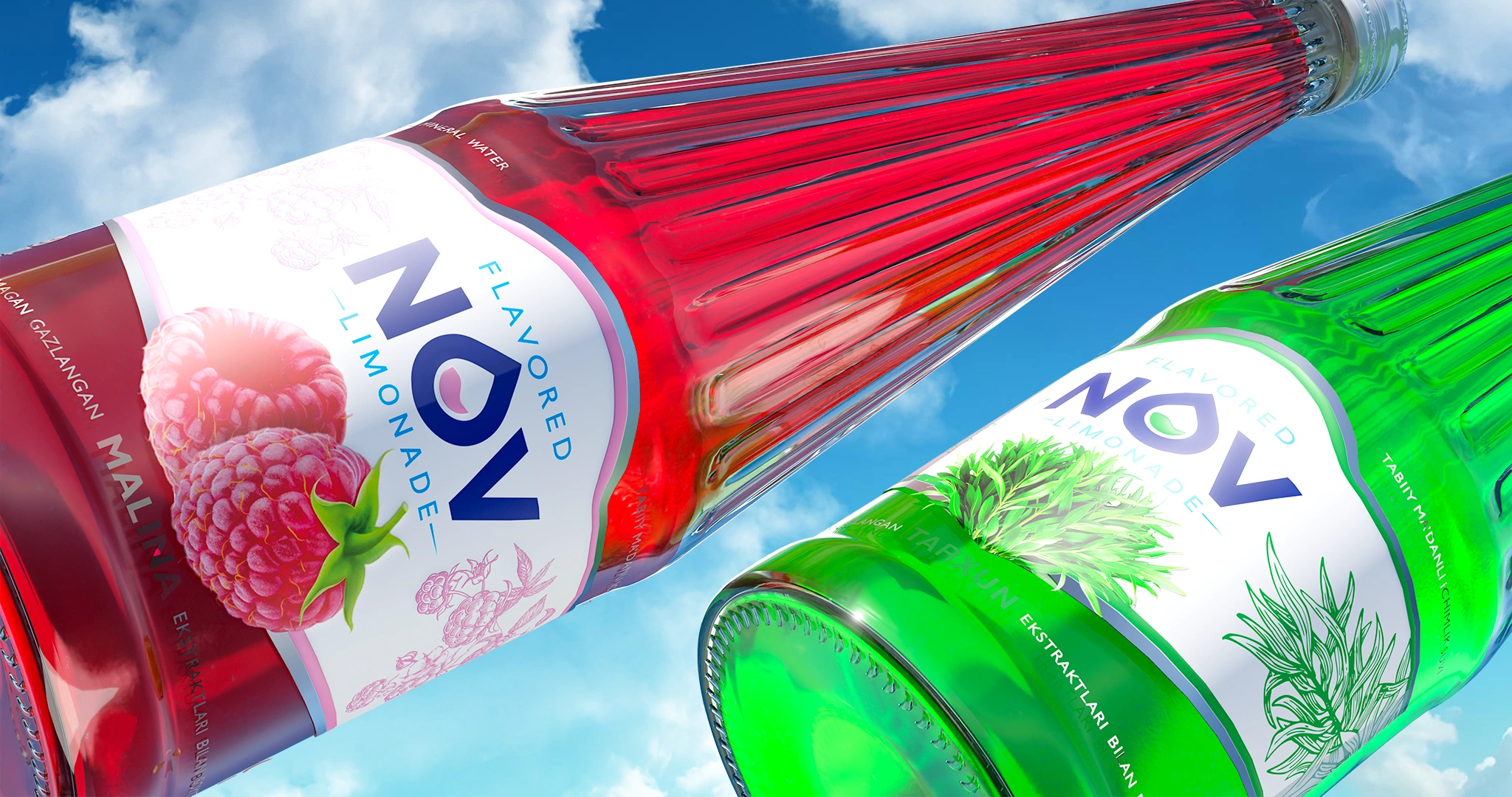
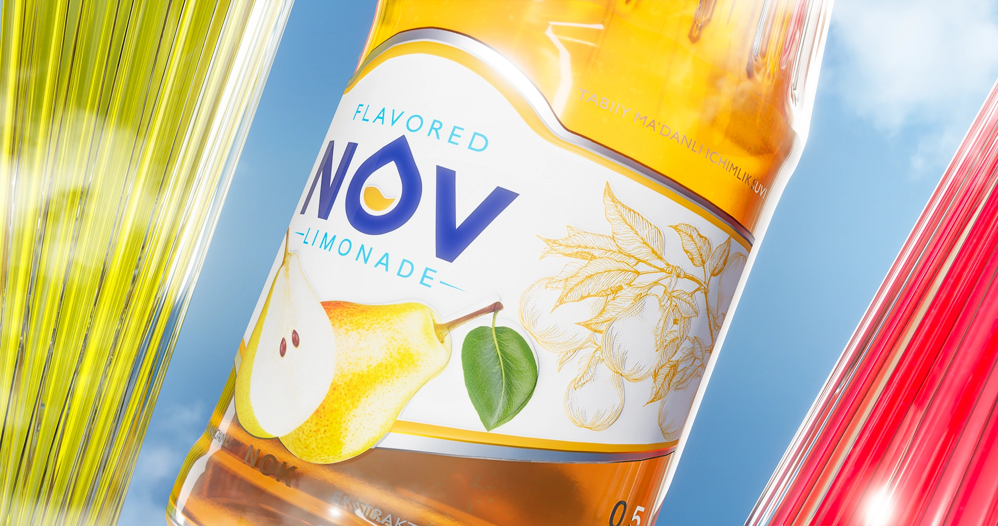
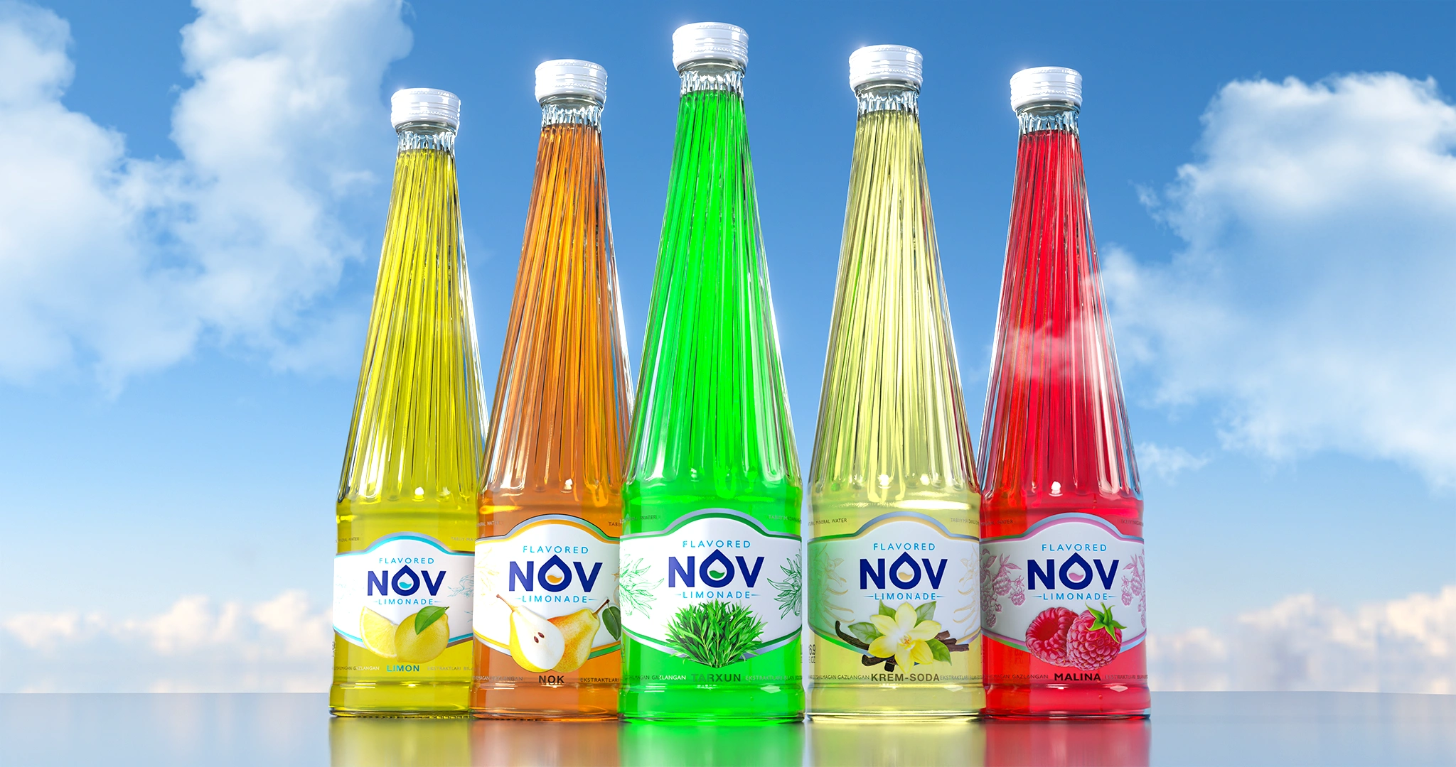
NOV — Label Design for Lemonades
The label design for the NOV lemonade line has been developed. A transparent "window" integrates the beverage's color into the design, a photorealistic fruit ensures instant taste recognition, and botanical graphics impart a premium and juicy appearance.
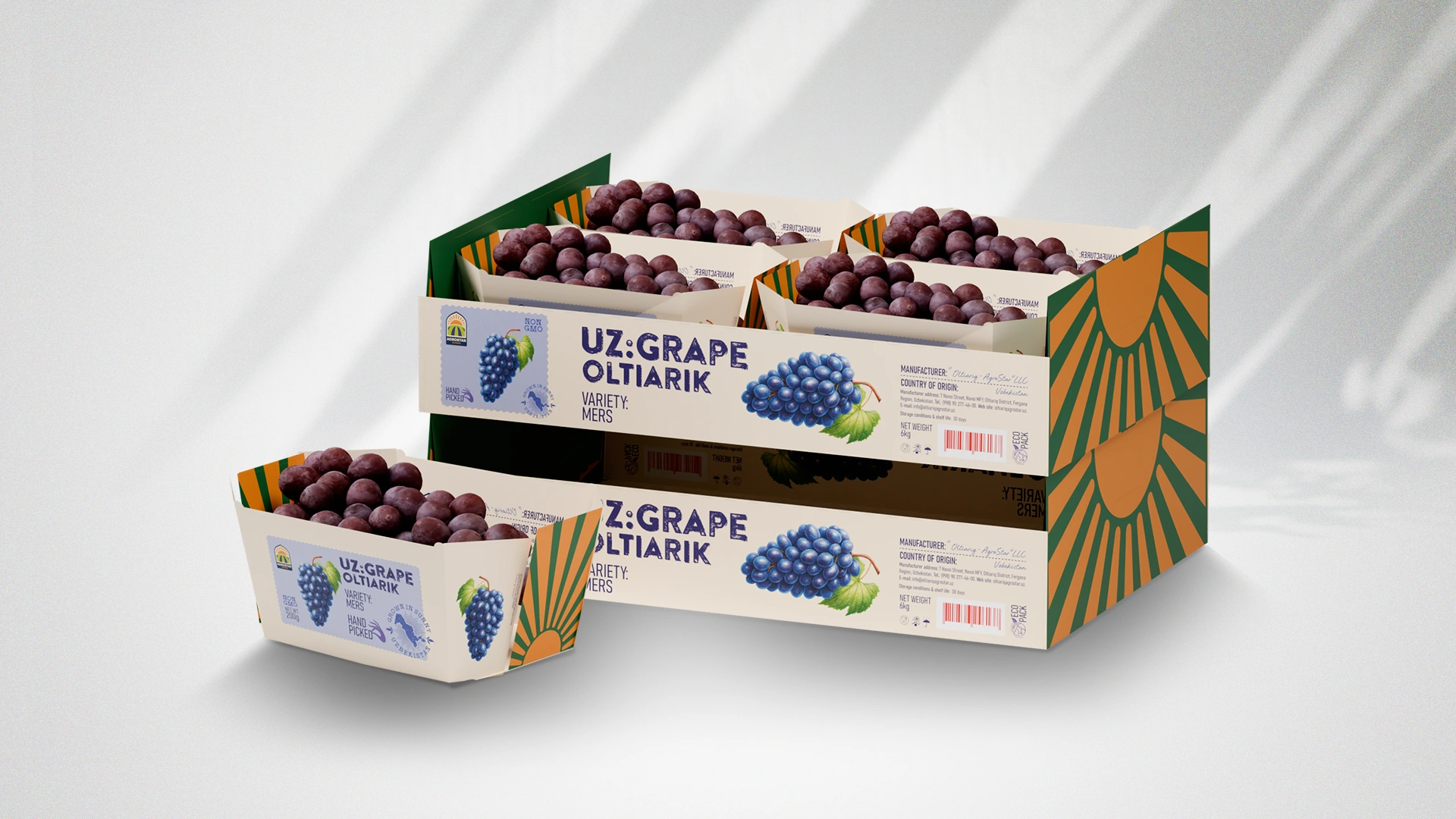
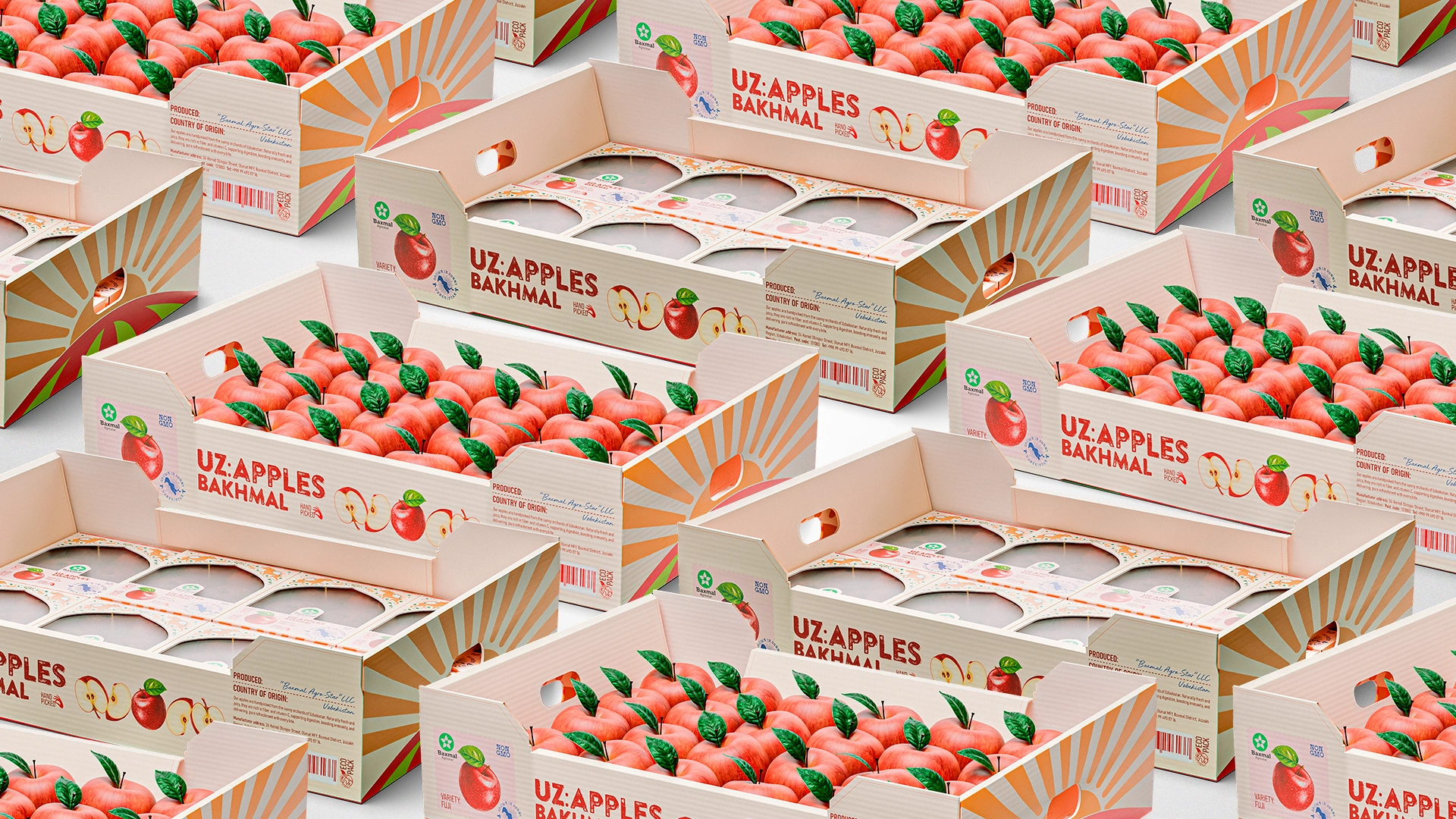
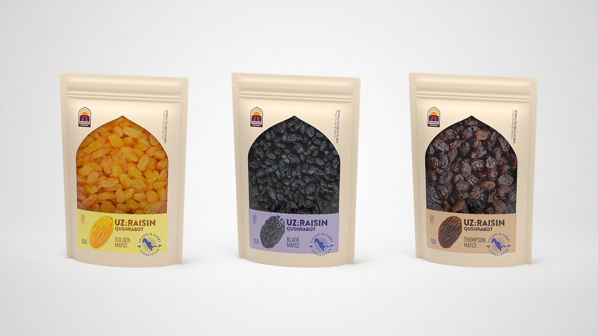
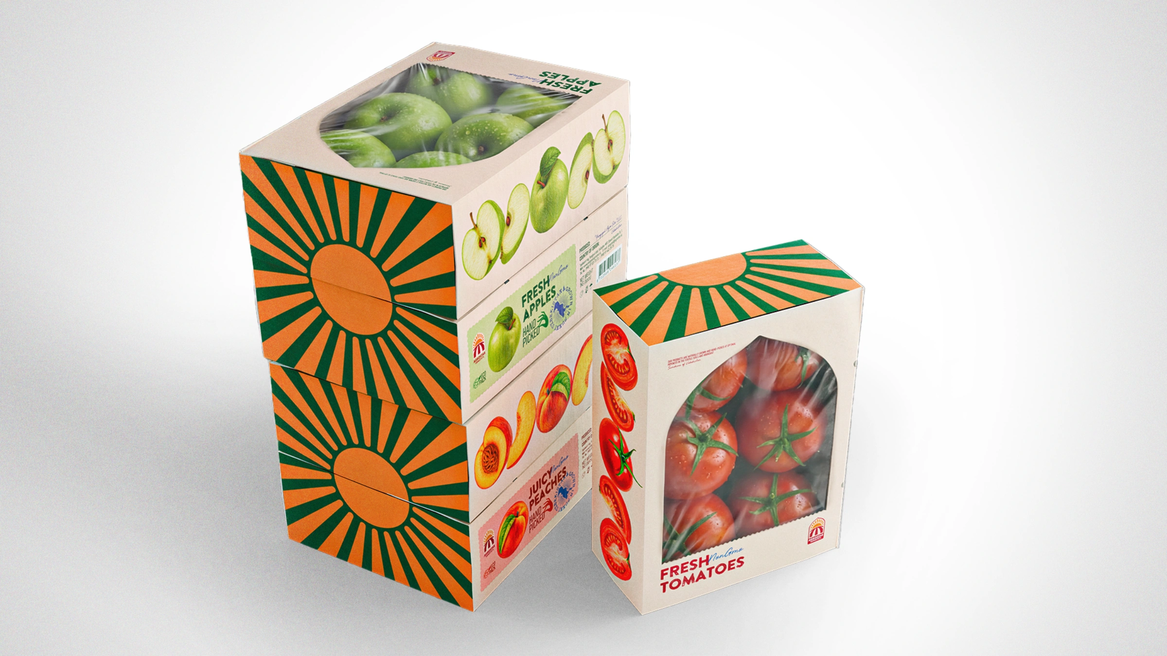
UzAgroStar — Packaging Design for Fruit and Vegetable Export
Export packaging design was developed for UzAgroStar. The cultural code (arches with Sherdor/Simurg symbols) and the "parcel" metaphor (stamps, Hand Picked) transform the product into a national brand, increasing its value on the global market.
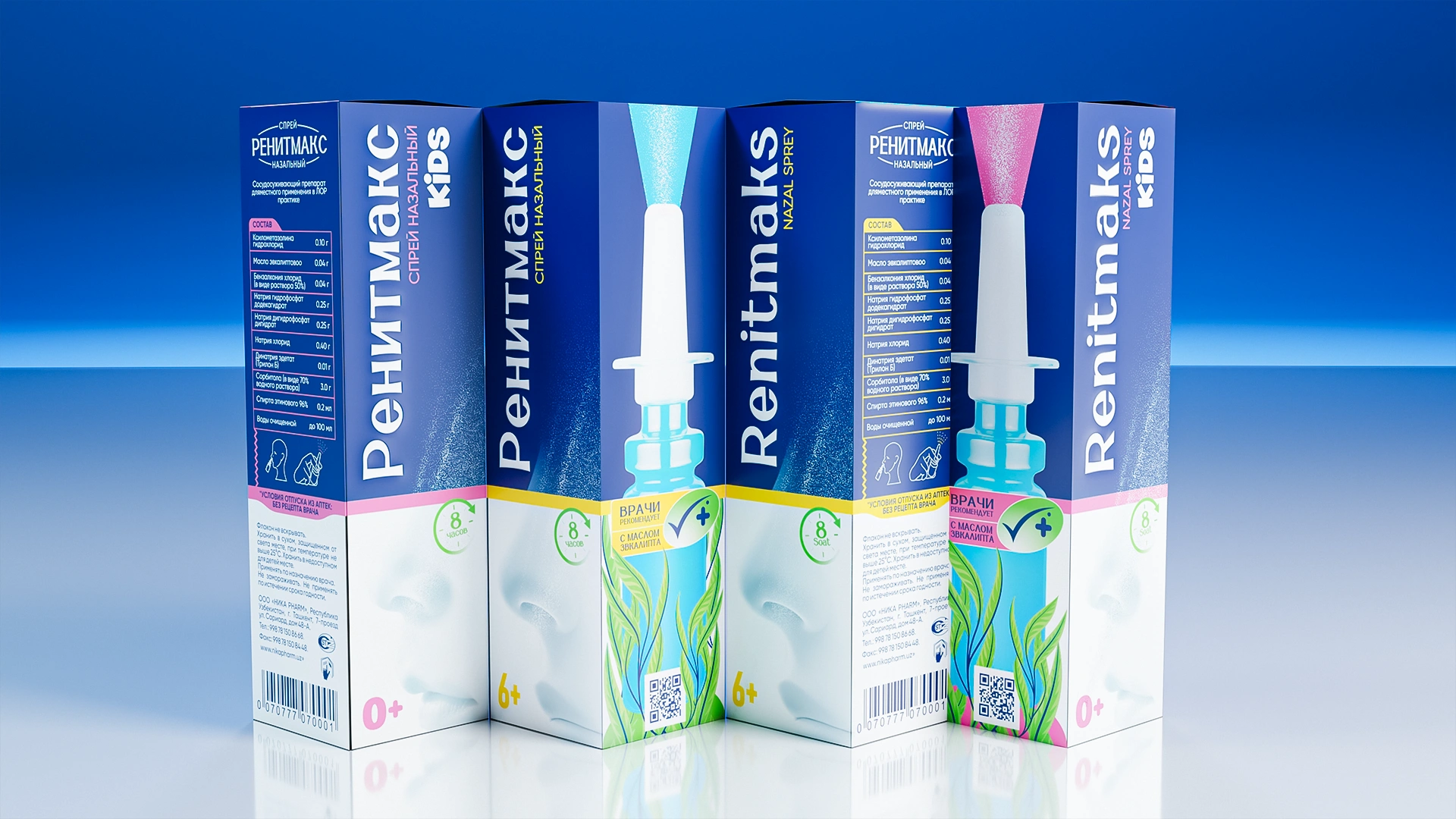

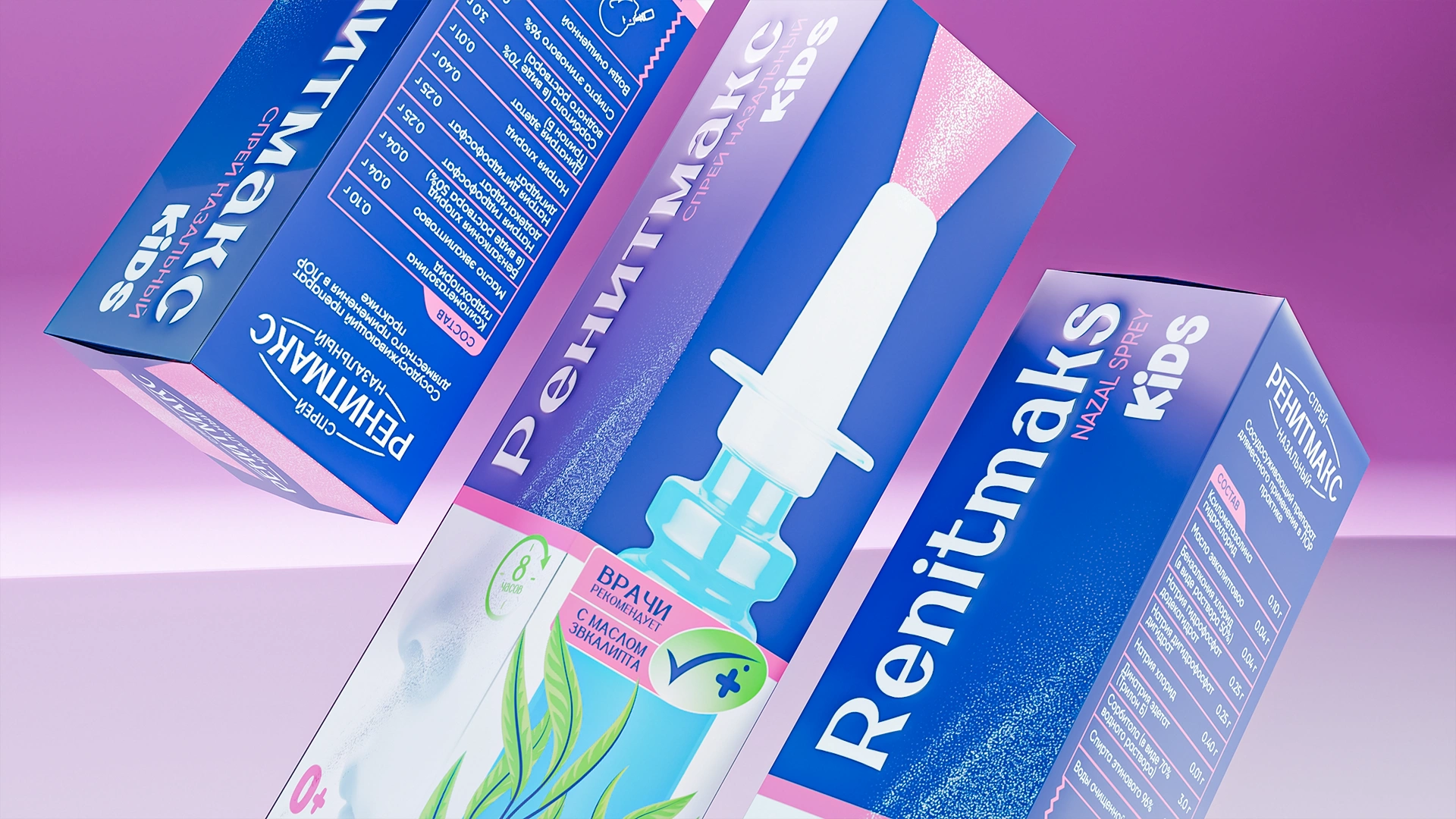
RenitMaks — Nasal Spray Packaging Design
Packaging design was developed for the RenitMaks nasal spray. Saturated medical blue color, eucalyptus leaves (natural action), and vertical typography create a modern, professional style and a clear visual architecture for the pharmacy shelf.
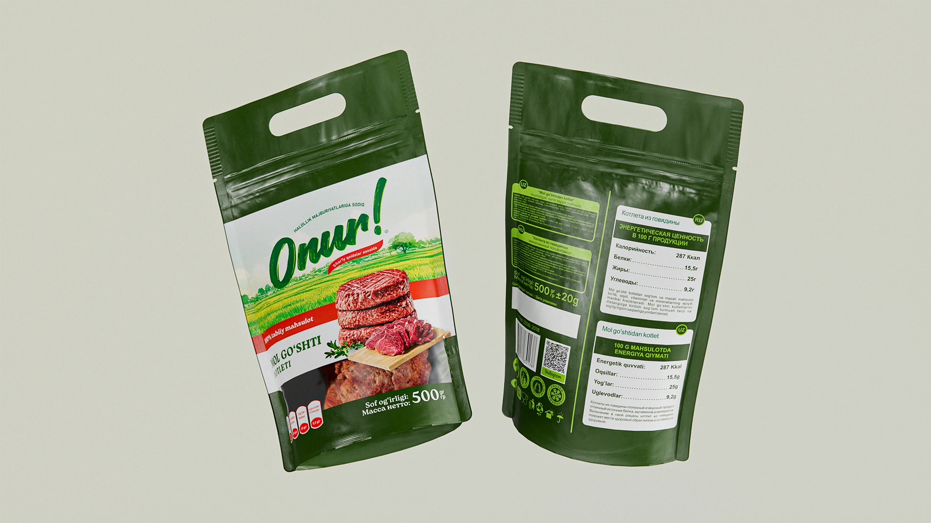
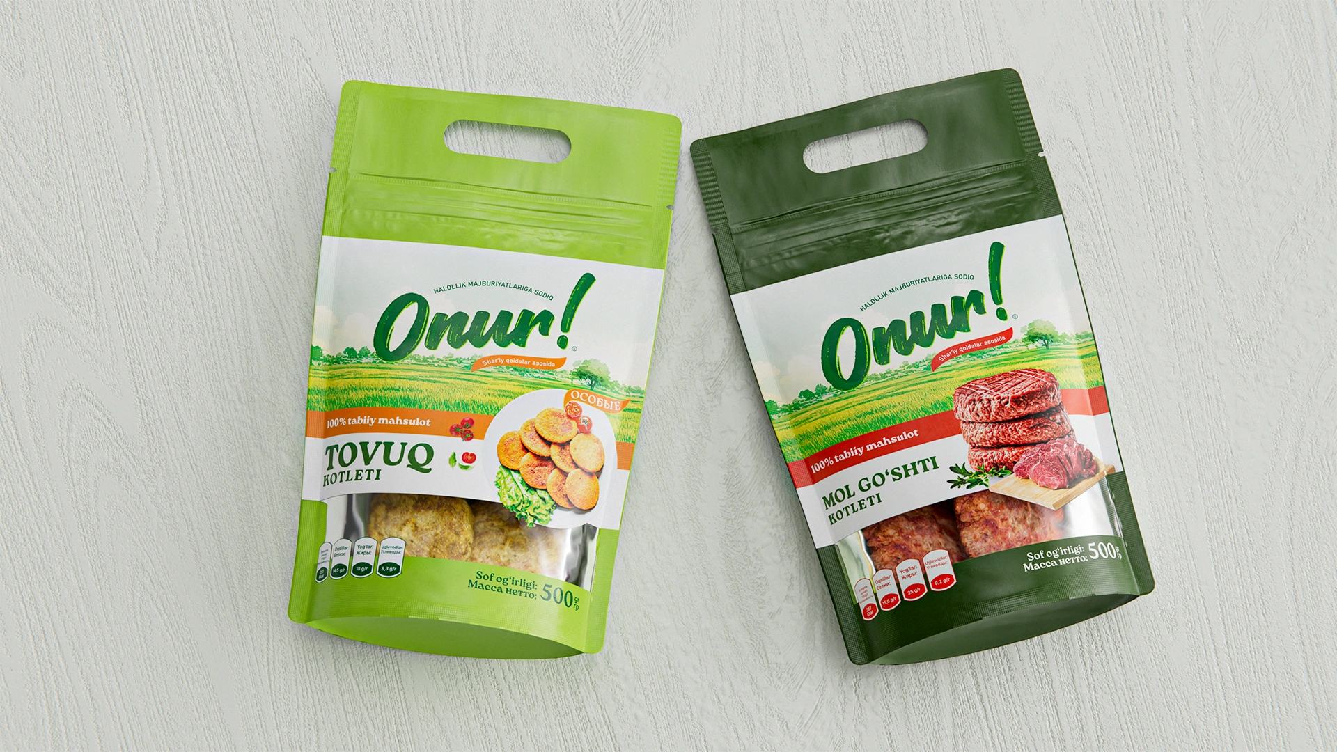
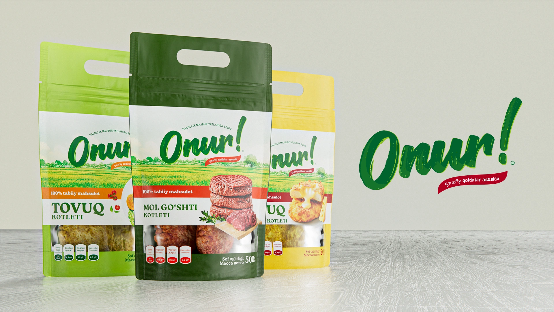
Onur — Naming and Packaging for Meat Semi-Finished Products
Onur – Naming and Packaging Design for Meat Semi-Finished Products
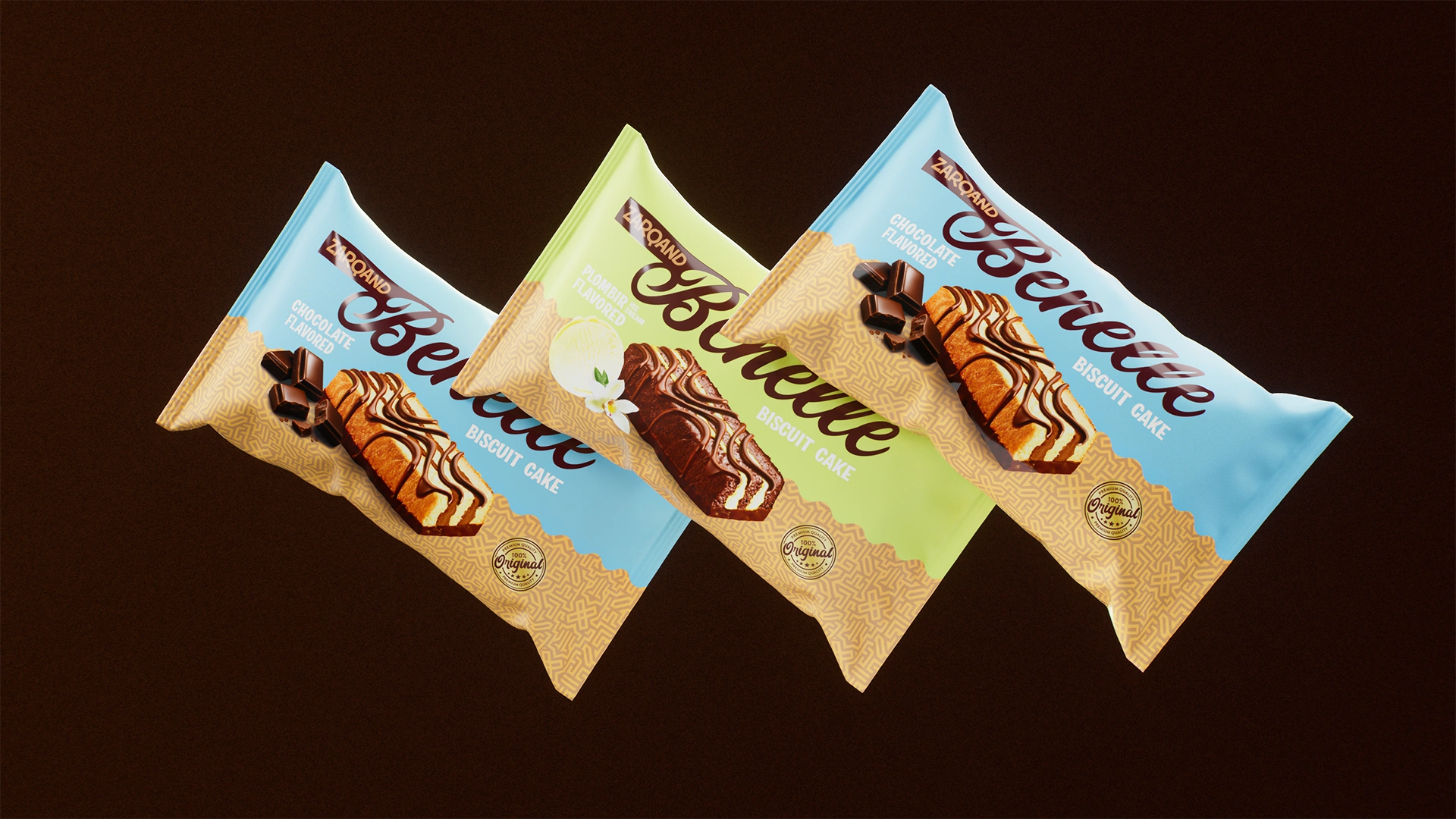
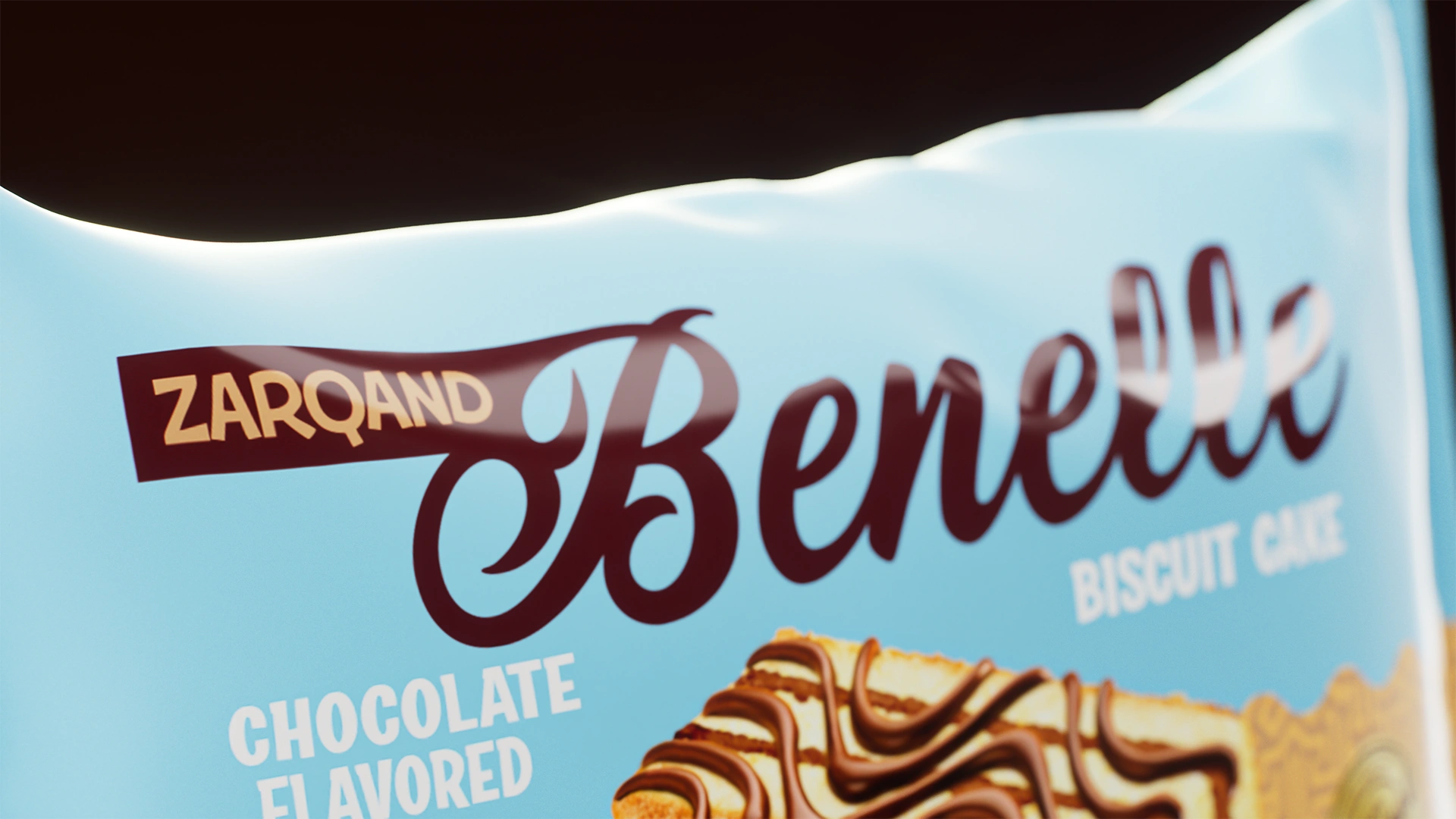
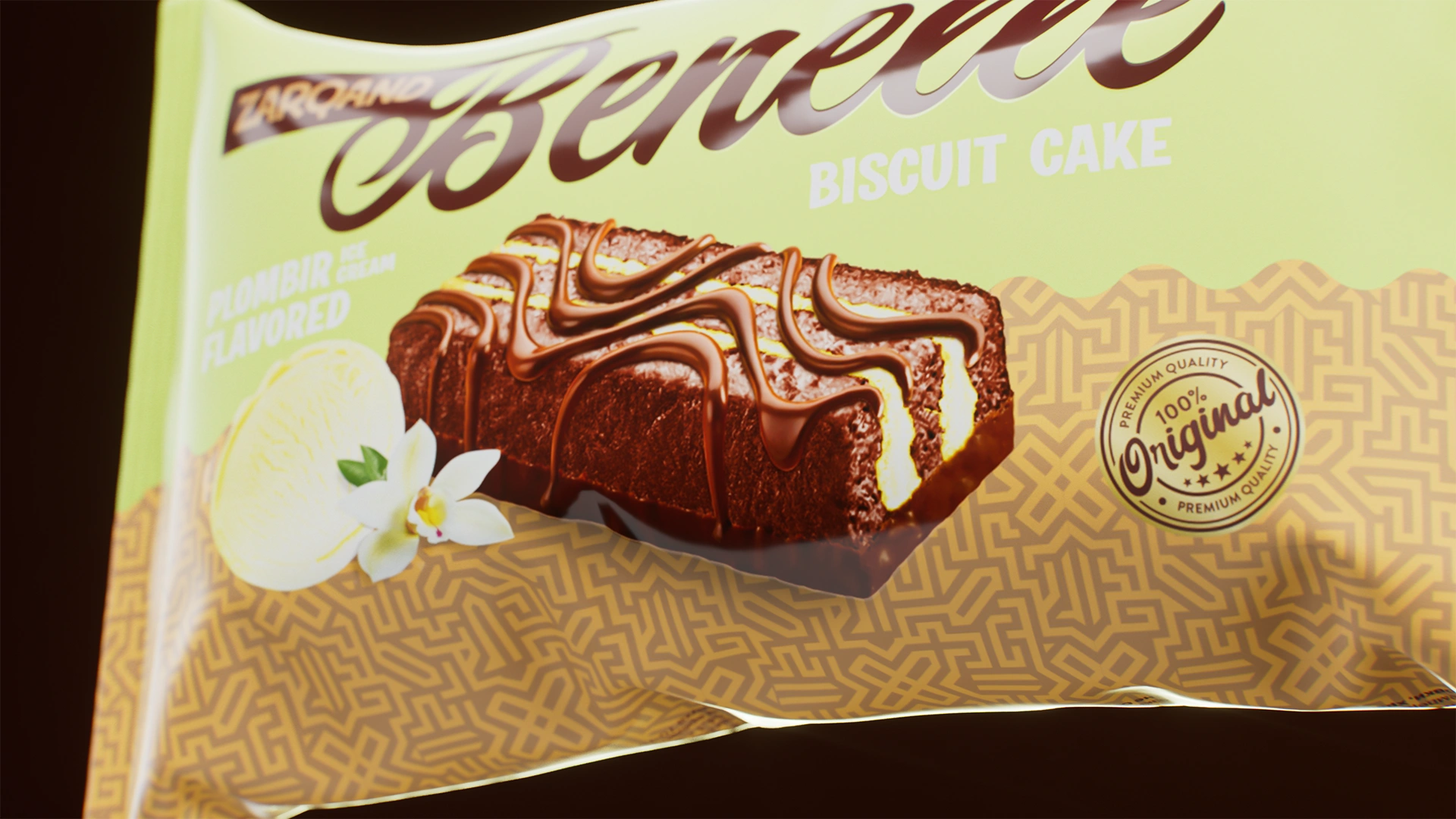
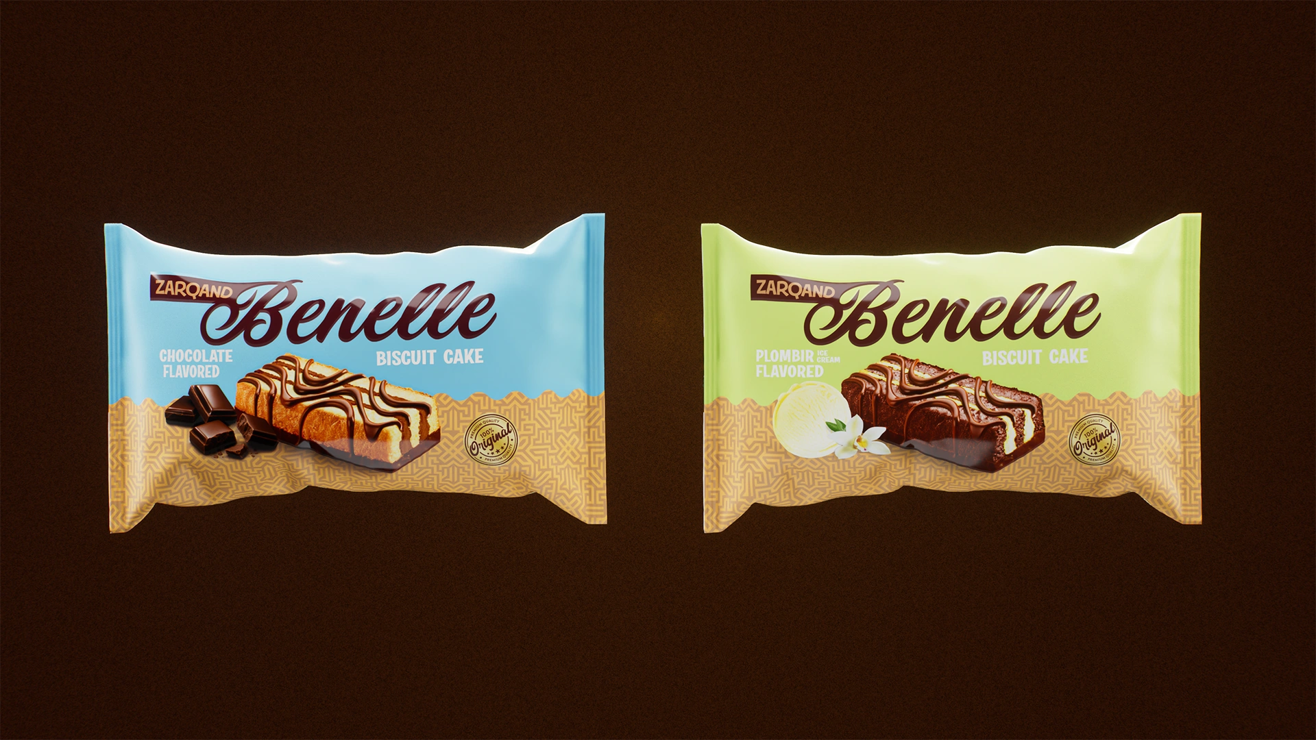
Benelle — Packaging Design for Biscuit Cakes
We developed a packaging design for Benelle biscuit cakes, emphasizing premium quality. Calm background colors with a gold ornament and a realistic 3D model of the cake make the product suitable for table setting.
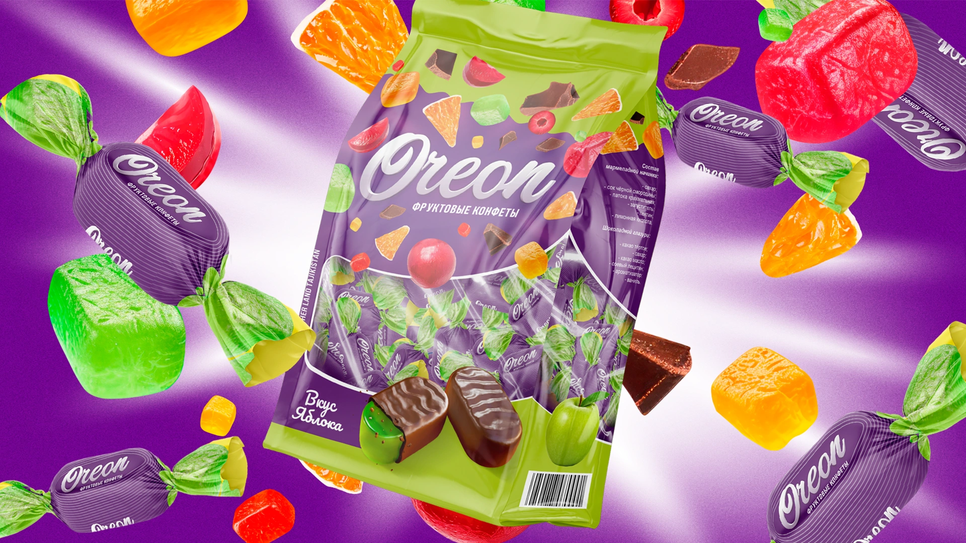
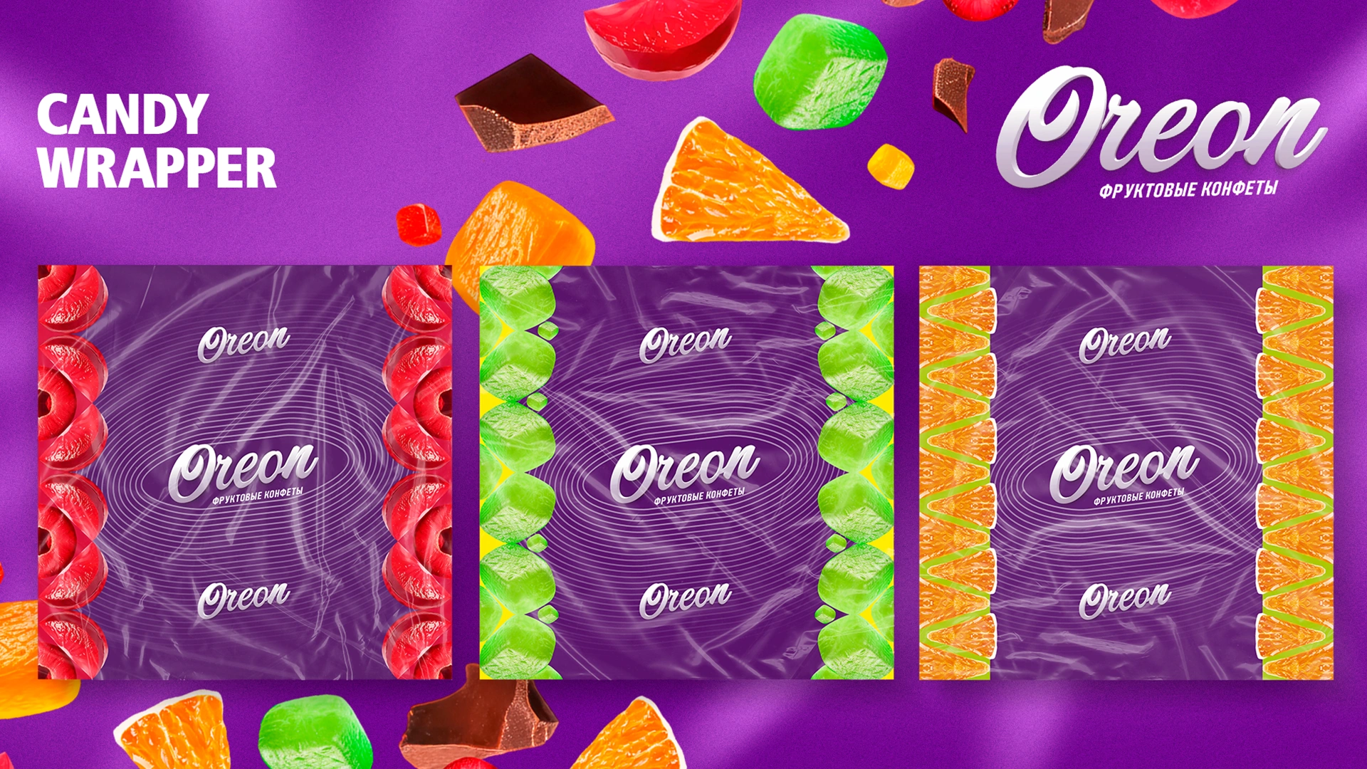
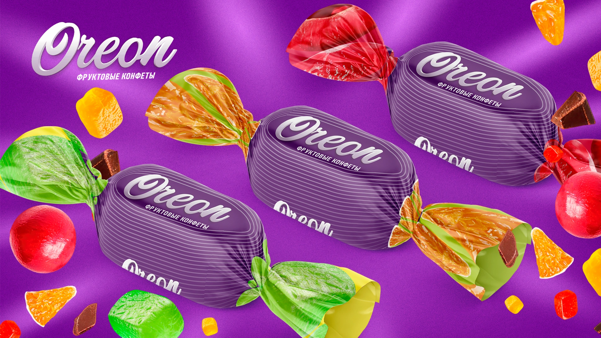
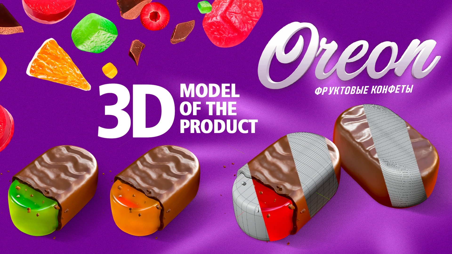
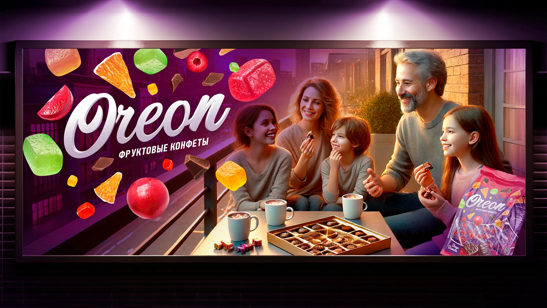
Oreon — Packaging Design for Fruit Candies
Oreon – Fruit Candy Packaging Design in Chocolate Glaze


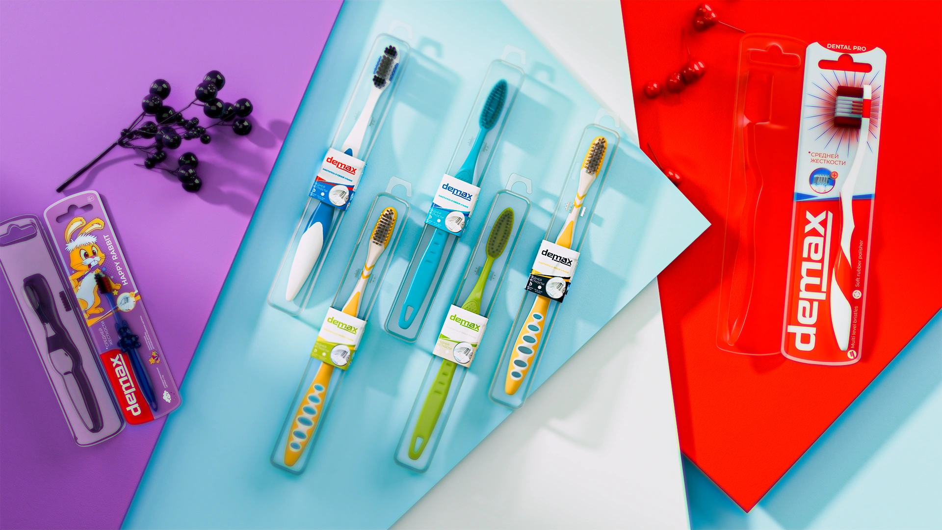
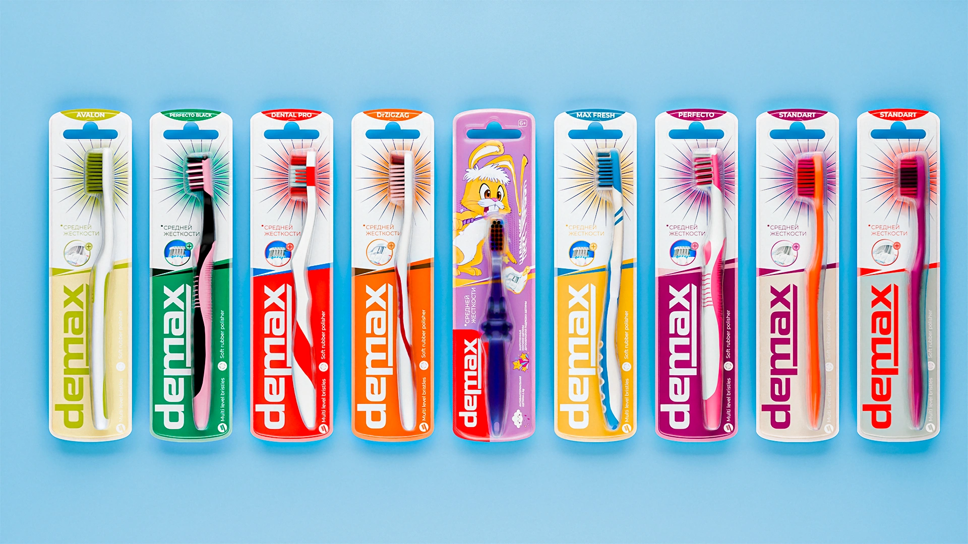
Demax — a unified concept for a toothbrush line
A unified visual concept was developed for the Demax toothbrush line. Graphic rays became the signature accent, symbolizing cleanliness and freshness, uniting different series into a single recognizable family.

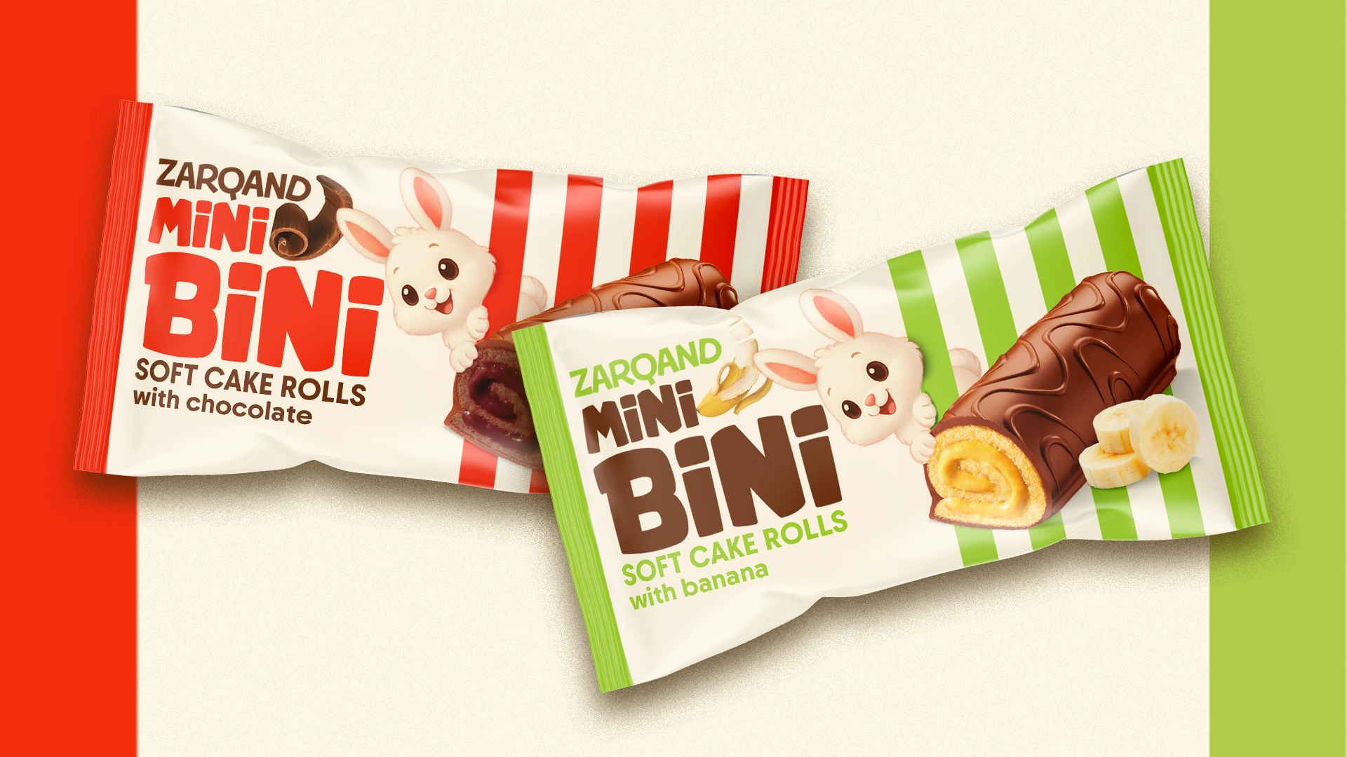
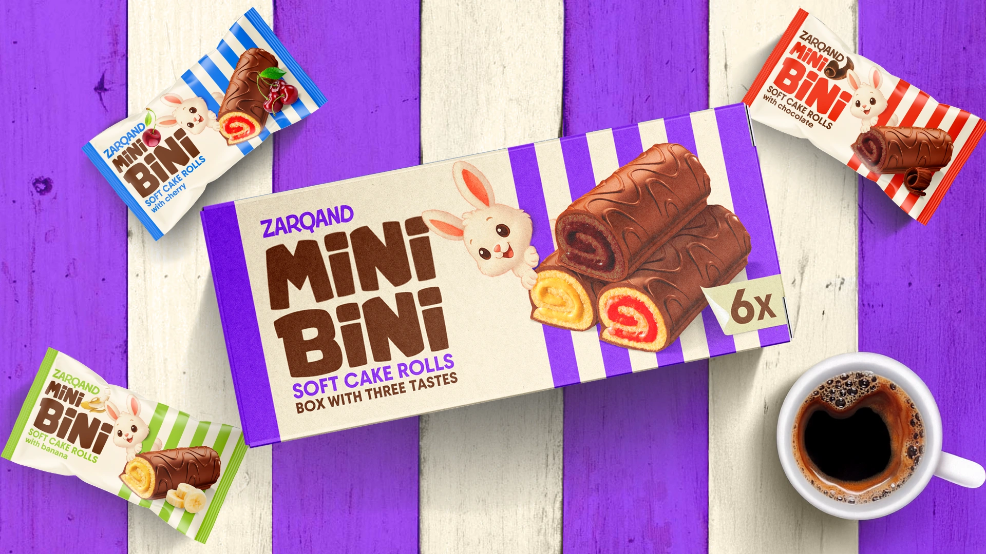
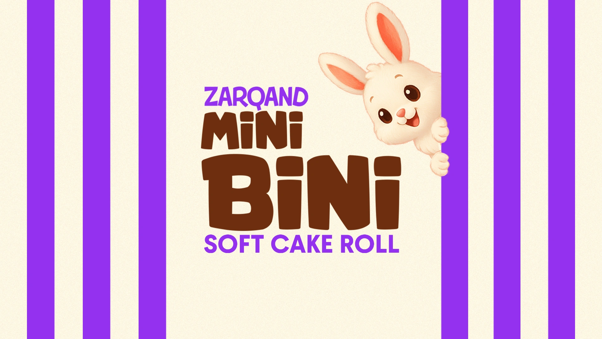
Mini Bini — packaging design for a mini roll
Mini Bini: the mini roll that says “take me with you”